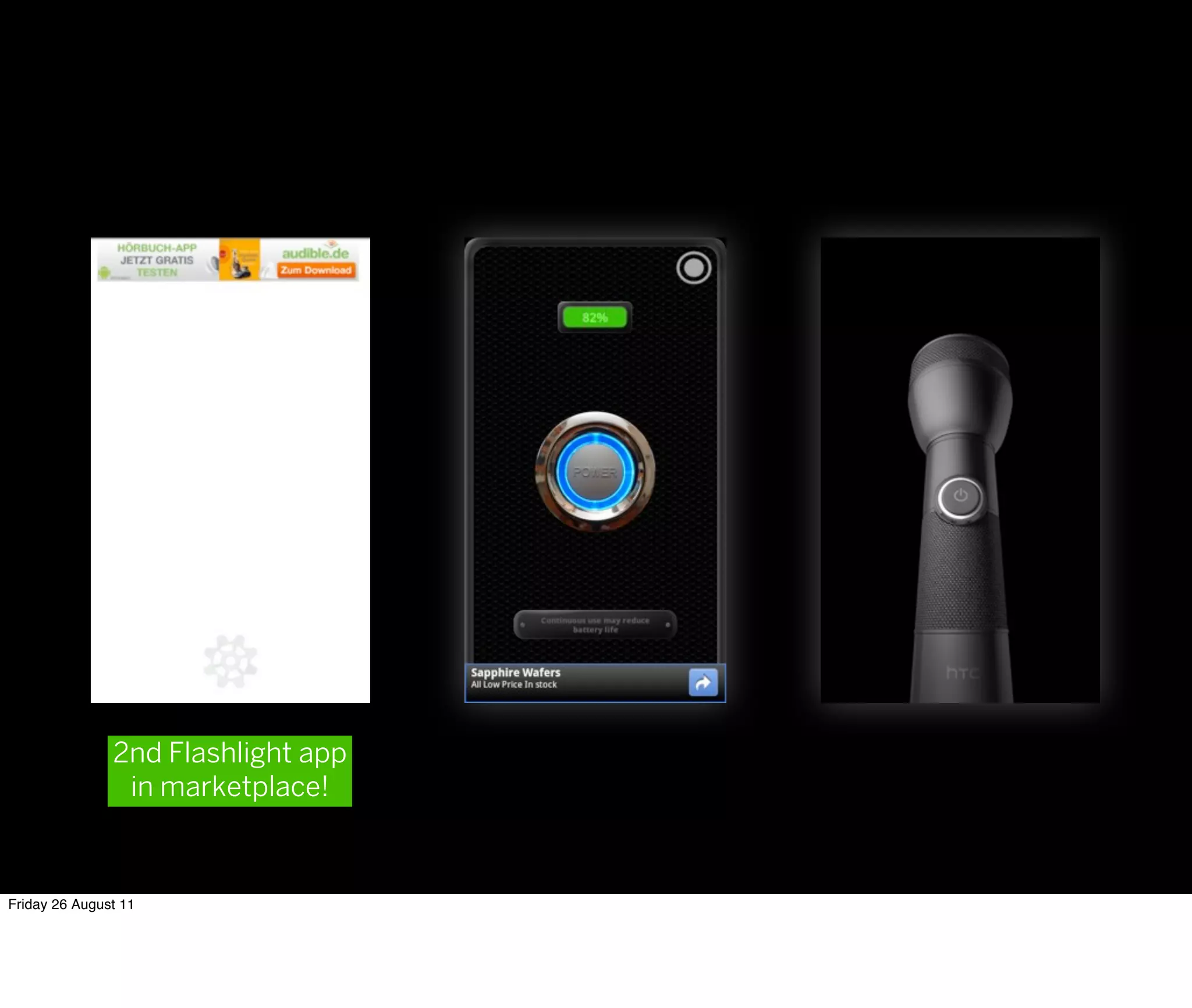
Downloaded 271 times

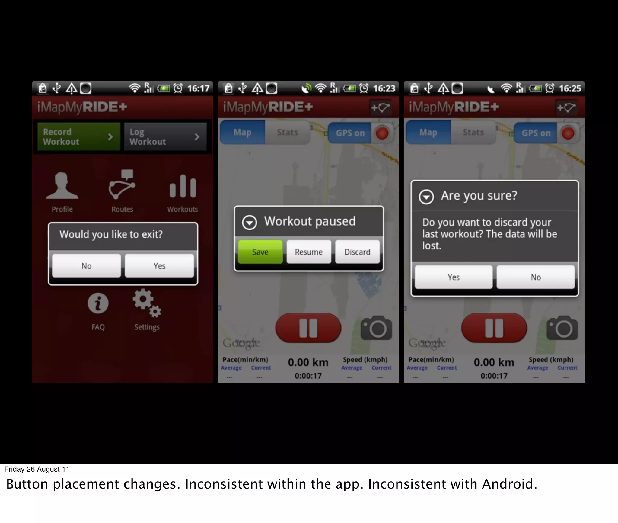

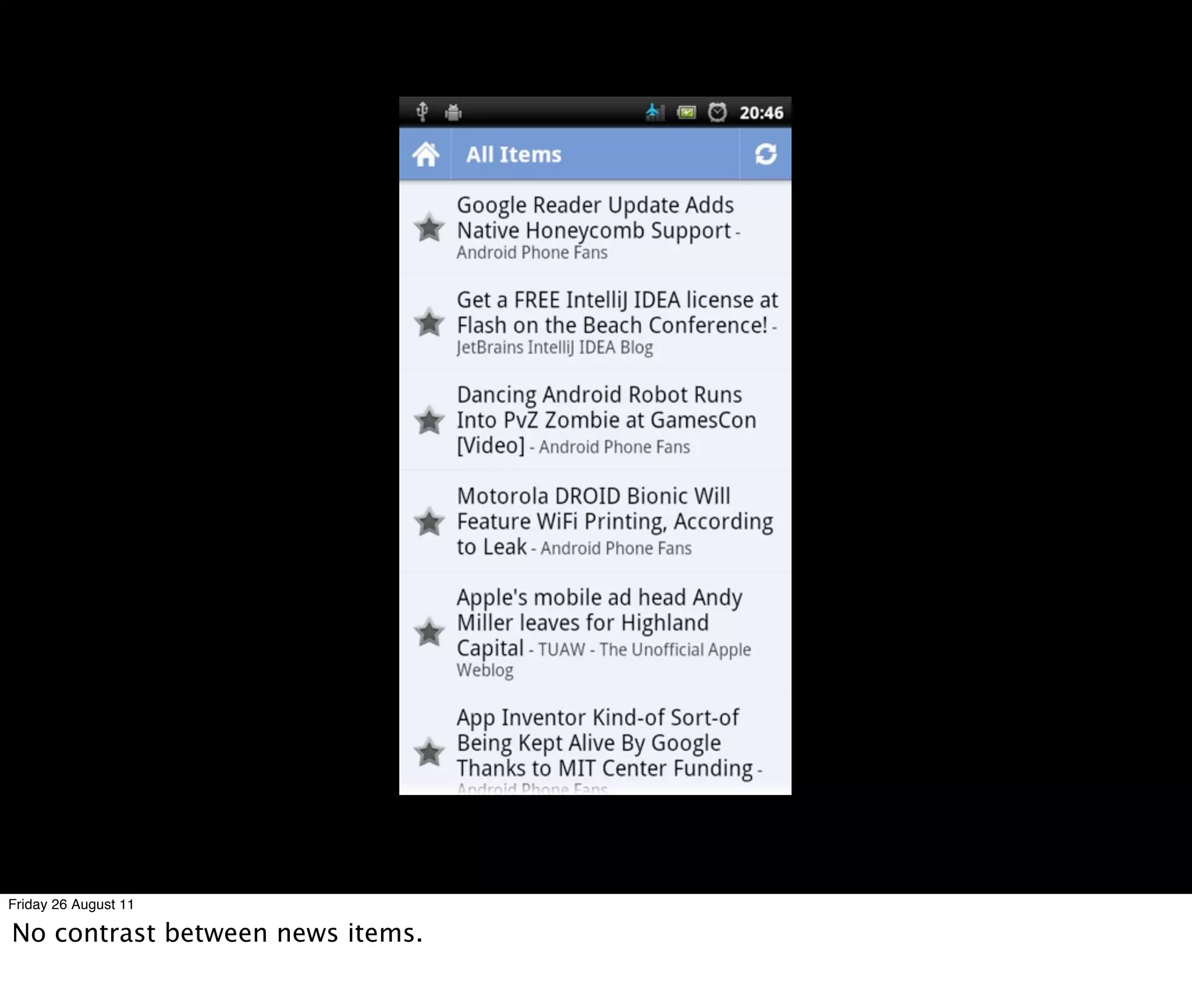
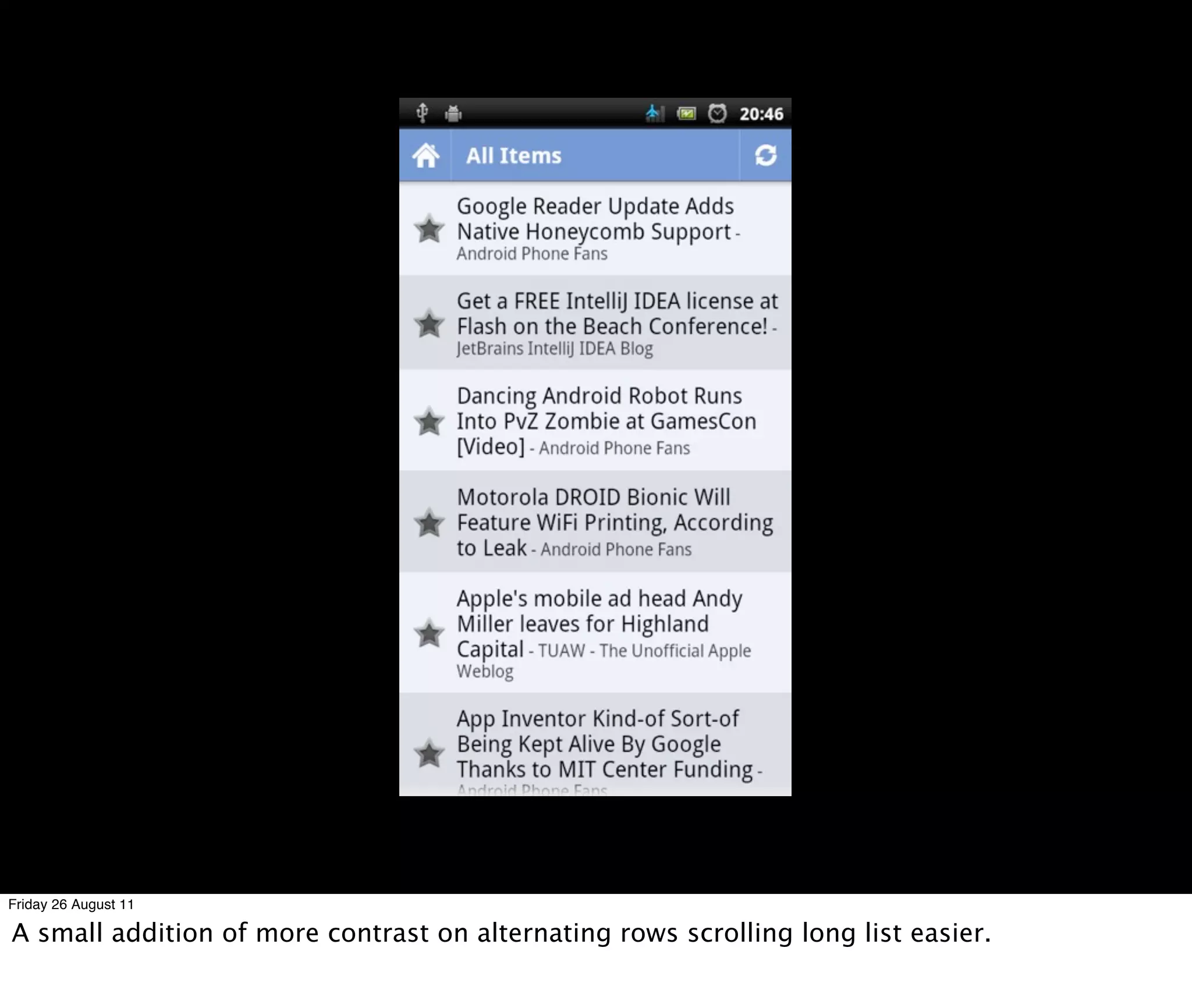
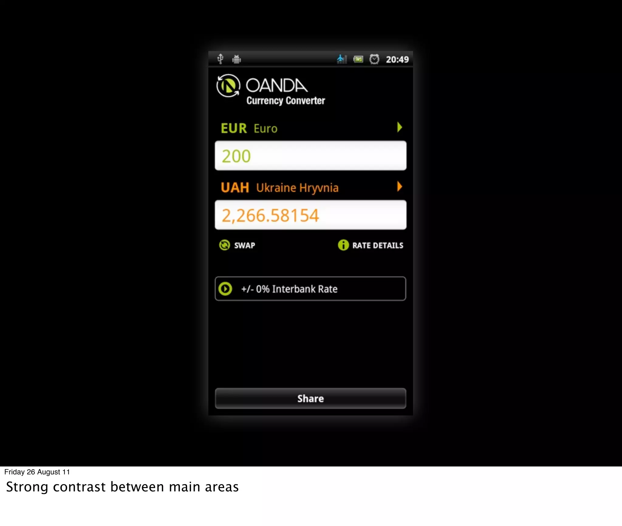
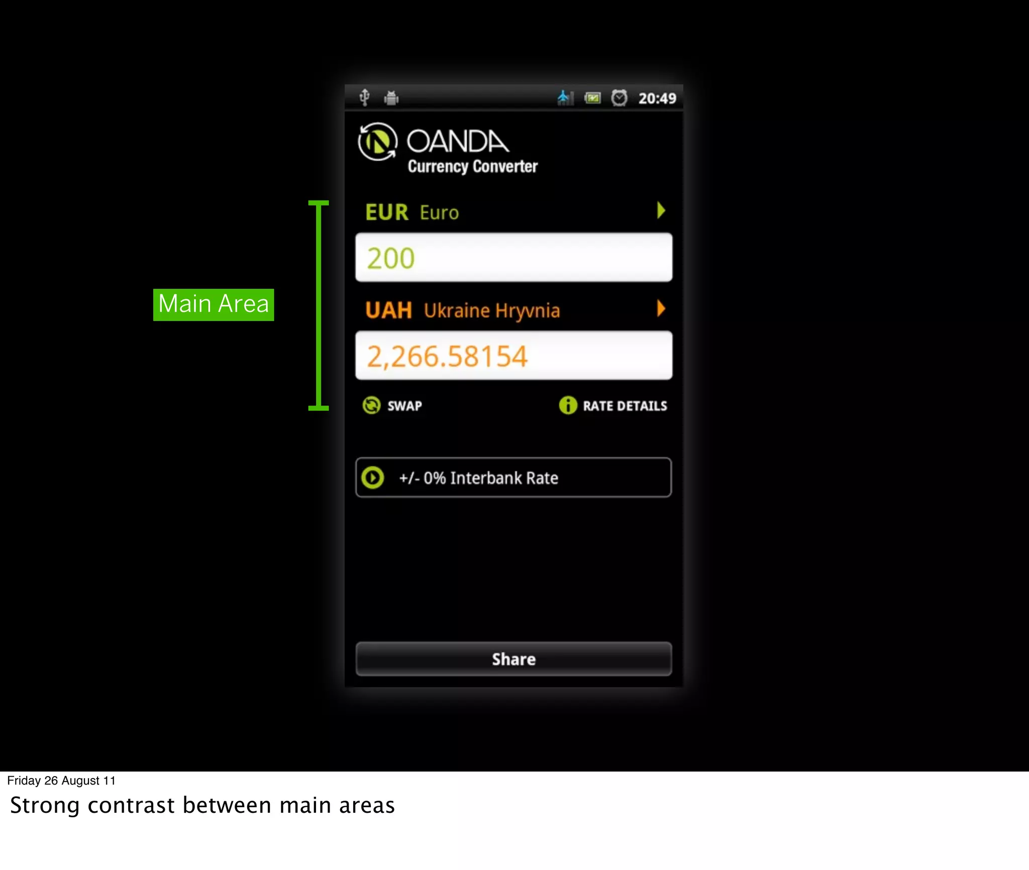
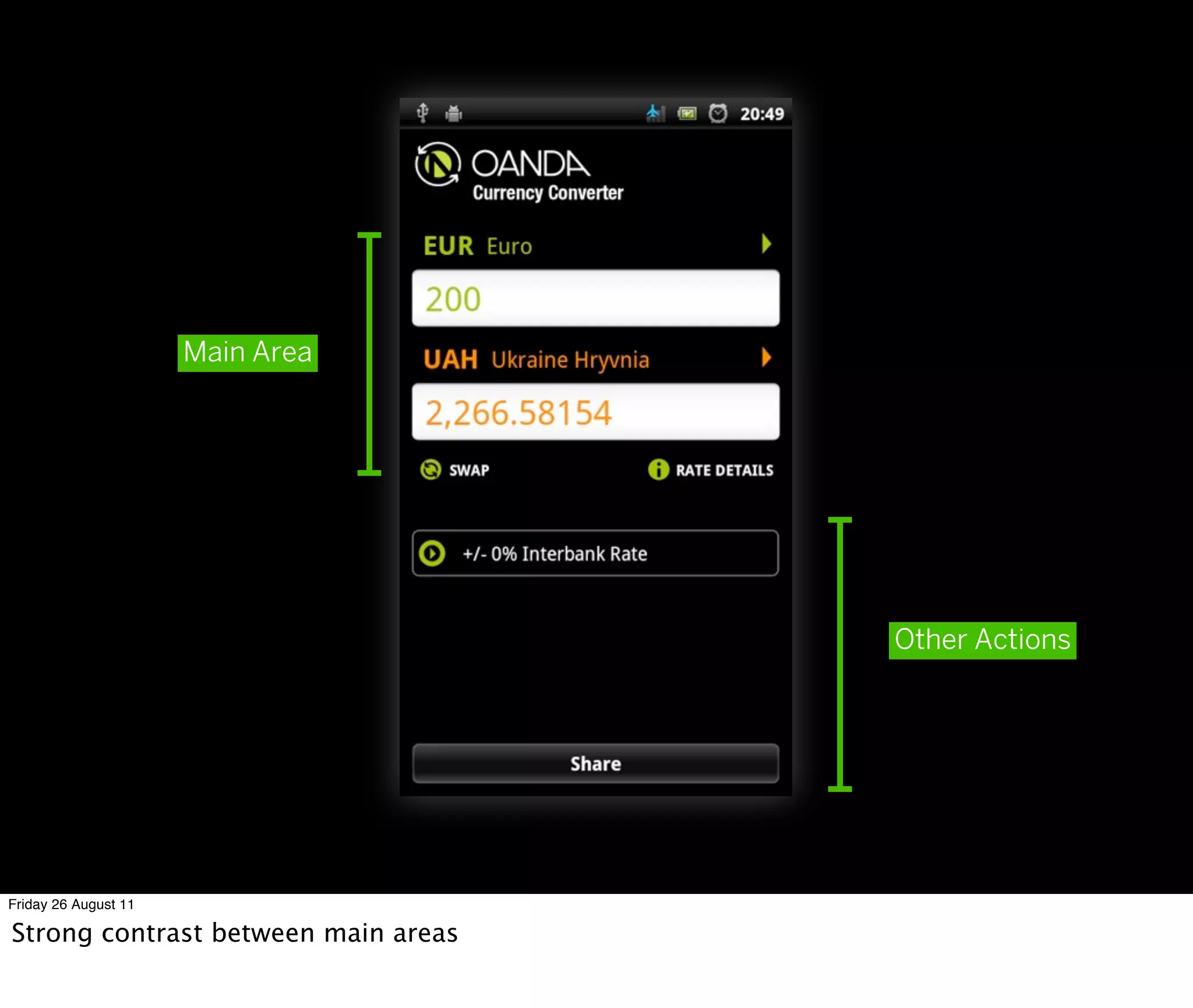


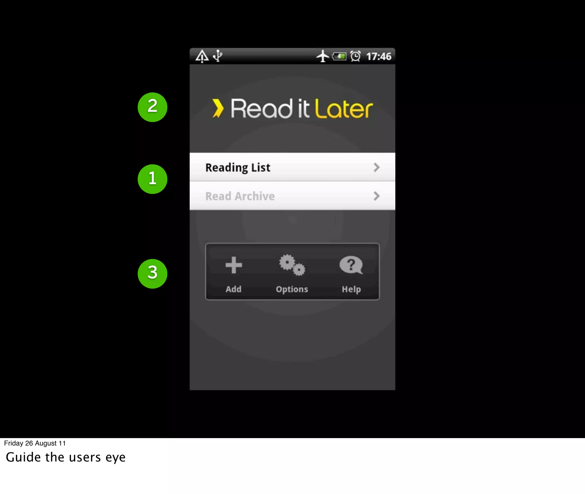
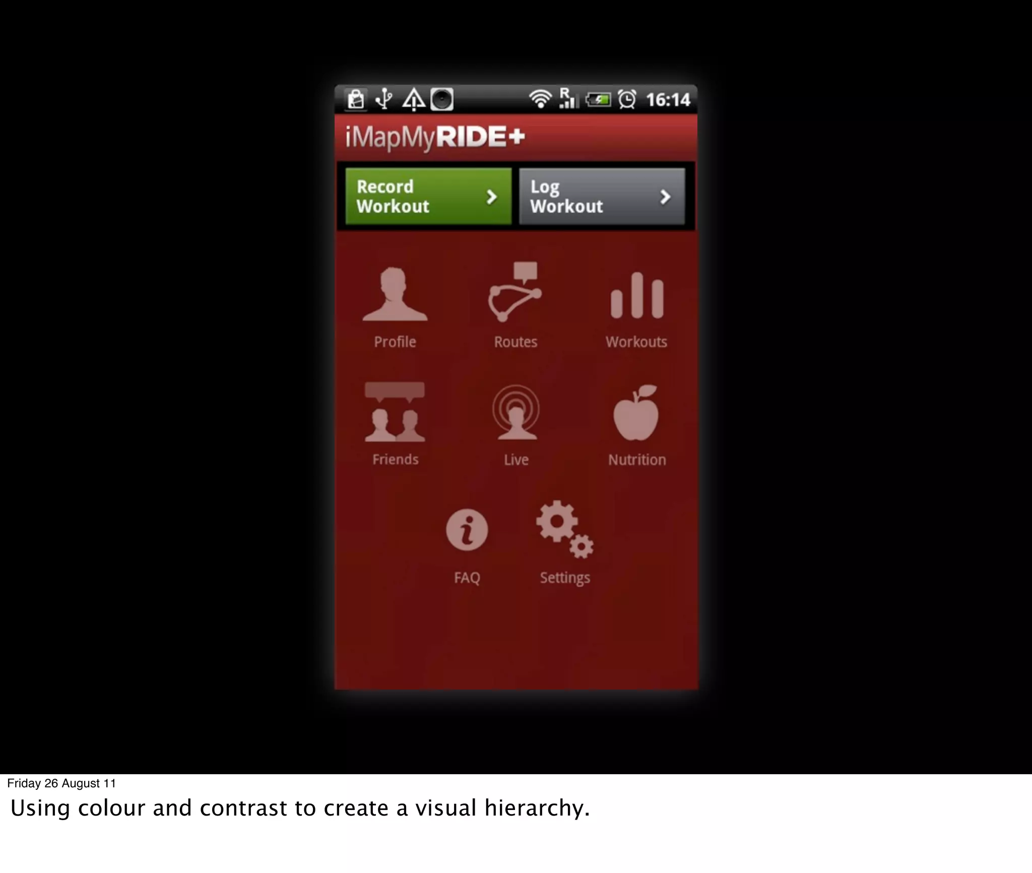
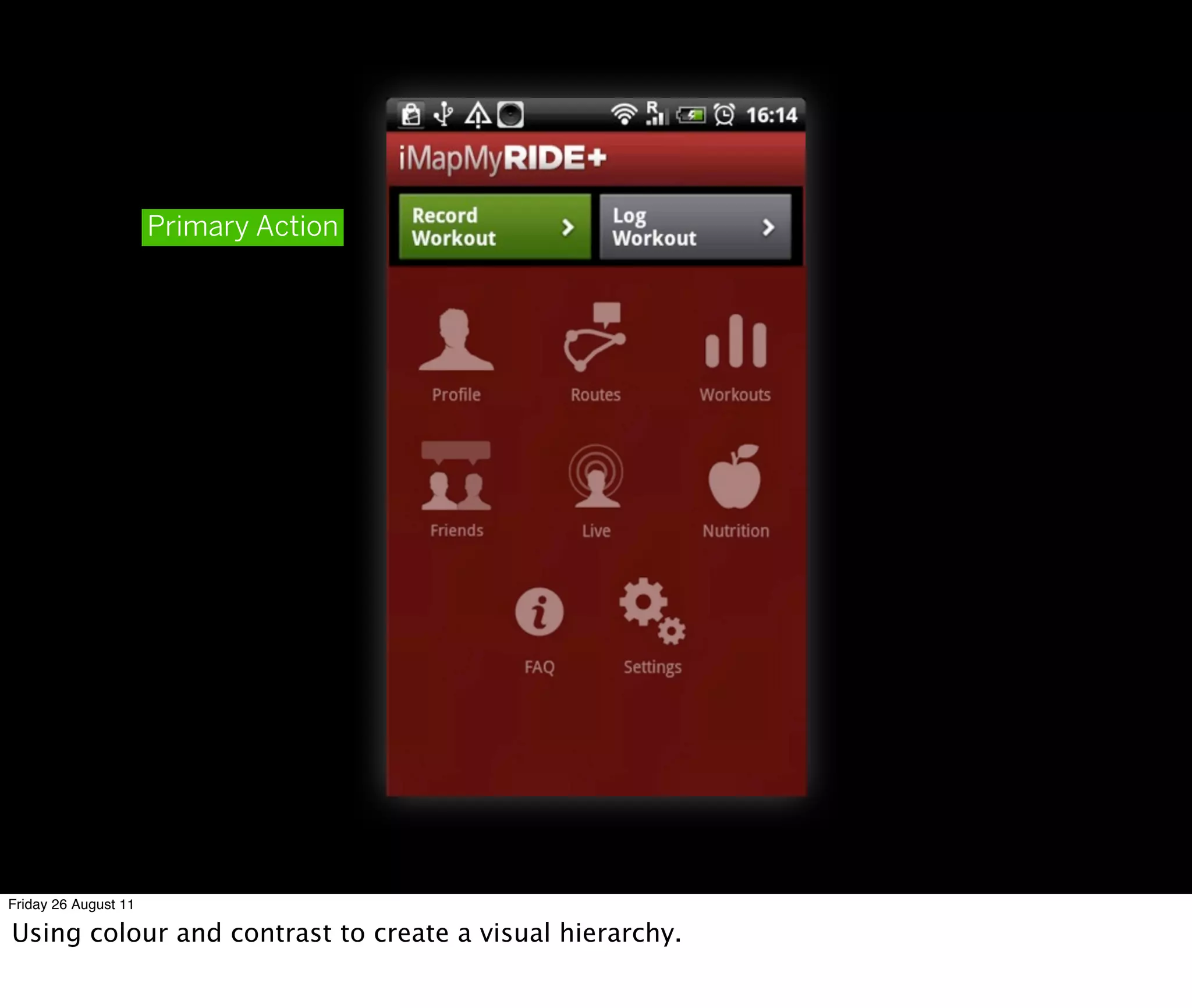
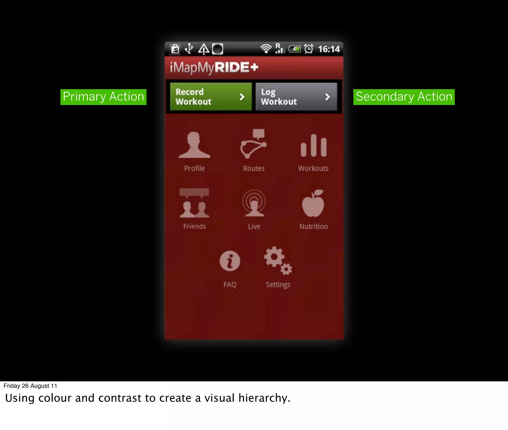
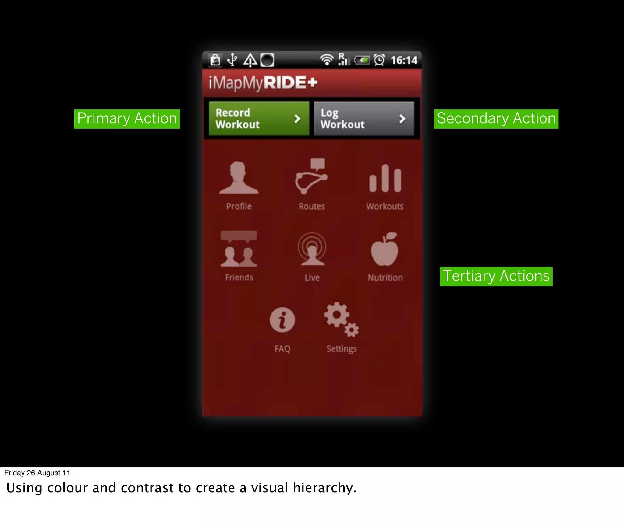


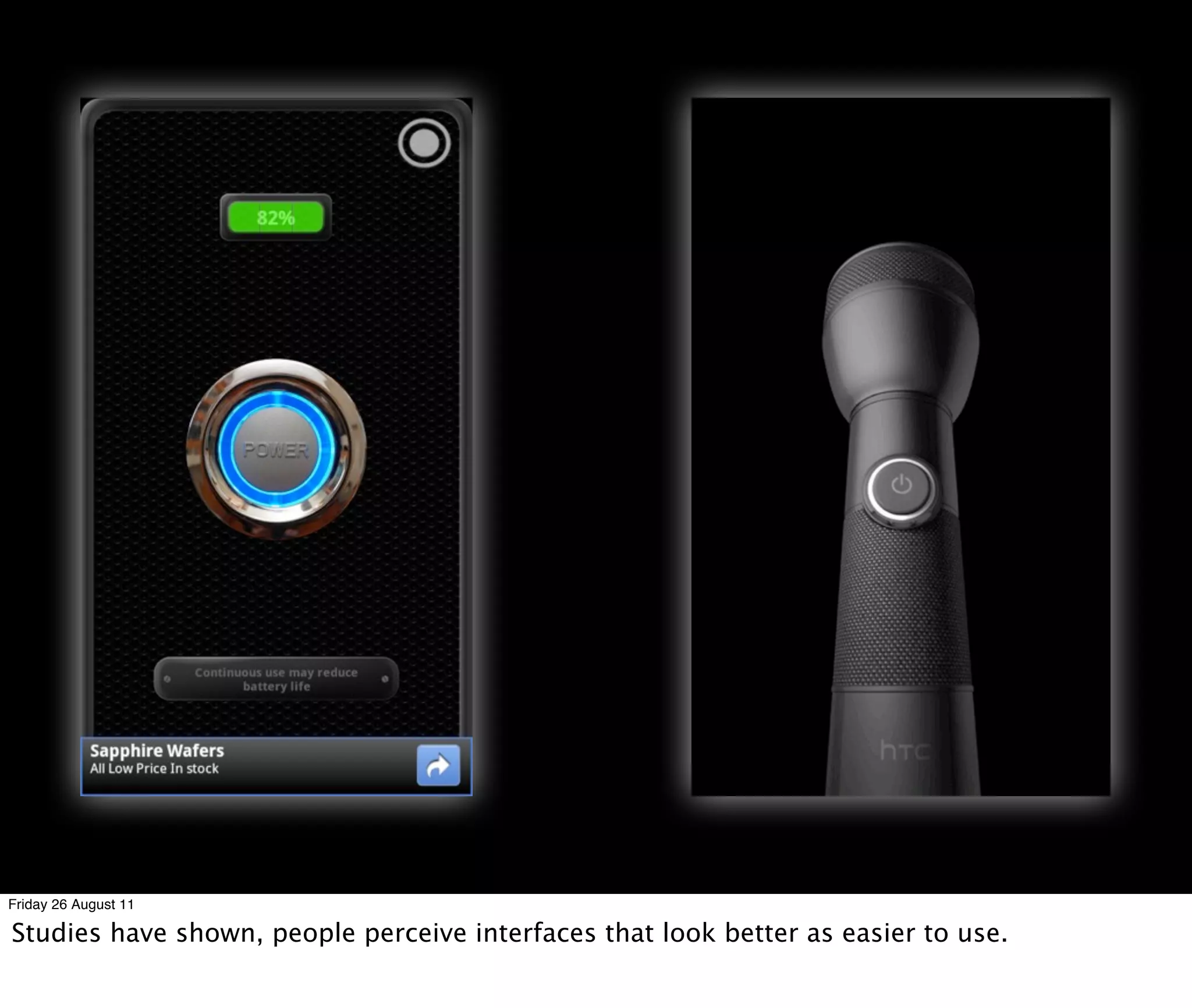
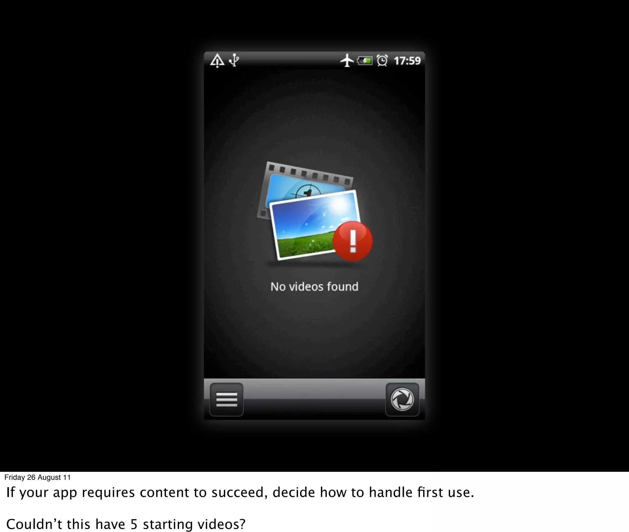
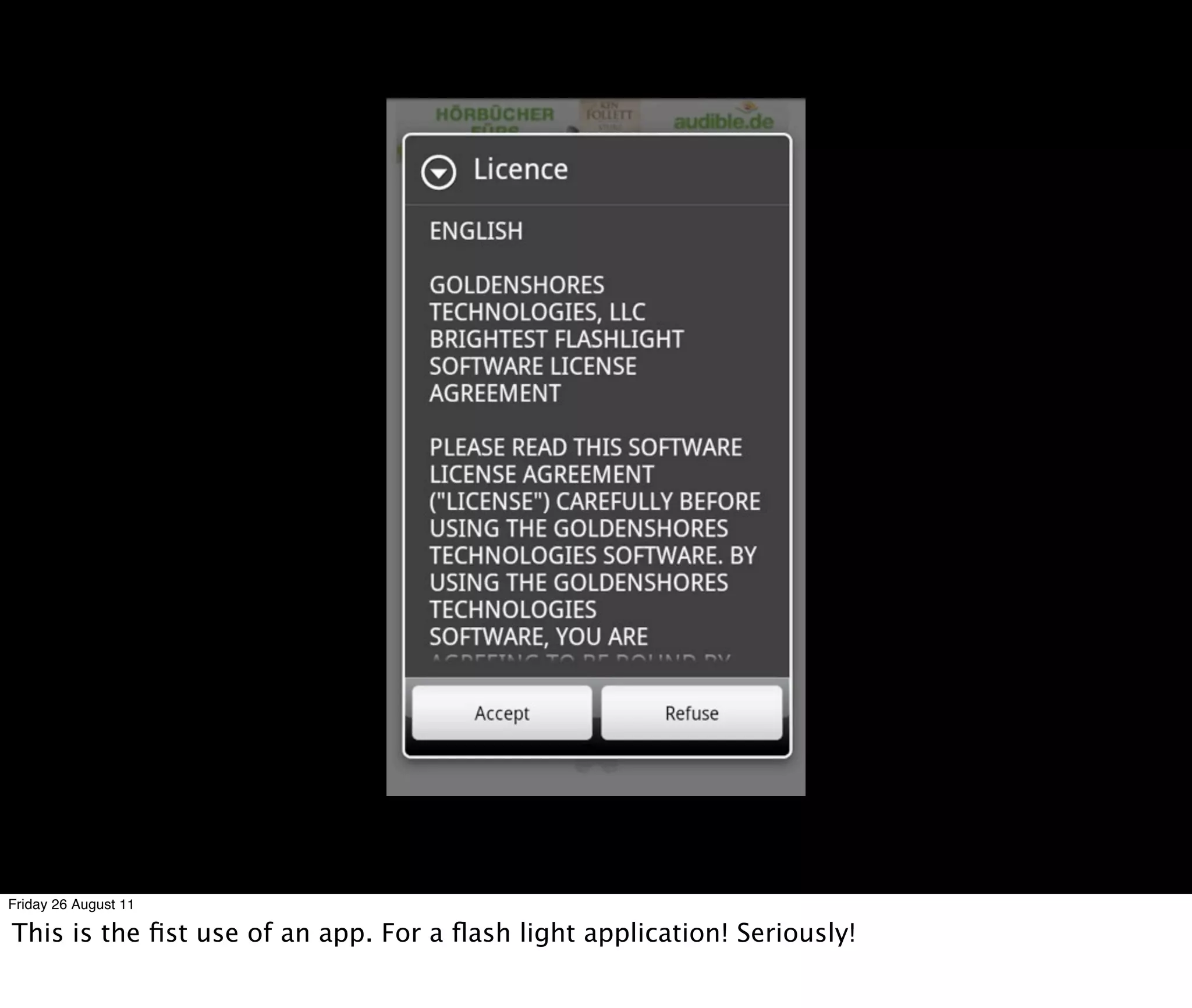


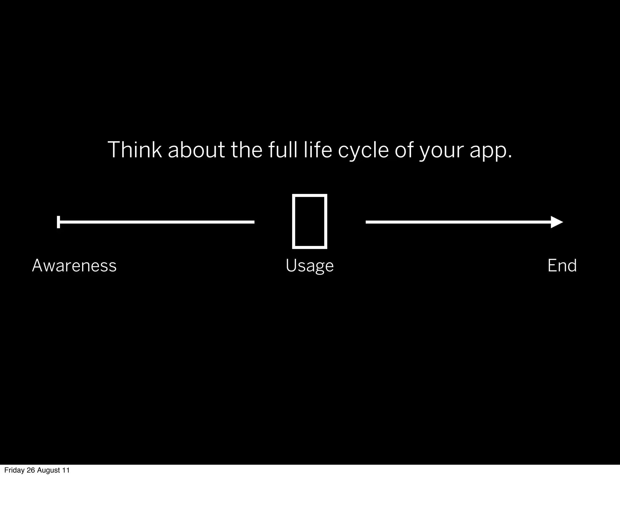
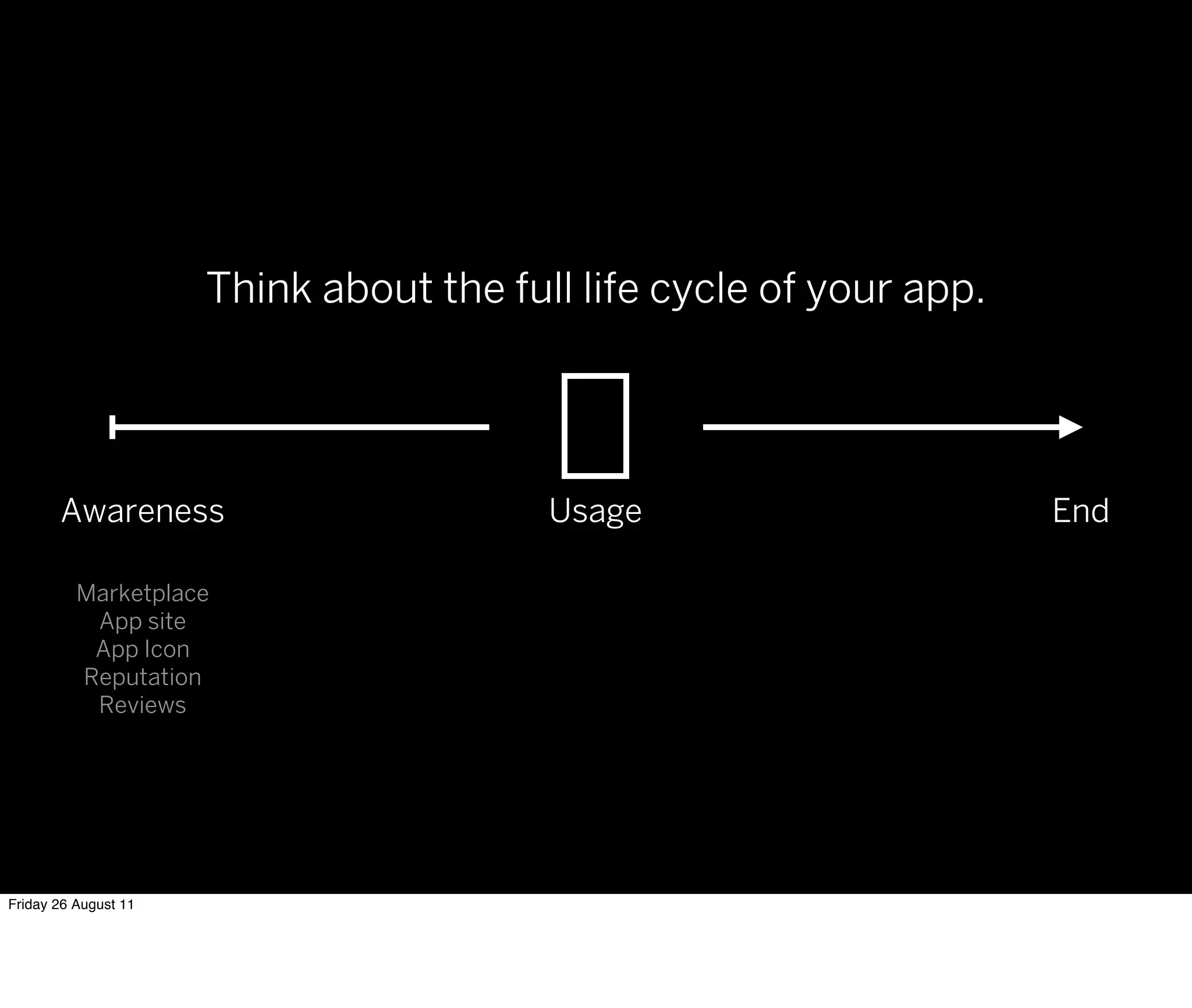
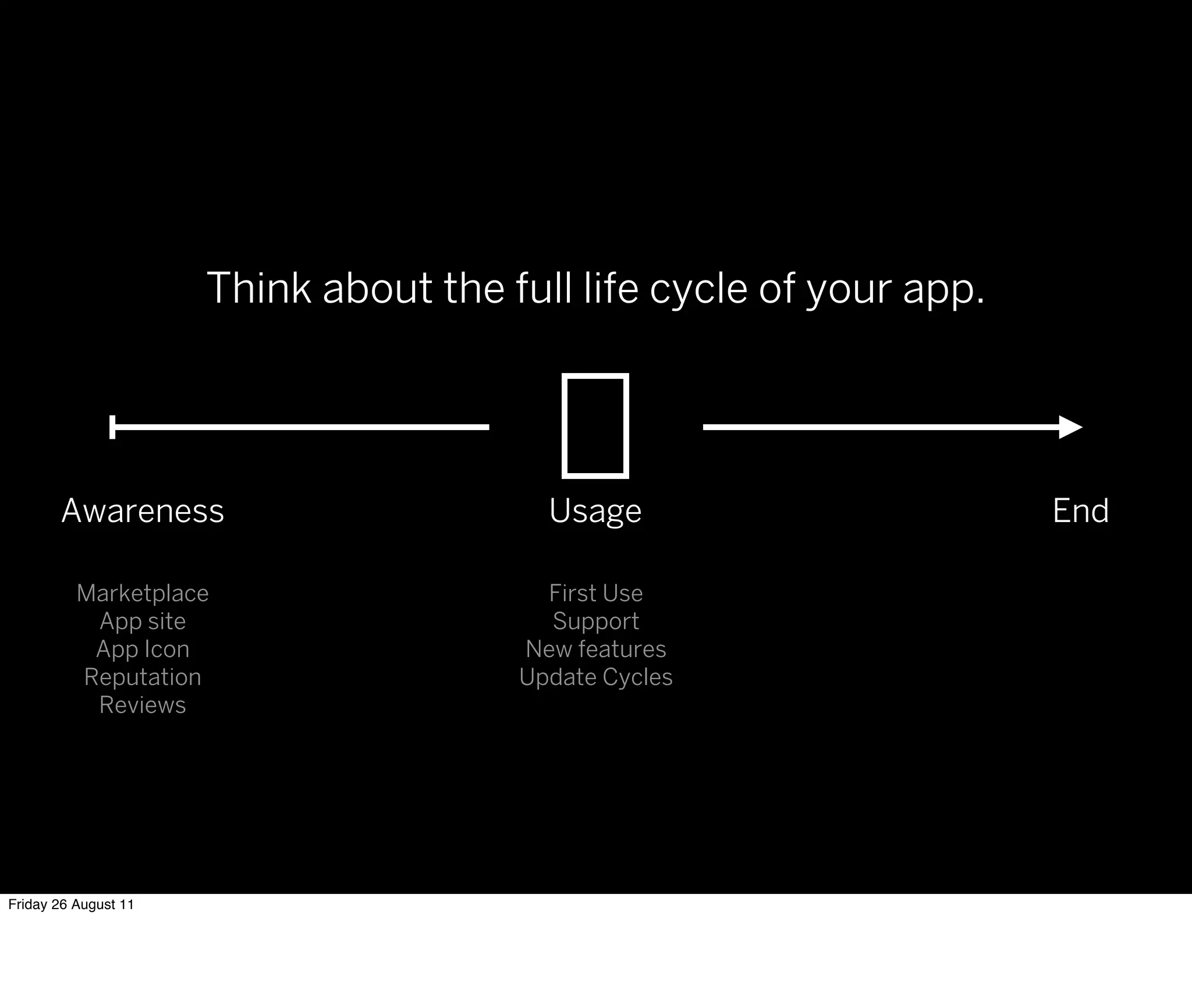
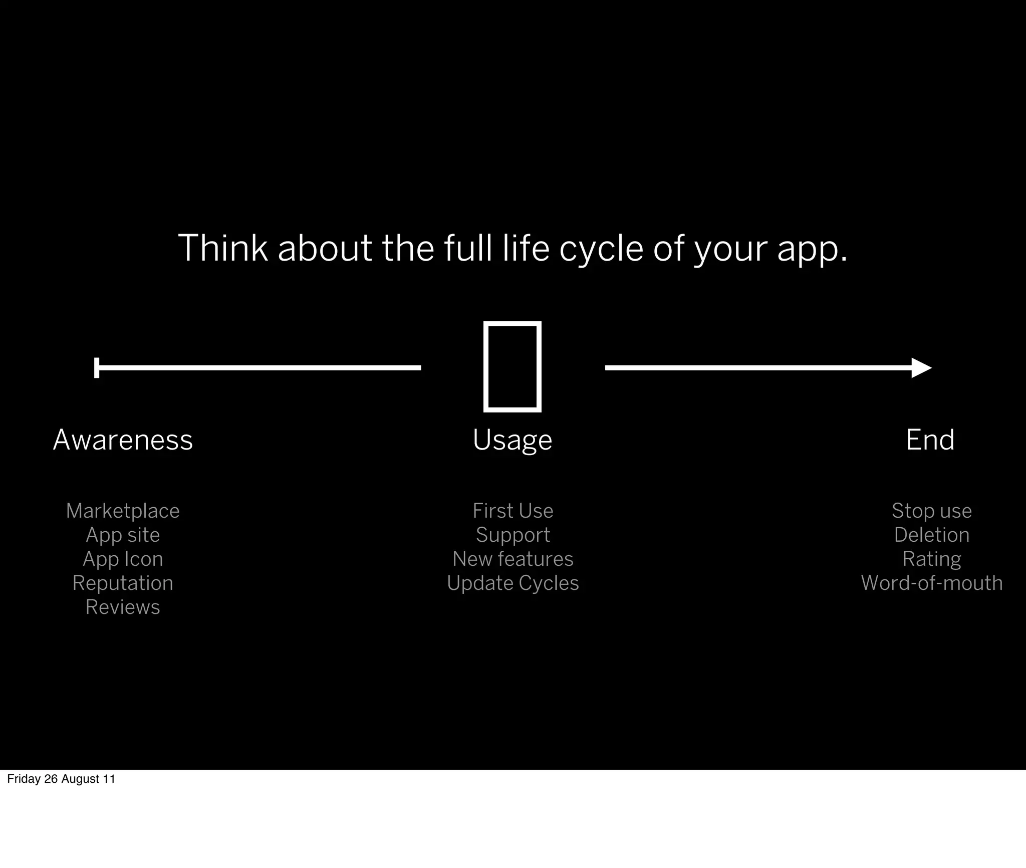


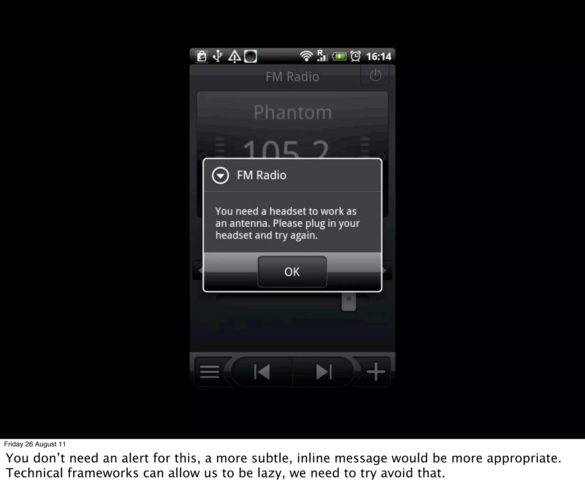
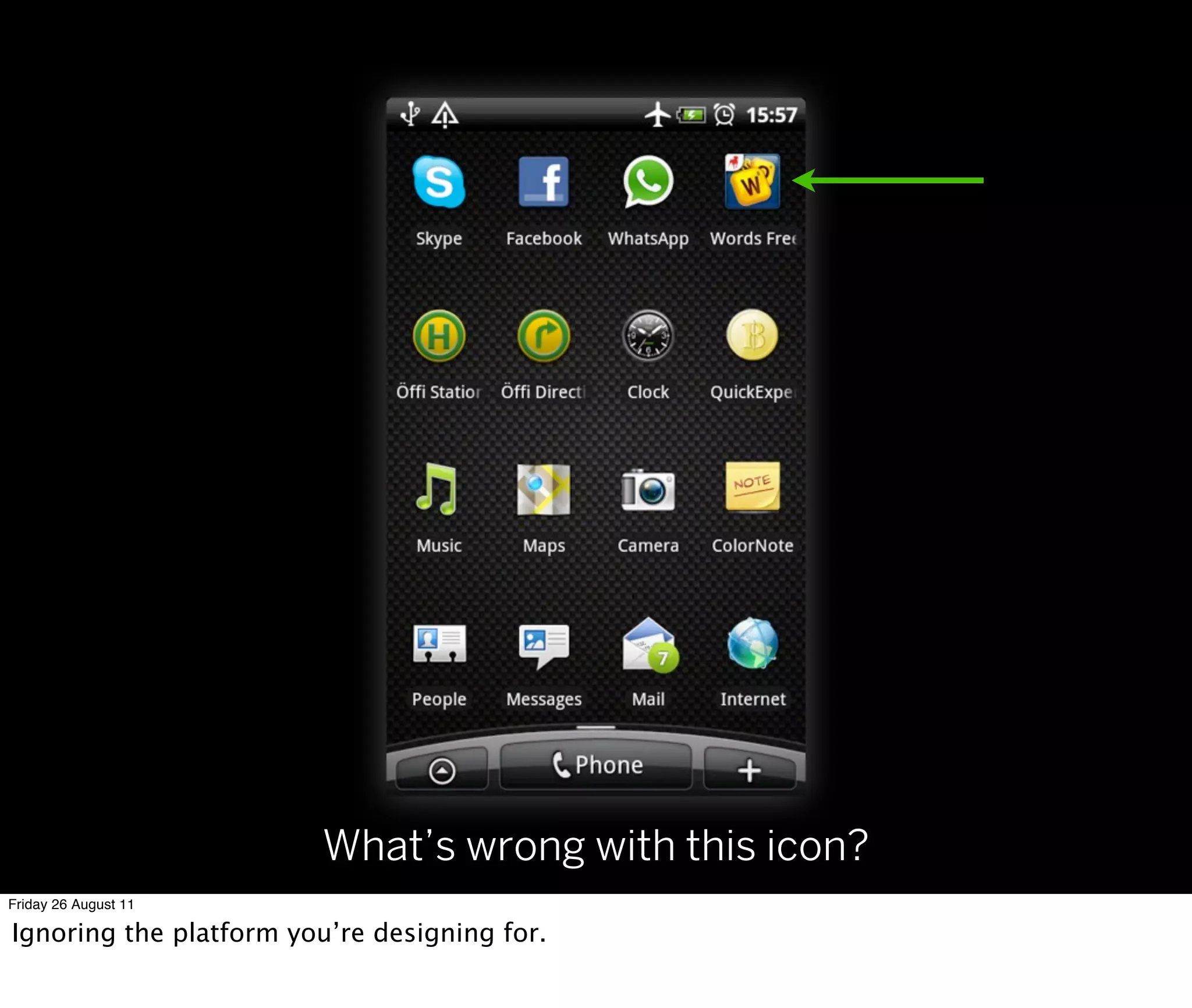
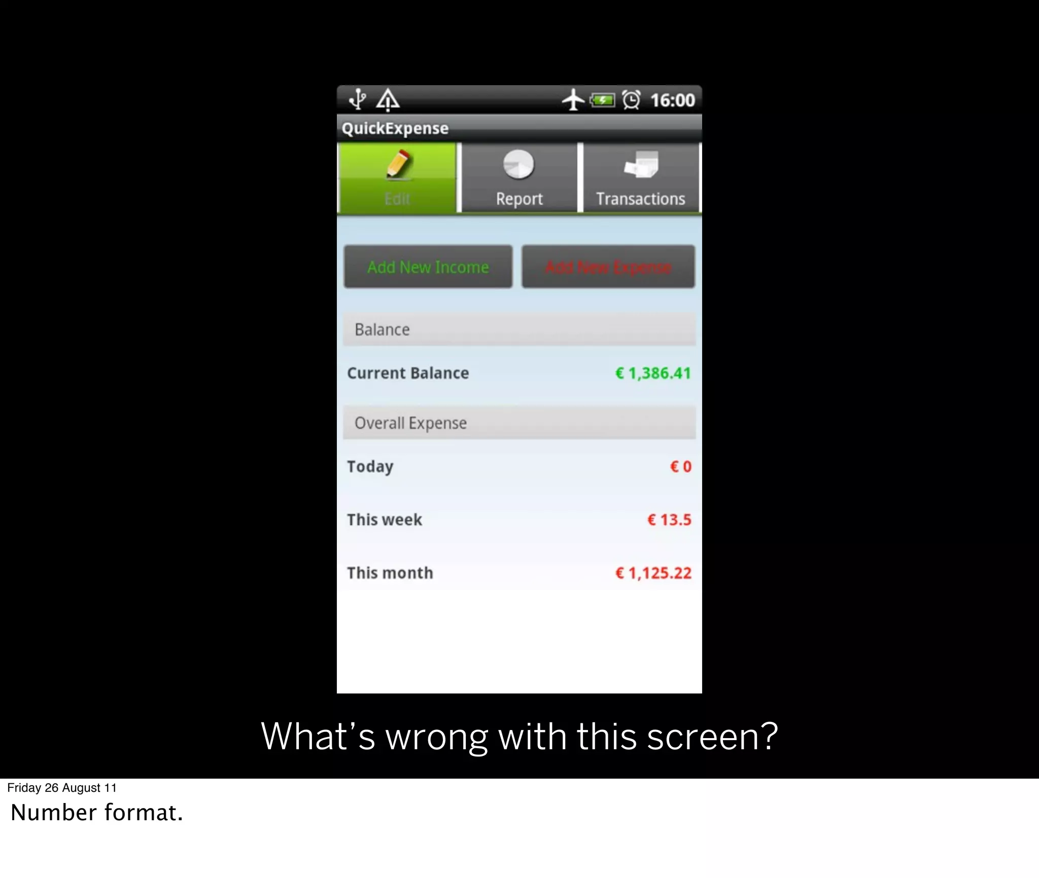
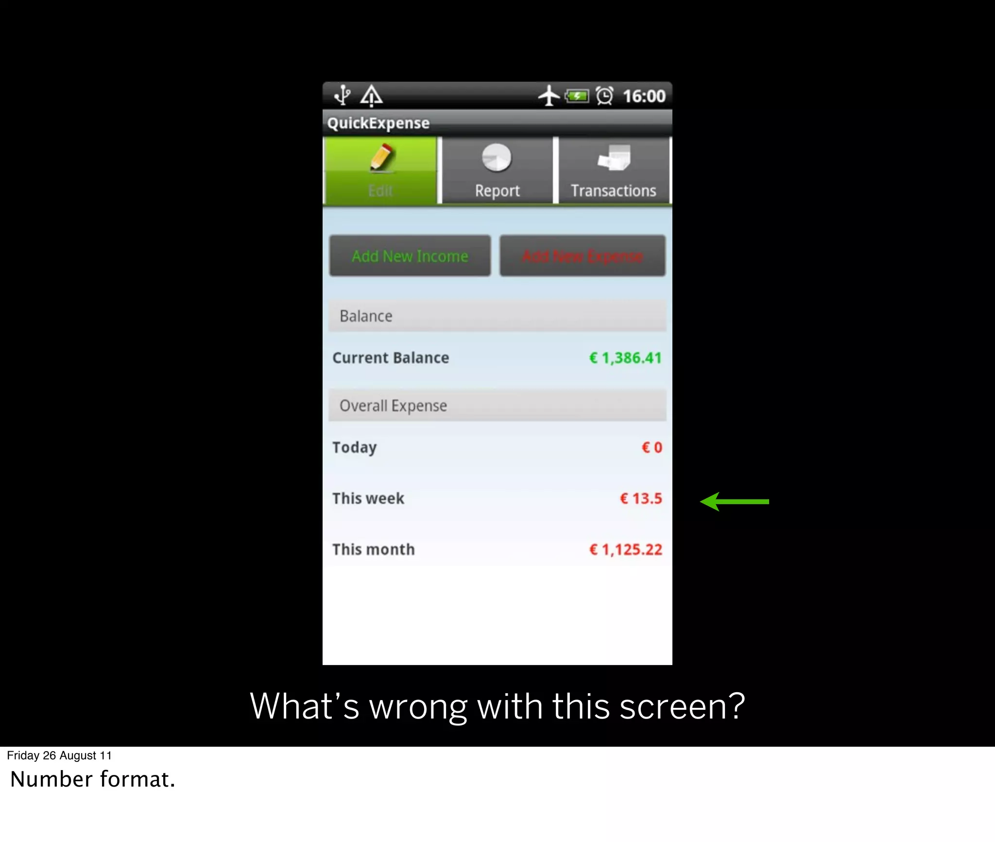
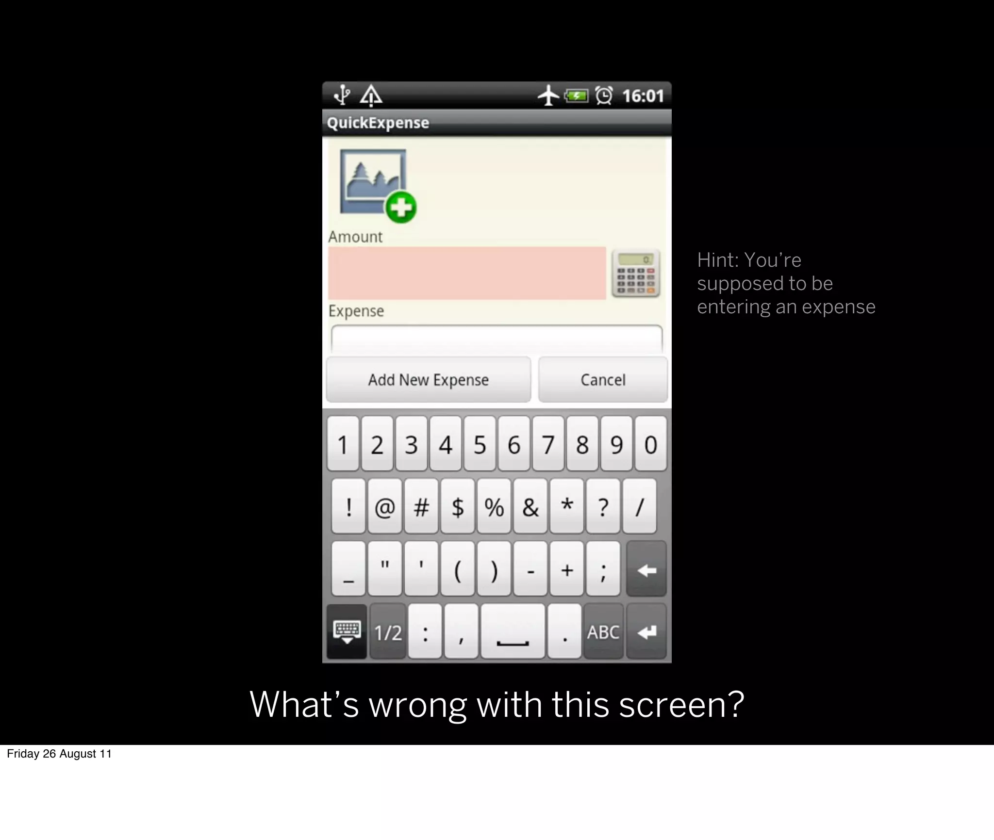


The document focuses on essential design principles for Android app development, presented during a meetup in Munich on August 25, 2010. Key topics include maintaining consistency, establishing visual hierarchy, and evaluating design effectiveness from the user's perspective. The speaker emphasizes the importance of user experience, app lifecycle, and the aesthetics of app interfaces to enhance usability.