1. Contents page Analyses
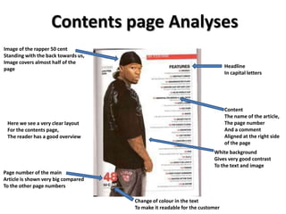
Image of the rapper 50 cent
Standing with the back towards us,
Image covers almost half of the
Headline
page
In capital letters
Content
The name of the article,
Here we see a very clear layout The page number
For the contents page, And a comment
The reader has a good overview Aligned at the right side
of the page
White background
Gives very good contrast
To the text and image
Page number of the main
Article is shown very big compared
To the other page numbers
Change of colour in the text
To make it readable for the customer
2. Image of two rappers in
A cowering position, Date
Covers most of the page
The guys are looking direct into the camera
Image connects well
To the content
Headline
Kept simple and easy
Here we see a more complex
Small image
Layout for a contents page,
Related to an article in the
But still there is good overview
magazine
And the hole page-elements
Connect together very fluidly
Content
The name of the article,
The page number
Page number of the main And a comment
Article is shown very big compared
To the other page numbers
More information about
The free gift which is given in
This issue of the magazine,
Information about the album and
The names of the tracks which
Are in the album
3. Image
Shows Usher in a coat and wearing
Sunglasses and holding a bag in his
Right hand, the image is very large and
it covers More than half of the page
Headline
Is a bit too small
This is a very simple layout for a
Contents page of a music magazine
Content And in my opinion are headings are too
The name of the Small but the reader has a good overview
article,
The page number
And a comment
Background
Goes from light to dark
In a diagonal direction,
It makes it look professional