2. With this I will be using the line of
the beat as an ‘A’.
With this name I felt that
because R&B can be a
smooth beat then the rest
is more like a recognisable
beat and thought this
name would fit in just
right.
The heart scanner beat
fitted in and though I
would use this to make
the name of my magazine
be different than the rest
and stand out.
BE T
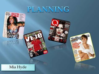
I‘ve researched
BEAT magazine and
not one has used the
idea I have come up
with. Although
there is already a
magazine already
named the same, it
will stand out with
the unique way of
how it is
typed/seen.
3.
Came along in the late 1940s, used first on
billboard magazine. R&B was an AfricanAmerican urban sound that evolved from
the blues and jazz.
Heavy and insistent beat.
About everyday life songs about work, sex,
and drinking.
4.
Rhythm & Blues, dance magazine, quirky like Jessie J
and Rita Ora.
I will have a mixture of male and female artists.
Will be an easy read and hopefully get a message across
that anyone who puts their mind to it can become
something they want to be. (double page spread story)
Bold and clear colours no black and white.
Confidence, no ominous looking pictures.
Happy and up beat.
Target audience; ANYONE WHO LOVES TO DANCE!
5. The images I’m thinking of using will be quirky but
also sophisticated, I want the images to portray a
fun feel and party mood. I will use a range of
angles and shots to create variety. I want the
images to be clear and smooth in texture.
6. This image is a long
shot which allows us
see the whole of the
person in the image. I
really liked being able
to get a different angle.
This is a close up of
my friend, I really like
this image as I was a
genuine smile and
how it’s a relaxed
shot.
This is a medium
close-up, also the
hand coming
forwards create a
sense of depth.
7. Indie Rock
Whilst doing my pictures I have changed my mind in
what I would like to do. Also my audience does prefer the
indie rock as to the R&B so I have chosen to appeal to my
target audience and use this popular genre.
These images
perfectly represent
the mise-en-scene
that I will emulate
in my images. The
hat and the long
wavy hair connotes
a sense of freedom
and feminity.
8.
Indie is short for independent, making
the music unique.
Indie rock came around at the times of
the mid to late 70s.
The music was rebellious and it was a
DIY type of scene.
In the mid 80s came New wave, this
originated in the UK. IT was more
experimental than punk and was more
polished.
Indie artists prefer to make their own
music and to not be a popular as what
pop bands may be.
9. This is an extreme close-up and in my
magazine I could use this type of shot to
create a powerful image.
A medium close-up
starts to give more
detail to the image
and the arms and
shoulders start to
appear.
This is a close-up shot of Johnny
Depp and this is just a close up of
the face, however, I could do a
close up of a guitar or a piece of
clothing.
10. Medium shot lets you get a feel of what’s
more in the background, gives a little bit
more depth to the image. Also lets you see
the type of objects are in the image. This
image will help me with my idea as I’m
hoping to get a guitar and to show its detail.
This is an example of a medium long
shot, and my idea includes a person sat
on a bench playing a guitar so this
gives me an idea on how to shoot my
image. By keeping he horizon line
straight and the image symmetrical, I
will give my magazine a professional
look.
11. This is a long shot, this
includes the whole body and
also the surroundings are
shown and lets the people
know what’s going on
around.
This is an extreme long
shot and this picture
would fit in perfectly in
what I would want to
do, however I would
need to make it look
like more of a music
magazine.
12. Low-angle shot.
I did this as it gave detail to the
guitar and chose to make each
person look in opposite ways as
they both have different
dreams.
High-angle shot.
I used this angle
to create a sense
of depth to the
instrument, also
the light reflects
well off it and
gives great detail.
Mid-shot.
I made this shot a mid-shot
as I wanted the detail of
her clothing to be shown
and you can see her
smiling which makes the
image bright and makes it
look as if she is happy to be
making music.
Mid-shot.
I used this type of
shot because the detail I
wanted was from the waist
upwards, also the way he is
looking into space gives us as
readers an intrigue into
where he is looking to.
13. At this point I was deciding
what to do with the plain space.
With the cover-lines I had to
edit them to make them smaller
so that they wasn’t touching the
image.
I had taken the
photo and all I
need to do was
stretch it to fit the
page. I then need
to put the text over
it. The masthead
was hard to place
at first but then I
turned it vertically
and it fit perfectly.
I used
many
tools to
get the
text
right, for
example
I had to
use ‘cutout tool’
to make
the
lettering
neat and
tidy.
14. I used the colour bar to change the
colour of my text. I also used a contrast
darker to make the shadows behind
the images darker.
For my
double page
spread I had
to make sure
all spelling
mistakes
where
corrected. By
doing this I
used a text
box which
put a red
line under
what wasn’t
correct.
This showed me
my pages that I
had used, this
helped me to
flick from my
front cover to
contents and
double page
easily.
For my images you can see I’ve
used a shadow to put behind,
this makes the image stand out
form the background.
15. I was stuck on what image I liked the most, I did like this one as it
was a good close up of her, however they way my page was laid out I
had to make the sacrifice of changing it to an image that would go
with everything else. Furthermore, in the end I was able to use this
image but I just made it smaller and cooperated it into my page.
For my
double page
spread I had
difficulty
choosing
what text I
wanted to
use,
however I
was able to
compare and
wasp easily
the sizes and
font when
needed to.
I had to fill this
space and was
changing
between a puff
or a picture.
After all, I used
both as was
able to connect
them both to
make it look
like it was
meant to be
there.