1. STRENGTHS
WEAKNESSES
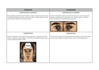
PORTRAITURE & LIKENESS
PORTRAITURE & LIKENESS
Very detailed and well drawn illustration, Allot of work has been put into
it. good resemblance of main character ‘Ender’. It feels right for a LWL
cover being a textured hand drawn piece.
Some small details could be more improved, such as the eyes, ears
and lips. Another point is that there is no visible clothes or uniform
which would have complimented the portrait.
COMPOSITION
COMPOSITION
Portrait is placed in the middle of the page which matches most LWL
covers. It gives the presentation of the cover an organised look, plus its
not too small and clearly visible.
The size of the portrait is quite big and does take up most of the space
on the covers design not leaving much room for the background.
2. STRENGTHS
WEAKNESSES
TYPOGRAPHY
TYPOGRAPHY
It is a bold simple font which does not take up too much space on the
cover. It is easily readable and stands out well in the design.
COLOUR
I used an atmospheric style using colours that relate to the films poster
which are blue and orange that contrast quite well and can also be
linked to the costumes used in the film, which also compares to the
films theme.
It’s almost squeezed into the bottom left of the page and could have
been placed in a better space, maybe not covering the portrait.
COLOUR
Too much black is used in the background design making the
illustration quite dark.