2. Something that my double
page spread doesn’t have
is any secondary images as
I felt that could be
distracting and wouldn’t fit
with the layout. This could
be seen as breaking
conventions as most
double page spreads have
more than just one image.
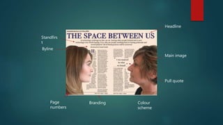
3. This headline is placed in where it follows conventions. It is the
biggest and first thing that the audience will see along with the
two images. This follows conventions of a tv listing double page
spread as it’s across the top of the page and in big font. It also
gives an idea about the conflict in the
Above the headline my double page spread features the name
of the documentary, date, time and where it will air. This is a part
of the RadioTimes branding. This is also sticking to conventions.
This pull quote is used to get the
audience’s attention without giving
much away. It also follows the
conventions of a RadioTimes magazine
as it’s separated off by a dotted line
and the font is much bigger than the
rest of the article. It is also placed in the
middle of the article but making is
separate so that it clearly stands out
against the rest of the page.
4. Having two main images could be
considered the only convention
that this double page spread didn’t
follow. However, these two images
are interacting with each other and
can be considered one image,
which is still following codes and
conventions.
These two images show the binary
opposition that the little eluded to
and help anchor the title.
The standfirst is the slogan that is featured in the documentary, it’s a key
piece of branding and also gives information about what the article will
be talking about. This follows conventions of a double page spread. We
decided to stick to this convention as it’s not just used in tv listings but
in any magazine and if we didn’t stick to these conventions it would
seem odd and of place.
5. The page numbers, branding and date fall into RadioTimes
conventions. This is a part of branding so that RadioTimes is
recognisable just from it’s page layout and fonts. We decided to
follow these conventions as we wanted the double page spread to fit
into RadioTimes as much as possible and also make it seem as real as
possible.