Call US '' 8377087607'' !! Call Girls In Model Town Metro (Delhi NCR)
Magazine Development Diary
1. Lucy-Anne Richardson
Development Diary – Magazine Front Cover
I started by looking through the original images I took during the photo shoot, as
it was both for the poster and magazine front cover. I decided to use a similar
image to that of the poster, as I want the magazine to show her as the character
instead of the actress. I chose an image of Amy with her hands up against glass as
I thought it could look like her hands were holding against the page. I also liked it
as she is staring straightforward meaning she would be staring at the audience.
This could make them feel uncomfortable
which would be the aim. I placed it onto
Photoshop and used the magnetic lasso
tool to go around it. I then used the quick
mask tool in order to erase certain
sections the lasso had missed. I then
copied it and pasted it onto the already
black background. I want to start of with a
black background as it is in keeping with
the poster and the genre. I also used it on
my mock up designs, as well as white –
connoting innocence - and red –
connoting blood - as a similar house style. This also
links in with the characters costume in the picture as
she is wearing a white floral dress showing her
innocence and naivety. Although I had used the quick
mask tool to make the edges look better, when the
image was up against the black background, the edges
looked jagged. I went into blending options and used
the inner shadow to soften the edges. It also blended it
slightly into the background, which made it look much
better. The image also seemed too bright which doesn’t
fit in with the kind of atmosphere and message I want to
get across. I went to image and adjustments and levels,
in order to make the image darker and eerie. Also, by
making the image darker, the edges didn’t stand out as
much and made the eyes look strange as if she were
possessed which worked really well.
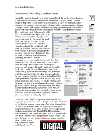
I used the name ‘dread’ on my mock up designs for the
magazine cover, however now looking back it is too similar to
my production company name as well as being situated with
the horror genre rather than the magazine. I asked a few
classmates who are in the same process of creating a media
product, which name they thought fitted the magazine
including dread, reel, digital and take – which all relate to the
film itself. The majority of people chose ‘digital’ which I also
agreed with as not only does it include my trailer, it is also
more realistic as the
magazine would not be
solely based upon The
2. Lucy-Anne Richardson
Swarm; it would have other films involved also. I liked
the font – Trajan Pro – which I used on the poster so I
tried it out for the title. If it doesn’t fit in correctly when
I finish the magazine cover, I can change it as it will be
easier to compare.
From doing a magazine cover for an AS project, I had
the idea to do two straplines, one at the top and one at
the bottom of the page to make it more interesting, as
well as showing the audience what the magazine can
offer such as “exclusive interviews” etc. Also,
hypothetically, once the magazine is sat on a shelf ready
to be sold, the front cover be covered up, however it is
possible that the top of the page can be shown so this is
why I chose to use a strapline at the top as well as the
bottom.
I felt that as I carried on, the background was just too
plain and boring. However, I did not want to use a background, as it would look
too over the top. I found this when I tried using a forest/trees
in the background, and changing the opacity. As I expected, it
was too busy and looked amateur. I came up with the idea of
creating a smokey effect on the black background. Firstly, I
formed a new page on Photoshop and made the background
black. I then chose a new layer and picked a white colour as it
is in keeping with my house style as well as being a bold
contrast yet subtle as the smoke colour will be white. By
clicking on filter, render and clouds, it automatically created an
effect on the page. However, it was too full on. The next step
was to use the pen (making sure the colour was black) and
make some marks – as seen below. Although the dots look
strange and random, it did not matter as I had used a black pen
so that once I put it onto the magazine cover, it would look
different. Making sure I was on the correct layer, I went to the
layer pallet on the right hand side of Photoshop and lowered the opacity, which
made a smokey effect behind the actress.
This looked really effective, compared to a plain black background that I now
realise was not a good choice. By looking at different film magazine covers, it has
shown that the majority of them have the title of the magazine at the top of the
page and the name of the film at the bottom accompanying the image. I decided
3. Lucy-Anne Richardson
to do this also as it seemed odd to have
the characters picture there without
somewhat explaining why. I didn’t want
to have the text exactly the same as
the magazine title so I wrote out the
text ‘Swarm’ and went to filter, blur
and motion blur. (Making it a 90
degree angle and 40 distance) which
made a smudge smokey effect) which
not only fits in with the background
but also typical conventions of
horror/scary films. I then went
through the same process – but making the text white instead of black – and
placed it behind the black text as I thought it looked effective and blurry. It is not
obvious but it makes a slight effect. I found that I really liked the look of this
effect and decided to do the same thing on the poster too. However, as the title in
the poster is already white, I used the blurry white copy and moved it slightly to
the side.
(As stated above, as I went through the process, I tried different fonts for the title
of the magazine. Originally I had used Trajan Pro, as it was the same as ‘The
Swarm’ text on the poster. However, now I have had the idea to include ‘The
Swarm’ on the magazine cover as well, I now want to use this font for that
instead of the masthead – also noting that I did not want the masthead the same
as the film title. I have now used Impact for the title as it goes well with ‘digital’
as the text actually looks digital. By going into the layer pallet and right clicking
onto blending options, I could use an inner shadow, bevel and emboss etc. which
created a blurry red outline (the chosen colour being red to fit in with the house
style and genre).
I took inspiration from Empire and Total Film, as they are very successful
magazines. On many front covers that I have seen, they
have used a film reel going across the page (examples
below) which I think is really effective, not only because it
gives more information, but also because it looks visually
effective. I especially like the placement of the barcode
in one of the sections. Top film reel image was taken from
the Internet as an example so I
could create my own (above)
4. Lucy-Anne Richardson
I decided to create my own reel in Photoshop, as I
can’t copy ones from the Internet or from magazines,
as it would not be my own work. I used the shapes in
order to create it. Once I had input all of the shapes in
the correct place, I used the shift button and clicked
each layer I had created, in order to link them all
together – making it easier to move around. As stated
previously, as I cannot take images from the Internet
because they aren’t original (taken or produced by myself) I thought I could use
images from my own trailer, which I filmed in the boxes as an ‘insight’ into ‘The
Swarm’.
As I was adding in the reel, I decided that the image I had chosen for the poster
was a really good image with effective editing. I thought that even tough the one I
have used for the magazine cover is good and editing exactly how I wanted it, I
felt that the pose in the other picture suited it better. I inserted this picture and
kept everything else in the exact same place just to compare. I am now going to
use the same picture due to the pose as it suits both products effectively.
I was originally going to use ‘The Possession, Saw, Cabin in the Woods, The
Swarm’ etc. for the strapline at the top of the page. However, as I wanted to use
another strapline at the bottom, I have used ‘exclusive interviews new images
competitions news” to let the readers know what the magazine holds. I decided
to make the top strapline more interesting and somewhat colourful as it could be
what the readers see first – on the shelf as explained above, for example. I
wanted to use older horror as well as the new contemporary films so I used
“From The Shining to Saw: The 50 must-see horror movies” which I think is an
effective way to draw readers in. Especially a range of readers and adults will
remember The Shining from the 1980’s, whereas younger readers would
perhaps prefer Saw, for example. The use of the colour yellow on ‘50’ had made
the number stand out. Especially as it is a large number, meaning the magazine
has a lot to offer. A yellow star was then added to make it look like a brand new
addition to the magazine, as well as
the colour connoting excitement and
contrasting completely with the red
and black.
I then looked at different ideas for the cover lines such as ‘Top 20 screams’ ‘Top
10 villains’ ‘Flashback to the 80’s’ and ‘Free poster inside’. I decided to use three
cover lines as I did not want to make the page too busy as it already has quite a
few aspects to it - especially as I have now included the film reel. I tried it in
white, black and red and none seemed to work well, and it was also difficult to
read clearly. I then used the same yellow I have used for the star and ‘50’ in the
strapline, which worked out well as it was easily readable, links in with the other
5. Lucy-Anne Richardson
yellows included and was bright to attract the reader. I also used ‘Trajan Pro’ for
the font as it linked in well with the other text – also I only wanted to use two
different fonts on the cover so it don’t make it too over the top.