1. Colour Palettes
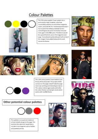
The fifthcolour palette I have lookedintois
particularlyrisqué. However, vibe have
successfullyusedthis onone oftheir magazine
covers, picturedleft. As I mentionedpreviouslyin
my research the militaryandkhaki trendis
something we see come intofashion time and
time againinthe R&B scene. Therefore it would
be a goodtheme to use on the magazine cover
page. It wouldwork particularlywell withsome of
the imagesI have added belowwhichcould
create thistheme.
The sixth colour palette I have lookedat uses
black, white and purple. The purple creates
contrast on the page andwill make the page
more eye catching andinterestingto look at.
This colour scheme again works withother
the urban theme I amtryingto create which
works with myR&B theme.
This palette is unusualand creates an
almost metallic designto the page. This
matches the style that I would like to
include inmymagazine suchas leather
and jewellerytrends.
2. This is one of myfavourite colour pallets after
looking at several magazinesfor inspiration. One
of myfavourite covers is a Vibe edition with
Rihanna featuring onthe front. I thinkthat this
wouldbe effective onmycover page as the
colours when used inthe right wayand withthe
right image are quite urban and seem to match
the R&B genre. Especiallywith the black and
white after doing some researchintoR&B style
and fashion. For example, white andblackleather
shirts, white sheer lace dresses, blacksnapbacks
and slick white andblacksuits are the current
trend on the R&B scene. The blue also adds a bit
of edginess which fits inwith R&B style.
The second colour palette I have chosento
look at uses red, white andblack. An
example ofa magazine which has
successfullyusedthis colour palette is
NME, who frequentlysport thison their
cover and contents pages, as well as
throughout their double page spreads. I
like the waythat the red adds something
bold to the page, however you canstill
create a minimalistic designwith the black
and white. The researchI have done into
my genre of music magazine hasshown
me that the R&B genre is daring and
pushesthe boundaries. Therefore using
red couldbe a wayof representing this,
for example byshowingsome danger and
mysteryandperhaps showing the sexual
and risqué side ofthe R&B genre.
The thirdcolour palette I have lookedat uses
black, white and orange. This is quite similar to the
last palette I lookedat in the sense that the orange
creates the contrast andboldness onthe page,
compared to the black and white which helpto
keep a minimalistic lookbyavoiding colour clashes
or anything toobrash. Vibe has alsousedthis
colour palette for one oftheir cover pages which
features Nicki Minaj onthe front. Again, this
colour palette has an urbanfeelandthe orange
creates the daringandboldfeatures that can relate
to the R&B genre.
The fourth colour pallet I have chosento
look at includesblack, white and pink. The
pink willcreate contrast on the page and
will work well withthe conventionalblack
and white colours.