Lucknow 💋 Call Girl in Lucknow Phone No 8923113531 Elite Escort Service Avail...
Ppt3
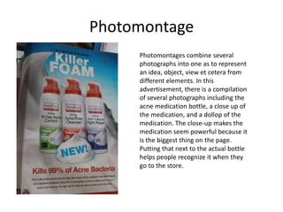
1. Photomontage
Photomontages combine several
photographs into one as to represent
an idea, object, view et cetera from
different elements. In this
advertisement, there is a compilation
of several photographs including the
acne medication bottle, a close up of
the medication, and a dollop of the
medication. The close-up makes the
medication seem powerful because it
is the biggest thing on the page.
Putting that next to the actual bottle
helps people recognize it when they
go to the store.
2. Photographic Mortise
Photographic mortise is done by cutting
out a section of the copper used to create
an image and filling it with another
object. This is more modern because it is
done on a computer but the idea is the
same: a part of the whole is cut out to
include another piece of information. In
this case, the small picture models the
sheer underwear in another pose, adding
to the angles.
3. Enlarged Halftone
I couldn’t find an enlarged halftone in the two
magazines I have, but the Mr. Clean advertisement
is likely inspired by enlarged halftones with the
repetition of white circles (even though halftones
are colored). This makes the advertisement have a
pop-art sort of feel. The picture of the cat’s eye is
real enlarged halftones. It carries connotations of a
newspaper advertisement or news photograph.
http://www.thetonesystem.com/inkjet_basics2.html
4. Depth of Field (2)
Depth of field refers to the depth in which
objects are in focus on the z-axis. In both
photographs to the left I focused on the
Vaseline lotion bottle. The one on top was
shot with F/22 and the one on the bottom
was an F/3.5. The greater your f-stop the
greater the depth of field. Large depth of
field is good for landscapes, for example,
when you want to show detail all along
the z-axis. Less depth of field is better
when there are distractions in your
background because it emphasizes your
subject (notice how your eye goes straight
to the Vaseline bottle in the bottom
picture).
5. Stop-action photograph
This is a photograph I took at the Holy
Angels vs. Henry Sibley basketball game.
A high shutter speed and a high ISO for
the low lighting allowed me to capture
this photograph with very limited blur.
Notice the tilt of number 34’s body,
showing that her teetering motion has
been frozen in space with the camera.
Angled lines are often created with stop-
action photography, which leads to the
feeling of action about to take place.
6. Grainy photograph
This is a crop of a photograph I
took last month. Notice the grain
especially showing through on the
man’s face and the back wall. This
is because I used an ISO 3200
because of the low lighting in the
area. The high ISO allows for less
light, but unfortunately makes
photographs more grainy.
7. Slow shutter speed
This is the picture that the
close-up was taken from on
the previous slide. The slower
shutter speed means that the
shutter is open for longer
amounts of time, in this case I
believe it was 1/30. This
creates blur on the photo of
any fast moving objects. In this
case, the artist’s hand is
blurred because it was moving
faster than 1/30th of a second.
This shows motion and action.
8. Blur vs. out of focus picture
My hand is the defining subject in both of
these pictures. The one on top is a
photograph with blur. The hand is still in
focus, but because of the slow shutter
speed and movement of my left hand, a
ghostly blurred imprint is left. My hand in
photograph on bottom, however, is simply
just not in focus. There are no defining
lines in it, but the bag of Sumatra coffee
beans is in focus. Blur is good if you want
to show motion, do light painting, or
create ghostly images. Being out of focus is
almost never good for the subject of your
photograph, but it can be good to have
non-subjects out of focus as to create
emphasis on your subject.
9. Panned action photo
A panned action photo is when you
follow a moving subject with your
camera while keeping the shutter
speed slightly longer than a stop-
action photograph. If done
correctly, this will put your subject in
focus and create a blur in the
background. In this photograph, my
fingers are in focus and I followed
them with the camera as they moved
through space, creating a blurred
background. This technique is tricky
to do, but can be good to show
motion while keeping the subject in
focus.
10. Zoom burst photo
A zoom burst photograph is taken with a
longer shutter speed and a zoom lens. You
focus on your subject, stabilize the
camera, take the picture and then either
zoom in or out while the shutter is open. This
makes an array of light lines that point
towards the center of the photograph, which
can create emphasis on whatever is in the
center. In this case, the word “AVEDA” has the
most attention because it was placed in the
center and all the lines point to it. The
photograph on top zooms in while the one on
bottom zooms out.
11. Wide lens
Wide angle lenses stretch the
distance between objects. In this
picture, the fingers look like
they’re located really far away
from the man’s head even though
they’re at normal arms-length. The
lens also increases the relative size
of things closer to the lens, which
is why his fingers are larger than
his head. Parallel lines converge
quickly, too, so it looks like his
arms would cross behind his head
if they continued outward event
http://www.shotaddict.com/wordpress/wp- though the imagined line would
content/uploads/2007/04/portet_04.jpg
not converge for much longer
because his arms are very close to
being parallel. There is a strong
depth of field so the man and his
hands are all relatively in focus.
12. Telephoto lens
Pictures taken with a telephoto
lens appear to have a decreased
distance between objects, thus
emphasizing overlapping planes.
Notice how close the third man
appears to be in relation to the first
two, even though he is likely about
five feet behind since he is not
assisting the tackle. The relative
size of objects in the distance are
increased. For example, the ref (?)
in white blurred in the left is about
half the size of the men in focus,
http://www.lightingpictures.net/tag/sports-photographers/ but he is likely very far away. Lines
converge slowly and the depth of
field is reduced so only the three
men are in focus.
13. Macro lens
Macro lenses are short in length
but they magnify the subject. They
are often used in nature
photography. In this
photograph, the Tokey’s eye is
magnified so that you can see
extreme detail that one would not
notice, or be capable of
noticing, without a special lens.
Interest is often created because it
is such a unique, up-close view.
http://burnthecanvas.com/wp-content/uploads/2010/06/011.jpg
14. Shot length/framing: Panoramic
http://www.youridahofalls.com/
The panoramic shot is a picture of the environment, like the one above
of Idaho Falls area. When placed in film or photo stories it is best
utilized to set the scene for part of the movie or story.
(Shot sizes between this slide and the next are long shot and medium
long shot. A long shot shows a group of people, full body, with some
environment and little seen emotion. A medium long shot moves in on
those people and you begin to see their emotions.)
15. Shot length/framing: medium shot
The medium shot is of one or a
few individuals where the lower
body is cropped out. You are
able to see emotions in the
people’s faces. This shot from
Scrubs is a medium shot because
you cannot see their lower
bodies and you are capable of
seeing that JD is mildly content
with this kiss while the girl is
very relaxed and content.
(The shot size between medium
shot and close-up is the medium
http://www.tvstylebook.com/tables/table-54-scrubs-scene-decoupage/
close-up. This is of a character
cropped in at mid-chest. You can
see facial features and detail of
clothing. It is personal.)
16. Shot length/framing: close-up
The close-up is a tight frame of a
person’s face. You are able to see
details in the skin such as wrinkles
and bumps, and get closer to people
than you usually would in real life. It
is a very personal shot. This shot
from The Shining allows you to get in
his face and really feel his delusion
because it is so personal.
17. Shot length/framing: extreme close-up
The extreme close-up shows a part of
the body or face or object, revealing
more detail. This is a screen shot from
Kill Bill. In this case, the extreme close-
up lets you see the red in her eyes,
showing that she is fatigued, as well
blood on her face that would normally
be a very small detail, but in this case is
a large part of the frame. It also adds to
the intensity of the scene because you
http://4.bp.blogspot.com/_iSwCsgcQqEM/SwlaTpiWLbI/AAAAAAAAAL8/Mzc1VZEhpsc/s1600
/close+up+8.png feel anxiety not being able to see what
she is seeing.
18. Photographic composition rules: Rule
of thirds
Rule of thirds states that when the
photograph is broken up by threes
vertically and horizontally, the most
important objects should lay along
those lines and at the points of
intersection. In this case, the man
and the cat lay upon the lines and
the cats eyes and the mans fingers
are on the intersecting points. These
are the points that your eye
automatically goes to, so emphasis
is created on the cat’s gaze and the
contact between man and cat.
19. Photographic composition rules:
balance
Balance creates a feeling of symmetry in
both symmetrical and asymmetrical
photographs. In this picture, the woman
on the left is balanced by an equally tall
mirror and the color of her pants are
balanced by the color reflected in the
mirror.
20. Photographic composition rules:
framing
Framing puts your main subject in a space
to put emphasis on it. In this case, there is a
rock framing around the woman, so your
eye first goes directly to her and from there
is led around the picture. You first relate to
the girl and then to what she is doing.
21. Photographic composition rules:
leading lines
This ad for Target uses the girl’s arms
and legs as leading lines. The lines
are utilized to direct the eye to the
most important thing in the page. In
this case, your eye is moved directly
to the clothing, which is what Target
is trying to sell in this ad.
22. Ansel Adams
Ansel Adams
“Old Faithful Geyser”
1950
Adams specialized in American environmental and
documentary photography. He broke away from the norm
of photography in that he believed it should take its own
form instead of mimicking oil paintings and other fine
art, as you can see in this photo. Instead of creating, for
example, a portrait of a well-dressed lady that closely
resembles an oil painting, he chose to make a realistic
view of Old Faithful his main subject. He believed a photo
can communicate the majesty of nature, which is shown
through the towering, powerful properties of Old Faithful
and the beautiful array of black, white and gray tones.
23. Edward Weston
Edward Weston
“Shell”
1927
Weston created interest in very ordinary objects
through creative use of point-of-view. Common
ordinary objects he used were nudes, nature
studies, Point Lobos, Death
Valley, clouds, trees, water, architecture, walls and
portraits. In this picture, Weston puts emphasis on
the shell through dramatic lighting and then props it
on its side so he could shoot an interesting view. He
also zoomed in on the shell and got down to it’s
level to create a photograph that depicts a view of a
shell that many of us don’t see every day.
24. Paul Strand
Paul Strand
“Blind”
1916
Strand took pictures of people in their normal
environment, which was a great juxtaposition against the
usual photography done in the studio. Like the photo on
the left, he often took pictures of the city with subjects
that were poor or vulnerable. Other subjects included the
working class, “typical” people.
http://www.metmuseum.org/toah/works-of-art/33.43.334
25. Imogen Cunningham
Imogen Cunningham
“After the Bath”
1952
“Agave”
1920’s
Cunningham was known for creating anti-Victorian
nudes that make the body into a feminine and
sensuous art. The pose and lighting in “After the
Bath” reflect Cunningham’s sensuality, as well as
his modern flare that repels Victorianism. He does
this by not including sentimental objects and by
really minimizing what’s in the picture. He also
included many botanical subjects, as illustrated
through “Agave”.
26. Jacob Rijs
Jacob Rijs
“Bandits Roost”
1888
Rijs, like Strand, took photographs of people in
their environment. He often photographed
poor New Yorkers . The ones on the left live in
crowded housing with limited space between
buildings. The streets and skyline appear
unkempt. Rijs was a humanitarian and took
these pictures to create a social change in
tenements.
27. Lewis Hine
Lewis Hine
“Spinner in North Pormal”
1910
Lewis also pushed for social reform. His
focus was in photographing people at
work, especially children, in order to
speak out against child labor.
28. Dorothea Lange
Dorothea Lange
“Migrant Mother”
1936
In Lange’s most famed photograph a woman and
her two children face the Great Depression with
great concern and sadness. Lange is known for
documenting the Great Depression and people in
poverty. Photographs like these influenced
documentary photography and photojournalism.
29. Russell Lee
Russell Lee
“Conversation at the
General Store, Louisiana”
1938
Lee, like Lange, was a
photojournalist hired by the FSA. He
documented the common and poor
people, including people of varying
races like the photograph to the
left.
30. Gordon Parks
Gordon Parks
“American Gothic”
1942
Gordon was an African American
photojournalist/portrait taker also hired by the
FSA. He focused on poor black Americans, as
shown by making Ella the subject of the portrait on
the left and combining her working image with the
American flag. This photograph was not allowed to
be made public.
31. John Vachon
John Vachon
“Worker at Carbon Black Plant”
1942
Vachon is another photographer
hired by the FSA to take pictures
of the poor. The picture to the left
emphasizes poor working
conditions as the man is covered
in soot.
32. Margaret Bourke-White
Margaret Bourke-White
“Buchenwald”
1945
Bourke-White was a female
photographer who is best known
for taking pictures of foreign
affairs and in work combat
zones. The photo to the left is
typical of her work because it is a
foreign affair and depicts the
poor.
33. Eugene Smith
Eugene Smith
“Japanese Suicide Charge”
1944
Smith is best known for his brutal war
images. The photo to the left is typical of
his work because it is a combat zone and
has grotesque images of death. Many of
his photographs were denied due to
their violent nature.
34. Robert Frank
Robert Frank
From The Americans
1958
Frank is from Switzerland and
came to America to photograph
an outsider’s view on American
lifestyle. The photograph to the
left depicts a more enjoyable
American pleasure of drive-in
movies, but Frank also
photographs on the other, less
enjoyable spectrum to show a
wide sample of American
lifestyles and actions.
35. Eugene Richards
Eugene Richards
“Family Album, Dorchester, Massachusetts”
1976
Richards got personal with his photography
and took many revealing pictures following
people or families. He documented
poverty, political issues, violence and more.
The picture to the left is of a family
representing their past, present and future
endeavors and struggles.
36. Sebastiao Selgado
Sebastiao Salgado
“Refugees in the Korem Camp”
1984
The photo depicts a poor family covering
up from the dust in the Korem Camp.
Salgado is best known for this kind of work
where he travels to less developed
countries and documents peoples lifestyles
there.
37. Photojournalistic use of multiple
pictures to tell a public affairs /news
story in a news magazine
The story in this magazine is about a
girl’s life who has been adopted and
about meeting her adoptive mother.
The pictures are used to show the girl
throughout her life and with different
mothers. This adds to the imagery of
the story because you can actually see
instead of imaging the relationship
between the people and see the girl as
she ages.
38. Advertising layout codes: Frame
Framed layouts are just that: they contain a
frame. The ad has margins or borders, which
act to close down the space and contain the
image. The ad to the left is framed due to its
margins around the picture. The frame carries
connotations of being secure, which
inadvertently makes the reader feel secure in
citi bank.
39. Advertising layout codes: copy-heavy
Copy-heavy advertisements rely mostly
on text to get their product across. It is
often used for technical or medical
devices because the company must
convince you rationally on why to
purchase the product. This ad is copy-
heavy due to the large block of text in
the upper 2/3 of the advertisement. It
works well for ThermaCare because if
the reader is looking for a hot patch, he
or she will likely take the time to read
through the facts and make a decision
to buy based on the rationale
presented.
40. Advertising layout codes: Postmodern
Post-modern advertising breaks the
codes of modern design, which is clean
and formulated. This kind of advertising
is obviously computer manipulated,
often with drawing or type placed over
images and containing multiple styles.
The ad to the left is postmodern
because it is clear that it has been
manipulated (they did not photograph a
phone shattering through glass while
playing Underworld) and it has type,
notably san serif, printed over the
image. Postmodern advertisements
carry the connotation of being
something new, so it works well with a
new kind of phone.
41. Advertising layout codes: picture
window
The picture window is a bleeding photo. It
creates a feeling of expansive space and
openness since the image goes right off the
page. In this advertisement, the brain
completes the bleed by imagining the
woman and dog in a large space with a lot of
nature, trees, flowers and maybe even a lake
in the background. This helps you imagine
that the perfume they are selling smells
natural like the expansive environment they
are in right now.
42. Gestalt Principles: similarity
Similarity is grouping by
size, shape, color, tone, texture, dir
ection or content. In the KAY
Jewelers ad, the brain groups the
rights together due to their similar
qualities, especially the four to the
left due to their similar direction.
This puts a special emphasis on
the rings making them the most
important thing in the ad.
43. Gestalt Principles: proximity &
continuity
Proximity is a grouping element that says
close elements are attracted to each other
and are perceived as a group. In this
occasion, the soap bars are all stacked, thus
close to each other, and the mind perceives
them as a stacked group of soap bars
instead of five individual bars.
Continuity is when similar elements that
are placed at a regular proximity may be
perceived as continuous. The St. Ives
bottles show continuity because they are
placed at a regular interval and the brain
pictures them to be never-ending off the
page, especially since the bottles
themselves touch the ends of the page.
44. Gestalt Principles: Graphic weight
This picture is unbalanced in that
there is more weight on the
bottom. This is due to similar
texture and color in the
overlapping feet. They are also
placed towards the bottom of the
page, so they have a gravitational
pull towards the bottom. The
weight of this picture is down.
45. Gestalt Principles: Closure
Closure is when the brain completes
shapes that have been blocked off or
go off the page, making them into
their proper form. In this
example, the brain completes the
railing behind the woman. We know
the railing does not cut off where the
woman’s legs begin. Because our
brain is not so caught up in
wondering why there’s half a railing, it
can spend more time focusing on the
products in the ad.
46. Postmodern graphics
Lawrence Weiner
“Bits and pieces”
2005
Postmodern graphics break the rules of
modern graphics. They are often attacks
on beliefs, ideas or even people. Different
types of media can be mixed including
television. It is a complete deconstruction
of what we expect art to be.
47. Cindy Sherman postmodern photo
Cindy Sherman
“Untitled #93”
Sherman photographs many
pictures of herself in a
studio playing different
roles. She is known for
sexualized photographs of
women where they look like
they’re the victim.
48. Frank Gehry postmodern architecture
Frank Gehry
“Dancing House”
Gehry’s work is a completely new
take on architecture. He uses raw
materials such as wood and metal
and creates new shapes and figures
that you wouldn’t expect to see in
buildings. They feel unbalanced,
asymmetrical, and raw.
49. Goffman’s women’s poses of
deference: Women as objects
Many advertisements show women
as being objects through
representing an entire woman
through only body parts. The parts
may even be used as props for
products. In the ad to the left only
the woman’s hand and lower arm
are showing in a picture that is
flooded with male confidence. The
hand is simply there to please the
male figure.
50. Goffman’s women’s poses of
deference: Licensed withdrawal
Licensed withdrawal is when a woman is
represented in an advertisement with a
flooding of emotion, whether it be delight
while sucking on fingers or pleasure with a
diverted head or gaze. In this
advertisement, the woman has become
withdrawn from real life as she focuses her
attention and imagination to all the thoughts
(probably sexual) that arise as she smells the
man’s cologne. This is especially noticeable
because the man is not withdrawn, but
instead tall and alert.
51. Goffman’s women’s poses of
deference:
This photograph has an array of
poses of deference. She is sitting
on the ground, putting her beneath
you. Her dress is very
childlike, making her look the same
way. She’s giving you the “come
hither” look as if she wants a man
to come. The perfume bottle and
it’s positioning is used as a phallic
object. She is caressing the bottle
with the “feminine touch”, which
adds to it being a phallic object.
52. Goffman’s women’s poses of
deference:
This photo also has a number of poses
of deference. Again, she is on the
ground with the camera above her. She
is the attention of not only males, but
also many females. Most notably she is
acting extremely childlike. She is doing
weird roller-skating poses in public, her
hair is in two mini buns, she’s wearing
knee-high socks and youthful clothing.
It makes her look very silly and
counteracts being a proactive roller-
skater.