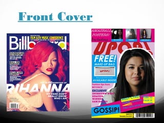
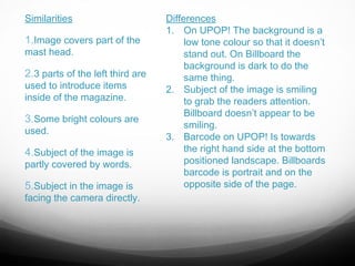
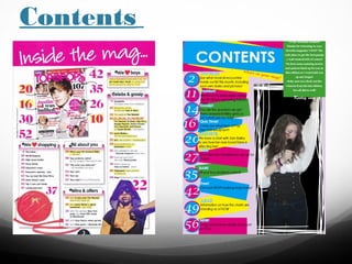
3. Similarities
1.Image covers part of the
mast head.
2.3 parts of the left third are
used to introduce items
inside of the magazine.
3.Some bright colours are
used.
4.Subject of the image is
partly covered by words.
5.Subject in the image is
facing the camera directly.
Differences
1. On UPOP! The background is a
low tone colour so that it doesn’t
stand out. On Billboard the
background is dark to do the
same thing.
2. Subject of the image is smiling
to grab the readers attention.
Billboard doesn’t appear to be
smiling.
3. Barcode on UPOP! Is towards
the right hand side at the bottom
positioned landscape. Billboards
barcode is portrait and on the
opposite side of the page.
5. Similarities
Differences
1. In the real magazine there is an
1.There is a banner across the
image of the front page to make an
top of the page to highlight
easy link between images and
what the page is for.
pages. My magazine has numbers
and descriptions only.
2.Included numbers of the
2. My magazine includes a message
pages to help the readers
from the “editor” to make it seem
navigate through the magazine.
more personal for the reader.
3. I have used one large image rather
3.Different colours have been
than 2 smaller images.
used to make it bright and eye
4. The image I have used is in a box
catching.
and has a background, whereas the
other magazine is cut out around
4.Images have been used to
entice the reader to look further
the subject.
and find out what they are
linked to.
7. Similarities
1. Both magazines have
used pink as the main
colour.
2. Both have used a
starburst on the double
page.
3. Both pages have
change the colour of the
text that is deemed
important.
4. Both pages have
included quotes.
5. There has been blocks
used to highlight some
important text.
Differences
1. The real magazine has
covered one whole page with a
picture of the subject whereas I
have included a smaller image in
the middle of both pages.
2. The real magazine has used
more than one image on the
page- one studio shot and one
on location. I have only got one
shot studio.
3. The real magazine have used
a quote for their title and covered
half a page with this, I used the
subjects name as a title and only
covered a thin part of the top of
the page.