
Recommended
More Related Content
What's hot
What's hot (18)
Similar to Front cover magazine completed analysis
Similar to Front cover magazine completed analysis (20)
More from kimshaw03
More from kimshaw03 (20)
Recently uploaded
Recently uploaded (20)
Front cover magazine completed analysis
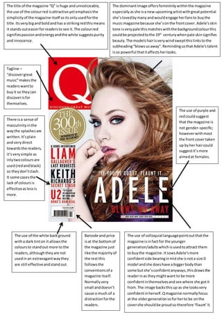
- 1. The title of the magazine “Q” is huge andunnoticeable, the use of the colourred isattractive yetemphasisthe simplicityof the magazine itself asitsonlyusedforthe title.Its verybigand boldandhas a strikingredthismeans it standsouteasierforreadersto see it.The colourred signifiespassionandenergyandthe white suggestspurity and innocence. The dominantimage offersfemininitywithinthe magazine especiallyasshe isa new upcomingartistwithgreatpotential she’slovedbymany andwouldengage herfansto buythe musicmagazine because she’sonthe frontcover. Adele’sskin tone isverypale thismatcheswiththe backgroundcolourthis couldbe projectedtothe 19th centurywhenpale skinsignifies beauty.The models hairisverywind sweptthislinkstothe subheading“blowsusaway”.Remindingusthat Adele’s talent isso powerful thatitaffectsherlooks. The use of purple and redcouldsuggest that the magazine is not gender-specific; howeverwithmost the front covertaken up byher haircould suggestit’smore aimedat females. There isa sense of masculinityinthe waythe splashesare written.It’splain and verydirect towardsthe readers, it’sverysimple as inlytwocoloursare used(redandblack) so theydon’tclash. It some casesthe lack of coloursis effectiveaslessis more. The use of the white background witha dark tinton it allowsthe coloursto standout more to the readers,althoughtheyare not usedinan extravagantwaythey are still effectiveandstandout. The use of colloquial languagepointoutthatthe magazine isinfact for the younger generation/adultswhichisusedtoattract them to buythe magazine. ItsowsAdele’smore confidentside bearinginmidshe isnota size 0 model andshe doeshave a biggerbodythan some butshe’sconfidentanyways,thisdrawsthe readerinas theymightwant to be more confidentinthemselvesandsee where she gotit from.The image backsthisup as she looksvery confidentinherself.Qmagazine normallyfocus at the oldergenerationsoforherto be onthe covershe shouldbe proudso therefore ‘flaunt’it. Barcode and price isat the bottomof the magazine just like the majorityof the rest this followsthe conventionsof a magazine itself. Normallyvery small anddoesn’t cause o much of a distraction forthe readers. Tagline – “discovergreat music”makesthe readerswantto buyit so theycan discoverisfor themselves.