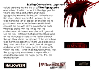
1. Before creating my the title of our film I had to do
research on it to find out which titles typography
where right for a slasher film and which
typography was used in the past slasher horror
film which where successful. I wanted to put
together some sort of aspect of another title to
produce an intertextual reference which will
contact the film with all the promotional parts
which go along with the film so that the
audiences could see one and want to go and
see the film. I establish that general colours used
for the typography were white, red and black
though, they where not all used at the same time
together the reason they where used is because
they have conations of death, blood, danger
and pour which the horror genre all represents
with in the films . What I had figured out was that
the typography was always sharp and hard
edged to represent the horror genre. This are
examples from successful horror films
Existing Conventions: Logos and Film
Titles Typography
2. MY FILM TITLE
The reason which I have chosen this title is
because shows and has all the features of all
the successful horror film titles from the past.
The typography is white, red and black. The
reason they where used is because they
have conations of death, blood, danger and
pour which the horror genre all represents
with in the films that the typography was is
sharp and hard edged to represent the
horror genre.
CURSE OF
THE
DAMNED
CURSE OF
THE
DAMNED
CURSE OF THE DAMNED