SlideShare a Scribd company logo
1 of 1
LogosThese logos let the viewer aware of what type of film this is by that institutions style or the posters logo that allows the viewer to recognise them and their standard.Further informationA web address is given to encourage the viewer to find more information on what the film is about.Target AudienceThe target audience for this film is clearly adults, and mainly men as they tend to  be more entertained by horror and can handle blood and gore, which is indicated by all these aspects of the poster, more than women. ImagesThe two human fingers stand for the number 2 but also gives the viewer an insight on what the film may be about. They appear to be standing upright on the jaggered base of the finger suggesting they have been cut off the hand. The decaying skin and the long, uneven, discoloured nails implies that they have been left to die and time has passed. The edge of a saw explains the amputated fingers and also reinforces the title ‘Saw’. There is a faded line that dissects the ‘S’ from the rest of the letters, this could indicate the dissecting of human bodies.HeadlinesThe title is a large and bold font that grabs the viewers attention. The font is uneven and dark, this indicates the atmosphere of a dark dungeon type room.TextThe only text on this poster is at the very bottom of the page, and doesn’t give a lot of information on when the film is going to be released. This then makes the viewer depend on the other aspects of the poster to gain information on what the film is based on and it also keeps them curious. The font type is very simple and smart, this contrasts the messy and gritty headline, so it emphasises the evilness of the story line.LayoutThe layout of this poster is very simple and bare. The large title dominates the centre of the page so it is the first thing to look at. The two fingers are positions after the text as it stands for the number 2 and makes it clear that it is a sequel. The saw that is just visible at the very top of the page links with the two fingers and allows the viewer to make assumptions of what has happened. The text at the bottom of the page is then the last thing to look at and the lack of information will keep the viewer curious and interested in the film.ColourThe colour white dominates this poster, however this then makes the dirty, mouldy green and brown colours pop out at the viewer and also emphasises the grittiness. This mouldy green and brown colour connotes decaying flesh, which suggests deaths and murders will take place in this film. The colour of the saw is a dull, metallic grey which is another colour that represents a depressing and cold atmosphere.8515631201003<br />

More Related Content

Similar to Saw poster[1][1]

Analyse 6 film posters task 7
Analyse 6 film posters  task 7Analyse 6 film posters  task 7
Analyse 6 film posters task 7
Louisha26
 
Analyzing print products
Analyzing print productsAnalyzing print products
Analyzing print products
annabelchughes
 
Textual analysis film posters
Textual analysis film postersTextual analysis film posters
Textual analysis film posters
Jordan2020
 
Media radials
Media radialsMedia radials
Media radials
Greenshaw
 
Media Radials
Media RadialsMedia Radials
Media Radials
Greenshaw
 
Media Radials
Media RadialsMedia Radials
Media Radials
Greenshaw
 

Similar to Saw poster[1][1] (20)

Magg
MaggMagg
Magg
 
Cloverfield
CloverfieldCloverfield
Cloverfield
 
Analyse 6 film posters task 7
Analyse 6 film posters  task 7Analyse 6 film posters  task 7
Analyse 6 film posters task 7
 
2. fmp research
2. fmp research2. fmp research
2. fmp research
 
Seven 9 frame analysis
Seven 9 frame analysisSeven 9 frame analysis
Seven 9 frame analysis
 
Saw ii poster analysis
Saw ii poster analysisSaw ii poster analysis
Saw ii poster analysis
 
Assign 10
Assign 10 Assign 10
Assign 10
 
Magazine analyses a2
Magazine analyses a2Magazine analyses a2
Magazine analyses a2
 
Poster analysis 2
Poster analysis 2Poster analysis 2
Poster analysis 2
 
Film poster analysis
Film poster analysisFilm poster analysis
Film poster analysis
 
Analyzing print products
Analyzing print productsAnalyzing print products
Analyzing print products
 
Adventure
Adventure Adventure
Adventure
 
Blair Witch Project Advertising Campaign Analysis
Blair Witch Project Advertising Campaign AnalysisBlair Witch Project Advertising Campaign Analysis
Blair Witch Project Advertising Campaign Analysis
 
A2 horror existing magazine front covers
A2 horror existing magazine front coversA2 horror existing magazine front covers
A2 horror existing magazine front covers
 
Analysis of film posters
Analysis of film postersAnalysis of film posters
Analysis of film posters
 
Textual analysis film posters
Textual analysis film postersTextual analysis film posters
Textual analysis film posters
 
'Se7en' Opening Sequence Title Research
'Se7en' Opening Sequence Title Research'Se7en' Opening Sequence Title Research
'Se7en' Opening Sequence Title Research
 
Media radials
Media radialsMedia radials
Media radials
 
Media Radials
Media RadialsMedia Radials
Media Radials
 
Media Radials
Media RadialsMedia Radials
Media Radials
 

Saw poster[1][1]

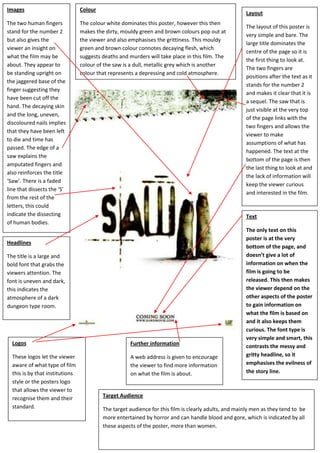
  • 1. LogosThese logos let the viewer aware of what type of film this is by that institutions style or the posters logo that allows the viewer to recognise them and their standard.Further informationA web address is given to encourage the viewer to find more information on what the film is about.Target AudienceThe target audience for this film is clearly adults, and mainly men as they tend to be more entertained by horror and can handle blood and gore, which is indicated by all these aspects of the poster, more than women. ImagesThe two human fingers stand for the number 2 but also gives the viewer an insight on what the film may be about. They appear to be standing upright on the jaggered base of the finger suggesting they have been cut off the hand. The decaying skin and the long, uneven, discoloured nails implies that they have been left to die and time has passed. The edge of a saw explains the amputated fingers and also reinforces the title ‘Saw’. There is a faded line that dissects the ‘S’ from the rest of the letters, this could indicate the dissecting of human bodies.HeadlinesThe title is a large and bold font that grabs the viewers attention. The font is uneven and dark, this indicates the atmosphere of a dark dungeon type room.TextThe only text on this poster is at the very bottom of the page, and doesn’t give a lot of information on when the film is going to be released. This then makes the viewer depend on the other aspects of the poster to gain information on what the film is based on and it also keeps them curious. The font type is very simple and smart, this contrasts the messy and gritty headline, so it emphasises the evilness of the story line.LayoutThe layout of this poster is very simple and bare. The large title dominates the centre of the page so it is the first thing to look at. The two fingers are positions after the text as it stands for the number 2 and makes it clear that it is a sequel. The saw that is just visible at the very top of the page links with the two fingers and allows the viewer to make assumptions of what has happened. The text at the bottom of the page is then the last thing to look at and the lack of information will keep the viewer curious and interested in the film.ColourThe colour white dominates this poster, however this then makes the dirty, mouldy green and brown colours pop out at the viewer and also emphasises the grittiness. This mouldy green and brown colour connotes decaying flesh, which suggests deaths and murders will take place in this film. The colour of the saw is a dull, metallic grey which is another colour that represents a depressing and cold atmosphere.8515631201003<br />