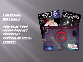
SlideShare a Scribd company logo
1 of 4
EVALUATION:
QUESTION 2

How does your
media product
represent
particular social
groups?
The front cover
Disturb magazine is aimed at males
between the age stages of late teens to mid-
twenties. They are also English speaking
males, as the magazine is written in                              The use of the title Disturb
English.                                                          shows that my audience
                                                                  are radicals because they
                                                                  want to ‘Disturb’ other
                                                                  people.
              The fact the magazine is for people
              who love both new and old music
              connotes a level of intelligence as a
              lot of work will have to be done to
              fill the magazine.

                               The use of this photo on the front cover connotes and act of
                               violence, disturbance and rebellion. This is because the image
                               shows a young man in a black top with a half naked woman on
                               it, a short (almost bald) haircut and screaming into a
                               microphone. Some audiences may think that because he has a
                               half naked picture on his shirt that he is more superior to
                               women. But others may think that it shows that men cant live
                               without women in their lives so they need to be around them all
                               the time.
Contents page
                     The use of the large image of the Deaf
                     Havana guitarist in black and white on the
                     contents page connotes that, because they are
                     a modern day band, the magazine is trying to
                     appeal to the older readers by making it look
                     cool so to make people want to know more
                     about it.
                     The image also has a white frame around it
                     this could make audiences think that the band
                     are so good that they are to be hung on a wall.
                     Others will just see it as eye catching.


By having the
names of the band
                                             Having the front page on the
in blood red and                             contents page connotes that
the other words in                           Disturb are really trying to show
white connotes                               you how good it is and make
                                             you want to buy it again, this is
that they have to                            also done by having the white
be read because                              frame around the cover and the
they are                                     editors note.
dangerous.
Double Page Spread
    In the centre of the double page spread I have a big red circle that has the words
    ‘Deaf Havana Live’ inside it, this connotes that, because it is red, people should
    stop and read it because it is almost like a stop sign. Audiences may also see that
    live music is a big part of the magazine because of the size of the word ‘Live’. By
    having the normal text a significant distance away it could mean to some
    audiences that there is a sense of danger about the circle and even the words are
    scared of it.


                     The use of the drop capital in a different font
                     could mean that some of the readers think that the
                     capital is trying to be radical like them and stand
                     out. Whereas others will just see a drop capital.


The pull quote has the colour red on the important parts of the quote.
This might mean to some audiences that, because the words are more
important other parts in the magazine in red are more important, and on
the front cover the new bands are in red whereas the old bands are in
purple. So some people wont like this and have a negative view towards
the magazine.
The pull quote is on a quirky white background, this could mean to some
audiences that it is like it has been cut out and stuck down on the page.

More Related Content

Viewers also liked

Vitamin patches concept packaging
Vitamin patches concept packagingVitamin patches concept packaging
Vitamin patches concept packagingCatherine Sergeeva
 
Wijzigingen in het besluit omgevingsrecht per 1 november 2014
Wijzigingen in het besluit omgevingsrecht per 1 november 2014Wijzigingen in het besluit omgevingsrecht per 1 november 2014
Wijzigingen in het besluit omgevingsrecht per 1 november 2014Laurens Golverdingen
 
Advancing your career
Advancing your careerAdvancing your career
Advancing your careermandrakewiz
 
Het Besluit omgevingsrecht versie oktober 2015
Het Besluit omgevingsrecht versie oktober 2015Het Besluit omgevingsrecht versie oktober 2015
Het Besluit omgevingsrecht versie oktober 2015Laurens Golverdingen
 
(Ebook health - nutrition) recipies and tips for healthy and thrifty meals
(Ebook   health - nutrition) recipies and tips for healthy and thrifty meals(Ebook   health - nutrition) recipies and tips for healthy and thrifty meals
(Ebook health - nutrition) recipies and tips for healthy and thrifty mealsmandrakewiz
 

Viewers also liked (6)

Vitamin patches concept packaging
Vitamin patches concept packagingVitamin patches concept packaging
Vitamin patches concept packaging
 
Wijzigingen in het besluit omgevingsrecht per 1 november 2014
Wijzigingen in het besluit omgevingsrecht per 1 november 2014Wijzigingen in het besluit omgevingsrecht per 1 november 2014
Wijzigingen in het besluit omgevingsrecht per 1 november 2014
 
Advancing your career
Advancing your careerAdvancing your career
Advancing your career
 
Het Besluit omgevingsrecht versie oktober 2015
Het Besluit omgevingsrecht versie oktober 2015Het Besluit omgevingsrecht versie oktober 2015
Het Besluit omgevingsrecht versie oktober 2015
 
(Ebook health - nutrition) recipies and tips for healthy and thrifty meals
(Ebook   health - nutrition) recipies and tips for healthy and thrifty meals(Ebook   health - nutrition) recipies and tips for healthy and thrifty meals
(Ebook health - nutrition) recipies and tips for healthy and thrifty meals
 
Sharing Economy
Sharing EconomySharing Economy
Sharing Economy
 

Similar to Evaluation qu 2

Analysing Magazine Covers
Analysing Magazine CoversAnalysing Magazine Covers
Analysing Magazine Coversahsatanstapes
 
Textual analysis music magazine
Textual analysis music magazineTextual analysis music magazine
Textual analysis music magazineannie-rose3
 
Evaluation question 5
Evaluation question 5 Evaluation question 5
Evaluation question 5 korrine4150
 
Analysing music magazines
Analysing music magazinesAnalysing music magazines
Analysing music magazines05knotwelllau
 
Textual Analysis 2
Textual Analysis 2Textual Analysis 2
Textual Analysis 2mnoficzer
 
Analysis of 3 pages
Analysis of 3 pagesAnalysis of 3 pages
Analysis of 3 pagesasia13775
 
Analysis of 3 pages
Analysis of 3 pagesAnalysis of 3 pages
Analysis of 3 pagesasia13775
 
Evaluation of my AS Production
Evaluation of my AS ProductionEvaluation of my AS Production
Evaluation of my AS Productiontaytumc
 
Macabees nme dps analysis
Macabees nme dps analysisMacabees nme dps analysis
Macabees nme dps analysisjessiekeegan
 
Evaluation as production final version
Evaluation as production final versionEvaluation as production final version
Evaluation as production final versiontaytumc
 
Macabees nme dps analysis
Macabees nme dps analysisMacabees nme dps analysis
Macabees nme dps analysisjessiekeegan
 
Magazine uses and gratifications
Magazine uses and gratificationsMagazine uses and gratifications
Magazine uses and gratificationsDa_Bhoy
 
Media magazine analysis
Media magazine analysisMedia magazine analysis
Media magazine analysisniamhreilly23
 
Q4 and q5 how did you attract your audience
Q4 and q5 how did you attract your audienceQ4 and q5 how did you attract your audience
Q4 and q5 how did you attract your audienceasmediag12
 
Evaluation
EvaluationEvaluation
Evaluationbenhope
 
Front cover music magazine analysis
Front cover music magazine analysisFront cover music magazine analysis
Front cover music magazine analysisKyraM16
 

Similar to Evaluation qu 2 (20)

Cover magazine
Cover magazineCover magazine
Cover magazine
 
Cover magazine
Cover magazineCover magazine
Cover magazine
 
Analysing Magazine Covers
Analysing Magazine CoversAnalysing Magazine Covers
Analysing Magazine Covers
 
Textual analysis music magazine
Textual analysis music magazineTextual analysis music magazine
Textual analysis music magazine
 
Magazine analysis
Magazine analysisMagazine analysis
Magazine analysis
 
Evaluation question 5
Evaluation question 5 Evaluation question 5
Evaluation question 5
 
Analysing music magazines
Analysing music magazinesAnalysing music magazines
Analysing music magazines
 
Textual Analysis 2
Textual Analysis 2Textual Analysis 2
Textual Analysis 2
 
Analysis of 3 pages
Analysis of 3 pagesAnalysis of 3 pages
Analysis of 3 pages
 
Analysis of 3 pages
Analysis of 3 pagesAnalysis of 3 pages
Analysis of 3 pages
 
Evaluation of my AS Production
Evaluation of my AS ProductionEvaluation of my AS Production
Evaluation of my AS Production
 
Macabees nme dps analysis
Macabees nme dps analysisMacabees nme dps analysis
Macabees nme dps analysis
 
Evaluation as production final version
Evaluation as production final versionEvaluation as production final version
Evaluation as production final version
 
Macabees nme dps analysis
Macabees nme dps analysisMacabees nme dps analysis
Macabees nme dps analysis
 
Magazine uses and gratifications
Magazine uses and gratificationsMagazine uses and gratifications
Magazine uses and gratifications
 
Media magazine analysis
Media magazine analysisMedia magazine analysis
Media magazine analysis
 
Q4 and q5 how did you attract your audience
Q4 and q5 how did you attract your audienceQ4 and q5 how did you attract your audience
Q4 and q5 how did you attract your audience
 
Evaluation
EvaluationEvaluation
Evaluation
 
Front cover music magazine analysis
Front cover music magazine analysisFront cover music magazine analysis
Front cover music magazine analysis
 
Inner
Inner Inner
Inner
 

Evaluation qu 2

  • 1. EVALUATION: QUESTION 2 How does your media product represent particular social groups?
  • 2. The front cover Disturb magazine is aimed at males between the age stages of late teens to mid- twenties. They are also English speaking males, as the magazine is written in The use of the title Disturb English. shows that my audience are radicals because they want to ‘Disturb’ other people. The fact the magazine is for people who love both new and old music connotes a level of intelligence as a lot of work will have to be done to fill the magazine. The use of this photo on the front cover connotes and act of violence, disturbance and rebellion. This is because the image shows a young man in a black top with a half naked woman on it, a short (almost bald) haircut and screaming into a microphone. Some audiences may think that because he has a half naked picture on his shirt that he is more superior to women. But others may think that it shows that men cant live without women in their lives so they need to be around them all the time.
  • 3. Contents page The use of the large image of the Deaf Havana guitarist in black and white on the contents page connotes that, because they are a modern day band, the magazine is trying to appeal to the older readers by making it look cool so to make people want to know more about it. The image also has a white frame around it this could make audiences think that the band are so good that they are to be hung on a wall. Others will just see it as eye catching. By having the names of the band Having the front page on the in blood red and contents page connotes that the other words in Disturb are really trying to show white connotes you how good it is and make you want to buy it again, this is that they have to also done by having the white be read because frame around the cover and the they are editors note. dangerous.
  • 4. Double Page Spread In the centre of the double page spread I have a big red circle that has the words ‘Deaf Havana Live’ inside it, this connotes that, because it is red, people should stop and read it because it is almost like a stop sign. Audiences may also see that live music is a big part of the magazine because of the size of the word ‘Live’. By having the normal text a significant distance away it could mean to some audiences that there is a sense of danger about the circle and even the words are scared of it. The use of the drop capital in a different font could mean that some of the readers think that the capital is trying to be radical like them and stand out. Whereas others will just see a drop capital. The pull quote has the colour red on the important parts of the quote. This might mean to some audiences that, because the words are more important other parts in the magazine in red are more important, and on the front cover the new bands are in red whereas the old bands are in purple. So some people wont like this and have a negative view towards the magazine. The pull quote is on a quirky white background, this could mean to some audiences that it is like it has been cut out and stuck down on the page.