Using posters to communiate your research
•
1 like•669 views

Credits to University of Nottingham Malaysia Campus - Graduate School. Slides prepared and presented by Dr Sue Scarborough.

Recommended
More Related Content
What's hot
What's hot (20)
Similar to Using posters to communiate your research
Similar to Using posters to communiate your research (20)
More from Hooi Shyan
More from Hooi Shyan (10)
Recently uploaded
Recently uploaded (20)
Using posters to communiate your research
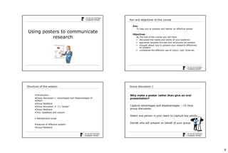
- 1. 1 Using posters to communicate research Aim and objectives of this course Aim: To help you to prepare and deliver an effective poster Objectives By the end of the course you will have: discussed the needs and wants of your audience appraised possible formats and structures for posters thought about how to present your research effectively on posters considered the effective use of colour, size, fonts etc •Introduction •Group discussion 1: advantages and disadvantages of posters •Group feedback •Group discussion 2: 3 x “whats“ •Group feedback •Text, typefaces and colours • Refreshment break •Features of effective posters •Group feedback Structure of this session Group discussion 1 Why make a poster rather than give an oral presentation? Capture advantages and disadvantages – 15 mins group discussion. Select one person in your team to capture key points. Decide who will present on behalf of your group.
- 2. 2 Group discussion 2 What … • do you need to know before you make a poster? • makes a poster attractive? • do you put in a poster? 15 mins group discussion. Select one person in your team to capture key points. Decide who will present on behalf of your group. The Poster Title Option 1 "Mechanism of airway constriction and secretion evoked by laryngeal administration of SO2 " Option 2 "Evidence that reflex effects of SO2 are mediated by afferent endings in the upper airway" Option 3 "Are reflex effects of SO2 mediated by afferent endings in the upper airway? Text Text should be simple and direct, for example For a written paper: "Within the UK setting, there has been a marked increase…." For a poster: "There has been a marked increase…." This could be cut further to bring the key work to the start of the sentence: "A marked increase…" NN Serif typeface Sans-serif typeface - best for screen Century Schoolbook Garamond Palatino Times New Roman Arial Verdana Tahoma Trebuchet Serif typeface - best for paper Serif Typefaces - Serif & Sans Serif
- 3. 3 48 point A C E Q W E R T Y U I O P A S D F G H J L Z X C V B N M Q W E R T Y U I O P 36 point 16 point 24 point 18 point 14 point 12 point 10 point 60 point Minimum Type size • Use only one typeface in a poster • Mixing typefaces just... • ...creates a mess • Make sure the host computer has your typefaces, or that PowerPoint embeds them Typefaces - Limiting Usage Same hue, high contrast Acceptable Same hue, high contrast Acceptable White on dark colour Acceptable Black on light colour Usually the best option Colour Different hue, low contrast Hard to read, makes your eyes go funny Different hue, High contrast Legible, but garish? Same hue, low contrast Hard to read Same hue, low contrast Hard to read Colour
- 4. 4 Different hue, low contrast Hard to read, makes your eyes go funny Different hue, High contrast Legible, but garish? Same hue, low contrast Hard to read Same hue, low contrast Hard to read Previous slide as seen by person with deuteranopic colour blindness You can check your own slides at www.vischeck.com Colour Blindness Ideally, maximum 5 colours per page (photographs excepted) Too many colours Graphics Examples of a typical poster session Example of a poster session at a large conference
- 5. 5 Features of effective posters Look at the available posters Use post-it notes to comment on the strengths and weaknesses of the posters – 10 mins In your group, discuss which posters were most effective and why. Then identify your group’s favourite poster – 10 mins Decide who will present on behalf of your group. • Remember your poster is a sales pitch • Keep your writing style fairly simple • Minimise jargon • Don’t have too much text • Have eye-catching graphics to draw people in • Make sure the text can be read from at least a metre away • Have A4 copies of your poster available for people to take away – this might be a longer, more text-based version • Consider the use of gimmicks to attract people e.g. an open tin of free chocolates or free pens or balloons? A final few points
- 6. Effective Scientific Posters Quick Reference George R. Hess An effective poster will help you … … engage colleagues in conversation. … get your main points across to as many people as possible. A poster is a visual communication tool. Posters serve as … » a source of information » a conversation starter » a summary of your work » an advertisement of your work Resources for Poster Presenters George Hess / NC State University / Forestry Department / Raleigh NC 27695-8002 www4.ncsu.edu/~grhess george_hess@ncsu.edu © 2004 Block, S.M. 1996. Do's and dont's of poster presentations. Biophysical Journal 71: 3527-3529. Briscoe, M.H. 1996. Preparing Scientific Illustrations: A Guide to Better Posters, Presentations, and Publications. Springer, New York. Davis, M. 1997. Scientific Papers and Presentations. Academic Press, New York. Gosling, Peter J. 1999. Scientist's Guide to Poster Presentations. Kluwer Academic Press, New York. Harms, M.l. 1995. How to prepare a poster presentation. Physiotheraphy 81: 276. Nicol, A.A.M. and P. M. Pexman. 2003. Displaying your findings: a practical guide for creating figures, posters, and presentations. American Psychological Association, Washington, DC. Teixeira, A. 1997. Preparing posters for technical presentations. Resource 4: 15-16. Tosney, K. 2004. How to create a poster that graphically communicates your message. URL=http://www.biology.lsa.umich.edu/research/labs/ktosney/file/PostersHome.ht ml , visited 2004 Feb 4. Tufte, E. 1983. The Visual Display of Quantitative Information. Graphics Press, Cheshire, CT. Tufte, E. 1997. Visual Explanations: Images and Quantities, Evidence and Narrative. Graphics Press, Cheshire, CT. Woolsey, J.D. 1989. Combating poster fatigue: How to use visual grammar and analysis to effect better visual communication. Trends in Neurosciences 12: 325- 332. Hess, G. & L. Liegel. 2004. Creating Effective Poster Presentations. URL=http://www.ncsu.edu/project/posters, visited 2004 Feb 4.
- 7. Population Sizes Through Time 0 50 100 150 200 250 300 350 400 450 0 2 4 6 8 10 12 14 16 18 20 Days PopulationSize Predators Prey Clean graphs show data clearly! Desired message: Prey decreased as predators increased. Focus on relationships – exact values are usually not important. Eliminate “chart junk” to keep focus on data (Tufte 1983). Grid lines, detailed ticks on axes, data markers, and grey background are not needed. Label data directly, when possible. Legends force reader to look back and forth to decode graph. Message is now loud and clear! Population Sizes Through Time 0 250 500 0 10 20 Days PopulationSize PredatorsPrey Tips for Effective Poster Presentations Get your message across with effective visual displays of data and small blocks of supporting text. Think of your poster as an illustrated abstract. Tell readers why your work matters, what you did, what you found, and what you recommend. Avoid excessive focus on methods – it’s the results and implications that count! Overall appearance. Use a pleasing arrangement of graphics, text, colors. Your poster should be neat and uncluttered – use white space to help organize sections. Balance the placement of text and figures. Organization. Use headings to help readers find what they’re looking for: objective, results, conclusions, etc. A columnar format helps traffic flow in a crowded poster session. Minimize text – use graphics. Keep text in blocks of no more than 50-75 words – don’t create large, monolithic paragraphs of prose. Text size. All text should be large enough to read from 1-2 meters, including the text in figures. Title should be larger, to attract attention from far away. Use color cautiously. Dark letters on light background are easiest to read. Stick to a theme of 2-3 colors. Avoid overly bright colors – they attract attention but wear out reader’s eyes. Don’t fight reader gravity, which pulls the eyes from top to bottom (first), and left to right. Include full contact information. You want to be found – the reader should not have to look up anything to find you. Prepare a 3-5 minute verbal explanation. Some people will ask you to “walk me through your poster.” In making such a presentation, don't read the poster. Instead, give the big picture, explain why the problem is important, and use the graphics on your poster to illustrate and support your findings and recommendations. Prepare a summary handout. You want people to remember your work – a handout provides a written record for readers. You can include a miniature version of your poster plus more detailed graphics, tables, and prose. The handout is something else you can refer to when talking to people about your work. Be sure to include complete contact information.
- 8. Outline of material for poster presentation course Posters commonly used in science and engineering, but becoming more common in other disciplines Audience People in your field People in your general area People outside your general area To cater for all needs in audience, provide context, use plain language, interpret your findings Title Brief, informative, interesting (enticing/provocative) Plan with rough sketch, create pathway for the eye Layout One possibility: Introduction, experimental details, results and discussion, conclusion, references and acknowledgements Introduction: context, why important? Experimental details: not necessary to include enough detail for someone to replicate Results and discussion: clear story, importance of figures Conclusion: brief References and acknowledgements: may wish to cite authors who are likely to be at the conference NO NEED TO INCLUDE ABSTRACT – it is printed in the conference proceedings anyway Text Simple, direct, LARGE, short sentences Font 32 – 36 for headings, 22-24 (or larger) for body text Size depends on importance Tip: If you print your poster on A4, everything should be comfortably readable including captions of figures San Serif fonts (Arial, Verdana, Trebuchet, Century Gothic etc.) easier to read. Comic Sans often appreciated by people with dyslexia, but others may consider it too childish or informal Figures/Graphics Make good graphics central in poster. Large, simple figures Colour Choose theme of 2 or 3 colours and stick to it At poster presentation Hang poster neatly, be there on time, have handouts/business cards, have pen and pad for comments
- 9. Examples of posters Link Comment / Source http://www.nottingham.ac.uk/graduateschool/events/ researchshowcase/winners2011.aspx http://www.nottingham.ac.uk/graduateschool/events/ researchshowcase/winners2010.aspx Examples of posters – Winners of The University of Nottingham Graduate School’s Research Showcase 2011 2010 http://www.eposters.net/ Examples of posters - for scientific posters http://www3.imperial.ac.uk/fuelcells/reports1/poster %20presentations/ Examples of posters - Imperial College London http://holmes.cancres.nottingham.ac.uk/posters Examples of posters from the UoN School of Pharmacy How to Guides Link Comment / Source http://www.vitae.ac.uk/researchers/1638/Posters.htm l Vitae How to or Guide - Postgraduate researchers > Raising your profile > Presenting your research >Posters http://www2.le.ac.uk/offices/careers/pgrd/resources/ designing-poster/poster University of Leicester How to or Guide - Poster presentations, Study guide http://www.ncsu.edu/project/posters North Carolina State University How to or Guide http://www.asp.org/education/howto_onPosters.html American Society of Primatologists How to or Guide - Block, S.M. (2996) Teaching Biophysics: Do’s and Don’ts of Poster Presentation. Biophysical Journal71:3527-352