Sales & Marketing Alignment: How to Synergize for Success
Double page. how it attracts audience
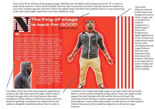
1. I decided to use a large long length image of my male model with his hands
held in a certain posture alongside looking above. I have also added a small
image of the male looking to the left with his hood on his head. This
represents that he belongs to a grime magazine and shows his masculinity
and toughness. I used a white drop shadow on both pictures to add emphasis.
I believe the posture of my model has helped me to attract my target
audience.
I have used
different coloured
border lines as my
background such as
white, orange, and
a red which can
easily be
recognised as a
faded orange. I
believe the
background is
highly significant in
terms of colour and
organisation simply
because after
viewing the tile and
image, I believe
that’s the next
important thing
that attracts the
audience. Therefore
it was important to
make it bright, and
slightly complex in
terms of design.
I have used “N” for all three of my magazine pages. With this one I decided to add a background to the “N” in order to
make it look attractive. I had to think carefully about the title, because that can either instantly attract the audience or
can be the complete opposite. However I believe by adding “king” indicated to the audience that it’s a must read seeing
as the male seems highly significant is he’s been labelled as “king”.
I’ve added a fairly short but interesting text regarding my
model on the right hand side of the page. I didn’t want to
overload the page with a lot of text because that could
possibly put off my audience. I believe by using a short but
attention-grabbing, remarkable text would motivate my
audience alongside immediately attract them to read on.