1. I’ve added afairly short but interesting text regardingmy model on the right
hand side of the page. I didn’twantto overload the page with a lot of text
because that could possibly putoff my audience. I believe by using a short
but attention-grabbing, remarkabletext would motivatemy audience
alongside immediately attract them to read on.
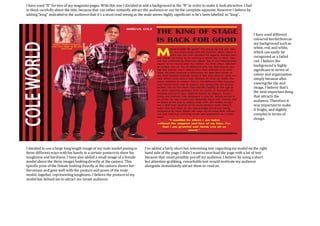
I decided to use a large longlength image of my male model posingin
three differentwayswith his hands in a certain postureto show his
toughness and hardness. I have also added a small image of a female
modelabove the three images lookingdirectly at the camera. This
specific pose of the female looking directly at the camera shows her
fierceness and goes well with the postureand poses of the male
model, together representingtoughness. I believe the postureof my
modelhas helped me to attract my target audience.
I have used “N” for two of my magazinepages. With this one I decided to add a background to the “N” in order to make it look attractive. I had
to think carefully about the title, because that can either instantly attract the audienceor can be the complete opposite. However I believe by
adding“king” indicated to the audiencethat it’s a must read seeing as the male seems highly significant is he’s been labelled as “king”.
I have used different
coloured borderlinesas
my background suchas
white, red, and white,
which can easily be
recognised as a faded
red. I believe the
background is highly
significant in terms of
colour and organisation
simply because after
viewingthe tile and
image, I believe that’s
the next importantthing
that attracts the
audience. Therefore it
was importantto make
it bright, and slightly
complexin terms of
design.