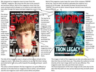
1. We compared our magazine cover to cover from the
“EMPIRE” magazine. We chose the film due to the research
we had done before. Both of the magazines come from the
same company which allowed us to really try and make them
look alike through the layout and past magazines covers it has
had.
Our group
also used
taglines
around the
main image
so that it
would be
similar to
the
magazine
cover shown
nearby. The
magazine
cover used
only two
taglines
around the
image like
the
magazine
cover
shown.
Both of the magazine covers have the name of the company ‘EMPIRE’
at the top. They are both red which captivates the audience as it
stands out of the page. We decided too keep the positioning of
“EMPIRE” the same as when researching we noticed it was rarely any
where different.
The tag line at
the top was
incorporated
onto our
magazine cover
so that it would
be similar to one
another. The
taglines didn’t
read the same
thing but
promoted the
same idea.
Both of the
magazines looks
very similar to
one another as
we compared
them.
The title of the magazine cover is shown at the bottom of both of the
magazine covers. This allows the audience to see the film that is being
promoted which was very useful towards the people wanting to watch
the film
The colour scheme between the two magazines are quite different as
well due to the idea that our magazine sticks to white, red and black
and the real magazine cover sticks to blue white and yellow.
The
background
of the
magazine
covers are
very different
to one
another as we
wanted a
change. We
believed it
worked very
well as it
allowed the
audience to
see a
difference
and a change
between the
two
The images in both of the magazines are also very alike due to the
idea that they are both close ups. They allow the audience to look
directly at the main image which can be very effective. This
magazine cover also only uses three main colours.
The facial expressions of the main image are the same due to the
idea that they both are very serious because they are both action
films