8 Fatal Landing Page Mistakes
•
0 likes•398 views

You could lose web visitors in an instant but don't. Find out how to make your landing pages engage and convert visitors by avoiding the top 8 mistakes. For more resources like this go to http://www.technoledge.com.au/b2b-marketing-trends

Recommended
Recommended
More Related Content
Recently uploaded
Recently uploaded (20)
Featured
Featured (20)
8 Fatal Landing Page Mistakes
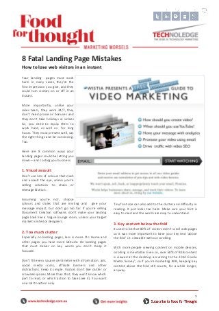
- 1. 1 Your landing pages must work hard. In many cases, they’re the first impression you give, and they could turn visitors on or off in an instant. More importantly, unlike your sales team, they work 24/7, they don’t need praise or bonuses and they don’t take holidays or sickies So, you need to equip them to work hard, as well as for long hours. They must present well, say the right things and be convincing. Too. Here are 8 common ways your landing pages could be letting you down—and costing you business. 1. Visual assault Don’t use lots of colours that clash and assault the eye, unless you’re selling solutions to chaos or teenage fashion. Assuming you’re not, choose colours and styles that are inviting and give your message impact, but don’t go too far. If you’re selling Document Creation software, don’t make your landing page look like a Vogue lounge room, unless your target market is interior designers. 2. Too much clutter Especially on landing pages, less is more. On Home and other pages you have more latitude. On landing pages that must delver on key words you don’t. Keep it focused. Don’t fill every square centimetre with information, ads, social media icons, affiliate banners and other distractions. Keep it simple. Visitors don’t like clutter or crowded spaces. More than that, they won’t know which part to read, or which action to take (see 4). You want one call to action only. Tiny font size can also add to the clutter and difficulty in reading. It just looks too hard. Make sure your font is easy to read and the words are easy to understand. 3. Key content below the fold It used to be that 80% of visitors didn’t scroll web pages so it was more important to have your key text ‘above the fold’ i.e. viewable without scrolling. With more people viewing content on mobile devices, scrolling is inevitable. Even so, over 60% of B2B content is viewed at the desktop, according to the 2014 Eccolo Media Survey1 , so if you’re marketing B2B, keeping key content above the fold still counts, for a while longer, anyway. 8 Fatal Landing Page Mistakes How to lose web visitors in an instant Caption and attribution
- 2. 2 4. Competing calls to action Some landing pages are studded with buttons, from go to our blog and download our free e-book, to sign-up now and Buy. Don’t ask visitors to do more than one thing at a time. Too many choices ill result in visitors taking no action at all. The simple rule is to call for a one action only—and make it very clear. This is critical for landing pages which are supposed to deliver on one key term (yet is not so for your Home page which overviews everything). Visitors have come looking for one thing. If they’ve found it, you need to tell them the one thing they need to do next. 5. Weak headlines Landing pages live or die by their headlines. Readers won’t take the time to dig into the detail on first glance. They’re in search mode, so you need to grab their attention and show them you have what they seek. Otherwise they’ll exit and keep on looking. A strong headline will make your landing page more effective, regardless of what else in on it. Be careful though; the rest of the page must deliver on the headline (which should reflect and contain your key search term too). You can also break up text up with more than one headline, but don’t ramble on. Keep it simple. 6. No pictures Images make instant impact. We’re visual beings and the internet is a visual medium. More than that, the right image can tell your story before a word is read. Use attractive, engaging mages, or quirky, unusual ones, or arresting ones. Avoid graphic images (e.g. of death or war) unless they’re relevant to your business, to the key term or purpose of your landing page. As with magazines, people are first drawn to pictures and will read the text linked to them. Make your image relevant to the content on the page or the headline, or use a caption in or under the image which links it to the purpose of the page. If visitors only look at the picture and read the caption, you want your key landing page message to be clear. 7. Too much happening It’s not just clutter and competing calls to action that can detract from your landing page’s purpose. Unnecessary music or too many animations do too. A bit like the annoying ads you can’t avoid before the breaking news on media sites, music and animations can be a real turnoff. That said, you can use animations or video very effectively. Below is a still from a media production site, where the video starts as soon as you land. It’s an employee (or an actor) showing us video, using video. It’s as if he’s speaking to us directly. Simple and effective, and the message is clear too (even if the still looks a bit cheesy). 8. Slow loading pages The impact of slow loading pages is instant and it’s been known for over a decade. Yet, it still afflicts a surprising number of websites and landing pages. If your visitors are looking for a provider to deliver on their key term, they won’t wait for your page to load. They’ll move on to one that does. In summary, keep your landing page focused, make it easy to read and understand, avoid distractions and make sure the next actions are clear. Good luck. ### References 1. Eccolo Media B2B Technology Content Survey 2014