
Recommended
More Related Content
Viewers also liked
Viewers also liked (10)
Similar to Typesetting Do's and Don'ts Guide
Similar to Typesetting Do's and Don'ts Guide (20)
More from kateridrex
More from kateridrex (20)
Typesetting Do's and Don'ts Guide
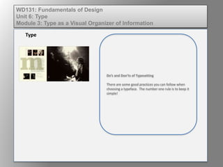
- 1. Do’s and Don’ts of Typesetting There are some good practices you can follow when choosing a typeface. The number one rule is to keep it simple! Type WD131: Fundamentals of Design Unit 6: Type Module 3: Type as a Visual Organizer of Information
- 2. 1. Avoid mixing too many fonts and styles of type. WD131: Fundamentals of Design Unit 6: Type Module 3: Type as a Visual Organizer of Information
- 3. 2. Be consistent. Do not set the point size to fit available space. Use a consistent size and adjust leading, tracking, or the line length to fit. WD131: Fundamentals of Design Unit 6: Type Module 3: Type as a Visual Organizer of Information
- 4. 3. Use type in upper case and lower case. WD131: Fundamentals of Design Unit 6: Type Module 3: Type as a Visual Organizer of Information
- 5. 4. Keep the body copy for reports and books to 12 points or less. Try not to use a body copy of less than 9 points. This small size is considered difficult to print and hard to read and is just for text that is deceptive in nature. WD131: Fundamentals of Design Unit 6: Type Module 3: Type as a Visual Organizer of Information
- 6. 5. Keep line lengths short. WD131: Fundamentals of Design Unit 6: Type Module 3: Type as a Visual Organizer of Information
- 7. 6. Limit headlines to not more than five words. WD131: Fundamentals of Design Unit 6: Type Module 3: Type as a Visual Organizer of Information
- 8. 7. Limit the body copy to not more the 64 characters in a line. WD131: Fundamentals of Design Unit 6: Type Module 3: Type as a Visual Organizer of Information
- 9. 8. Avoid using too big a point size for the body copy. A small size with more leading is better for readability. WD131: Fundamentals of Design Unit 6: Type Module 3: Type as a Visual Organizer of Information
- 10. 9. Investigate and use proven and accepted typefaces. WD131: Fundamentals of Design Unit 6: Type Module 3: Type as a Visual Organizer of Information
- 11. 10. Develop typeface favorites for specific uses and utilize them until you are experienced enough to experiment. WD131: Fundamentals of Design Unit 6: Type Module 3: Type as a Visual Organizer of Information
- 12. 11. Avoid distorting typeface using software programs. Use the italicized, bold, condensed, and expanded fonts and not the “fake” fonts that are created when you press CTRL+B to make the text bold. WD131: Fundamentals of Design Unit 6: Type Module 3: Type as a Visual Organizer of Information
- 13. 12. Use lots of white space. However, do not overuse. WD131: Fundamentals of Design Unit 6: Type Module 3: Type as a Visual Organizer of Information
- 14. 16. Be sensitive to balance, creativity, and readability. WD131: Fundamentals of Design Unit 6: Type Module 3: Type as a Visual Organizer of Information