FULL ENJOY - 9953040155 Call Girls in Mahipalpur | Delhi
adadDouble pages spread analysis
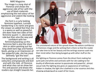
1. NME Magazine
The image is a long shot of
Florence and shows the
aggressive side of her with the
use of black materials
emphasising the red colour of her
aggressive and violent like looking
hair
the font is a curly looking
feminine typeface, Lucinda
handwriting is its name and gives
the viewer an added feel that she
is a woma as well as powerful,
she does have two sides of her
feminine quaint ==, decorative
side but then also the sexy and
confident with her
femininity,backing uo this
feminine feel is also the short
skirt or attire pointing out her
long sleek bare legs and heeled
boots, giving us an impression of
her powerful side, she has most
definetly “got the love”.
The background and writing is all
colourless and grayscale and dull
and with the reds of Florence
and what shes sat on show her
fire and passion and draws the
readers eye straight towards her.
The uncluttered nature of the spread shows the editors confidence
in Florences image and the writing that is there so that the reader
can take time to let her beauty and the writings essence soak into
their mind rather than being bunged up with other stuff on the
page.
the lighting on Florence comes from the direct front making her
quite pale and white and contrasts with her skin adding to her
duality of effeminate woman to passionate and powerful , almost
sexual reds.The lighting also gives an appearance of nothing is
hidden in shadow, the light she is bathed in is her essence and shes
showing and giving all as a part of her music.
2. Linking to the ‘’Gospel according to…’’ the article is set like the ten commandments under different headings
of ‘’Thou shalt…’’, aswell as that suprislingly little profanity is used aswell as the archaic religious language
such as ‘’Thou shalt’’ draws the attention of the audience due to the alternative methods used to most of
Nicki Minajs releases in the media.
The style of this page is interesting because it isnt settoo heavily structured, it has lines of text in columns but
they are aligned to the left and their isnt an average length of the paragraphs and the paragraphs on the
right of the page form around Minaj’s body, presenting her free willed body from having the text move in
a variety of ways around the page.
The colour scheme is in bright pinks and bold blacks to establish the artist aswell as linking her to her
album’pink Friday’ and gives off a colourful and more individual personality and approach in the readers
eyes.
Nicki’s pose , makeup
and facial expression
also draws in people by
seeing her individual
style you can tell she is a
one of a kind
exceptional artist
bringing in a new
perspective into hip
hop.Her off centre
position shows her
domination of the page
and the readers eyes on
both sides of the page,
much like how she is
dominating the music
market at the time
being.
3. Very large L takes
up an entire
page.Links to Gagas
name(Which is also
the first word in the
article) and
replicates the Q’s
font , colour and
logo.
Lady Gagas name is the
title of the page.The fonts
used in the title show the
duality of gaga, Lady is in
fancy scripture, in lower
case showing her
femininity and classyness
but then the larger
CAPITAL GAGA showing
her emphasis and
outlandishness compared
to many other artists.
2 Drop capitals strangely in the
middle of the article
Sexual photo of Lady
Gaga to attract the
male eye because
she is clad very
thinly and barely
covers her breasts
with her hands.
Grayscale colour
scheme to look
more classy and
vintage with the red
contrasting this dull
effect and picking up
more attention from
the reader.