Industry analysis tool 2.0
•
0 likes•38 views

This document summarizes a financial performance analysis tool that allows users to: 1) Compare a target company's operating and working capital performance to industry benchmarks and peer companies through tables and graphs. 2) Identify potential improvements in key financial metrics like working capital days, operating expenses, and income statement categories. 3) Select desired improvements to calculate estimated cash benefits and earnings per share impacts from optimizing performance. 4) View historical performance trends over time for the target company and peer group across financial statements and key performance indicators.

Recommended
Recommended
More Related Content
Similar to Industry analysis tool 2.0
Similar to Industry analysis tool 2.0 (18)
Recently uploaded
Recently uploaded (20)
Industry analysis tool 2.0
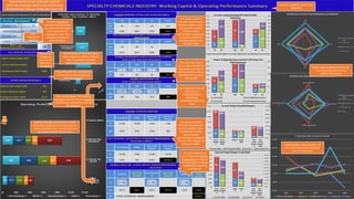
- 1. Overall Benefits are summarized and also converted to potential EPS improvement Identify potential Working Capital improvement for Industry Median, Peer, Top Quartile and Best Demonstrated Performance Analyses is available for all major Industries Spider diagram Quadrant status for both Operating and Working Capital Performance You can also display the potential Summary benefits based on desired improvements selected for P&L and BS categories Company targeted is selected from drop down list, same with four other Peer companies for comparison. Each new selection refreshes all data and charts THIS REPRESENTS THE SUMMARY PAGE OF BOTH THE WORKING CAPITAL AND OPERATING PERFORMANCE FOR ALL COMPANIES SELECTED Identify potential improvement in each of the P&L categories when compared to Industry Median, Peer, Top Quartile and Best Demonstrated Performance This next Table allows you to select the desired improvement in days of working capital as well as displaying the resulting cash benefit This next Table allows you to select the desired improvement in days of working capital as well as displaying the resulting cash benefit The current and Best Potential improvement, based on Median, Peer, Top Quartile and Best Demonstrated performance is displayed for each P&L category in these two Tables The current and Best Potential improvement, based on Median, Peer, Top Quartile and Best Demonstrated performance is displayed in days and dollars for Working Capital in the Top two Tables ALL TABLES ON THE LEFT ALSO HAVE A COMPLIMENTARY GRAPHICAL REPRESENTATION FOR EACH Quick graphical representation of the 5-Year Net Income % Growth for all 5 companies Peer Companies selected Appropriate Weighted Avg. Cost of Capital can be applied
- 2. THIS PAGE DISPLAYS THE SUMMARY TABLE OF THE OPERATING PERFORMANCE FOR THE TARGET COMPANY AS WELL AS INDIVIDUAL COMPARATIVE OPERATIONAL COMPONENTS GRAPHICALLY WITH PEER COMPANIES SELECTED Identify potential improvement in each of the P&L categories when compared to Industry Median, Peer, Top Quartile and Best Demonstrated Performance Potential $ Improvement ALL DATA AND GRAPHS ARE FOR THE FIVE COMPANIES SELECTED FOR THEIR RESPECTIVE YEAR END FINANCIALS FROM 2012 TO 2016, AS WELL AS THE TWELVE TRAILING MONTHS (TTM) This chart displays each component of Operating Expenses as a % of Revenue, as well as the Total Operating Expense for the Target Company This chart displays the number of turns annually for each of major balance sheet category These two charts display the Financial Strength of the Company’s Balance Sheet as well as the ability to cover Debt interest commitments This chart displays each major Income Statement component against Revenue to identify any anomalies based on rate of change, which should track revenue These two charts display the key categories of the Income Statement on a comparative basis against each Peer company as well as a five year history for the Target company
- 3. THIS PAGE DISPLAYS THE SUMMARY TABLE OF THE WORKING CAPITAL PERFORMANCE FOR THE TARGET COMPANY AS WELL AS INDIVIDUAL COMPARATIVE COMPONENTS GRAPHICALLY WITH PEER COMPANIES SELECTED This chart displays each major Working Capital component against Revenue to identify any anomalies based on rate of change, which should track revenue Corresponding $ Improvement Potential Improvement in Working Capital days by component Combined $ Improvement This chart displays the management of Cash generated or expended by the Company including Investments, Financing, Operations as well as the Net change in the cash position This chart identifies the potential working capital improvement ($) to the Industry Median, against Peers selected, Top Industry Quartile and also the Best Demonstrated Performance of the Target company over the past five years This chart compares the number of Net Working Capital days and Dollars ($) being used by each company selected This chart displays the number of Working Capital days used by the target company by specific component This chart displays the individual components of Inventory and Total Inventory relative to COGS, which should track similar paths