7 QC tools to improve quality and productivity
•
1 like•596 views

This document discusses the use of seven quality tools (7 QC tools) to improve quality in industry. It describes each of the 7 tools: check sheets, flow charts, histograms, Pareto charts, cause-and-effect diagrams, scatter diagrams, and control charts. These tools can be used to collect and analyze quality data to identify problems, determine root causes of issues, and monitor processes over time to ensure statistical control. The document asserts that continuous use of these simple quality control tools can improve product quality, enhance employee skills at problem-solving, and help create a quality culture within an organization.

Recommended
More Related Content
What's hot
What's hot (20)
Viewers also liked
Viewers also liked (15)
Similar to 7 QC tools to improve quality and productivity
Similar to 7 QC tools to improve quality and productivity (20)
More from ijsrd.com
More from ijsrd.com (20)
Recently uploaded
Recently uploaded (20)
7 QC tools to improve quality and productivity
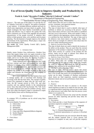
- 1. IJSRD - International Journal for Scientific Research & Development| Vol. 3, Issue 02, 2015 | ISSN (online): 2321-0613 All rights reserved by www.ijsrd.com 59 Use of Seven Quality Tools to Improve Quality and Productivity in Industry Pratik K. Gadre1 Devendra P Jadhav2 Shivraj G Gaikwad3 Anirudh V Jadhav4 1,2,3,4 Department of Mechanical Engineering 1,2,3,4 Smt.Kashibai Navale College of Engineering, Pune, Maharashtra Abstract— The main aim of this paper is to provide the use of 7-Quality Tools (QC) to improve the quality of products in any industry. It included different methods and tools by which some organization can keep check on quality. Some simple techniques like basic Quality Control(QC) provide simple and effective way to improve the quality.The work shows continuous use of these tools upgrades the personnel characteristics of the people involved. It enhances their ability to think generate ideas, solve problem and do proper planning. The development of people improves the internal environment of the organization, Which plays a major role in the total Quality Culture. Key words: QC Tools, Quality Control (QC), Quality Management (QM) I. INTRODUCTION Quality means freedom from deficiencies—freedom from errors that require doing work over again (rework) or that result in field failures, customer dissatisfaction, customer claims, and so on. In this sense, the meaning of quality is oriented to costs, and higher quality usually “costs less.” Today industrial area is developing very fast. Every day new concept and ideas are emerging out with their relevance to industry, along with it the problems concerned with the industrial production, quality and customers are also increasing. It is very difficult but also important to maintain the quality of the product in order to stay in the market and maintain the brand name of the company or firm. QC is more traditional way that business have used to manage quality. QC is concerned with checking and reviewing work that has been done. The concept of quality control first originated in Japan after the 2nd world war. Later, the QC concept moved to USA, UK, and other countries and was applied initially in the manufacturing sector. Since then idea of QC has boosted. The 7 QC Tools are simple statistical tools used for problem solving. These tools were either developed in Japan or introduced to Japan by the Quality Gurus such as Deming and Juran. II. METHODOLOGY In company 95% of problems can be solved using these seven tools. The seven Quality Tools are: 1) Check sheet 2) Flow Charts 3) Histograms 4) Pareto Analysis 5) Cause and effect diagrams(Ishikawa diagram) 6) Scatter Diagram 7) Control Chart A. Check Sheet: Purpose: Check sheets allow the user to collect data from a process in an easy, systematic, and organized manner. 1) Defective Item Check Sheet: This type of check sheet is used to identify what types of problems or defects are occurring in the process. Usually these check sheets will have a list of the defects or problems that may occur in the process. When each sample is taken, a mark is placed in the appropriate column whenever a defect or a problem has been identified. The type of data used in the defective item check sheets is countable data. Table 1 below shows an example of a defective item check sheet for the wave solder manufacturing process. 2) Defective Location Check Sheet: This type of check sheets are used to identify the location of the defect on the product. They are used when the external appearance of the product is important. Usually this type of check sheet consists of a picture of the product On this picture, marks can be made to indicate were defects are occurring on the surface of the product. 3) Defective Cause Check Sheet: This type of check sheet tries to identify causes of a problem of defect. More than one variable is monitored when collecting data for this type of check sheets. For example, we could be collecting data about the type of machine, operator, fate, and time on the same check sheet. 4) Checkup Confirmation Check Sheet: This type of check sheet is used to ensure that proper procedure is being followed. These check sheets usually will have a list of tasks that need to be accomplished before the action can be taken. Examples of checkup confirmation check sheets are final inspection, machine maintenance. Operation checks and service performance check sheets. B. Flow Charts: 1) Purpose: A flow chart shows the steps in a process i.e. the actions which transform an input to an output for the next step. This is a significant help in analyzing a process but it must reflect the actual process used rather than what the process owner thinks it is or wants to be. The differences between the actual and the intended process are often surprising and provide many ideas for improvements. 2) Description: Flow Charts provide a visual illustration of the sequence of operations required to complete a task Fig. 2.1: Pictorial Representation of Flow Chart A pictorial representation of a process is flowchart Fig no.2.1. From the picture one can overview about the inputs and the outputs acquired from it. Every process will require(s) to complete its task, and will provide output(s)
- 2. Use of Seven Quality Tools to Improve Quality and Productivity in Industry (IJSRD/Vol. 3/Issue 02/2015/015) All rights reserved by www.ijsrd.com 60 when the task is completed. For example, an injection molding machine requires inputs in the form of raw material and proper machine settings to be able to produce a proper part. The output of the injection molding process is the finished part. Flow charts can be drawn in many styles. They can be drawn by using picture, engineering symbols, or just squares and rectangles. The, flow charts can be used to describe a single process, parts of a process, or a set of processes. C. Histograms: Purpose: To determine the spread or variation of a set of data points in a graphical form. Fig. 2.2: Histogram D. Pareto Charts: 1) Purpose: The purpose of the Pareto chart is to prioritize problems-to decide what problems must be addressed. No company has enough resources to tackle every problem, so they must prioritize. The purpose of this report is to inform the reader of the Pareto principles and how it can be applied to the manufacturing environment. 2) Pareto Principle: The Pareto concept was developed by the Italian economist Wilfred Pareto describing the frequency distribution of any given characteristic of a population. It is also called as the 20-80 rule. He determined that a small percentage of any given group (20%) account for a high amount of a certain characteristic (80%). The Pareto chart is especially helpful in improving manufacturing processes. 3) Pareto Analysis: Pareto analysis is based on principle of 80-20 i.e. 20% of problem cause 80% of the trouble. Fig. 2.3: Parreto Analysis In above graph, start from 80% on Y-axis and mark point on cumulative graph. Draw a perpendicular on X-axis and identify 20% of causes for 80% of rejections (e.g. A and B in the above fig.). Take care of defects A and B using cause and effect diagram or such tools to reduce rejections. E. Cause-and-Effect Diagram: 1) Purpose: One important part of the process improvement is continuously striving to obtain more important about the process and its output. Cause-and-effect diagrams allow us to do not just that but also can lead us to the root cause or causes of problems. It is a tool that enables the user to set down systematically a graphical representation of the trail that leads ultimately to the root cause of a quality concern or problem. 2) Description: Its basic aim of fish bone diagram is to find out major as well as minor causes of quality problems, under the 4 M approach: Materials, Machines, Manpower and Methods. 1) Manpower: People’s behavior and attitudes. 2) Methods: The way activities are carried out. 3) Machinery: what people work with? 4) Material: what people work on? Fig. 2.4: Cuase Effect Diagram F. Scatter Diagram: 1) Purpose: To identify correlations that might exist between a quality characteristic and a factor might be driving it. Also called: scatter plot, X�Y graph 2) Description: The scatter diagram graphs pairs of numerical data, with one variable on each axis, to look for a relationship between them. If the variables are correlated, the points will fall along a line or curve. The better the correlation, the tighter the points will hug the line. 3) When to Use a Scatter Diagram When you have paired numerical data When your dependent variable may have multiple values for each value of your independent variable When trying to determine whether the two variables are related, such as… When trying to identify potential root causes of problems. After brainstorming causes and effects using a fishbone diagram, to determine objectively whether a particular cause and effect are related When determining whether two effects that appear to be related both occur with the same cause
- 3. Use of Seven Quality Tools to Improve Quality and Productivity in Industry (IJSRD/Vol. 3/Issue 02/2015/015) All rights reserved by www.ijsrd.com 61 When testing for autocorrelation before constructing a control chart. 4) Scatter Diagram Procedure: 1) Collect pairs of data where a relationship is suspected. 2) Draw a graph with the independent variable on the horizontal axis and the dependent variable on the vertical axis. For each pair of data, put a dot or a symbol where the x-axis value intersects the y-axis value. (If two dots fall together, put them side by side, touching, so that you can see both.) 3) Look at the pattern of points to see if a relationship is obvious. If the data clearly form a line or a curve, you may stop. The variables are correlated. You may wish to use regression or correlation analysis now. Otherwise, complete steps 4 through 7. 4) Divide points on the graph into four quadrants. If there are X points on the graph, Count X/2 points from top to bottom and draw a horizontal line. Count X/2 points from left to right and draw a vertical line. If number of points is odd, draw the line through the middle point. 5) Count the points in each quadrant. Do not count points on a line. 6) Add the diagonally opposite quadrants. Find the smaller sum and the total of points in all quadrants. A = point sin upper left + points in lower right B = points in upper right + points in lower left Q = the smaller of A and B N = A + B 7) Look up the limit for N on the trend test table. If Q is less than the limit, the two variables are related. If Q is greater than or equal to the limit, the pattern could have occurred from random chance. 5) Scatter Diagram Example: The ZZ-400 manufacturing team suspects a relationship between product purity (percent purity) and the amount of iron (measured in parts per million or ppm). Purity and iron are plotted against each other as a scatter diagram, as shown in the figure below. There are 24 data points. Median lines are drawn so that 12 points fall on each side for both percent purity and ppm iron. Then they look up the limit for N on the trend test table. For N = 24, the limit is 6. Q is equal to the limit. Therefore, the pattern could have occurred from random chance, and no relationship is demonstrated. Fig. 2.5: Scatter Diagram Example G. Control Chart: Also called: statistical process control 1) Description: The control chart is a graph used to study how a process changes over time. Data are plotted in time order. A control chart always has a central line for the average, an upper line for the upper control limit and a lower line for the lower control limit. These lines are determined from historical data. By comparing current data to these lines, you can draw conclusions about whether the process variation is consistent (in control) or is unpredictable (out of control, affected by special causes of variation). Control charts for variable data are used in pairs. The top chart monitors the average, or the centering of the distribution of data from the process. The bottom chart monitors the range, or the width of the distribution. If your data were shots in target practice, the average is where the shots are clustering, and the range is how tightly they are clustered. Control charts for attribute data are used singly. 2) When to Use a Control Chart: When controlling ongoing processes by finding and correcting problems as they occur. When predicting the expected range of outcomes from a process. When determining whether a process is stable (in statistical control). When analyzing patterns of process variation from special causes (non-routine events) or common causes (built into the process). When determining whether your quality improvement project should aim to prevent specific problems or to make fundamental changes to the process. 3) Control Chart Basic Procedure: 1) Choose the appropriate control chart for your data. 2) Determine the appropriate time period for collecting and plotting data. 3) Collect data, construct your chart and analyze the data. 4) Look for “out-of-control signals” on the control chart. When one is identified, mark it on the chart and investigate the cause. Document how you investigated, what you learned, the cause and how it was corrected. 4) Out-Of-Control Signals: A single point outside the control limits. In Figure 1, point sixteen is above the UCL (upper control limit).
- 4. Use of Seven Quality Tools to Improve Quality and Productivity in Industry (IJSRD/Vol. 3/Issue 02/2015/015) All rights reserved by www.ijsrd.com 62 Two out of three successive points are on the same side of the centerline and farther than 2 σ from it. In Figure 1, point 4 sends that signal. Four out of five successive points are on the same side of the centerline and farther than 1 σ from it. In Figure 1, point 11 sends that signal. A run of eight in a row are on the same side of the centerline. Or 10 out of 11, 12 out of 14 or 16 out of 20. In Figure 1, point 21 is eighth in a row above the centerline. Obvious consistent or persistent patterns that suggest something unusual about your data and your process. Fig. 2.6: Control Chart: Out-Of-Control Signals 5) Continue to plot data as they are generated. As each new data point is plotted, check for new out- of-control signals. 6) When you start a new control chart, the process may be out of control. If so, the control limits calculated from the first 20 points are conditional limits. When you have at least 20 sequential points from a period when the process is operating in control, recalculate control limits. III. CONCLUSION Seven QC tools are most helpful in troubleshooting issues related to quality. It has been observed that by application of seven Quality tools performance of company has improved drastically by 95%. Selection of Quality control technique has influenced three factors: ease of use of technique, ability to measure product specification fulfillment, ability to improve critical quality and productivity problems. Quality tools has important place in data collecting, analyzing, visualizing and making sound base for data founded decision making. The development of quality tools has been successful in providing customers with more consistent and quality products. In short, 7 Quality Tools have proofed to be useful in enhancing the development of industry. REFERENCES [1] Juran J. M., 1974, Quality Control Handbook, McGraw Hill, New York. [2] Walker, H. F and Levesque, J. 'The Innovation Process and Quality Tools', Quality Progress, Vol. 40, No. 7, July 2007, pp. 18/22 [3] Pratik J. Patel*, Sanjay C. Shah**, Sanjay Makwana [Int. Journal of Engineering Research and Applications www.ijera.com ISSN: 2248-9622, Vol. 4, Issue 2( Version 1), February 2014, pp.129- 134 ] [4] Powell, T.C., (1995). Total quality management as competitive advantage: a review and empirical study. Strategic Management Journal, 16(1), 15-27. [5] Oakland, J.S. and Leslie, J.P., (1996). Total Quality Management-Text with Cases, Great Britain, Martins: The Printer.