VIP Call Girls Sonagachi - 8250192130 Escorts Service 50% Off with Cash ON De...
Nme
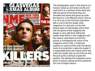
1. The photography used in this picture is a medium close up and looks scruffy and neat which is a contrast of the band and tells the genre of the band they are versatile and shows the genre as indie the layout is a bit different which I like as it is not a lot on the first third side there still is a bit to tell the reader what magazine it is and who is it but this shows signs of individuality which links with the genre of the magazine the design is very well done telling the reader what will be in the magazine and the colours used stand out and the picture is overlapping the name of the magazine which I like, a rhetorical question is used but links with the bands name of a song then it asks the reader if a respectable band are insane which will make the reader pick up and find out and the pull quote is serious at grab the readers. the attitude this magazine cover gives is serious asking serious questions not a lot of bright colours.
2. I really like the photography used in this contents page and gives real meaning it’s a medium close up of a ‘presumed dead member’ and the picture is serious and respectable. The layout is very well used there is a lot of information given but doesn’t look to cramped or no much I like the list of all the bands that are in the magazine and telling the reader where they are and other info on the other side about live gigs and reviews the design is used well there isn't a lot of colour and the little bit of red stand out and make the reader look and read ahead the red is only used on the important bits of info and the page numbers the attitude is very serious as its about a band member who they think is dead but still grabs the attention of the readers
3. The photography used in this picture is a long shot of a band member which looks very serious but is holding a babies head ?? Which will make the readers think and want to read ahead and there is a lot of lighting showing that it is serious and the genre of the band, the colours they are wearing are all dull dark colours with bright sunset colours behind which contrasts with the band and shows that they are indie The layout is very simple the writing revolves around the band which makes them centre of attention. the design has a significant style and colour the style is very trendy and links in well with the band the colour Contrasts with the bands dark colours to make them stand out and make them look not as emoish and more indie rockish music The attitudes given off are a bit different and a bit random very indie but still wanting to make a point and get the reader to listen to what they have to say