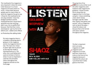
1. The strap line of my magazine is very similar to all the other magazines and I looked at vibe magazine for guidance. I chose to write this to show that my magazine that it is for boys and girls. I chose something urban which I know teenagers will like rather than saying “free games and quizzes” such as magazines such as top of the pops. I chose the colours red because that is the format and colour scheme throughout the magazine. The Bar is important and is on every magazine on single magazine some magazine it is at the back but I chose for it to be on the front of my magazine because it matched the colours ad I just think that it looks good on the front. The masthead of my magazine is very important I chose the name Listen because it is a music magazine and every listens to music. I chose listen because people want to read a listen to what the magazine has got to say. I Chose for the masthead to be very big and bold. I chose the background black and the masthead because I know that it would be very eye catching, I didn’t use a fun or graffiti font because i feel that that is very stereotypical. I got my font of of dafont.com. I added some effects on Photoshop like adding shade. On every magazine there is a headline indicating what is going on in the magazine and on my magazine there is two. The main one I chose to place right next to picture as the way the model is stairing directly at it. The other one is just below but I used an increase in font to show it is just as important. I used the red and white colour thorughout the magazine and also on the front page