The CMO Survey - Highlights and Insights Report - Spring 2024
Media Question 1
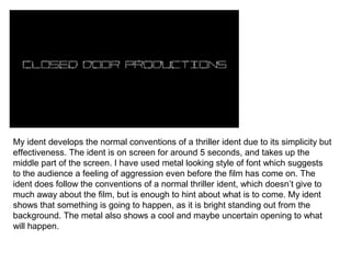
1. My ident develops the normal conventions of a thriller ident due to its simplicity but
effectiveness. The ident is on screen for around 5 seconds, and takes up the
middle part of the screen. I have used metal looking style of font which suggests
to the audience a feeling of aggression even before the film has come on. The
ident does follow the conventions of a normal thriller ident, which doesn’t give to
much away about the film, but is enough to hint about what is to come. My ident
shows that something is going to happen, as it is bright standing out from the
background. The metal also shows a cool and maybe uncertain opening to what
will happen.
2. As soon as the ident has been on screen, we then challenged the normal concept
of which normally the main character is instantly introduced, often in a certain
situation. I challenged this because I wanted the audience to fell confused at the
start, and wanted a un-continuous narrative, which is successfully achieved from
feedback I had. The calm relaxing music and the cuts of a few different piles of
leaves suggests something more thoughtful and a lot deeper than the audience
may have been expecting. Many opening sequences done keep the audience
involved, but I wanted one that would make them think a little more.
3. After this sudden outburst of leaves, the next few shots are of the main character,
which can be identified as a normal person through the colour blue on his jacket.
The man is clearly running for something/someone which may be following the
person. I didn’t want to use a close up at this point as I wanted more questions to
be formed by the viewer. Who is this person? Why is he running? Where is he
running to? All of these questions are formed by the long shot, which keeps the
scene set through the opening shots.
4. At this point, the audience can see the character closer. The introduction of the
other main character, who has only been seen once. The first character, who is
being followed by the man in the grey hoodie, is still running, and in the same
shot, the man in the grey hoodie follows on after him. They can be clearly seen as
the same person, which now suggests to the audience that maybe the people are
in the same place, but at different times. This again keeps them asking questions.
5. A black screen leads to a pan of the person in the grey hoodie. The audience can
tell that this is introducing the next character. I used normal conventions from what
would normally be found in a thriller opening, as the introduction is fast and
sudden. The character music is added, which is tense and bass like music.
6. My media product uses conventions which keep the audience happy yet on edge
to what is going to happen next. The man in the blue is seen again, and the
person In the grey is not seen, which leave the question about who is he, and
keep the audience watching. The extreme long shot shows the character as
scared, which suggest that the other character may be a evil person, or a law
breaker.
7. An over the shoulder shot confirms that the person is looking out for the other, and
the same goes for the other. At this point, I challenged the conventions of a thriller
greatly, as the shot of the O-T-S shot is shown from both the grey and blue
hoodies views. This means that the man in the blue may also be looking out for
someone. This changes the entire narrative and confuses the audience. Now they
don’t know who is good and who is bad. This would not happen in many thrillers
as the plot is easy to follow in them.
8. The character walks behind a tree and comes out the other side as the other
person. This is again not following the normal conventions of a thriller, but creates
a link between the two characters. The character is the same person, and can be
clearly seen. When he comes out the other side, he is wearing another hoodie.
This shows that there is a link to the two characters, but the audience don’t know if
its in the future or the past. This now leavs the audience in suspense to what will
happen next.
9. After all of this hard to follow narrative, the title of the film comes on screen. This
follows the majority of thriller conventions as the font used and the colour
suggests that the narrative continues in the way it has previously been. The use of
white on black again contrasts and suggests that the people in the film. The title
hints very slightly at a crumbling relationship, as the font is, and could mean this in
the context of the narrative.
10. After all of this hard to follow narrative, the title of the film comes on screen. This
follows the majority of thriller conventions as the font used and the colour
suggests that the narrative continues in the way it has previously been. The use of
white on black again contrasts and suggests that the people in the film. The title
hints very slightly at a crumbling relationship, as the font is, and could mean this in
the context of the narrative.