Download as KEY, PPTX


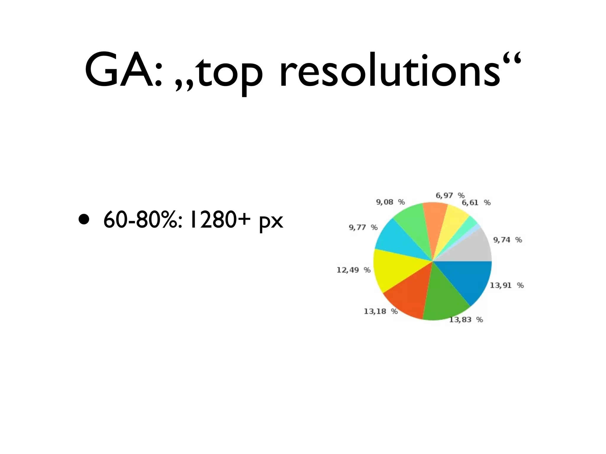
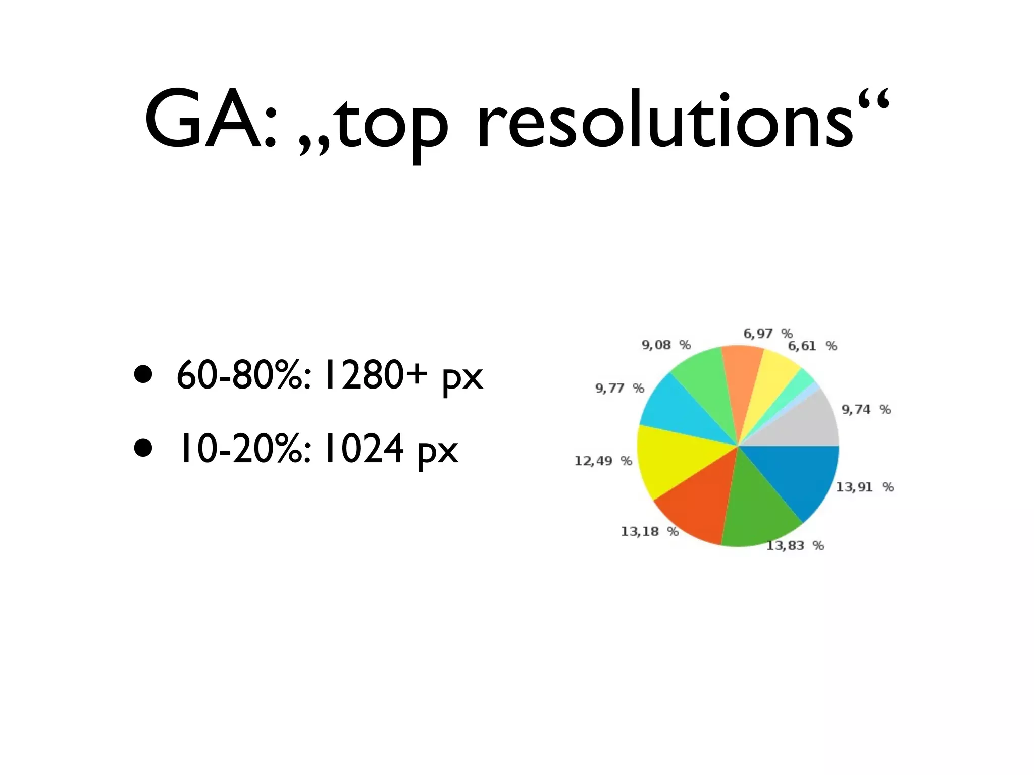
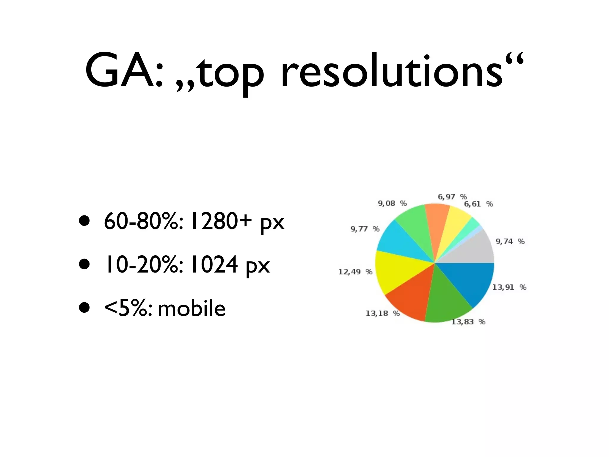
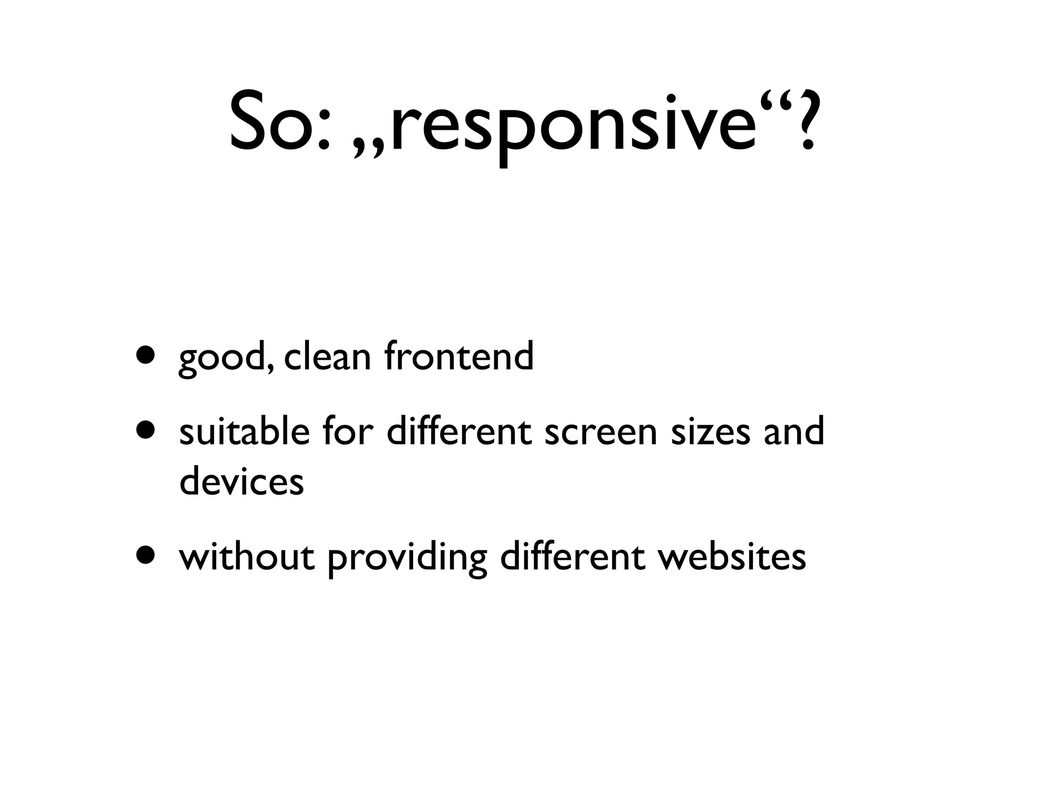


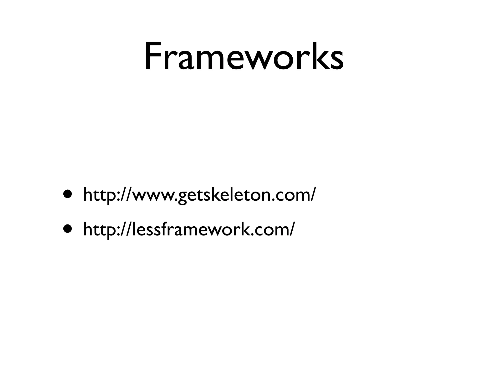
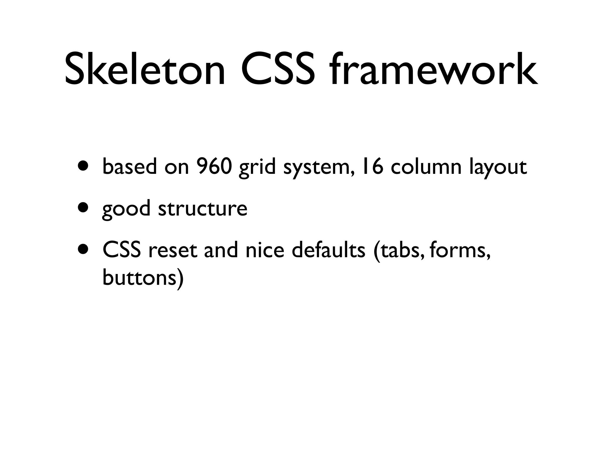
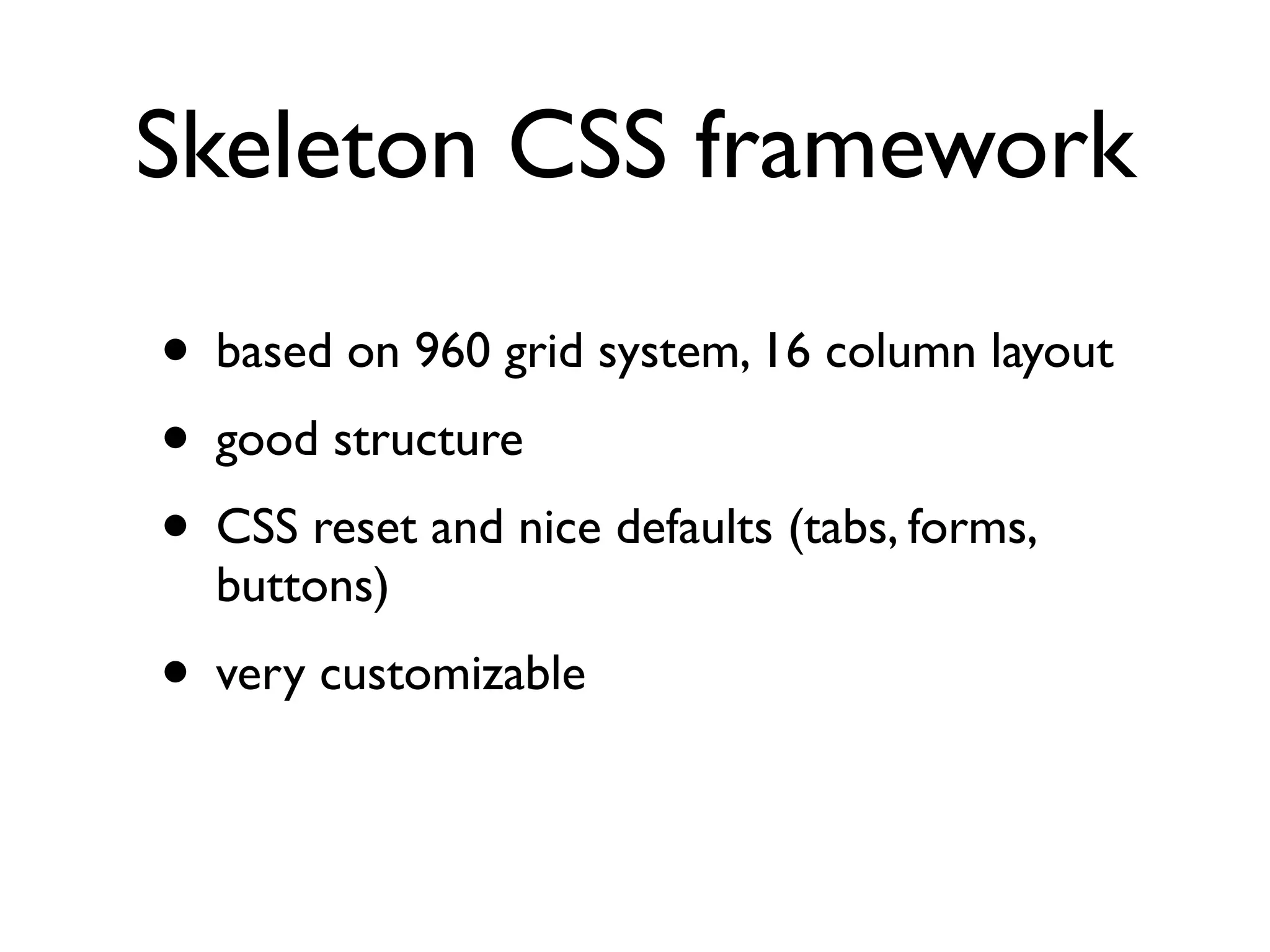
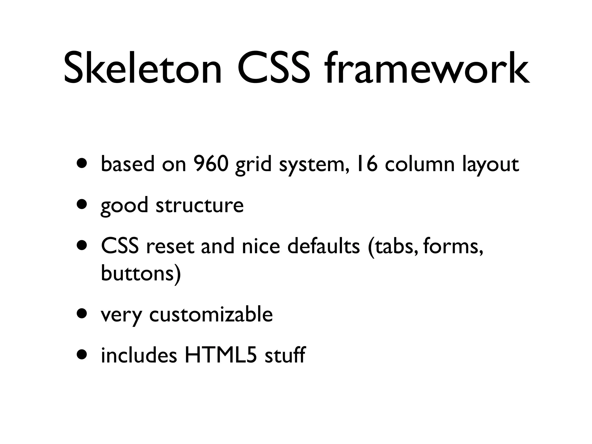


- The document discusses responsive web design, which creates web pages that automatically adjust for viewing on different sized devices without needing separate mobile sites. - It provides tips for responsive design like using elastic images and videos, text columns on wide screens, and removing, reordering or redesigning parts for different screens. - Frameworks like Skeleton are recommended, which use fluid grids and media queries to adapt layouts responsively.


