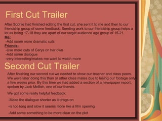
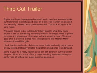
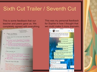
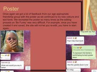
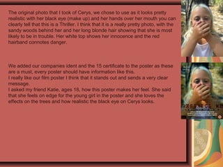
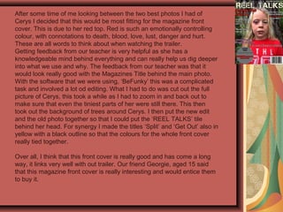
1. First Cut Trailer
After Sophie had finished editing the first cut, she sent it to me and then to our
friendship group of some feedback. Sending work to our friendship group helps a
lot as being 17-18 they are apart of our target audience age group of 15-21.
Me:
-Add some more dramatic cuts
Friends:
-Use more cuts of Cerys on her own
-Add some dialogue
-very interesting/makes me want to watch more
Second Cut Trailer
After finishing our second cut we needed to show our teacher and class peers.
We were later doing this than or other class mates due to losing our footage only
a few weeks prior. By this time we had added a section of a newspaper report,
spoken by Jack Mellish, one of our friends.
We got some really helpful feedback:
-Make the dialogue shorter as it drags on
-Is too long and slow it seems more like a film opening
-Add some something to be more clear on the plot
2. Third Cut Trailer
Sophie and I spent ages going back and fourth over how we could make
our trailer more interesting and clear on a plot. This is when we decided
that we really did need a crazy obsession wall. This took a long time for
us to make.
We asked people in our independent study lessons what they would
expect to see on something as creepy like this. So we got ideas of phone
numbers and addresses, other ways to track someone down. We even
got a snip of Sophie’s blonde hair, linking back to the ‘Masked Mans’
stimulus of blond little girls.
I think that this adds a lot of dynamic to our trailer and really put across a
creepy feeling, that really creates the plot for an audience to understand.
Being in year 13 is really helpful as we can ask others in our year and in
the year below, and some of the younger teaching assistants to help us
as they are all without our target audience age group.
3. Sixth Cut Trailer / Seventh Cut
This is some feedback that our
teacher and peers gave us. We
completely agreed with everything.
This was my personal feedback
for Sophie in how I thought that
we could make it more dramatic.
4. Poster
Once again we got a lot of feedback from our age appropriate
friendship group with the poster as we continued to try new colours and
text fonts. We recreated the poster so many times as the editing
process on ‘Be Funky’ was very difficult. For example, once you have
created it and saved, the site will not let you re-edit, you have to start
again.
5. The original photo that I took of Cerys, we chose to use as it looks pretty
realistic with her black eye (make up) and her hands over her mouth you can
clearly tell that this is a Thriller. I think that it is a really pretty photo, with the
sandy woods behind her and her long blonde hair showing that she is most
likely to be in trouble. Her white top shows her innocence and the red
hairband connotes danger.
We added our companies ident and the 15 certificate to the poster as these
are a must, every poster should have information like this.
I really like our film poster I think that it stands out and sends a very clear
message.
I asked my friend Katie, ages 18, how this poster makes her feel. She said
that she feels on edge for the young girl in the poster and she loves the
effects on the trees and how realistic the black eye on Cerys looks.
6. Magazine
We asked our friends using our group chat on WhatsApp to
help us with any final things that we should change on our
magazine cover.
7. After some time of me looking between the two best photos I had of
Cerys I decided that this would be most fitting for the magazine front
cover. This is due to her red top. Red is such an emotionally controlling
colour, with connotations to death, blood, love, lust, danger and hurt.
These are all words to think about when watching the trailer.
Getting feedback from our teacher is very helpful as she has a
knowledgeable mind behind everything and can really help us dig deeper
into what we use and why. The feedback from our teacher was that it
would look really good with the Magazines Title behind the main photo.
With the software that we were using, ‘BeFunky’ this was a complicated
task and involved a lot od editing. What I had to do was cut out the full
picture of Cerys, this took a while as I had to zoom in and back out to
make sure that even the tiniest parts of her were still there. This then
took out the background of trees around Cerys. I then put the new edit
and the old photo together so that I could put the ‘REEL TALKS’ tile
behind her head. For synergy I made the titles ‘Split’ and ‘Get Out’ also in
yellow with a black outline so that the colours for the whole front cover
really tied together.
Over all, I think that this front cover is really good and has come a long
way, it links very well with out trailer. Our friend Georgie, aged 15 said
that this magazine front cover is really interesting and would entice them
to buy it.
8. What We Have Learnt From
Audience Feedback
Audience feedback, for A2 was something that we both wanted to improve
and use to gain other opinions throughout the process as opposed to only at
the end. This meant that we left time to gather feedback, to allow us to
improve and be notified of flaws we did not identify ourselves.
Each time we created a cut we aimed to show it to different people to get
multiple opinions. Getting feedback from our class was very useful as they
drew our attention to not just the creative parts but as well the fact that we
didn’t put a realises date in the trailer at all, they also reminded us that we
must have a ident on our film poster. This made everything look slightly more
professional.
When it came to the magazine I found feedback from our target audience
aged friends very useful as it was then that I realised I had actually spelt
something wrong and never noticed it. It took someone reading it for the first
time to fully clock on to the error.
Not only did we get audience feedback for the main products as a whole but
also from things such as; the company name and the trailer name. This
feedback came from ages 15-21, this meant from the start we were already
appealing to our target audience.