
Recommended
More Related Content
Similar to LPGA BrandON
More from fspopp
LPGA BrandON
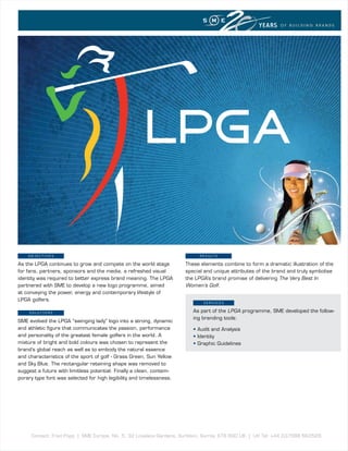
- 1. YEARS OF BUILDING BRANDS OBJECTIVEs R E s u lT s As the LPGA continues to grow and compete on the world stage These elements combine to form a dramatic illustration of the for fans, partners, sponsors and the media, a refreshed visual special and unique attributes of the brand and truly symbolise identity was required to better express brand meaning. The LPGA the LPGA’s brand promise of delivering The Very Best In partnered with SME to develop a new logo programme, aimed Women’s Golf. at conveying the power, energy and contemporary lifestyle of LPGA golfers. sERVICEs sOluTIOns As part of the LPGA programme, SME developed the follow- ing branding tools: SME evolved the LPGA “swinging lady” logo into a strong, dynamic and athletic figure that communicates the passion, performance • Audit and Analysis and personality of the greatest female golfers in the world. A • Identity mixture of bright and bold colours was chosen to represent the • Graphic Guidelines brand’s global reach as well as to embody the natural essence and characteristics of the sport of golf - Grass Green, Sun Yellow and Sky Blue. The rectangular retaining shape was removed to suggest a future with limitless potential. Finally a clean, contem- porary type font was selected for high legibility and timelessness. Contact: Fred Popp | SME Europe, No. 5, 32 Lovelace Gardens, Surbiton, Surrey, KT6 6SD UK | UK Tel: +44 (0)7588 663528