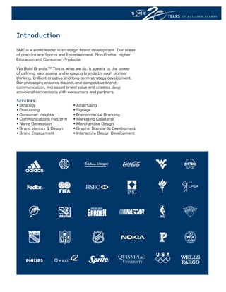
1. YEARS OF BUILDING BRANDS
YEARS
OF BUILDING BRANDS
2. YEARS OF BUILDING BRANDS
Introduction
SME is a world leader in strategic brand development. Our areas
of practice are Sports and Entertainment, Non-Profits, Higher
Education and Consumer Products.
We Build Brands.™ This is what we do. It speaks to the power
of defining, expressing and engaging brands through pioneer
thinking, brilliant creative and long-term strategy development.
Our philosophy ensures distinct and competitive brand
communication, increased brand value and creates deep
emotional connections with consumers and partners.
Services:
• Strategy • Advertising
• Positioning • Signage
• Consumer Insights • Environmental Branding
• Communications Platform • Marketing Collateral
• Name Generation • Merchandise Design
• Brand Identity & Design • Graphic Standards Development
• Brand Engagement • Interactive Design Development
3. YEARS OF BUILDING BRANDS
OUR PROCESS: BrandONTM
About BrandON ™
BrandON is a complete brand transformation solution, which enables
an enterprise to unleash the power of their brands through a highly
focused development programme.
The Benefits of BrandON ™
• Unifies the brand
• Builds brand equity
• Aids in corporate culture change
• Creates long term positioning
• Deepens affinity among fans and partners
• Shapes sales and marketing strategies
How Brand-ON Works
1. Define
• Market Insights
• Executive Interviews & Workshops
• Summary of Analysis
• Brand Strategy & Tactics
2. Express
• Brand Communications Platform
• Creative Design Execution
• Identity/Look & Feel
• Brand Guidelines
3. Engage
• Brand Roll-Out Strategy
• Internal & External Campaign Development
• Benchmarking & Measurement
• Ongoing Consultation
“SME’s Brand-ON solution completely transformed the Detroit
Pistons organization – on court, with our staff and most
importantly, in the hearts and minds of our fans and partners.
4. YEARS OF BUILDING BRANDS
IN THE SOUL OF OUR CLUBS
IN THE SONGS OF OUR FANS
IN THE HEARTS OF OUR PLAYERS
IN THE WILL CHAMPION
OF A
IN THE WORDS T H A T U N I T E
Football. Football.
Fútbol. Soccer.
Fútbol.
S o c c e r.
OBJECTIVEs The resulting creative expression – Football. Fútbol. Soccer. –
Major League Soccer partnered with SME to develop a strategic galvanises all fans, and succinctly conveys the inherent ambitions
branding and communication campaign that positions the league and emotional aspirations of the game.
as the North American dialect of the World’s Game.
sERVICEs
sOluTIOn
SME partnered with Major League Soccer to develop a brand
SME developed a deeply engaging programme that unites all of
positioning that aligns the league with the international
MLS – teams, fans, partners and players – under one brand
passion and spirit of the sport:
statement, heightening esteem and awareness across the nation
and the globe. Through a comprehensive research study to better • Brand Positioning
understand how the MLS brand is perceived, its affinity drivers • Campaign Naming
and its aspirations for the future, SME identified the essential • Campaign Identity
points of differentiation for MLS. • Look Tools Kit
• Print Advertising
R E s u lT s
• Graphic Standards Guide
SME established the essence of MLS as one that communicates • Broadcast Advertising Bed
the sport as everyone’s game – a beautiful game that is simple
and pure. The MLS positioning reinforces the notion that the
game connects each of us to one another and to the world –
fan-to-fan, player-to-player, club-to-club and country-to-country.
Contact: Fred Popp | SME Europe, No. 5, 32 Lovelace Gardens, Surbiton, Surrey, KT6 6SD UK | UK Tel: +44 (0)7588 663528
5. 2006 FIFA World Cup Germany™ Official Mascot
2006 FIFA World Cup Germany™ Official Mascot
GOLEO VI
GOLEO VI
LE
LEO
OBJECTIVEs R E s u lT s
GOLEO is the official mascot of the 2006 FIFA World Cup Germany. GOLEO exceeded all expectations for commercial success for FIFA
He is a clumsy 8’ tall lion that loves kids and thinks he is a better and the partners.
footballer than he actually is. GOLEO speaks several languages and
carries around his “side-kick”, Pille (German slang for football). FIFA
Marketing engaged SME to extend GOLEO beyond his physical cari- sERVICEs
cature so that he would resonate better with a younger fan base. • Brand & Merchandise Strategy
• Identity
sOluTIOn • Characterisation
Understanding the multitude of applications across a myriad of • Brand Extension
commercial categories, including sponsorship, broadcast and • Graphic Standards Guidelines
licensing; SME graphically represented GOLEO as he appears in
costume, in 16 different football poses. Additionally, SME created
the “GOLEO Self Portrait” line – a variety of fun, cool doodles drawn
in a GOLEO’s own hand.
Contact: Fred Popp | SME Europe | t: +44 (0)7588 663528 | e: fspopp@smebranding.com
6. YEARS OF BUILDING BRANDS
OBJECTIVEs R E s u lT s
To attract fans and partners back to the brand after the cancelled In the past three seasons, the Boston Bruins have become a
2004-2005 NHL season and to develop a new long-term position- transformed organisation both on and off the ice. The 08/09
ing based on the notion of teamwork, home, tradition and loyalty – season has seen record increases in attendance and team
hallmarks of the Boston Bruins brand. performance.
sOluTIOn
The Boston Bruins engaged SME to develop The Hub of Hockey sERVICEs
brand campaign, a compelling platform reflecting the team’s rich In developing a more consistent, concise, and effective brand for
heritage and placing the Boston Bruins brand at the epicentre of Boston Bruins, SME employed the following services:
all things hockey in New England. The Hub of Hockey is scalable to
grass roots and youth initiatives, to high school/collegiate hockey, • Strategy & Tactics
to NESN, the Bruins’ RSN, and to partner activation opportunities. • Consumer Insights
The Hub of Hockey was inspired by the words of Oliver Wendell • Campaign, Tagline, Look and Feel
Holmes, “Boston is the hub of the universe.” The campaign’s visual • Print, Television, Radio and Interactive Advertising
expression was influenced by the patriotic spirit of those words, • Stakeholder Engagement
intensifying the emotional bond for fans and making the brand a • Graphic Standards and Guidelines
destination of the heart.
Contact: Fred Popp | SME Europe, No. 5, 32 Lovelace Gardens, Surbiton, Surrey, KT6 6SD UK | UK Tel: +44 (0)7588 663528
7. YEARS OF BUILDING BRANDS
KASEYKAHNE
KASEY KAHNE
THE MAN • THE RACER • THE TEAMMATE
OBJECTIVEs he’s driving 150 mph in the Budweiser/Richard Petty Motorsports
Professional racecar driver Kasey Kahne is a new force on the Number 9 Car, fishing, or putting time into his charitable founda-
NASCAR landscape. In an effort to effectively communicate brand tion, Kasey Kahne is indeed Driven – by strong American values
essence for the Kasey Kahne partnership brand – Budweiser, and a powerful will to simply be the best.
Richard Petty Motorsports and Kasey Kahne – SME was engaged
R E s u lT s
to better define the brand for fans, partners and sponsors.
Kasey Kahne is now positioned for maximum growth with fans,
sOluTIOn partners and sponsors through advertising, point of sale and
SME led a comprehensive consumer analysis that included focus social media channels.
groups and on-track research identifying current fan perceptions.
This helped guide the creation of an effective positioning, allowing sERVICEs
all partners to activate Kasey’s values, attitude and ethics; thus
In developing a more consistent, concise, and effective brand
creating deeper, longer term connections. The overarching
for Kasey Kahne, SME employed the following services:
positioning, Driven, expresses exactly what the Kasey Kahne
brand stands for: Integrity, Intensity and Excellence. • Consumer Insights
• Strategy & Tactics
Driven is supported by a three-part communications platform: • Communications Platform
Kasey Kahne The Man, The Racer, and The Teammate. As The • Campaign, Tagline, Look and Feel
Man, Kasey is an accomplished outdoorsman and thrill seeker; • Activation Guidelines
as The Racer, Kasey is a world-class driver, intense and competitive;
as The Teammate, Kasey is giving, caring, and humble. So whether
Contact: Fred Popp | SME Europe, No. 5, 32 Lovelace Gardens, Surbiton, Surrey, KT6 6SD UK | UK Tel: +44 (0)7588 663528
8. YEARS OF BUILDING BRANDS
Celebrate THE QUEST!
OBJECTIVEs R E s u lT s
As the first professional league in American sports history to The results identified and defined the NHL’s brand strengths
cancel an entire season due to labour strife, the NHL faced a and provided the league with the tools to guide the brand into
strenuous road in its return to ice. Before the lockout, declining a new era.
game attendance, television ratings, sponsor support, revenue,
and franchise values weakened one of America’s top four leagues
in the face of serious competition from sports such as NASCAR, sERVICEs
MLS and the Arena Football League. SME was contracted to As part of the NHL, SME developed the following
help the NHL define its brand and prepare for its return to the branding tools:
ice and beyond.
• BrandON™ Workshop and Report
sOluTIOn • Consumer Research
• Executive Interviews
A comprehensive brand audit was conducted including executive
• Executive Workshop
interviews with NHL management and fan focus groups. SME
• Positioning
developed a platform anchored by the core values of the league:
• Values, Dimensions, Essence
passion, toughness, courage, sacrifice, honour, team, respect,
• Brand Values
and commitment. The brand positioning culminates in a creative
• Brand Communications Platform
expression conveying the collective emotion of all fans and
• Brand Identity Consultation
players as they travel on a season long pursuit for Lord Stanley’s
• Flash-based sales tool
Cup. Celebrate the Quest! is the embodiment of this spirit.
Contact: Fred Popp | SME Europe, No. 5, 32 Lovelace Gardens, Surbiton, Surrey, KT6 6SD UK | UK Tel: +44 (0)7588 663528
9. YEARS OF BUILDING BRANDS
OBJECTIVEs R E s u lT s
As the LPGA continues to grow and compete on the world stage These elements combine to form a dramatic illustration of the
for fans, partners, sponsors and the media, a refreshed visual special and unique attributes of the brand and truly symbolise
identity was required to better express brand meaning. The LPGA the LPGA’s brand promise of delivering The Very Best In
partnered with SME to develop a new logo programme, aimed Women’s Golf.
Golf
at conveying the power, energy and contemporary lifestyle of
LPGA golfers.
sERVICEs
sOluTIOns As part of the LPGA programme, SME developed the follow-
ing branding tools:
SME evolved the LPGA “swinging lady” logo into a strong, dynamic
and athletic figure that communicates the passion, performance • Audit and Analysis
and personality of the greatest female golfers in the world. A • Identity
mixture of bright and bold colours was chosen to represent the • Graphic Guidelines
brand’s global reach as well as to embody the natural essence
and characteristics of the sport of golf - Grass Green, Sun Yellow
and Sky Blue. The rectangular retaining shape was removed to
suggest a future with limitless potential. Finally a clean, contem-
porary type font was selected for high legibility and timelessness.
Contact: Fred Popp | SME Europe, No. 5, 32 Lovelace Gardens, Surbiton, Surrey, KT6 6SD UK | UK Tel: +44 (0)7588 663528
10. l a gal axy: i l l u m i n a t i n g t h e f u t u r e o f a m e r i c a n s o c c e r
YEARS OF BUILDING BRANDS
The stars are shining brightly for MLS’ LA
Galaxy. The long-awaited arrival of superstar
David Beckham ushers a new era for profes-
sional soccer in North America, elevating the
team from national relevance to international
recognition as “America’s International
Superclub Brand”.
To express the dramatic shift in LA Galaxy
brand positioning and culture, SME was
contracted to create a compelling brand
identity that reflects the team’s new position-
ing. Working in collaboration with AEG senior
management and adidas, SME developed an
iconic yet timeless emblem that embraces
the world’s game and features a “quasar”
as the central graphic element, as well as a
prominent representation of city initials. The
LA Galaxy’s new dynamic brand colours are
deep blue, gold and white. The new look will
lead the brand into an unprecedented future,
and will surely come to symbolise the historic
moment when American professional soccer
began to truly compete on the world stage. PRIMARY MARK WORD MARK
“A Quasar is the heart of a galaxy generating
incredible light and energy. Our crest shows
a Quasar shining brightly in a deep blue
California sky. It illuminates the initials “LA”,
used globally to refer to our City of Angels.
The colour gold honours the Galaxy’s proud
history and tradition in the Golden State.”
Alexi Lalas,
President and General Manager - LA Galaxy
Services:
Brand Strategy
Brand Identity
Contact: Fred Popp | SME Europe, No. 5, 32 Lovelace Gardens, Surbiton, Surrey, KT6 6SD UK | UK Tel: +44 (0)7588 663528
11. DOLPHIN STADIUM: B r A n D i n g A g l o B A l D e S T i n A T i o n
YEARS OF BUILDING BRANDS
T h e S i T u AT i o n The poSiTioning
identifying a South Florida icon expressing the gateway to the Dream
The first solution: renaming the venue to Dolphin Stadium. Making the
South Florida is home to one of name singular was vital to establishing a brand identity for the venue
the National Football League’s that is separate from that of the team. The brand demanded a life of
its own, with the ability to still bestow its unique characteristics and
premier franchises – the Miami
gateway to
personality upon the properties that play there. Second solution: SME
arrived at a brand identity that is sleek, iconic and timeless, pointing the
Dolphins – a brand ever associ- The organisation forward towards an amazingly bright future and supporting
dream
ated with perfection and the the new positioning - Gateway to the Dream. The brand represents pas-
sage into games and events where this live experience is simply unparal-
endless strive for excellence. leled. And from this sentiment, SME executed a huge array of creative
In addition to serving as the home of this esteemed franchise,
Dolphin Stadium is also home to the Florida Marlins (two-time
the deliverables, expressing the new brand for all things Dolphin Stadium.
The ToolS
WEBSITE
World Series Champions), University of Miami Football and the Building the Brand The ServiceS
FedEx Orange Bowl Championships. Dolphin Stadium has also Armed with the new brand strategy, SME created all the tools
complete coverage
hosted a myriad of renowned national and international events crucial to launching a seamless brand communication program.
SME employed a comprehensive, integrated approach, where
including the Rolling Stones, The Three Tenors and the Monster At the heart of the creative expression was the sleek new identity
every piece of communication, every employee, and every
Truck Series. However, for all of it’s recognition and glory, that speaks to the culture, the excitement, and limitless future of
message exudes the personality of this exciting new brand.
Dolphin Stadium, having experienced several name Dolphin Stadium. The new stadium logo colours evolved from the
changes over the years, was a brand in great need of classic Miami Dolphins palette - identifiable elements that capture
a singular, strategic long-term identity and positioning. the unmatched spirit of the region. Such a brand evolution must Services included:
activate at the internal level, so a major engagement initiative
Integrated Communication Strategy
Dolphins Enterprises enlisted SME to raise the bar was undertaken to effect cultural change within the company. The
Identity Package
and elevate the brand by creating a powerful, ambassadors of one’s brand starts with its people, and in this case,
• Logo Program
iconic identity so that audiences would recognize Dolphin Stadium folks passionately jumped on board.
• Environmental Program
this venue as the epitome of a world-class, South
• Signage and Banners
Florida entertainment experience.
• Partnership Brand System
• Staff Uniforms
T�e C�u� L�vel
• HD Brand Video
SERVICE BRANDING
Digital Asset Management System
The chAllenge
Website Design & Development
capturing the Florida experience and Beyond Premium Seating Sales & Marketing Strategy
South Florida is the most visited place on the planet with 80 million Direct Mail Campaign
tourists a year arriving from all corners of the globe.A diverse place HTML e-campaign
strongly tied to the Latin American culture. A region teeming with Web-based Micro-Site
passionate people looking for their next awe-inspiring experience – Marketing Collateral
whether it is dancing, dining, clubbing, golf, fishing, sunbathing or
swimming. The inherent challenge for this project was to capture
the essence of the region while enhancing the world-class experi-
T h e r e S u lT S
ence for international audiences at the stadium. This charge was
paramount to remaining competitive for fans and partners in a Anywhere and everywhere
landscape of old and new venues continuing to reinvent themselves You simply can’t convey the essence of a brand with sporadic
by providing more and more amenities to fans and partners than execution. You must communicate this messaging at every touch-
ever before. The 85,000 seat Dolphin Stadium is and will continue point imaginable. We immerse guests in the brand experience of
to be, a global sports and entertainment destination. And over the Dolphin Stadium, from where they’re parking, to how they’re greeted,
years it has become Super Bowl Central - site of five Super Bowls in to the foodservice, to their seating process, after every show and
the past twelve years. Additionally, Dolphin stadium has undergone after the game, win or lose. Wherever they turn, they are living the
a $300 million Club Level expansion. So how do you envelop all brand. We engage the guests, delivering the brand promise at every
aspects of a brand that audiences can connect with on motivating stage. And that is the ultimate achievement.
BRAND ENGAGEMENT BOOK
levels, reflect this impressive new expansion, and still deliver the
PREMIUM SALES BROCHURE essence of South Florida?
Contact: Fred Popp | SME Europe, No. 5, 32 Lovelace Gardens, Surbiton, Surrey, KT6 6SD UK | UK Tel: +44 (0)7588 663528
12. YEARS OF BUILDING BRANDS
WHY SME?
Strategic Approach
• ur ability to develop successful brand strategies will help position
O
your organisation for years to come.
Passion
• We love what we do!
Creativity
• Award-winning brand development, strategy and design.
Quality
• The pursuit of excellence drives us.
Service
• ur partnership with you and your organisation is extremely
O
important and this shows in how we care.
Results
• We are a results oriented firm with the goal of exceeding
expectations – your success is our success!
13. YEARS OF BUILDING BRANDS
YEARS
OF BUILDING BRANDS
SME Europe No. 5, 32 Lovelace Gardens Surbiton Surrey KT6 6SD UK
Frederick S. Popp
Managing Director, SME Europe
UK Tel: +44 (0)7588 663528
fspopp@smebranding.com