3. EyeFlow The poster follows conventional
eyeflow, starting at the top right
and following the line of the image
in a “c” shape to the bottom right.
The image takes up the
conventional two thirds of the
page as is a close up.
4. Although this is an international poster, the design techniques it employs are universal
and is evidence of the power of design and image to transcend the language barrier
and still have the same affect of the audience.
IMAGE:
I was attracted to this poster by the use of selective colouring and brightness and
contrast as it makes the distressful subject of the image even more dramatic. The
images washed out white creates an artistic and stylised backdrop for the highlighted
red blood. Red, not only clearly denoted as blood, also has connotations of violence,
corruption and danger which are clearly visible in this distressing image. It is especially
poignant when accompanied by the colour white, with its innocent and pure
connotations being corrupted by the red.
The colour red, when used on the models lips also help to sexualise her and follow
common convention of the representation of women in the media. It is conventional to
make women appear sexually attractive as it appeals to men who would want to be in a
relationship with her and women who would want to look like her. Here however the
image is corrupted by the distressing situation in which the model is in.
Another element contributing to this is the that the darkest part of the picture is in the
black, smudged makeup around the eyes, showing she may have been crying and how
the artificiality of her beauty is corrupted by the emotion of pain.
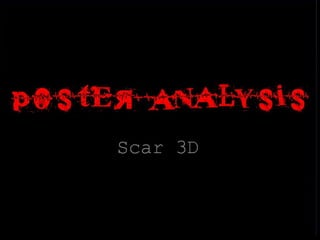
5. FONT:
The font used in the title is very reflected of what is portrayed in the image. It appears
as if etched into a surface and the colour red used, the image and the word itself “Scar”
suggests it has been cut into someone. This is a distressing idea for the viewer to think
about and contributes to the feeling of discomfort that the viewer feels. It makes them
cringe to think of it.
The rest of the text is in a standard, conventional serif font which gives us the key
information clearly and formally. It allows the powerful title font to stand out in
comparison to it, especially as the title and the word “3D” are in such close proximity.
The viewer can see the words clearly but they do not lessen the affect of the title. A
shadow affect is used on the word “3D” to subtly imitate the affect it is advertising.
6. ACTOR CREDITS:
The film features actors that have recently found fame in another well known context.
Therefore, to attract more viewers to the film, the actors previous work is referenced to
under their names. This is often used when an up-and-coming actor is featuring in a
film who not yet a house hold name, but that has a significant credit under their belt.
BILLING BOX:
This is used conventionally, in a very conventional part of the page. The billing box tells
the viewer about all the cast and crew involved in the production, as well as the
producers.
AUDIENCE:
As the cast of the film are young people and the film is set around a graduation, I would
assume that the target audience are young people approximately 16-24. The poster
appeals to this audience with its use of stylised image, as the audience come from a
generation where photo manipulation is fashionable and widely used. Also, the use of
font would appeal to them as young people are less likely to be distressed with the
apparent gory nature of the film that it expresses.
7. ACTOR CREDITS:
The film features actors that have recently found fame in another well known context.
Therefore, to attract more viewers to the film, the actors previous work is referenced to
under their names. This is often used when an up-and-coming actor is featuring in a
film who not yet a house hold name, but that has a significant credit under their belt.
BILLING BOX:
This is used conventionally, in a very conventional part of the page. The billing box tells
the viewer about all the cast and crew involved in the production, as well as the
producers.
AUDIENCE:
As the cast of the film are young people and the film is set around a graduation, I would
assume that the target audience are young people approximately 16-24. The poster
appeals to this audience with its use of stylised image, as the audience come from a
generation where photo manipulation is fashionable and widely used. Also, the use of
font would appeal to them as young people are less likely to be distressed with the
apparent gory nature of the film that it expresses.