HMCS Max Bernays Pre-Deployment Brief (May 2024).pptx
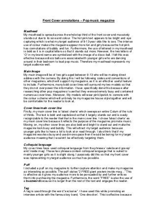
Front cover annotations – pop music magazine
1. Front Cover annotations – Pop music magazine
Masthead
My masthead is spread across the whole top third of the front cover and massively
stands out due to its size and colour. The hot pink text appears to be bright and eye
capturing which is what my target audience of 9-13 year olds like to see. The intense
use of colour makes the magazine appear more fun and girly because the hot pink
has connotations of bubbly and fun. Furthermore, the use of lettered in my masthead
is bold as it is in capital letters so that it stands out more. However, the two letters of
‘O’ in my brand name are symbolized with the image of a disco-ball. I felt this was
effective because disco balls are associated with younger girls who are dancing
around in their bedroom to loud pop music. Therefore my masthead represents my
target audience well.
Main Image
My main image will be of two girls aged between 9-13 who will be making direct
address with the camera. By doing this I will be following codes and conventions of
other magazines, which will support my magazine, as it is an effective useful feature
to include. Furthermore, many bold cover lines will surround my two models so that
they do not over power the information. I have specifically done this because after
researching other pop magazines I saw that they were extremely busy and contained
numerous cover lines. Moreover, My models will wear pink lipstick to connote with
the colour scheme which will untimely tie my magazine house style together and will
be comfortable for the reader to look at.
Cover lines/main cover line
Firstly, my main cover line is ‘latest charts’ which sweeps an entire Colum of the rule
of thirds. The text is bold and capitalized so that it largely stands out and is easily
recognizable to the reader that that is the main cover line. I chose ‘latest charts’ as
my main cover line because it reflects the purpose of the magazine; promote music.
Moving on, my other cover lines are also bold and bright to stand out and make the
magazine look busy and bubbly. This will attract my target audience because
younger girls like to have a lot to look at or read through. I also think that if my
magazine was less busy and used more space then it would be boring for my target
audience meaning that I wouldn’t be effectively targeting them.
Colloquial language
My cover lines have used colloquial language from the phrases ‘celebs and gossip’
and ‘inside mag’. These two phrases contain colloquial language that is suited to
mainly younger girls as it is slight slang. I purposely did this so that my front cover
was representing my target audience as much as possible.
Puff
I included a puff on my magazine to further capture attention and make my magazine
as interesting as possible. The puff states “2 FREE giant posters inside mag…” This
is effective as it gives my audience more to be persuaded by and further entices
them into purchasing the magazine. Furthermore, the word “FREE” is also the use of
a buzzword because it is larger than the rest of the text and engages the reader.
Tag
A tag is used through the word “exclusive”. I have used this while promoting an
interview article with the famous boy band, ‘One direction’. This is effective because
2. it allows the reader to believe they are receiving unique information, which increases
their engagement with the magazine.
Strip/strapline
This is positioned at the bottom of my magazine to give the reader more information
about what will appear inside the magazine.
Pull quotes
I have included a pull quote on the front cover to make my magazine look more
interesting as it implies even celebrities have read it. This is because I have created
a pull quote from the idol Selena Gomez and it says that she loves the magazine.
This will be effective with relation to my target audience as she is someone 9-13 year
old girls would look up to and it would be an honor to read a magazine that she loves.
Therefore the pull quote adds more persuasion.
Colour scheme
My colour scheme consists of different shades of pink and yellow and baby blue.
These three colours have female, girly connotations so my target audience is again
represented. Furthermore, I feel these colours are bright and energetic so my
magazine is portrayed to appear fun and crazy.
Barcode
My barcode is positioned in the lower third so that it does not take up hot spot areas.
I have challenged codes and conventions as I have positioned it to the left instead of
the stereotypical positioning of the right. I did this so that I could use more space and
not make them right side overly crowded. I feel it is more comfortable for the reader
this way as it is not too busy.
Price
The price of my magazine is £1.99. I carefully chose this price because it was the
most popular from my audience research. Therefore I have shown to take on board
audience advice. The price £1.99 is effective because even though it is only a penny
away from £2 it seems so much more cheaper. Therefore the audience is
manipulated into believing it is cheap.