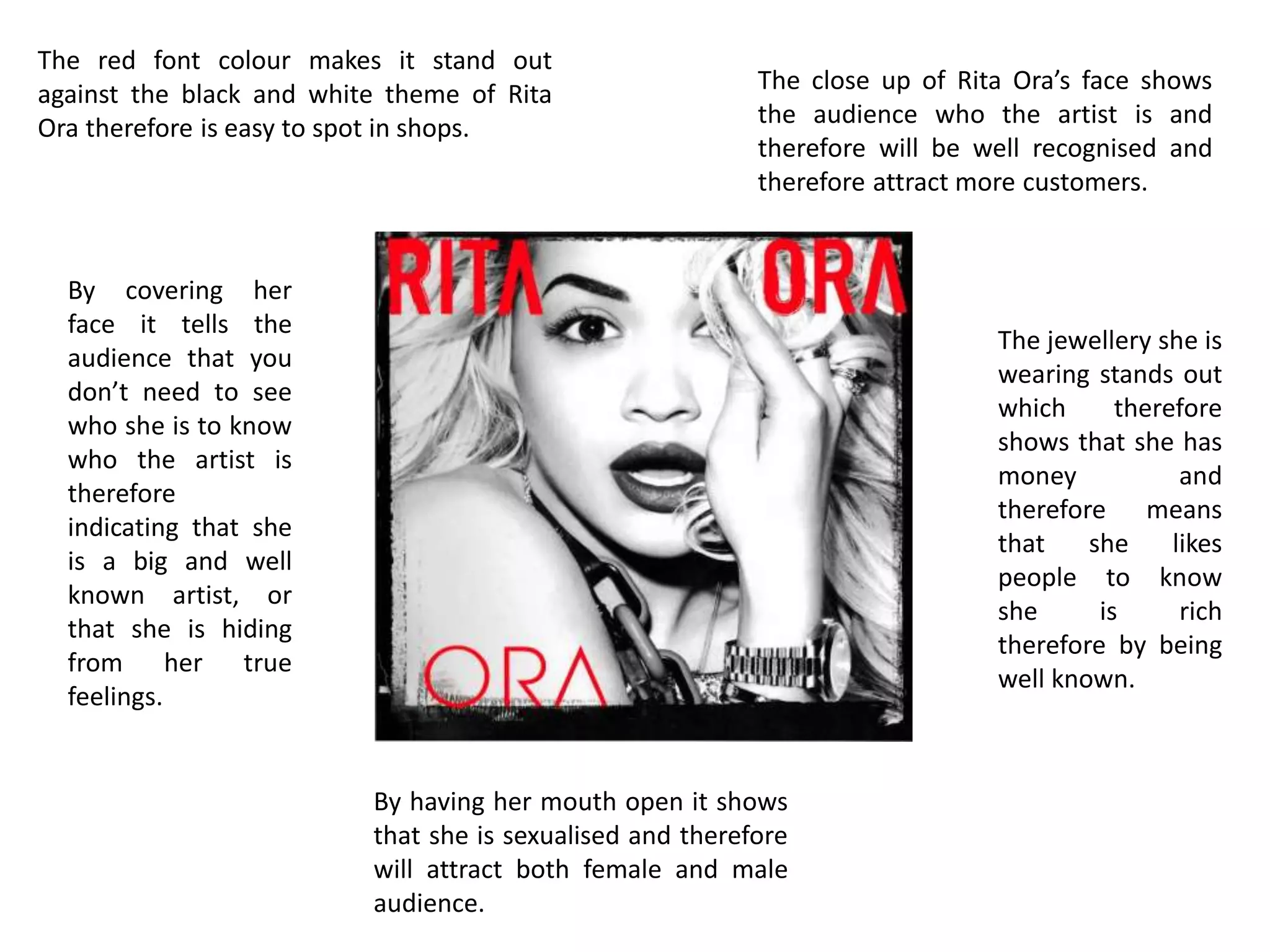
The document analyzes visual elements of an album cover and marketing materials for Rita Ora. It discusses how the red font stands out against the black and white theme, drawing attention. A close-up of Rita Ora's face allows audiences to recognize the artist and potentially attract more customers. The collage of photos suggests she is popular. Elements like song listings and a blown kiss are intended to engage audiences and suggest intimacy, with the goal of increasing album sales.