
Recommended
More Related Content
What's hot
What's hot (18)
Similar to Rita ora
Similar to Rita ora (20)
Recently uploaded
Recently uploaded (20)
Rita ora
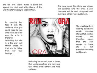
- 1. The red font colour makes it stand out against the black and white theme of Rita Ora therefore is easy to spot in shops. The close up of Rita Ora’s face shows the audience who the artist is and therefore will be well recognised and therefore attract more customers. The jewellery she is wearing stands out which therefore shows that she has money and therefore means that she likes people to know she is rich therefore by being well known. By having her mouth open it shows that she is sexualised and therefore will attract both female and male audience. By covering her face it tells the audience that you don’t need to see who she is to know who the artist is therefore indicating that she is a big and well known artist, or that she is hiding from her true feelings.
- 2. On the back and front of this digipak Rita Ora carries on the black and white theme therefore allows the red coloured writing to attract the audience. The red colour writing can indicate that she is dangerous and therefore she is daring people to listen to her music, or it can symbolise love and intimacy. The collage pictures show that she is popular because it can symbolise that everyone wants to take her photo. By having her songs written on the digipak it attracts the audience as they will know her songs and therefore this will mean that more people want to buy her digipak. By having a close up of her blowing a kiss suggest that she is in love or loves the audience. This is due to a kiss being associated with love and intimacy, therefore this may indicate that she feels close to the audience and her fans.