Download as PDF, PPTX


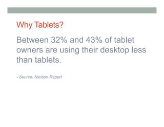


The document discusses best practices for user experience design for tablets. It notes that over 1/3 of Americans own a tablet and tablet owners spend more time on tablets than desktops. The best practices discussed include designing with the context and tasks in mind, filling needs, focusing on core tasks, making search easy, enhancing browsing, using gestures meaningfully, having clear calls to action, reducing typing, designing usable forms, making interactive elements clear, and intuitive navigation. It also discusses usability testing for tablets.