2. Overall, I wanted to
use a similar color
scheme to Q magazine
as it looks
effective, but my final
product varies as my
model has more of a
contrast of color.
Therefore, with each
convention I used on
my product I tried to
keep the color scheme
as close and accurate
as possible to a real
media product, to
make my product look
realistic and effective.
I used this right hand
bar and attempted to
convey the idea onto
my product, but
develop it, so it was
within a different time
period and Rock artists
featured to fit in with
the Rock music genre.
INSPIRATION
I developed the
conventions of Q
magazines, as I made my
‘Rock artist’ have really
dramatic make-up to
produce crazy and
rebellious connotations.
Whereas, in existing
music products, this
effect is quite rare and
hardly used. As with Q
magazine, she has quite
dark and distinctive
make-up. I also
experimented with
Photoshop to produce
various different eye
colours to challenge
various different Rock
conventions.
I used a similar color scheme for the main title, therefore
I used the existing convention of having a main title, with
text of smaller fonts and different colors. Although, I
varied the layout, as I have mine positioned more on top
of the model, as my camera shot was different and I
wanted my models hand to be visible. Whereas, in Q
magazine her hand it above the title, there the main title
is located lower.
I also added a barcode on the bottom right hand side of the page, with a
date and price, as I have conventionally seen this is in various different
Rock magazines, although Q magazine did not do this. Which usually
connotes that the magazine is expensive if it is small and hidden away. I
made the date and price small, as they are not the most important
conventions featured on the front page. I also situated it here as it is
easier to scan when being purchased in the shop therefore it a convenient
location.
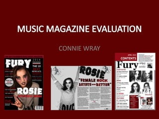
FINAL FRONT COVER
How I challenged
conventions
How I used
conventions
How I developed
conventions
I challenged the
conventions of a real
product, as real
products such as Q
usually have a
background such as a
brick wall, or rain.
Whereas, I went for
a more simple
approach and just
applied a black
background. Allowing
the rest of the
conventions to stand
out clearly and
effectively.
3. INSPIRATION FINAL CONTENTS PAGE
Similarities/Uses
I wanted to apply a similar color
scheme to Q magazine, as well
as a similar layout. Therefore, I
decided to put a grey border
around the white page, to
continue the color scheme used
on the front cover also. I also
overlapped the border with a
red rectangle on the left hand
corner, with the masthead
underneath. I also had to change
the masthead from white to
black for it to fit in which the
color scheme, but I assured it
was the same size and effect.
It is conventional for the title of
the page and the date to be at
the top of the page, as people
read for left to right, from top to
bottom, so it will be the first
thing the readers will be
informed of, as it is of high
importance in reference to the
page.
Differences/Developments
Although I was focusing on Drummer magazine as inspiration for my contents page, I developed a few aspects, such as
adding a subscription section, as throughout my research I have learnt that this is a conventional aspect and a promotional
technique. Therefore, I inserted a couple of photographs from my magazine with prices and details as I have seen in different
magazines. I also added an editors note, which Drummer magazine does not have, I directly addressed the audience to give
the reader a personal feel and connection, as signed it off with my signature which creates even more of a personal touch. As
well, as a small photograph of myself which I also applied the black and white effect on, to make it fit in with the continuous
color scheme that I had been using. With a photograph of myself, the reader feels as if they know the editor, therefore will
feel more of a connection with the magazine itself.
How I challenged
conventions
How I used
conventions
How I developed
conventions
I used the same layout as
Drummer magazine, but re-
arranged it and included
different aspects. I used the
technique of having the
contents down the left hand
side, with article headings. I
also put the main article
photographs really
large, therefore representing
their importance. I also added
a regulars section, as there is
in Drummer magazine, as I
thought this was a good
convention which I could use
on my own. I also added page
numbers (excluding the word
‘page’) as with Drummer
magazine, but I applied it
underneath the photograph
rather than on it, so nothing
was being covered.
I challenged the conventions
of this real media product by
adding four different
photographs of my model
posing in a variety of different
ways, instead of just a few
simple photographs, allocated
apart from each other.
Therefore, I put them all in a
square for effect.
4. INSPIRATION
How I challenged
conventions
How I used
conventions
How I developed
conventions
I positioned my model so she took up half
of the double page spread, as with the this
NME page with Lily Allen, therefore I used
this convention, as the model needs to be
large to produce the connotations of
importance and relevance within the
magazine. Although, I put my model on the
left hand side, as I think it would be more
effective if the audience saw the model
first instead of columns of small text, as it
has more of a visual impact. I also used the
conventions of NME, because their model
is touching the main title, suggesting that
the pull quote has come personally from
them. Therefore, I took this approach and
made my model lean on her
name, therefore it will link all of the
aspects together.
I developed the conventions, as I made my
model black and white, instead of
colorful, as I think with my magazine it
fitted in better with the color scheme. As
my models make up was pink, therefore
this did not necessarily fit in. I also
developed it further, because the make-up
on my model is very dominant and
powerful, whereas in NME, the model has
very little noticeable make-up.
Therefore, this was one of my main
aspects. My model also has dark hair and
dark clothing, which is conventional as Lily
Allen in NME’s article looks similar.
I challenged the
conventions of
NME in
particular, because
they have used
boxed
lettering, with
different shapes
and sizes of letters.
Whereas, I used a
text creator to
create a rock effectof my title and pull quote, I also made them
black and red to fit in with the color scheme.
Although, I have put ‘Rosie’ diagonally which is
also used in NME. Also, in NME the pull quote
overlaps the middle of the page, which I did
not do, I chose the keep all of the text on one
side on the page, so the model would still be a
dominant feature.
I also added the magazine logo and the date
alongside the page number as this is
conventional in Rock music magazines. I only
put the numbers on one side of the page, as
they don’t need to be on both. I also made the
text black, therefore it would fit in with the
rest of the article and the theme of it. I also
made sure that it was located right at the
bottom of the page and in a small text, as it is
not a very important aspect (in comparison to
the title) therefore does not need to be large
or exaggerated.
5. I created a Rock music magazine and I think it uses and developed the codes and conventions of real media products within the Rock magazine
industry, my magazine follows the conventions of Rock magazines I focused on during the research process. I have demonstrated my knowledge of the
industry by using the codes and conventions used in existing music magazines. I have also challenged the forms and conventions of real media
products, as stereotypically, Rock is associated with dominantly males, therefore I challenged this stereotype by focusing particularly on females.
I chose the name Fury, because it produces connotations of Rock, as it is stereotypically known to be an angry and rebellious genre of music. Therefore, the
name is short and easily recognizable and can be linked to the genre of music well. Fury is an emotion, therefore it will provoke emotion in the audience, as
they will know what Rock music is furious, therefore they will be able to relate or recognize the emotion. I developed the masthead, as it looked simple at
first, but then when I looked at real media products, they focused on ensuring the masthead provoked connotations of the Rock music industry, therefore I
used the same forms as this conventions to convey it onto my product, by developing my current idea.
I also continued the color scheme of red, grey, black and white throughout the magazine to create continuity. I used this color scheme as it was one which
was continuous throughout my research. I think it looked effective and was a good way to make particular conventions more visible with the use of
color, standing against the black and white effect. Rock music is stereotypically known to be furious and rebellious, therefore the colors produce
connotations of the genre. As red produces connotations of danger and risk, and black and white are usually the color of the clothing that Rock fans and
Rock artist wear therefore the audience can relate to this. White and grey both connote a fresh and new look, therefore because it is a new magazine it
will need these connotations to be conveyed.
Also, I also used the conventions of these real media products as I
made my article titles and details along the side red and white, which
all of these magazines have. Although, I made my title white with no
background, whereas none of the real media products have taken this
approach. I have followed the conventions of Q magazine and placed
my masthead behind my model, to represent importance.
Within the music industry a large
percentage of Rock magazines have men
featured on them, and in reference to Rock
music, men are stereotypically known to be
more successful and significant in
comparison to women. Therefore, I
challenged the convention by choosing a
female orientated Rock magazine.