Vip Udaipur Call Girls 9602870969 Dabok Airport Udaipur Escorts Service
Magazine cover comparison essay finished
1. Danielle Bridge
Magazine cover comparison essay
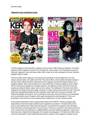
The first magazine I have decided to analyse is issue number 1396 of Kerrang magazine. The target
audience of this magazine is around 15 to 25 years old, mainly males. This is because the genre of
‘Kerrang’ magazine is rock and heavy metal, which is seen as a more male genre of music, therefore
targeted mostly at males.
The house style of this magazine is very strong and noticeable. In every single issue, the main
colours used are black, red, yellow and white. The colours black, red and yellow represent danger or
warning, which reflects the heavy metal genre of the magazine and also the target audience, as it
suggests rebellion. Also, there is always use of sans serif fonts in Kerrang magazine, which implies
that it is informal and targeted at a younger audience. The lettering and text on the front cover are
usually very bold and bright, colours such as red or yellow. The masthead on the front cover of this
magazine runs along the top of the page, and there is a black coloured sans serif font used. There are
white lines intercepting the lettering of the masthead, which looks like it has been smashed. This
reflects the rebellion of the genre, as it is rock/heavy metal. Also, the word ‘Kerrang is onomatopoeia
as it sounds like the noise of a guitar, which again represents the rock/metal genre. There is an
exclamation mark at the end of the masthead which implies that it is loud or being shouted.
In the primary optical area, there is large red text saying ‘HOT SHOTS’, this has purposely been
placed there to catch the reader’s attention and to appeal to an audience. The lead article on this
cover is about Gerard Way of My Chemical Romance, so therefore this magazine issue will attract
fans of this band, and persuade them to buy this issue. There are a number of cover lines on this front
cover; however they are presented in a slightly different way than traditional magazines. These cover
lines have been merged with photographs, for example the photograph of ’30 Seconds to Mars’ has a
cover line underneath it, which states that there will be a section in this magazine in relation to that
2. Danielle Bridge
band. This is a new way to present cover lines, which has been used to attract the audience even
more.
The main image on this front cover does not use the rule of thirds, as Gerard Way has been placed in
the centre of the page. He appears to be wearing a black leather jacket, which is a classic item of
clothing representing rock or heavy metal. His hair is also brightly coloured, and similar to the text, it is
a bold, which stands out from the rest of the cover and looks more appealing. His appearance and
costume establish the genre of the magazine, as he portrays a typical rock/heavy metal act. There are
also other images on the front cover, which have been placed in the terminal area. The artists in the
images look very rock-like through their appearance, costume and facial expressions.
In the weak fallow area, there is a bright, bold yellow circle which includes writing. This has purposely
been placed there to attract the audience, as we do not usually look in this area. The yellow, again,
represents warning, which will draw the readers into reading on.
th
The second magazine cover that I decided to analyse is the 4 February issue of ‘NME’. This
magazine is very different compared to ‘Kerrang’, as it has a different target audience. The target
audience of ‘NME’ is around 16 to 35 year olds, both genders. The genre of this magazine is
Indie/Alternative, which is different to Kerrang’s metal genre.
This magazine looks a lot softer, and less harsh than Kerrang. The colours used are still bright,
however are not as piercing, or give off the impression of danger or warning. The main colours on this
front cover are hot pink and white, but also include hints of yellow. Even though Kerrang’s prominent
colour is yellow, which represents danger, it is very different in this case, as yellow has just been used
to attract the reader, as it is a bright colour. The masthead of ‘NME’ magazine is in a white sans serif
font, similar to Kerrang, however it is located in the primary optical area of the cover, which is the top
left hand side. The font used is extremely bold, and stands out from the rest of the magazine, as it is a
white colour against a grey coloured background. In comparison to Kerrang’s masthead, this one is
not as harsh or rebellious, which makes this magazine look more sophisticated and softer.
The lead article on this cover is ‘Noel Fielding’ which is printed in a large hot pink sans serif font. This
will attract the reader as it is a bright, eye catching colour, and has been used deliberately to draw the
reader in. There is also a model credit underneath which reads ‘in his weirdest interview yet’. This will
persuade people to want to read on, as it is intriguing. This is very different from Kerrang as it actually
gives hints to what the interview may include, however on Kerrang’s cover; it just gives the band
names, which again suggests that this magazine is for a more sophisticated audience. There is also a
quote that has been printed in a bright yellow, hand written font, in which shares a section of his
interview. Readers will see this quote, and may want to read on as it sounds interesting. This quote
has purposely been located in the primary optical area, as this is where the readers look first, so they
will not miss it. There are many other cover lines that are presented in the same way as the lead
article, however in a smaller font size. Again, this is different to Kerrang’s presentation of cover lines,
as they incorporate the image into the cover line, whereas on NME’s front cover, the cover lines are
presented in a more traditional, column format.
The main image that dominates the cover is of Noel Fielding. There is an obvious use of thirds in this
photograph, as his figure intercepts the second and the last third, which is extremely different to
Kerrang, as Gerard Way is photographed in the centre. This adds effect, and it also creates negative
space, in which the cover lines have later been placed. The lighting in this image is quite bright, which
is causing his figure to leave a shadow on the floor, which may represent the indie/alternative genre,
as it is darker. In this image, Noel Fielding appears to be wearing leather pants and a leather jacket,
which is quite similar to that of Gerard Way on Kerrang’s front cover, and implies that he is some sort
of rock act. However, the makeup on his face represents him as quite an old, classic, indie act. Noel
Fielding appears to have a blue face, blue nails and blue shoes. The colour blue is seen as quite a
3. Danielle Bridge
male colour, which is a complete contrast with the hot pink lettering on the cover, which suggests that
this magazine is aimed at both genders, not just one like Kerrang.
Also, in the weak fallow area, there is a bigger font size used, in a hot pink colour, which will draw the
reader’s attention to that section as we do not naturally look there. This is similar to the Kerrang
magazine, as there is use of bright colours there too. However, different from Kerrang, there is a small
image and text in the strong fallow area, which attracts the reader to that section of the cover.
Overall, both magazines are completely different; however there are a few micro aspects that may be
considered similar between the two. Kerrang magazine is much more informal, and has a harsher
house style, and even though NME is aimed at an indie/alternative audience, its house style and
appearance is much softer and formal, which will attract an older audience.