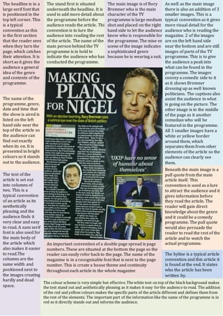
1. The name of the
programme, genre,
date and time that
the show is aired is
listed on the left
hand side near the
top of the article so
the audience can
find out exactly
when its on. It is
presented in bright
colours so it stands
out to the audience.
The headline is in a
large serif font that
is positioned in the
top left corner. This
is a typical
convention as this
is the first section
that the reader sees
when they turn the
page, which catches
their attention. It is
short as it gives the
audience a general
idea of the genre
and contents of the
programme.
The stand first is situated
underneath the headline. It is
used to add more detail about
the programme before the
audience reads the article. This
convention is to lure the
audience into reading the rest
of the article. The name of the
main person behind the TV
programme is in bold to
indicate the audience who has
conducted the programme.
The main image is of Rory
Bremner who is the main
character of the TV
programme is large medium
shot and placed on the right
hand side to let the audience
know who is responsible for
the programme. The mise en
scene of the image indicates
a sophisticated genre
because he is wearing a suit.
As well as the main image
there is also an addition of 3
smaller images. This is a
typical convention as it gives
more visual detail for the
audience who is reading the
magazine. 2 of the images
are on the left hand side
near the bottom and are still
images of parts of the TV
programme. This is to give
the audience a peak into
what can be found in the
programme. The images
convey a comedic side to it
as it shows Bremner
dressing up as well known
politicians. The captions also
assist the audience in what
is going on the picture. The
other image is in the middle
of the page as it another
comedian who will be
featured in the programme.
All 3 smaller images have a
white or yellow border
around them, which
separates them from other
elements of the article so the
audience can clearly see
them.
Beneath the main image is a
pull quote from the main
article itself. This
convention is used as a lure
to attract the audience and it
gives information before
they read the article. The
reader will gain direct
knowledge about the genre
and it could be a comedy
programme. The pull quote
would also persuade the
reader to read the rest of the
article and to watch the
actual programme.
The byline is a typical article
convention and this article it
is found at the end. It states
who the article has been
written by.
An important convention of a double page spread is page
numbers. These are situated at the bottom the page so the
reader can easily refer back to the page. The name of the
magazine is in a recognisable font that is next to the page
number. This is create a house theme and continuity
throughout each article in the whole magazine
The text of the
article is set out
into columns of
two. This is a
typical convention
of an article as its
aesthetically
pleasing and the
audience finds it
very clear and easy
to read. A sans serif
font is also used for
the main body of
the article which
also makes it easier
to read.The
columns are the
same width and
positioned next to
the images creating
hardly and dead
space.
The colour scheme is very simple but effective.Thewhite text on top of the blackbackground makes
the text stand out and aesthetically pleasing as it makes it easy forthe audience to read. The addition
of the red and yellow colours makes the specific parts of the article different and defines them from
the rest of the elements. The important part of the information like the name of the programme is in
red so it directly stands out and informs the audience.