
Recommended
More Related Content
What's hot
What's hot (17)
Similar to Magazine pitch
Similar to Magazine pitch (20)
Recently uploaded
Recently uploaded (20)
Magazine pitch
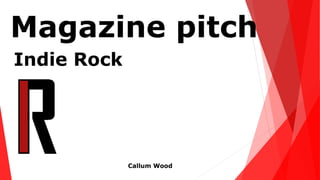
- 2. The logo I have created is easy to remember as it’s a simple logo with the combination of the letter ‘I’ and ‘R’ for indie rock. My music magazine doesn’t have a title as the logo is easily noticeable by others, for example the music magazines ‘Q’ and ‘GQ’
- 3. The three colours I’m using in my music magazine is red, white and black. I have used the colour red as it connotates passion and love towards music and the upcoming genre. I have used the colour black as it connotates mystery and power. The colour white has been used as it connotates light and contrasts with black which will make the magazine stand out. All three colours are commonly used in indie rock magazines which makes its easily noticed by the indie rock community
- 4. The target audience for my music magazine is for the ages 15-21 as the genre of my magazine is indie rock. The target audience was determined through the questionnaire I produced. The gender is quiet even. I will not be targeting one gender as its nearly even and will help sell my magazine as its aimed at a larger target audience by targeting both genders. Indie rock is also for young adults as they don’t like to be mainstream and like everyone else and like to follow new upcoming bands.