SlideShare a Scribd company logo
1 of 2
Task 2 Grid Sheet 2
Now look at the website www.thenationalstudent.com and select a double page
spread to analyse. (P1 M1 D1)
    1. What types of topics are discussed in the magazines and why have they
       chosen these subjects?


Within this particular article there is an in-depth discussion about how to get a job
within social media sector. This is shown from various techniques through question
and answering to engage the audience with various information which may concern
the audience such as “what are the best social formats to look for when
jobhunting?” This is an important area of which the magazine has to cover as they
are making a student magazine which need to provide certain information as all of
students have different tastes and career paths they want to venture in. Whether it
is social media or law and order .Therefore they needed to try and advertise certain
careers that may interest the audience into following this up after reading the
magazine article and apply to when they have finished university looking to get
there career up running within a particular industry. The also discuss various
techniques regarding other careers by getting the experts who have been in the
industry for along amount of time to share their knowledge with those undecided
whether to go in that part of the industry.
    2. How are the images used? What type of meaning are they trying to denote?

The magazine uses simplistic black and white theme for the question and answer
process’s in order to establish the more serious tone of the article which deals with
all the important information regarding the backbone of the subject. They have
included various related tools and symbols in relation to the topic of the article such
as diagrams that shows phones which relates to multimedia which hooks the
audience, as it creates continuity by creating a theme around the social media
which is important that the audience are able to identify the importance of codes
and conventions which are associated within the article and career path of social
media in order to establish what the sector is about which the pictures link in within
the text to showcase this information

The use of arrows add a sense of new direction social media can have on the
reader if they were to use this career as the more read they the article the more in
depth it highlights the advantages and vast career opportunities the social media
can have on some one who chooses this as a career path. There is also a
sarcastic approach through an image of social media for dummies which highlights
how from a beginner you can find out really basic information which will help you
progress throughout the later stages of their career path where this information will
get you where you want. What this image also represents is that it signifies how
easy it is to get into social media if you know the simple procedures i.e twitter and
Facebook the tools you would be using.
   3. What colour scheme is used and why?

Within the first page of the article there are both masculine colours i.e. blue and
feminine colours such as pink to target the both genders to produce a wider range
of the target audience regarding the article which is effective as both colours go well
together and produce an effective title page in introducing the article which is
important to stand out and attract the audience attention into reading the article.
The colour was vibrant yet effective as they were trying to simulate how the career
is interesting and fun to draw people into wanting to explore this as a career choice
has it has some benefits included within the social media career path as
interacting with the target audience. The most important part of the colour scheme
within the article is that a specific theme is being created which is a code and
convention within making any article to hook the audience the white bold text used
within the article is bold and effective to highlight the key important information
behind the pink and blue background colours to make the statements stand out as
they have a great important.
     4. Who is the target audience for the magazine?

The target audience is for students who are undecided what career path the they
are going to choose before or after university .Therefore within the magazine they
talk about important people within the industry who gives tips and guidance to the
students who are interested in going in to particular parts of various industries.
What the magazine also provides is the latest news regarding part of their target
audience which are graduates. The magazine highlights key areas such as
particular job prospects that graduates face and what level of pay they can get
once they have finished .They also try to maintain in the target audience which is
both genders therefore they have to accommodate a wide range of subjects to suit
the audience’s needs.
    5. What do you like or not like about this magazine?

What I liked about the magazine was that colour scheme of yellow ,blue ,white
which made the magazine front cover stand out and be effective which looked
vibrant and eye catching which would hook me into buying the magazine as I like
bright colours. This is also why I liked the magazine article colour scheme as there
is a clear and direct theme being established within the magazine which was
effective and eye catching which made the text stand out. What I also liked about
the magazine front cover and article itself was that the images provided importance
whether it was Jessica Ennis highlighting inspiration to people that hard work create
opportunities and successes whereas within the article the images focused on the
corresponding techniques associated within social media industry which was
effective.

What I didn’t like about the magazine is that the magazine looked a bit amateurish
due to the fact the coverlines looked untidy and not professional as they both
covered the 2 thirds which shouldn’t be covered so the left third should be left
empty due to specific codes and conventions which Mixmag met and made the
magazine look effective. Finally what I didn’t like about the magazine is that
although they didn’t have a barcode there was a large amount of space that needed
to be filled however they didn’t which didn’t make the magazine look or feel
attractive like a Mixmag magazine who take advantage of the empty space.

More Related Content

What's hot (16)

Evaluation presentation q1
Evaluation presentation q1Evaluation presentation q1
Evaluation presentation q1
 
Evalutaion mag
Evalutaion magEvalutaion mag
Evalutaion mag
 
Evaluation nicolle media
Evaluation nicolle mediaEvaluation nicolle media
Evaluation nicolle media
 
AS Media Evaluation Q1 & Q2
AS Media Evaluation Q1 & Q2AS Media Evaluation Q1 & Q2
AS Media Evaluation Q1 & Q2
 
Question 3
Question 3Question 3
Question 3
 
Question 3
Question 3Question 3
Question 3
 
Evaluation question 1
Evaluation question 1Evaluation question 1
Evaluation question 1
 
Unit 30 LO4
Unit 30 LO4Unit 30 LO4
Unit 30 LO4
 
Creative critical reflection
Creative critical reflectionCreative critical reflection
Creative critical reflection
 
As g321
As g321As g321
As g321
 
Evaluation questions
Evaluation questionsEvaluation questions
Evaluation questions
 
Evaluation question 1
Evaluation question 1Evaluation question 1
Evaluation question 1
 
Evaluation question 1
Evaluation question 1Evaluation question 1
Evaluation question 1
 
Evaluation 2 (1)
Evaluation 2 (1)Evaluation 2 (1)
Evaluation 2 (1)
 
Sam titmarsh
Sam titmarshSam titmarsh
Sam titmarsh
 
Media magazine anaylsis
Media magazine anaylsisMedia magazine anaylsis
Media magazine anaylsis
 

Viewers also liked (16)

Respuesta al ruego sobre la mejora del carril bici
Respuesta al ruego sobre la mejora del carril biciRespuesta al ruego sobre la mejora del carril bici
Respuesta al ruego sobre la mejora del carril bici
 
Modul tkj ditpsmk
Modul tkj ditpsmkModul tkj ditpsmk
Modul tkj ditpsmk
 
Hypersphere
HypersphereHypersphere
Hypersphere
 
Salon avec 4 sieges et table basse
Salon avec 4 sieges et table basseSalon avec 4 sieges et table basse
Salon avec 4 sieges et table basse
 
Portugeurea15 (1)
Portugeurea15 (1)Portugeurea15 (1)
Portugeurea15 (1)
 
Wiki
WikiWiki
Wiki
 
resale open in Shankra residency Omaxe city Flats..7503367689
resale open in Shankra residency Omaxe city Flats..7503367689resale open in Shankra residency Omaxe city Flats..7503367689
resale open in Shankra residency Omaxe city Flats..7503367689
 
Initial Ideas
Initial IdeasInitial Ideas
Initial Ideas
 
referencement google
referencement googlereferencement google
referencement google
 
acai berry
acai berryacai berry
acai berry
 
Info
InfoInfo
Info
 
Credit timeline
Credit timelineCredit timeline
Credit timeline
 
Doc
DocDoc
Doc
 
Bloc i llibreta
Bloc i llibretaBloc i llibreta
Bloc i llibreta
 
2013 member nominated trustee notice of election
2013 member nominated trustee notice of election2013 member nominated trustee notice of election
2013 member nominated trustee notice of election
 
8.º curso
8.º curso8.º curso
8.º curso
 

Similar to Task 2 grid sheet 2 (20)

Evaluation for Magazine Cover
Evaluation for Magazine CoverEvaluation for Magazine Cover
Evaluation for Magazine Cover
 
Evaluation
EvaluationEvaluation
Evaluation
 
Factual proposal
Factual proposalFactual proposal
Factual proposal
 
Feedback
FeedbackFeedback
Feedback
 
Evaluation Questions
Evaluation QuestionsEvaluation Questions
Evaluation Questions
 
Evaluation Questions
Evaluation QuestionsEvaluation Questions
Evaluation Questions
 
Evaluation: [School Magazine]
Evaluation: [School Magazine]Evaluation: [School Magazine]
Evaluation: [School Magazine]
 
Creative critical reflection
Creative critical reflectionCreative critical reflection
Creative critical reflection
 
Creative critical reflection
Creative critical reflectionCreative critical reflection
Creative critical reflection
 
Final evaluation
Final evaluationFinal evaluation
Final evaluation
 
Final
FinalFinal
Final
 
Evaluation
EvaluationEvaluation
Evaluation
 
Creative critical reflection
Creative critical reflection Creative critical reflection
Creative critical reflection
 
Creative critical reflection
Creative critical reflection Creative critical reflection
Creative critical reflection
 
Creative critical reflection
Creative critical reflection Creative critical reflection
Creative critical reflection
 
Creative critical reflection
Creative critical reflection Creative critical reflection
Creative critical reflection
 
Creative critical reflection
Creative critical reflection Creative critical reflection
Creative critical reflection
 
Evaluation
EvaluationEvaluation
Evaluation
 
Final
FinalFinal
Final
 
Final
FinalFinal
Final
 

More from btecmedia12 (20)

Edit Decision List
Edit Decision ListEdit Decision List
Edit Decision List
 
Edit Decision List
Edit Decision List Edit Decision List
Edit Decision List
 
Radio Trailer Analysis
Radio Trailer AnalysisRadio Trailer Analysis
Radio Trailer Analysis
 
Questionnaire results
Questionnaire resultsQuestionnaire results
Questionnaire results
 
Contents Page
Contents PageContents Page
Contents Page
 
Student Magazine Project
Student Magazine ProjectStudent Magazine Project
Student Magazine Project
 
Mix Mag Project
Mix Mag Project Mix Mag Project
Mix Mag Project
 
Combined Units
Combined UnitsCombined Units
Combined Units
 
Contents page
Contents pageContents page
Contents page
 
Annotations
AnnotationsAnnotations
Annotations
 
Page 4
Page 4Page 4
Page 4
 
Page 2
Page 2Page 2
Page 2
 
Page 1
Page 1Page 1
Page 1
 
Annotations
AnnotationsAnnotations
Annotations
 
Page 8
Page 8Page 8
Page 8
 
Page 7
Page 7Page 7
Page 7
 
Page 6
Page 6Page 6
Page 6
 
Page 5
Page 5Page 5
Page 5
 
Page 4
Page 4Page 4
Page 4
 
Page 3.docx
Page 3.docxPage 3.docx
Page 3.docx
 

Task 2 grid sheet 2

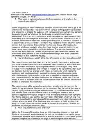
  • 1. Task 2 Grid Sheet 2 Now look at the website www.thenationalstudent.com and select a double page spread to analyse. (P1 M1 D1) 1. What types of topics are discussed in the magazines and why have they chosen these subjects? Within this particular article there is an in-depth discussion about how to get a job within social media sector. This is shown from various techniques through question and answering to engage the audience with various information which may concern the audience such as “what are the best social formats to look for when jobhunting?” This is an important area of which the magazine has to cover as they are making a student magazine which need to provide certain information as all of students have different tastes and career paths they want to venture in. Whether it is social media or law and order .Therefore they needed to try and advertise certain careers that may interest the audience into following this up after reading the magazine article and apply to when they have finished university looking to get there career up running within a particular industry. The also discuss various techniques regarding other careers by getting the experts who have been in the industry for along amount of time to share their knowledge with those undecided whether to go in that part of the industry. 2. How are the images used? What type of meaning are they trying to denote? The magazine uses simplistic black and white theme for the question and answer process’s in order to establish the more serious tone of the article which deals with all the important information regarding the backbone of the subject. They have included various related tools and symbols in relation to the topic of the article such as diagrams that shows phones which relates to multimedia which hooks the audience, as it creates continuity by creating a theme around the social media which is important that the audience are able to identify the importance of codes and conventions which are associated within the article and career path of social media in order to establish what the sector is about which the pictures link in within the text to showcase this information The use of arrows add a sense of new direction social media can have on the reader if they were to use this career as the more read they the article the more in depth it highlights the advantages and vast career opportunities the social media can have on some one who chooses this as a career path. There is also a sarcastic approach through an image of social media for dummies which highlights how from a beginner you can find out really basic information which will help you progress throughout the later stages of their career path where this information will get you where you want. What this image also represents is that it signifies how easy it is to get into social media if you know the simple procedures i.e twitter and Facebook the tools you would be using. 3. What colour scheme is used and why? Within the first page of the article there are both masculine colours i.e. blue and feminine colours such as pink to target the both genders to produce a wider range of the target audience regarding the article which is effective as both colours go well together and produce an effective title page in introducing the article which is
  • 2. important to stand out and attract the audience attention into reading the article. The colour was vibrant yet effective as they were trying to simulate how the career is interesting and fun to draw people into wanting to explore this as a career choice has it has some benefits included within the social media career path as interacting with the target audience. The most important part of the colour scheme within the article is that a specific theme is being created which is a code and convention within making any article to hook the audience the white bold text used within the article is bold and effective to highlight the key important information behind the pink and blue background colours to make the statements stand out as they have a great important. 4. Who is the target audience for the magazine? The target audience is for students who are undecided what career path the they are going to choose before or after university .Therefore within the magazine they talk about important people within the industry who gives tips and guidance to the students who are interested in going in to particular parts of various industries. What the magazine also provides is the latest news regarding part of their target audience which are graduates. The magazine highlights key areas such as particular job prospects that graduates face and what level of pay they can get once they have finished .They also try to maintain in the target audience which is both genders therefore they have to accommodate a wide range of subjects to suit the audience’s needs. 5. What do you like or not like about this magazine? What I liked about the magazine was that colour scheme of yellow ,blue ,white which made the magazine front cover stand out and be effective which looked vibrant and eye catching which would hook me into buying the magazine as I like bright colours. This is also why I liked the magazine article colour scheme as there is a clear and direct theme being established within the magazine which was effective and eye catching which made the text stand out. What I also liked about the magazine front cover and article itself was that the images provided importance whether it was Jessica Ennis highlighting inspiration to people that hard work create opportunities and successes whereas within the article the images focused on the corresponding techniques associated within social media industry which was effective. What I didn’t like about the magazine is that the magazine looked a bit amateurish due to the fact the coverlines looked untidy and not professional as they both covered the 2 thirds which shouldn’t be covered so the left third should be left empty due to specific codes and conventions which Mixmag met and made the magazine look effective. Finally what I didn’t like about the magazine is that although they didn’t have a barcode there was a large amount of space that needed to be filled however they didn’t which didn’t make the magazine look or feel attractive like a Mixmag magazine who take advantage of the empty space.