SlideShare a Scribd company logo
1 of 140
Download to read offline
Rethinking the Mobile Web
                                              a pragmatic look at creating an accessible and inclusive mobile experience


http://www.ļ¬‚ickr.com/photos/fpat/3692425154
we   apps, and...
                       a lovely, location-b
                                           ased,
                          social, photo thing
                                              y...


                       this presentation
                                         is
                        not about these.


http://www.ļ¬‚ickr.com/photos/scobleizer/3985020876
Dinosaurs!


                                   we think the iPad is pretty awesome, but...


http://www.ļ¬‚ickr.com/photos/goincase/4647893507
something is askew...
1.8                 billion
                                       the number of internet
                                       connections in the world today...


26% of the worldā€™s population at the beginning of 2010 ā€“ http://www.internetworldstats.com
6.8             billion
                          the number of people
                          in the world today...


*2009 estimates put the population around 6.79 billion inhabitants...
3.4         billion
                      the number of people
                      with mobile devices today...


 or roughly 1/2 the population of the planet, which is...
itā€™s about people not devices...
so hereā€™s the dilemma...


http://www.ļ¬‚ickr.com/photos/soundman1024/1796003688
"The future is already here ā€“ itā€™s
                                                  just not evenly distributed."
                                                                     ā€“ William Gibson


http://www.ļ¬‚ickr.com/photos/kiwanja/3169447879
no home


                                   Sony Ericsson
                                      w810i


               no iPhone


                                   technology should not only be accessible...


http://www.ļ¬‚ickr.com/photos/walkadog/3093763311
but inclusive...


                                                               iPhone


http://www.ļ¬‚ickr.com/photos/javiercito/2319331695
and available to everyone...


                                                         iPhone


http://www.ļ¬‚ickr.com/photos/pictfactory/2796367140
yes, even this man who
                                                    does not have an iPhone...


                                                      not an iPhone...


http://www.ļ¬‚ickr.com/photos/dopesmuglar/486087009
so, who actually has an iPhone...


http://www.ļ¬‚ickr.com/photos/data_op/2468057934
USA
about 6% US market share...
                                                                                                                US Population: 307 million
                                                                                                                Smartphone penetration: 31% of pop.
                                                                                                                iPhone market share: 21% of smp.
                                 enormous                                                                       Total iPhones in US: 19 million (~6%)
                                 impact


                   low overall
                   penetration


                          The iPhone Reality in Europe: Low Overall Penetration, Enormous Impact
http://moconews.net/article/419-deep-discounts-on-smartphones-drive-u.s.-adoption-rates-to-nearly-a-thi/ and http://www.npd.com/press/releases/press_100510.html
EU5
only 4% EU5* market share...
                                                     enormous                       EU5* = France, Germany, Italy, Spain and United Kingdom
                                                     impact


                                        low overall
                                        penetration


                             The iPhone Reality in Europe: Low Overall Penetration, Enormous Impact
http://www.comscore.com/layout/set/popup/layout/set/popup/Press_Events/Press_Releases/2010/6/The_iPhone_Reality_in_Europe_Low_Overall_Penetration_Enormous_Impact
<4% global market share*

                                   enormous
                                   impact


                 low overall
                 penetration


*I suspect itā€™s actually much less, but ļ¬nding accurate global ļ¬gures is a tad diļ¬ƒcult...
ie: BMW
The ā€most popularā€ devices donā€™t necessarily
     translate to the most used devices.
                          ie: Ford
ā€
                                                   yeah, but those
                                                   devices suck!


http://www.ļ¬‚ickr.com/photos/eldret_99/3311540398
ahem...
the ļ¬rst smartphone in 2003...
          considered
          portable in 1984                   ļ¬ts in your pocket


                                                               still widely used...


                  Released: 1984          Released: 2003
                     CPU: 8 MHz           CPU: 104 MHz
           RAM: 128k (512k max)           RAM: 6 MB
      Storage: 400k (3.5ā€ ļ¬‚oppy)          Storage: 32 MB MMC Card
  Display: 22.9 cm Monochrome             Display: 5.3 cm Thousands of colours
Dimensions: 34.5 x 24.4 x 27.7 cm         Dimensions: 10.9 x 5.8 x 2.4 cm
                  Weight: 7.5 kgs         Weight: 122 g
the music phone in 2008...
again, it was ā€˜portableā€™...?

                                    ...this runs Flash


                                                                               not a feature phone,
                                                                               nor a smartphone...


                             Released: 1998                Released: 2008
                             CPU: 233 MHz                  CPU: 434 MHz
                 RAM: 32 MB (512 MB max)                   RAM: 128 MB
             Storage: 4 GB (+ optical drive)               Storage: 8 GB (16 GB max)
       Display: 38.1 cm Millions of colours                Display: 8.1 cm Millions of colours
        Dimensions: 40.1 x 38.6 x 44.7 cm                  Dimensions: 11.1 x 5.2 x 1.5 cm
                           Weight: 17.3 kgs                Weight: 109 g
the feature phone in 2009...

          smartphone from 2005                              extremely
                                                            popular today...


     still widely
   used today...


                     Released: 2005        Released: 2009
                      CPU: 220 MHz         CPU: 369 MHz
                         RAM: 22 MB        RAM: 30 MB
                      Storage: 64 MB       Storage: 1 GB (16 GB max)
Display: 5.3 cm Thousands of colours       Display: 5.1 cm Thousands of colours
      Dimensions: 10.8 x 5.3 x 2.2 cm      Dimensions: 10.6 x 4.7 x 1.5 cm
                       Weight: 126 g       Weight: 88 g
the smartphone in 2010...

          ...playing ā€œcatch-upā€
                                         raising the ā€œbarā€...


                    Released: 2010     Released: 2010
                     CPU: 680 MHz      CPU: 1 GHz A4 Processor
                      RAM: 256 MB      RAM: 512 MB
       Storage: 16 GB (32 GB max)      Storage: 16 GB (32 GB max)
Display: 8.9 cm Millions of colours    Display: 8.9 cm Millions of colours
   Dimensions: 11.4 x 5.9 x 1.3 cm     Dimensions: 11.5 x 5.9 x 0.9 cm
                      Weight: 135 g    Weight: 137 g
ā€
                                                   ...but folks with those other phones
                                                   simply donā€™t use the Internet.


http://www.ļ¬‚ickr.com/photos/carbonnyc/3369424492
yeah, and grandma
                                                           doesnā€™t do Facebook...  ā€
                                                                   Grandma*


                                                Facebook


http://www.ļ¬‚ickr.com/photos/amagill/304701054
                                                                         *not my Grandma
1.3           billion
                        the number of mobile internet
                        users today...


 ...includes WAP and ā€˜real webā€™ via Tomi Ahonen Consulting
1/3
                   number of global internet
                   users who access the internet
                   only via mobile...


...includes WAP and ā€˜real webā€™ via Tomi Ahonen Consulting
21%      the projected worldwide
         3G penetration in 2010...


  via Morgan Stanley
so, what are they using...
mobile browser market share
                                                                                                     via http://gs.statcounter.com - 02/2010
                                                other?
                                                                                                                      things have changed


                                                                                                                                      skeptical


                                                                                                                      UC ate Nokiaā€™s share...
                                        other?
                                                                   other?


                                                                   note OperaMini...
                                                                                                                                 Blackberry!
             quality + sample size?
Data Source: http://gs.statcounter.com
Published Under a Creative Commons Attribution 3.0 Unported License
You are free to copy, distribute and transmit the work and to adapt the work providing it is attributed to www.icrossing.co.uk

http://www.ļ¬‚ickr.com/photos/icrossing_uk/4342659861
something happened in February...


                                           UC browser...


                                         Nokia browser...


Top 9 Mobile Browsers in China from Sep 09 to Aug 10 | StatCounter Global Stats
               http://gs.statcounter.com/#mobile_browser-CN-monthly-200909-201008
moving forward...

 used in iOS, Android, Palm WebOS, Nokia Qt,                                     primarily used on feature
          Bada, Symbian and new Blackberry...                                    phones supporting Java ME...


                                                        +

                           WebKit                              OperaMini                         Windows Mobile


                                                                    proxy browser...
                                     watch these...
                           lots of new browsers, variation and of course ā€“ legacy browsers


                            ā€œFennecā€             Browser     UC
Obigo                                                                                  SkyFire
                                                   proxy browsers


                       Internet Explorer                     MicroB                     Internet Browser
the importance of WebKit...


                                     open source
                                     licensed under the GNU Library General Public License

                                     excellent standards support
                                     including HTML, CSS3, SVG, etc.

                                     innovations often contributed back
                                     example: HTML5, CSS animations, SquirrelFish, etc.

                                     adopted by many leading companies
                                     including Apple, Nokia, Samsung, Google, Palm, etc.

WebKit                               used in many mobile operating systems
                                     including iOS, Android, webOS, Bada, Symbian, etc.


      btw - ā€œThere is no WebKit on Mobileā€ by @ppk
     http://www.quirksmode.org/blog/archives/2009/10/there_is_no_web.html
the importance of OperaMini...


                                                  free
                   costs consumers absolutely nothing

                          a full-web experience
         supports Ajax, zooming, tabbed browsing, etc

                  excellent standards support
   based on the same code-base as the Opera browser                  OperaMini
               available just about anywhere
  on JavaME, iPhone, Android, Windows Mobile + more

               an extremely eļ¬ƒcient browser
a proxy server ļ¬lters, compresses & pre-renders content


                        usable on older devices
          breathe new life into those antique devices...


                                               very important
rendered + optimised         and proxy browsers...
proxy browser                    on proxy server...


                                                                                  free + unlimited
                                                                                     bandwidth


                       OBML*                               HTML
                         limited + costly       proxy server                           bbc.co.uk
                            bandwidth

    *OBML (Opera Binary Markup Language) is highly optimised for mobile networks + devices.
on private networks...

             caller


                             a

                                                    d
  limited + costly
     bandwidth

                               switching
                                centre                                      receiver

            c                                             b


base-station

                                    to the Internet...


transcoding, bandwidth limitations, service blocking and no packet neutrality
also availabl
                                                             e for Android
                                                                          ...


                                                   OperaMini is great for browsing
                                                   the web on iPhone when your
                                                   connection stinks. Which is
                                                   unfortunately is fairly often in my
                                                                                         ā€
                                                   case. ā€“ @jonathanstark


http://www.ļ¬‚ickr.com/photos/johanl/4424185115
app
yeah, whateverā€“I just wanna build a mobile website...
traditionally you might consider...


                                                           a device database
                                                                           ie. DeviceAtlas
                                                device detection           or WURFL

                        content adaptation
      an abstraction layer
                                                                device            various standards
                                                 exhausting     capabilities
 media types                WURFL/WALL           testing

                       transcoding                                     multiple templates private networks
     mimetypes                                                          geī€‚ing ā€œon-deckā€
                                           data limits               multiple sites
                         an oļ¬€-deck strategy...                                     cHTML
     the ā€œOne Webā€ dream                                       thematic
                                 correct doctypes             consistency
                fragmentation                                         switching algorithms
                                         WML    using UAProf data                      XHTML-MP

http://www.ļ¬‚ickr.com/photos/rmlowe/3281353786
                                                                                     WAP
but that might be a bit overwhelming...


                                                                     OMG...     ā€
http://www.ļ¬‚ickr.com/photos/richardmoross/1413692087
start somewhere familiar...


http://www.ļ¬‚ickr.com/photos/adactio/4742158560
...a look at what weā€™re doing now?*


         *for illustration purposes only
we could
do nothing...


 http://www.alistapart.com/
but thatā€™s not terribly mobile friendly ā€“ what about...
a mobile
           speciļ¬c site...


http://mobify.me


                   http://m.alistapart.com/
oh, but then that just begs the question...
other...


                         laptops/netbooks                               TVs


                                               handheld consoles


                                                              what exactly is mobile...


http://www.ļ¬‚ickr.com/photos/amagill/26273015
or, more speciļ¬cally...
128x160


                                240x320

                           320x480

                                             what isnā€™t...
1280x768
           1024x768
                      480x800
then again, we could...
create an adaptive experience...


         http://www.ļ¬‚ickr.com/photos/rohit_saxena/4873732679
an example
                               http://colly.com*


*for illustration purposes only, Iā€™m not criticising the talented Mr. Collison or his ļ¬ne work...
http://colly.com


MOBILE SITE OF THE YEAR
         NOMINEE

http://www.thenetawards.com/
a lovely website


http://colly.com/
squishy             squishy


                              with ļ¬‚exible layout

http://colly.com/
also available on mobile...


                    squishy                squishy


http://colly.com/
al
                              an optimce
                              experien


                    squishy                                               squishy   tada!


                        brought to you through the magic of @media queries...
http://colly.com/
ahem...


http://www.ļ¬‚ickr.com/photos/jakerome/3481634789
these are also mobile...
                    WebKit                                                                         WebKit


                     approximations based on actual device testing - font rendering will vary...
http://colly.com/
as are these...
                            the iPhone is #1 device for OperaMini


  *OperaMini is often preferred by many users as it optimises content prior to download, which reduces data costs.
http://colly.com/
and these...
                           Mozilla
                                               77mm
                    47mm


                                     insanely tiny!


                                                      expect many more tablet
                                                      devices on the market soon...

http://colly.com/
traditionally used
                                                                     for the ļ¬ne print...


                                                          which now require this...

http://www.ļ¬‚ickr.com/photos/chrisbrenschmidt/1832787028
viewport is much smaller
                                                 than the actual content


                                                                            and this...

http://www.ļ¬‚ickr.com/photos/katerha/4592429363
keyhole browsing


                    for this experience

http://colly.com/
...would you be
                    happy with this?


                                        hmm...

http://colly.com/
once again

  why are we writing for only one browser...

2000                              2010


                       ...is WebKit the new Internet Explorer?
ā€œThis site works best in Safari 4ā€
                                                                                        ā€
                                                      is ok where ā€œThis site works best in
                                                      IE4ā€ wasnā€™t?!? Open standards or
                                                      double standards? ā€“ @csssquirrel
                                                      via @brucel


http://www.ļ¬‚ickr.com/photos/pjanvandaele/3990379048
If you want to use the web on a
                                       ā€
       mobile device, is the purchase of
       an iPhone the cost of entry?
                 or Android device

      this design can work on
      *many* more devices...


let alone only one device?
as per my highly sophisticated
                                      mobile web triage process... ;)
                               Good
                               Could be improved
                               Needs to be improved


                    letā€™s make it more accessible...
http://colly.com/
3 one style sheet w/@media queries

                                        4    jQuery used only for animation...


                                  5 same images used for
                                     all screen devices...


                                                  only a few issues...

         2   well structured,
             meaningful markup
                                                        Good
4   Javascript animations tend to work
    poorly on the majority of mobile devices...         Could be improved

                                                        Needs to be improved
a few guidelines...
2. use well structured, meaningful markup


for those still paying attention, yes there is a #1 and we will get to it shortly...
2                                   well structured, meaningful markup...


                                  mmm... meaning!

   structure


          thereā€™s lots more, but who
          wants to stare at code...


http://colly.com/   view source
2                                   well structured, meaningful markup...
         use <header>, <h1>, <p> and other semantically meaningful tags to provide basic structure


                                     *Note: this is not from hī€‚p://colly.com
                                                                           recreating
                                                                           existing <tags>
                                        <div class="body">                 is not cool
                                         <div class="header">
                                          <div class= "h1">
                                            <span>Hello World!</span>
                                          </div>
                                         </div>                         <div> soup...
                                         <div class="body">HTML
                                          <span class="emphasis">can actually be</span>meaningful.
                                         </div>
                                        </div>


                     soup is best served in a bowl...


    without a basic, meaningful structure you will need to re-create many existing properties
2. use well structured, meaningful markup
3. the absence of support for @media queries
   is in fact the ļ¬rst @media query...
3                  all-in-one stylesheet with @media queries...


        a single css ļ¬le is network eļ¬ƒcient, but often includes
        unnecessary style data for mobile devices...

<link href="screen.css" type="text/css" rel="stylesheet" media="screen" />


                        ....towards the end of ā€˜screen.cssā€™ we ļ¬nd the @media queries


            mobile speciļ¬c tweaks are added at the very
            end, and only through @media queries...

@media (max-device-width:480px) and (orientation:portrait) { ...
how retro...


                                                   kinda backwards...


http://www.ļ¬‚ickr.com/photos/dumbledad/3400708183
rocket science

     a desktop browser...


                                                       are we expecting too much...

http://www.ļ¬‚ickr.com/photos/nasa_goddard/4678389619/
rocket science


                                a mobile browser...
                                                        ...from our mobile browsers?

http://www.ļ¬‚ickr.com/photos/wwworks/3749061604
which brings us to...
1. mobile ļ¬rst
2. use well structured, meaningful markup
3. the absence of support for @media queries
   is in fact the ļ¬rst @media query...


          aha, I told you weā€™d eventually get to #1!
Luke Wroblewski


                                                                             mobile ļ¬rst
                                                                     http://www.lukew.com/ļ¬€/entry.asp?933


http://www.ļ¬‚ickr.com/photos/pete-karl/4637024524
traditional thinking goes like so...
is technically served to everyone...


                                       a full desktop site
sprinkle on a few @media queries...


    + @media queries
a full desktop site
...if the @media query resolves
to true, tada - a mobile site!


                                             = mobile site
                                      + @media queries
                                  a full desktop site
but hereā€™s the problem...
FAIL
                                                             = mobile site
                                                      + @media queries
                                                a full desktop site
http://www.ļ¬‚ickr.com/photos/hendry/3053419265
= mobile site

                                                a full desktop site
http://www.ļ¬‚ickr.com/photos/hendry/3053419265
@media queries will resolve to false on most devices...


       no, really ā€“ you simply cannot rely on them currently on mobile devices
resulting in this experience...


http://colly.com/
so itā€™s far more eļ¬€ective when we start with...
is technically served
to everyone...


           a mobile site
for browsers that support
   them, other browsers will
   just ignore them...


+ @media queries
           a mobile site
tada ā€“ a desktop site! ;)


= full desktop site
    + @media queries
            a mobile site
which is really just...
and not a new idea at all...
progressive enhancement

                 = full desktop site
  Jeremy Keith         + media queries
                                       a mobile site

                          http://www.ļ¬‚ickr.com/photos/clagnut/315554083
think mobile ļ¬rst
but letā€™s get back to...
1. mobile ļ¬rst
2. use well structured, meaningful markup
3. the absence of support for @media queries
   is in fact the ļ¬rst @media query...
3                  all-in-one stylesheet with @media queries...


        a single css ļ¬le is network eļ¬ƒcient, but often includes
        unnecessary style data for mobile devices...

<link href="screen.css" type="text/css" rel="stylesheet" media="screen" />


                        ....towards the end of ā€˜screen.cssā€™ we ļ¬nd the @media queries


            mobile speciļ¬c tweaks are added at the very
            end, and only through @media queries...

@media (max-device-width:480px) and (orientation:portrait) { ...
3                          default stylesheet plus @media queries...


 place mobile related styles into a default stylesheet...

<link href="default.css" type="text/css" rel="stylesheet" media="screen" />
<link href="desktop.css" type="text/css" rel="stylesheet" media="screen
 and (min-device-width:1024px) and (max-width:989px)" />
                        link additional style sheets using @media queries
                        to progressively enhance the content for more
                        capable browsers


                                  some mobile browsers look for it...

 *you may want to use both the ā€˜screenā€™ and ā€˜handheldā€™ media types for your default stylesheet
1. mobile ļ¬rst
2. use well structured, meaningful markup
3. the absence of support for @media queries
   is in fact the ļ¬rst @media query...

4. progressively enhance using JavaScript
   and @media queries
4                 jQuery/JavaScript used only for animation...


                                    jQuery is still a rather hefty library
                                    for use on mobile devices...

<script type="text/javascript" src=".../jquery.min.js"><script>
<script type="text/javascript" src=".../scrollto.js"><script>
                                  animation in JavaScript can be
                                  very taxing on mobile devices...
mobile browsers arenā€™t as
                                                                   capable as desktop browsers...


                                                 again, are we expecting too much...?


http://www.ļ¬‚ickr.com/photos/mjryall/3638778588
4              use CSS instead of JavaScript for animations...
                are jQuery (and JavaScript) necessary to
                provide an experience on mobile devices...?

<script type="text/javascript" src=".../jquery.min.js"><script>
<script type="text/javascript" src=".../scrollto.js"><script>
                 consider using basic DOM manipulation, or a mobile optimised Javascript library


<script type="text/javascript" src=".../xui.min.js"><script>
                                  the ā€œjQuery Mobileā€ long before jQuery Mobile...
                                            http://xuijs.com                     http://jquerymobile.com


                             use CSS for animations if available instead of Javascript


                                                                                 ...use CSS animations
.scrollto {                                                                      (where possible) instead
   -webkit-transform: translate(540px, -200px);
   -moz-transform: translate(540px, -200px);
   -o-transform: translate(540px, -200px);
   }
                                   ignored on browsers that donā€™t support it
look ma, no jQuery?


                                                             from a time before jQuery...
                                                                 Twiī€‚er?


http://www.ļ¬‚ickr.com/photos/wordridden/2474879344
then again, do you really need javascript?


*none of these services relied on Javascript when they ļ¬rst started...
1. mobile ļ¬rst
2. use well structured, meaningful markup
3. the absence of support for @media queries
   is in fact the ļ¬rst @media query...

4. progressively enhance using JavaScript
   and @media queries

5. adapt content (especially images)
   appropriately for each device
5                                         same images used for all devices...

                                      one size rarely ļ¬ts all...

ul li#biography a span.label {
  background: url("../pig.png") repeat-x center bottom;
  }
                                                                                  16 Kb
                                        also adapt content used in <img /> tags


               we should also adapt images found within the markup...

<img src="butterļ¬‚y.png"
     width="200" height="160" alt="butterļ¬‚y" />


                                                                                  16 Kb


http://colly.com/
5                     images adapted appropriately for each device...


ul li#biography a span.label {
  background: url("../pig-small.png") repeat-x center bottom;
  }
                    provide appropriate sized images for various devices
                                                                                                           6 Kb
                                              also adapt content used in <img /> tags


                      many CMSā€™s such as WordPress provide a means of
                      ļ¬ltering HTML before itā€™s sent to the client

<img src="butterļ¬‚y-small.png"
     width="100" height="80" alt="butterļ¬‚y" />
                                                                                                           6 Kb
          be sure to update the width and height aī€‚ributes accordingly


                     services such as http://tinysrc.net can automatically resize + compress your images
http://colly.com/
we could also rethink the <img />* tag...

                              one image can have multiple source
                              ļ¬les, each for an appropriate context
<img alt="butterļ¬‚y">
  <source src="butterļ¬‚y-small.png" width="100" height="80" />
  <source src="butterļ¬‚y.png" width="200" height="160" />
  <source src="butterļ¬‚y-large.svg" width="400" height="400"
   media="min-device-width:320px" /> image formats, and aspect ratios
</img>                                     could be modiļ¬ed as required
         and possibly even include media queries...


                    *Iā€™m just dreaming here, this doesnā€™t currently exist...
the results could be...
much better...


                    approximations based on actual device testing - font rendering will vary...
http://colly.com/
quick

     another example...
                    http://2010.dconstruct.org*


*again, for illustration purposes only, Iā€™m not criticising the ļ¬ne folks behind dConstruct...
http://2010.dconstruct.org/
squishy                         squishy


  http://2010.dconstruct.org/
diļ¬€erent                                           diļ¬€erent    tada!


                              again, brought to you through the magic of @media queries...
http://2010.dconstruct.org/
so close...


http://2010.dconstruct.org/
6 fonts often not supported on mobile

                                             sprite image not used 6
                                                on mobile devices...


                     6 images not used on
                        mobile devices...


                                     only one real issue...

        3   a single (and compressed!) style sheet

2    well structured, meaningful
     and compressed markup
                                                 Good

      simple DOM scripting without               Could be improved
    4 large Javascript libraries
                                                 Needs to be improved
1. mobile ļ¬rst
2. use well structured, meaningful markup
3. the absence of support for media queries
   is in fact the ļ¬rst @media query...

4. progressively enhance using JavaScript
   and @media queries

5. adapt content (especially images)
   appropriately for each device

6. compress content where possible,
   and avoid sending unnecessary data
6                                display:none still loads resources...
                                                                 donā€™t expect mobile
                                                                 bandwidth to be free...


@media (max-device-width:767px), all and (max-width:449px) { ...

 .speaker-carousel {
   display: none;      all of the speaker-carousel images are actually loaded,
                       even though they are never displayed on mobile devices...
 }
images not used on   @font-face not supported
           mobile devices...    on most mobile devices...


             367.35 KB          93.63 KB


http://2010.dconstruct.org/
6                                  ...avoid sending unnecessary data


@media (max-device-width:767px), all and (max-width:449px) { ...

 .speaker-carousel {
   display: none;      ļ¬nd another way to remove the
                       unused resources on mobile devices...
 }
anything else...?
little tweaks...


                              ļ¬xed       relative
                              width        width
                                      width: 90%;
                                      height: auto;


http://2010.dconstruct.org/
accessibility*


                                                          features                     functionality

                                                      usability                          performance


                                                         experience                   bandwidth


                                                                                         a balancing act...


http://www.ļ¬‚ickr.com/photos/superfantastic/50088733
1. mobile ļ¬rst
2. use well structured, meaningful markup
3. the absence of support for @media queries
   is in fact the ļ¬rst @media query...

4. progressively enhance using JavaScript
   and @media queries

5. adapt content (especially images)
   appropriately for each device

6. compress content where possible,
   and donā€™t include unnecessary data
why even bother...


                                                             Iā€™ve seen
                                                             that look...


http://www.ļ¬‚ickr.com/photos/eldret_99/3311540632
...people actually do use the mobile web


                                                     source comScore MobiLens


http://www.ļ¬‚ickr.com/photos/pictfactory/2796367140
...but, not only on these devices
but, also on these...


WebKit
            OperaMini
and, these...


WebKit
           OperaMini
and, these...


btw - expect many, many more devices to be heading our ways soon...
Dinosaurs!


               ...and shouldnā€™t everyone beneļ¬t from technology?


http://www.ļ¬‚ickr.com/photos/goincase/4647893507
thank you


hello@yiibu.com

More Related Content

Similar to Rethinking the Mobile Web by Yiibu

Adaptation: Why responsive design actually begins on the server
Adaptation: Why responsive design actually begins on the serverAdaptation: Why responsive design actually begins on the server
Adaptation: Why responsive design actually begins on the serveryiibu
Ā 
Yiibu goingmobile2010-100818120505-phpapp01
Yiibu goingmobile2010-100818120505-phpapp01Yiibu goingmobile2010-100818120505-phpapp01
Yiibu goingmobile2010-100818120505-phpapp01Gustavo Luveira
Ā 
The trouble with context
The trouble with contextThe trouble with context
The trouble with contextAlexander Anikin
Ā 
The trouble with context
The trouble with contextThe trouble with context
The trouble with contextyiibu
Ā 
Yiibu rethinkingthemobileweb-100910074556-phpapp01
Yiibu rethinkingthemobileweb-100910074556-phpapp01Yiibu rethinkingthemobileweb-100910074556-phpapp01
Yiibu rethinkingthemobileweb-100910074556-phpapp01Raymond Morin
Ā 
Native vs. Mobile Web vs. Hybrid Apps for Mobile Development
Native vs. Mobile Web vs. Hybrid Apps for Mobile DevelopmentNative vs. Mobile Web vs. Hybrid Apps for Mobile Development
Native vs. Mobile Web vs. Hybrid Apps for Mobile DevelopmentJason Grigsby
Ā 
Beyond The Mobile Web By Yiibu
Beyond The Mobile Web By YiibuBeyond The Mobile Web By Yiibu
Beyond The Mobile Web By YiibuJim Porter
Ā 
Beyond the mobile web by yiibu
Beyond the mobile web by yiibuBeyond the mobile web by yiibu
Beyond the mobile web by yiibuyiibu
Ā 
Beyond the mobile web
Beyond the mobile webBeyond the mobile web
Beyond the mobile webAlexander Anikin
Ā 
Beyond The Mobile Web By Yiibu 110412113255 Phpapp01
Beyond The Mobile Web By Yiibu 110412113255 Phpapp01Beyond The Mobile Web By Yiibu 110412113255 Phpapp01
Beyond The Mobile Web By Yiibu 110412113255 Phpapp01Therese Kokot
Ā 
Beyond The Hamburger Menu - MOBX, 13 Sep 2014
Beyond The Hamburger Menu - MOBX, 13 Sep 2014Beyond The Hamburger Menu - MOBX, 13 Sep 2014
Beyond The Hamburger Menu - MOBX, 13 Sep 2014Anna Dahlstrƶm
Ā 
Mobxbeyondthehamburgermenu13sep2014 140916040153-phpapp01
Mobxbeyondthehamburgermenu13sep2014 140916040153-phpapp01Mobxbeyondthehamburgermenu13sep2014 140916040153-phpapp01
Mobxbeyondthehamburgermenu13sep2014 140916040153-phpapp01Victor Minuesa
Ā 
Change? Wot me? Digital Marketing is Here Already
Change? Wot me? Digital Marketing is Here AlreadyChange? Wot me? Digital Marketing is Here Already
Change? Wot me? Digital Marketing is Here AlreadyIan Fenwick, Digital Marketing
Ā 
SparkUp 2010 Mobile UX 101
SparkUp 2010 Mobile UX 101SparkUp 2010 Mobile UX 101
SparkUp 2010 Mobile UX 101Antony Ribot
Ā 
Casting Off Our Desktop Shackles
Casting Off Our Desktop ShacklesCasting Off Our Desktop Shackles
Casting Off Our Desktop ShacklesJason Grigsby
Ā 
(Not) Predicting What's Next
(Not) Predicting What's Next(Not) Predicting What's Next
(Not) Predicting What's NextZeh Fernando
Ā 
Mobile: the next frontier
Mobile: the next frontierMobile: the next frontier
Mobile: the next frontierMike Ellis
Ā 
Comm Tech 303 Final- Ashley Elgin
Comm Tech 303 Final- Ashley ElginComm Tech 303 Final- Ashley Elgin
Comm Tech 303 Final- Ashley Elginashleyelgin
Ā 

Similar to Rethinking the Mobile Web by Yiibu (20)

Adaptation: Why responsive design actually begins on the server
Adaptation: Why responsive design actually begins on the serverAdaptation: Why responsive design actually begins on the server
Adaptation: Why responsive design actually begins on the server
Ā 
Yiibu goingmobile2010-100818120505-phpapp01
Yiibu goingmobile2010-100818120505-phpapp01Yiibu goingmobile2010-100818120505-phpapp01
Yiibu goingmobile2010-100818120505-phpapp01
Ā 
The trouble with context
The trouble with contextThe trouble with context
The trouble with context
Ā 
The trouble with context
The trouble with contextThe trouble with context
The trouble with context
Ā 
Yiibu rethinkingthemobileweb-100910074556-phpapp01
Yiibu rethinkingthemobileweb-100910074556-phpapp01Yiibu rethinkingthemobileweb-100910074556-phpapp01
Yiibu rethinkingthemobileweb-100910074556-phpapp01
Ā 
Native vs. Mobile Web vs. Hybrid Apps for Mobile Development
Native vs. Mobile Web vs. Hybrid Apps for Mobile DevelopmentNative vs. Mobile Web vs. Hybrid Apps for Mobile Development
Native vs. Mobile Web vs. Hybrid Apps for Mobile Development
Ā 
Beyond The Mobile Web By Yiibu
Beyond The Mobile Web By YiibuBeyond The Mobile Web By Yiibu
Beyond The Mobile Web By Yiibu
Ā 
Beyond the mobile web by yiibu
Beyond the mobile web by yiibuBeyond the mobile web by yiibu
Beyond the mobile web by yiibu
Ā 
Beyond the mobile web
Beyond the mobile webBeyond the mobile web
Beyond the mobile web
Ā 
Beyond The Mobile Web By Yiibu 110412113255 Phpapp01
Beyond The Mobile Web By Yiibu 110412113255 Phpapp01Beyond The Mobile Web By Yiibu 110412113255 Phpapp01
Beyond The Mobile Web By Yiibu 110412113255 Phpapp01
Ā 
Keynote ok acrl murphy
Keynote ok acrl murphyKeynote ok acrl murphy
Keynote ok acrl murphy
Ā 
Mobile & journalism webinar - trad(1)
Mobile & journalism   webinar - trad(1)Mobile & journalism   webinar - trad(1)
Mobile & journalism webinar - trad(1)
Ā 
Beyond The Hamburger Menu - MOBX, 13 Sep 2014
Beyond The Hamburger Menu - MOBX, 13 Sep 2014Beyond The Hamburger Menu - MOBX, 13 Sep 2014
Beyond The Hamburger Menu - MOBX, 13 Sep 2014
Ā 
Mobxbeyondthehamburgermenu13sep2014 140916040153-phpapp01
Mobxbeyondthehamburgermenu13sep2014 140916040153-phpapp01Mobxbeyondthehamburgermenu13sep2014 140916040153-phpapp01
Mobxbeyondthehamburgermenu13sep2014 140916040153-phpapp01
Ā 
Change? Wot me? Digital Marketing is Here Already
Change? Wot me? Digital Marketing is Here AlreadyChange? Wot me? Digital Marketing is Here Already
Change? Wot me? Digital Marketing is Here Already
Ā 
SparkUp 2010 Mobile UX 101
SparkUp 2010 Mobile UX 101SparkUp 2010 Mobile UX 101
SparkUp 2010 Mobile UX 101
Ā 
Casting Off Our Desktop Shackles
Casting Off Our Desktop ShacklesCasting Off Our Desktop Shackles
Casting Off Our Desktop Shackles
Ā 
(Not) Predicting What's Next
(Not) Predicting What's Next(Not) Predicting What's Next
(Not) Predicting What's Next
Ā 
Mobile: the next frontier
Mobile: the next frontierMobile: the next frontier
Mobile: the next frontier
Ā 
Comm Tech 303 Final- Ashley Elgin
Comm Tech 303 Final- Ashley ElginComm Tech 303 Final- Ashley Elgin
Comm Tech 303 Final- Ashley Elgin
Ā 

More from Bryan Rieger

The End of Unlimited Bandwidth
The End of Unlimited BandwidthThe End of Unlimited Bandwidth
The End of Unlimited BandwidthBryan Rieger
Ā 
Some Kind of Wonderful
Some Kind of WonderfulSome Kind of Wonderful
Some Kind of WonderfulBryan Rieger
Ā 
What Would Picasso Do?
What Would Picasso Do?What Would Picasso Do?
What Would Picasso Do?Bryan Rieger
Ā 
Going Mobile (2010) by Yiibu
Going Mobile (2010) by YiibuGoing Mobile (2010) by Yiibu
Going Mobile (2010) by YiibuBryan Rieger
Ā 
8 Ways to Improve App Store User Experience
8 Ways to Improve App Store User Experience8 Ways to Improve App Store User Experience
8 Ways to Improve App Store User ExperienceBryan Rieger
Ā 
Mobile Ajax Workshop
Mobile Ajax WorkshopMobile Ajax Workshop
Mobile Ajax WorkshopBryan Rieger
Ā 
Of Prototypes, Rubber Ducks And Little Men Behind The Curtain
Of Prototypes, Rubber Ducks And Little Men Behind The CurtainOf Prototypes, Rubber Ducks And Little Men Behind The Curtain
Of Prototypes, Rubber Ducks And Little Men Behind The CurtainBryan Rieger
Ā 
Modeling the Mobile User Experience
Modeling the Mobile User ExperienceModeling the Mobile User Experience
Modeling the Mobile User ExperienceBryan Rieger
Ā 
Mobile Persuasion
Mobile PersuasionMobile Persuasion
Mobile PersuasionBryan Rieger
Ā 
MEX 2008 - Is Fashion a Stronger Motivator than Functionality?
MEX 2008 - Is Fashion a Stronger Motivator than Functionality?MEX 2008 - Is Fashion a Stronger Motivator than Functionality?
MEX 2008 - Is Fashion a Stronger Motivator than Functionality?Bryan Rieger
Ā 
Going Mobile - A Pragmatic Look At Mobile Design
Going Mobile - A Pragmatic Look At Mobile DesignGoing Mobile - A Pragmatic Look At Mobile Design
Going Mobile - A Pragmatic Look At Mobile DesignBryan Rieger
Ā 
Creating Casual Games, Content and Applications for the Mobile Long Tail
Creating Casual Games, Content and Applications for the Mobile Long TailCreating Casual Games, Content and Applications for the Mobile Long Tail
Creating Casual Games, Content and Applications for the Mobile Long TailBryan Rieger
Ā 
Makin It Work
Makin It WorkMakin It Work
Makin It WorkBryan Rieger
Ā 

More from Bryan Rieger (14)

The End of Unlimited Bandwidth
The End of Unlimited BandwidthThe End of Unlimited Bandwidth
The End of Unlimited Bandwidth
Ā 
Some Kind of Wonderful
Some Kind of WonderfulSome Kind of Wonderful
Some Kind of Wonderful
Ā 
What Would Picasso Do?
What Would Picasso Do?What Would Picasso Do?
What Would Picasso Do?
Ā 
Going Mobile (2010) by Yiibu
Going Mobile (2010) by YiibuGoing Mobile (2010) by Yiibu
Going Mobile (2010) by Yiibu
Ā 
8 Ways to Improve App Store User Experience
8 Ways to Improve App Store User Experience8 Ways to Improve App Store User Experience
8 Ways to Improve App Store User Experience
Ā 
Mobile Ajax Workshop
Mobile Ajax WorkshopMobile Ajax Workshop
Mobile Ajax Workshop
Ā 
Of Prototypes, Rubber Ducks And Little Men Behind The Curtain
Of Prototypes, Rubber Ducks And Little Men Behind The CurtainOf Prototypes, Rubber Ducks And Little Men Behind The Curtain
Of Prototypes, Rubber Ducks And Little Men Behind The Curtain
Ā 
Modeling the Mobile User Experience
Modeling the Mobile User ExperienceModeling the Mobile User Experience
Modeling the Mobile User Experience
Ā 
Mobile Persuasion
Mobile PersuasionMobile Persuasion
Mobile Persuasion
Ā 
MEX 2008 - Is Fashion a Stronger Motivator than Functionality?
MEX 2008 - Is Fashion a Stronger Motivator than Functionality?MEX 2008 - Is Fashion a Stronger Motivator than Functionality?
MEX 2008 - Is Fashion a Stronger Motivator than Functionality?
Ā 
Going Mobile - A Pragmatic Look At Mobile Design
Going Mobile - A Pragmatic Look At Mobile DesignGoing Mobile - A Pragmatic Look At Mobile Design
Going Mobile - A Pragmatic Look At Mobile Design
Ā 
Creating Casual Games, Content and Applications for the Mobile Long Tail
Creating Casual Games, Content and Applications for the Mobile Long TailCreating Casual Games, Content and Applications for the Mobile Long Tail
Creating Casual Games, Content and Applications for the Mobile Long Tail
Ā 
Makin It Work
Makin It WorkMakin It Work
Makin It Work
Ā 
Prime Sky
Prime SkyPrime Sky
Prime Sky
Ā 

Recently uploaded

08448380779 Call Girls In Civil Lines Women Seeking Men
08448380779 Call Girls In Civil Lines Women Seeking Men08448380779 Call Girls In Civil Lines Women Seeking Men
08448380779 Call Girls In Civil Lines Women Seeking MenDelhi Call girls
Ā 
Slack Application Development 101 Slides
Slack Application Development 101 SlidesSlack Application Development 101 Slides
Slack Application Development 101 Slidespraypatel2
Ā 
A Year of the Servo Reboot: Where Are We Now?
A Year of the Servo Reboot: Where Are We Now?A Year of the Servo Reboot: Where Are We Now?
A Year of the Servo Reboot: Where Are We Now?Igalia
Ā 
Real Time Object Detection Using Open CV
Real Time Object Detection Using Open CVReal Time Object Detection Using Open CV
Real Time Object Detection Using Open CVKhem
Ā 
Histor y of HAM Radio presentation slide
Histor y of HAM Radio presentation slideHistor y of HAM Radio presentation slide
Histor y of HAM Radio presentation slidevu2urc
Ā 
08448380779 Call Girls In Diplomatic Enclave Women Seeking Men
08448380779 Call Girls In Diplomatic Enclave Women Seeking Men08448380779 Call Girls In Diplomatic Enclave Women Seeking Men
08448380779 Call Girls In Diplomatic Enclave Women Seeking MenDelhi Call girls
Ā 
Boost PC performance: How more available memory can improve productivity
Boost PC performance: How more available memory can improve productivityBoost PC performance: How more available memory can improve productivity
Boost PC performance: How more available memory can improve productivityPrincipled Technologies
Ā 
šŸ¬ The future of MySQL is Postgres šŸ˜
šŸ¬  The future of MySQL is Postgres   šŸ˜šŸ¬  The future of MySQL is Postgres   šŸ˜
šŸ¬ The future of MySQL is Postgres šŸ˜RTylerCroy
Ā 
TrustArc Webinar - Stay Ahead of US State Data Privacy Law Developments
TrustArc Webinar - Stay Ahead of US State Data Privacy Law DevelopmentsTrustArc Webinar - Stay Ahead of US State Data Privacy Law Developments
TrustArc Webinar - Stay Ahead of US State Data Privacy Law DevelopmentsTrustArc
Ā 
Powerful Google developer tools for immediate impact! (2023-24 C)
Powerful Google developer tools for immediate impact! (2023-24 C)Powerful Google developer tools for immediate impact! (2023-24 C)
Powerful Google developer tools for immediate impact! (2023-24 C)wesley chun
Ā 
08448380779 Call Girls In Friends Colony Women Seeking Men
08448380779 Call Girls In Friends Colony Women Seeking Men08448380779 Call Girls In Friends Colony Women Seeking Men
08448380779 Call Girls In Friends Colony Women Seeking MenDelhi Call girls
Ā 
GenCyber Cyber Security Day Presentation
GenCyber Cyber Security Day PresentationGenCyber Cyber Security Day Presentation
GenCyber Cyber Security Day PresentationMichael W. Hawkins
Ā 
CNv6 Instructor Chapter 6 Quality of Service
CNv6 Instructor Chapter 6 Quality of ServiceCNv6 Instructor Chapter 6 Quality of Service
CNv6 Instructor Chapter 6 Quality of Servicegiselly40
Ā 
The 7 Things I Know About Cyber Security After 25 Years | April 2024
The 7 Things I Know About Cyber Security After 25 Years | April 2024The 7 Things I Know About Cyber Security After 25 Years | April 2024
The 7 Things I Know About Cyber Security After 25 Years | April 2024Rafal Los
Ā 
Presentation on how to chat with PDF using ChatGPT code interpreter
Presentation on how to chat with PDF using ChatGPT code interpreterPresentation on how to chat with PDF using ChatGPT code interpreter
Presentation on how to chat with PDF using ChatGPT code interpreternaman860154
Ā 
How to convert PDF to text with Nanonets
How to convert PDF to text with NanonetsHow to convert PDF to text with Nanonets
How to convert PDF to text with Nanonetsnaman860154
Ā 
Raspberry Pi 5: Challenges and Solutions in Bringing up an OpenGL/Vulkan Driv...
Raspberry Pi 5: Challenges and Solutions in Bringing up an OpenGL/Vulkan Driv...Raspberry Pi 5: Challenges and Solutions in Bringing up an OpenGL/Vulkan Driv...
Raspberry Pi 5: Challenges and Solutions in Bringing up an OpenGL/Vulkan Driv...Igalia
Ā 
IAC 2024 - IA Fast Track to Search Focused AI Solutions
IAC 2024 - IA Fast Track to Search Focused AI SolutionsIAC 2024 - IA Fast Track to Search Focused AI Solutions
IAC 2024 - IA Fast Track to Search Focused AI SolutionsEnterprise Knowledge
Ā 
EIS-Webinar-Prompt-Knowledge-Eng-2024-04-08.pptx
EIS-Webinar-Prompt-Knowledge-Eng-2024-04-08.pptxEIS-Webinar-Prompt-Knowledge-Eng-2024-04-08.pptx
EIS-Webinar-Prompt-Knowledge-Eng-2024-04-08.pptxEarley Information Science
Ā 
Exploring the Future Potential of AI-Enabled Smartphone Processors
Exploring the Future Potential of AI-Enabled Smartphone ProcessorsExploring the Future Potential of AI-Enabled Smartphone Processors
Exploring the Future Potential of AI-Enabled Smartphone Processorsdebabhi2
Ā 

Recently uploaded (20)

08448380779 Call Girls In Civil Lines Women Seeking Men
08448380779 Call Girls In Civil Lines Women Seeking Men08448380779 Call Girls In Civil Lines Women Seeking Men
08448380779 Call Girls In Civil Lines Women Seeking Men
Ā 
Slack Application Development 101 Slides
Slack Application Development 101 SlidesSlack Application Development 101 Slides
Slack Application Development 101 Slides
Ā 
A Year of the Servo Reboot: Where Are We Now?
A Year of the Servo Reboot: Where Are We Now?A Year of the Servo Reboot: Where Are We Now?
A Year of the Servo Reboot: Where Are We Now?
Ā 
Real Time Object Detection Using Open CV
Real Time Object Detection Using Open CVReal Time Object Detection Using Open CV
Real Time Object Detection Using Open CV
Ā 
Histor y of HAM Radio presentation slide
Histor y of HAM Radio presentation slideHistor y of HAM Radio presentation slide
Histor y of HAM Radio presentation slide
Ā 
08448380779 Call Girls In Diplomatic Enclave Women Seeking Men
08448380779 Call Girls In Diplomatic Enclave Women Seeking Men08448380779 Call Girls In Diplomatic Enclave Women Seeking Men
08448380779 Call Girls In Diplomatic Enclave Women Seeking Men
Ā 
Boost PC performance: How more available memory can improve productivity
Boost PC performance: How more available memory can improve productivityBoost PC performance: How more available memory can improve productivity
Boost PC performance: How more available memory can improve productivity
Ā 
šŸ¬ The future of MySQL is Postgres šŸ˜
šŸ¬  The future of MySQL is Postgres   šŸ˜šŸ¬  The future of MySQL is Postgres   šŸ˜
šŸ¬ The future of MySQL is Postgres šŸ˜
Ā 
TrustArc Webinar - Stay Ahead of US State Data Privacy Law Developments
TrustArc Webinar - Stay Ahead of US State Data Privacy Law DevelopmentsTrustArc Webinar - Stay Ahead of US State Data Privacy Law Developments
TrustArc Webinar - Stay Ahead of US State Data Privacy Law Developments
Ā 
Powerful Google developer tools for immediate impact! (2023-24 C)
Powerful Google developer tools for immediate impact! (2023-24 C)Powerful Google developer tools for immediate impact! (2023-24 C)
Powerful Google developer tools for immediate impact! (2023-24 C)
Ā 
08448380779 Call Girls In Friends Colony Women Seeking Men
08448380779 Call Girls In Friends Colony Women Seeking Men08448380779 Call Girls In Friends Colony Women Seeking Men
08448380779 Call Girls In Friends Colony Women Seeking Men
Ā 
GenCyber Cyber Security Day Presentation
GenCyber Cyber Security Day PresentationGenCyber Cyber Security Day Presentation
GenCyber Cyber Security Day Presentation
Ā 
CNv6 Instructor Chapter 6 Quality of Service
CNv6 Instructor Chapter 6 Quality of ServiceCNv6 Instructor Chapter 6 Quality of Service
CNv6 Instructor Chapter 6 Quality of Service
Ā 
The 7 Things I Know About Cyber Security After 25 Years | April 2024
The 7 Things I Know About Cyber Security After 25 Years | April 2024The 7 Things I Know About Cyber Security After 25 Years | April 2024
The 7 Things I Know About Cyber Security After 25 Years | April 2024
Ā 
Presentation on how to chat with PDF using ChatGPT code interpreter
Presentation on how to chat with PDF using ChatGPT code interpreterPresentation on how to chat with PDF using ChatGPT code interpreter
Presentation on how to chat with PDF using ChatGPT code interpreter
Ā 
How to convert PDF to text with Nanonets
How to convert PDF to text with NanonetsHow to convert PDF to text with Nanonets
How to convert PDF to text with Nanonets
Ā 
Raspberry Pi 5: Challenges and Solutions in Bringing up an OpenGL/Vulkan Driv...
Raspberry Pi 5: Challenges and Solutions in Bringing up an OpenGL/Vulkan Driv...Raspberry Pi 5: Challenges and Solutions in Bringing up an OpenGL/Vulkan Driv...
Raspberry Pi 5: Challenges and Solutions in Bringing up an OpenGL/Vulkan Driv...
Ā 
IAC 2024 - IA Fast Track to Search Focused AI Solutions
IAC 2024 - IA Fast Track to Search Focused AI SolutionsIAC 2024 - IA Fast Track to Search Focused AI Solutions
IAC 2024 - IA Fast Track to Search Focused AI Solutions
Ā 
EIS-Webinar-Prompt-Knowledge-Eng-2024-04-08.pptx
EIS-Webinar-Prompt-Knowledge-Eng-2024-04-08.pptxEIS-Webinar-Prompt-Knowledge-Eng-2024-04-08.pptx
EIS-Webinar-Prompt-Knowledge-Eng-2024-04-08.pptx
Ā 
Exploring the Future Potential of AI-Enabled Smartphone Processors
Exploring the Future Potential of AI-Enabled Smartphone ProcessorsExploring the Future Potential of AI-Enabled Smartphone Processors
Exploring the Future Potential of AI-Enabled Smartphone Processors
Ā 

Rethinking the Mobile Web by Yiibu

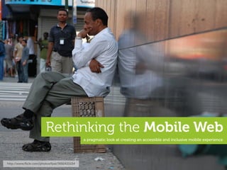
  • 1. Rethinking the Mobile Web a pragmatic look at creating an accessible and inclusive mobile experience http://www.ļ¬‚ickr.com/photos/fpat/3692425154
  • 2. we apps, and... a lovely, location-b ased, social, photo thing y... this presentation is not about these. http://www.ļ¬‚ickr.com/photos/scobleizer/3985020876
  • 3. Dinosaurs! we think the iPad is pretty awesome, but... http://www.ļ¬‚ickr.com/photos/goincase/4647893507
  • 5. 1.8 billion the number of internet connections in the world today... 26% of the worldā€™s population at the beginning of 2010 ā€“ http://www.internetworldstats.com
  • 6. 6.8 billion the number of people in the world today... *2009 estimates put the population around 6.79 billion inhabitants...
  • 7. 3.4 billion the number of people with mobile devices today... or roughly 1/2 the population of the planet, which is...
  • 8. itā€™s about people not devices...
  • 9. so hereā€™s the dilemma... http://www.ļ¬‚ickr.com/photos/soundman1024/1796003688
  • 10. "The future is already here ā€“ itā€™s just not evenly distributed." ā€“ William Gibson http://www.ļ¬‚ickr.com/photos/kiwanja/3169447879
  • 11. no home Sony Ericsson w810i no iPhone technology should not only be accessible... http://www.ļ¬‚ickr.com/photos/walkadog/3093763311
  • 12. but inclusive... iPhone http://www.ļ¬‚ickr.com/photos/javiercito/2319331695
  • 13. and available to everyone... iPhone http://www.ļ¬‚ickr.com/photos/pictfactory/2796367140
  • 14. yes, even this man who does not have an iPhone... not an iPhone... http://www.ļ¬‚ickr.com/photos/dopesmuglar/486087009
  • 15. so, who actually has an iPhone... http://www.ļ¬‚ickr.com/photos/data_op/2468057934
  • 16. USA
  • 17. about 6% US market share... US Population: 307 million Smartphone penetration: 31% of pop. iPhone market share: 21% of smp. enormous Total iPhones in US: 19 million (~6%) impact low overall penetration The iPhone Reality in Europe: Low Overall Penetration, Enormous Impact http://moconews.net/article/419-deep-discounts-on-smartphones-drive-u.s.-adoption-rates-to-nearly-a-thi/ and http://www.npd.com/press/releases/press_100510.html
  • 18. EU5
  • 19. only 4% EU5* market share... enormous EU5* = France, Germany, Italy, Spain and United Kingdom impact low overall penetration The iPhone Reality in Europe: Low Overall Penetration, Enormous Impact http://www.comscore.com/layout/set/popup/layout/set/popup/Press_Events/Press_Releases/2010/6/The_iPhone_Reality_in_Europe_Low_Overall_Penetration_Enormous_Impact
  • 20. <4% global market share* enormous impact low overall penetration *I suspect itā€™s actually much less, but ļ¬nding accurate global ļ¬gures is a tad diļ¬ƒcult...
  • 21. ie: BMW The ā€most popularā€ devices donā€™t necessarily translate to the most used devices. ie: Ford
  • 22. ā€ yeah, but those devices suck! http://www.ļ¬‚ickr.com/photos/eldret_99/3311540398
  • 24. the ļ¬rst smartphone in 2003... considered portable in 1984 ļ¬ts in your pocket still widely used... Released: 1984 Released: 2003 CPU: 8 MHz CPU: 104 MHz RAM: 128k (512k max) RAM: 6 MB Storage: 400k (3.5ā€ ļ¬‚oppy) Storage: 32 MB MMC Card Display: 22.9 cm Monochrome Display: 5.3 cm Thousands of colours Dimensions: 34.5 x 24.4 x 27.7 cm Dimensions: 10.9 x 5.8 x 2.4 cm Weight: 7.5 kgs Weight: 122 g
  • 25. the music phone in 2008... again, it was ā€˜portableā€™...? ...this runs Flash not a feature phone, nor a smartphone... Released: 1998 Released: 2008 CPU: 233 MHz CPU: 434 MHz RAM: 32 MB (512 MB max) RAM: 128 MB Storage: 4 GB (+ optical drive) Storage: 8 GB (16 GB max) Display: 38.1 cm Millions of colours Display: 8.1 cm Millions of colours Dimensions: 40.1 x 38.6 x 44.7 cm Dimensions: 11.1 x 5.2 x 1.5 cm Weight: 17.3 kgs Weight: 109 g
  • 26. the feature phone in 2009... smartphone from 2005 extremely popular today... still widely used today... Released: 2005 Released: 2009 CPU: 220 MHz CPU: 369 MHz RAM: 22 MB RAM: 30 MB Storage: 64 MB Storage: 1 GB (16 GB max) Display: 5.3 cm Thousands of colours Display: 5.1 cm Thousands of colours Dimensions: 10.8 x 5.3 x 2.2 cm Dimensions: 10.6 x 4.7 x 1.5 cm Weight: 126 g Weight: 88 g
  • 27. the smartphone in 2010... ...playing ā€œcatch-upā€ raising the ā€œbarā€... Released: 2010 Released: 2010 CPU: 680 MHz CPU: 1 GHz A4 Processor RAM: 256 MB RAM: 512 MB Storage: 16 GB (32 GB max) Storage: 16 GB (32 GB max) Display: 8.9 cm Millions of colours Display: 8.9 cm Millions of colours Dimensions: 11.4 x 5.9 x 1.3 cm Dimensions: 11.5 x 5.9 x 0.9 cm Weight: 135 g Weight: 137 g
  • 28. ā€ ...but folks with those other phones simply donā€™t use the Internet. http://www.ļ¬‚ickr.com/photos/carbonnyc/3369424492
  • 29. yeah, and grandma doesnā€™t do Facebook... ā€ Grandma* Facebook http://www.ļ¬‚ickr.com/photos/amagill/304701054 *not my Grandma
  • 30. 1.3 billion the number of mobile internet users today... ...includes WAP and ā€˜real webā€™ via Tomi Ahonen Consulting
  • 31. 1/3 number of global internet users who access the internet only via mobile... ...includes WAP and ā€˜real webā€™ via Tomi Ahonen Consulting
  • 32. 21% the projected worldwide 3G penetration in 2010... via Morgan Stanley
  • 33. so, what are they using...
  • 34. mobile browser market share via http://gs.statcounter.com - 02/2010 other? things have changed skeptical UC ate Nokiaā€™s share... other? other? note OperaMini... Blackberry! quality + sample size? Data Source: http://gs.statcounter.com Published Under a Creative Commons Attribution 3.0 Unported License You are free to copy, distribute and transmit the work and to adapt the work providing it is attributed to www.icrossing.co.uk http://www.ļ¬‚ickr.com/photos/icrossing_uk/4342659861
  • 35. something happened in February... UC browser... Nokia browser... Top 9 Mobile Browsers in China from Sep 09 to Aug 10 | StatCounter Global Stats http://gs.statcounter.com/#mobile_browser-CN-monthly-200909-201008
  • 36. moving forward... used in iOS, Android, Palm WebOS, Nokia Qt, primarily used on feature Bada, Symbian and new Blackberry... phones supporting Java ME... + WebKit OperaMini Windows Mobile proxy browser... watch these... lots of new browsers, variation and of course ā€“ legacy browsers ā€œFennecā€ Browser UC Obigo SkyFire proxy browsers Internet Explorer MicroB Internet Browser
  • 37. the importance of WebKit... open source licensed under the GNU Library General Public License excellent standards support including HTML, CSS3, SVG, etc. innovations often contributed back example: HTML5, CSS animations, SquirrelFish, etc. adopted by many leading companies including Apple, Nokia, Samsung, Google, Palm, etc. WebKit used in many mobile operating systems including iOS, Android, webOS, Bada, Symbian, etc. btw - ā€œThere is no WebKit on Mobileā€ by @ppk http://www.quirksmode.org/blog/archives/2009/10/there_is_no_web.html
  • 38. the importance of OperaMini... free costs consumers absolutely nothing a full-web experience supports Ajax, zooming, tabbed browsing, etc excellent standards support based on the same code-base as the Opera browser OperaMini available just about anywhere on JavaME, iPhone, Android, Windows Mobile + more an extremely eļ¬ƒcient browser a proxy server ļ¬lters, compresses & pre-renders content usable on older devices breathe new life into those antique devices... very important
  • 39. rendered + optimised and proxy browsers... proxy browser on proxy server... free + unlimited bandwidth OBML* HTML limited + costly proxy server bbc.co.uk bandwidth *OBML (Opera Binary Markup Language) is highly optimised for mobile networks + devices.
  • 40. on private networks... caller a d limited + costly bandwidth switching centre receiver c b base-station to the Internet... transcoding, bandwidth limitations, service blocking and no packet neutrality
  • 41. also availabl e for Android ... OperaMini is great for browsing the web on iPhone when your connection stinks. Which is unfortunately is fairly often in my ā€ case. ā€“ @jonathanstark http://www.ļ¬‚ickr.com/photos/johanl/4424185115
  • 42. app yeah, whateverā€“I just wanna build a mobile website...
  • 43. traditionally you might consider... a device database ie. DeviceAtlas device detection or WURFL content adaptation an abstraction layer device various standards exhausting capabilities media types WURFL/WALL testing transcoding multiple templates private networks mimetypes geī€‚ing ā€œon-deckā€ data limits multiple sites an oļ¬€-deck strategy... cHTML the ā€œOne Webā€ dream thematic correct doctypes consistency fragmentation switching algorithms WML using UAProf data XHTML-MP http://www.ļ¬‚ickr.com/photos/rmlowe/3281353786 WAP
  • 44. but that might be a bit overwhelming... OMG... ā€ http://www.ļ¬‚ickr.com/photos/richardmoross/1413692087
  • 46. ...a look at what weā€™re doing now?* *for illustration purposes only
  • 47. we could do nothing... http://www.alistapart.com/
  • 48. but thatā€™s not terribly mobile friendly ā€“ what about...
  • 49. a mobile speciļ¬c site... http://mobify.me http://m.alistapart.com/
  • 50. oh, but then that just begs the question...
  • 51. other... laptops/netbooks TVs handheld consoles what exactly is mobile... http://www.ļ¬‚ickr.com/photos/amagill/26273015
  • 53. 128x160 240x320 320x480 what isnā€™t... 1280x768 1024x768 480x800
  • 54. then again, we could...
  • 55. create an adaptive experience... http://www.ļ¬‚ickr.com/photos/rohit_saxena/4873732679
  • 56. an example http://colly.com* *for illustration purposes only, Iā€™m not criticising the talented Mr. Collison or his ļ¬ne work...
  • 57. http://colly.com MOBILE SITE OF THE YEAR NOMINEE http://www.thenetawards.com/
  • 59. squishy squishy with ļ¬‚exible layout http://colly.com/
  • 60. also available on mobile... squishy squishy http://colly.com/
  • 61. al an optimce experien squishy squishy tada! brought to you through the magic of @media queries... http://colly.com/
  • 63. these are also mobile... WebKit WebKit approximations based on actual device testing - font rendering will vary... http://colly.com/
  • 64. as are these... the iPhone is #1 device for OperaMini *OperaMini is often preferred by many users as it optimises content prior to download, which reduces data costs. http://colly.com/
  • 65. and these... Mozilla 77mm 47mm insanely tiny! expect many more tablet devices on the market soon... http://colly.com/
  • 66. traditionally used for the ļ¬ne print... which now require this... http://www.ļ¬‚ickr.com/photos/chrisbrenschmidt/1832787028
  • 67. viewport is much smaller than the actual content and this... http://www.ļ¬‚ickr.com/photos/katerha/4592429363
  • 68. keyhole browsing for this experience http://colly.com/
  • 69. ...would you be happy with this? hmm... http://colly.com/
  • 70. once again why are we writing for only one browser... 2000 2010 ...is WebKit the new Internet Explorer?
  • 71. ā€œThis site works best in Safari 4ā€ ā€ is ok where ā€œThis site works best in IE4ā€ wasnā€™t?!? Open standards or double standards? ā€“ @csssquirrel via @brucel http://www.ļ¬‚ickr.com/photos/pjanvandaele/3990379048
  • 72. If you want to use the web on a ā€ mobile device, is the purchase of an iPhone the cost of entry? or Android device this design can work on *many* more devices... let alone only one device?
  • 73. as per my highly sophisticated mobile web triage process... ;) Good Could be improved Needs to be improved letā€™s make it more accessible... http://colly.com/
  • 74. 3 one style sheet w/@media queries 4 jQuery used only for animation... 5 same images used for all screen devices... only a few issues... 2 well structured, meaningful markup Good 4 Javascript animations tend to work poorly on the majority of mobile devices... Could be improved Needs to be improved
  • 76. 2. use well structured, meaningful markup for those still paying attention, yes there is a #1 and we will get to it shortly...
  • 77. 2 well structured, meaningful markup... mmm... meaning! structure thereā€™s lots more, but who wants to stare at code... http://colly.com/ view source
  • 78. 2 well structured, meaningful markup... use <header>, <h1>, <p> and other semantically meaningful tags to provide basic structure *Note: this is not from hī€‚p://colly.com recreating existing <tags> <div class="body"> is not cool <div class="header"> <div class= "h1"> <span>Hello World!</span> </div> </div> <div> soup... <div class="body">HTML <span class="emphasis">can actually be</span>meaningful. </div> </div> soup is best served in a bowl... without a basic, meaningful structure you will need to re-create many existing properties
  • 79. 2. use well structured, meaningful markup 3. the absence of support for @media queries is in fact the ļ¬rst @media query...
  • 80. 3 all-in-one stylesheet with @media queries... a single css ļ¬le is network eļ¬ƒcient, but often includes unnecessary style data for mobile devices... <link href="screen.css" type="text/css" rel="stylesheet" media="screen" /> ....towards the end of ā€˜screen.cssā€™ we ļ¬nd the @media queries mobile speciļ¬c tweaks are added at the very end, and only through @media queries... @media (max-device-width:480px) and (orientation:portrait) { ...
  • 81. how retro... kinda backwards... http://www.ļ¬‚ickr.com/photos/dumbledad/3400708183
  • 82. rocket science a desktop browser... are we expecting too much... http://www.ļ¬‚ickr.com/photos/nasa_goddard/4678389619/
  • 83. rocket science a mobile browser... ...from our mobile browsers? http://www.ļ¬‚ickr.com/photos/wwworks/3749061604
  • 85. 1. mobile ļ¬rst 2. use well structured, meaningful markup 3. the absence of support for @media queries is in fact the ļ¬rst @media query... aha, I told you weā€™d eventually get to #1!
  • 86. Luke Wroblewski mobile ļ¬rst http://www.lukew.com/ļ¬€/entry.asp?933 http://www.ļ¬‚ickr.com/photos/pete-karl/4637024524
  • 88. is technically served to everyone... a full desktop site
  • 89. sprinkle on a few @media queries... + @media queries a full desktop site
  • 90. ...if the @media query resolves to true, tada - a mobile site! = mobile site + @media queries a full desktop site
  • 91. but hereā€™s the problem...
  • 92. FAIL = mobile site + @media queries a full desktop site http://www.ļ¬‚ickr.com/photos/hendry/3053419265
  • 93. = mobile site a full desktop site http://www.ļ¬‚ickr.com/photos/hendry/3053419265
  • 94. @media queries will resolve to false on most devices... no, really ā€“ you simply cannot rely on them currently on mobile devices
  • 95. resulting in this experience... http://colly.com/
  • 96. so itā€™s far more eļ¬€ective when we start with...
  • 97. is technically served to everyone... a mobile site
  • 98. for browsers that support them, other browsers will just ignore them... + @media queries a mobile site
  • 99. tada ā€“ a desktop site! ;) = full desktop site + @media queries a mobile site
  • 100. which is really just...
  • 101. and not a new idea at all... progressive enhancement = full desktop site Jeremy Keith + media queries a mobile site http://www.ļ¬‚ickr.com/photos/clagnut/315554083
  • 103. but letā€™s get back to...
  • 104. 1. mobile ļ¬rst 2. use well structured, meaningful markup 3. the absence of support for @media queries is in fact the ļ¬rst @media query...
  • 105. 3 all-in-one stylesheet with @media queries... a single css ļ¬le is network eļ¬ƒcient, but often includes unnecessary style data for mobile devices... <link href="screen.css" type="text/css" rel="stylesheet" media="screen" /> ....towards the end of ā€˜screen.cssā€™ we ļ¬nd the @media queries mobile speciļ¬c tweaks are added at the very end, and only through @media queries... @media (max-device-width:480px) and (orientation:portrait) { ...
  • 106. 3 default stylesheet plus @media queries... place mobile related styles into a default stylesheet... <link href="default.css" type="text/css" rel="stylesheet" media="screen" /> <link href="desktop.css" type="text/css" rel="stylesheet" media="screen and (min-device-width:1024px) and (max-width:989px)" /> link additional style sheets using @media queries to progressively enhance the content for more capable browsers some mobile browsers look for it... *you may want to use both the ā€˜screenā€™ and ā€˜handheldā€™ media types for your default stylesheet
  • 107. 1. mobile ļ¬rst 2. use well structured, meaningful markup 3. the absence of support for @media queries is in fact the ļ¬rst @media query... 4. progressively enhance using JavaScript and @media queries
  • 108. 4 jQuery/JavaScript used only for animation... jQuery is still a rather hefty library for use on mobile devices... <script type="text/javascript" src=".../jquery.min.js"><script> <script type="text/javascript" src=".../scrollto.js"><script> animation in JavaScript can be very taxing on mobile devices...
  • 109. mobile browsers arenā€™t as capable as desktop browsers... again, are we expecting too much...? http://www.ļ¬‚ickr.com/photos/mjryall/3638778588
  • 110. 4 use CSS instead of JavaScript for animations... are jQuery (and JavaScript) necessary to provide an experience on mobile devices...? <script type="text/javascript" src=".../jquery.min.js"><script> <script type="text/javascript" src=".../scrollto.js"><script> consider using basic DOM manipulation, or a mobile optimised Javascript library <script type="text/javascript" src=".../xui.min.js"><script> the ā€œjQuery Mobileā€ long before jQuery Mobile... http://xuijs.com http://jquerymobile.com use CSS for animations if available instead of Javascript ...use CSS animations .scrollto { (where possible) instead -webkit-transform: translate(540px, -200px); -moz-transform: translate(540px, -200px); -o-transform: translate(540px, -200px); } ignored on browsers that donā€™t support it
  • 111. look ma, no jQuery? from a time before jQuery... Twiī€‚er? http://www.ļ¬‚ickr.com/photos/wordridden/2474879344
  • 112. then again, do you really need javascript? *none of these services relied on Javascript when they ļ¬rst started...
  • 113. 1. mobile ļ¬rst 2. use well structured, meaningful markup 3. the absence of support for @media queries is in fact the ļ¬rst @media query... 4. progressively enhance using JavaScript and @media queries 5. adapt content (especially images) appropriately for each device
  • 114. 5 same images used for all devices... one size rarely ļ¬ts all... ul li#biography a span.label { background: url("../pig.png") repeat-x center bottom; } 16 Kb also adapt content used in <img /> tags we should also adapt images found within the markup... <img src="butterļ¬‚y.png" width="200" height="160" alt="butterļ¬‚y" /> 16 Kb http://colly.com/
  • 115. 5 images adapted appropriately for each device... ul li#biography a span.label { background: url("../pig-small.png") repeat-x center bottom; } provide appropriate sized images for various devices 6 Kb also adapt content used in <img /> tags many CMSā€™s such as WordPress provide a means of ļ¬ltering HTML before itā€™s sent to the client <img src="butterļ¬‚y-small.png" width="100" height="80" alt="butterļ¬‚y" /> 6 Kb be sure to update the width and height aī€‚ributes accordingly services such as http://tinysrc.net can automatically resize + compress your images http://colly.com/
  • 116. we could also rethink the <img />* tag... one image can have multiple source ļ¬les, each for an appropriate context <img alt="butterļ¬‚y"> <source src="butterļ¬‚y-small.png" width="100" height="80" /> <source src="butterļ¬‚y.png" width="200" height="160" /> <source src="butterļ¬‚y-large.svg" width="400" height="400" media="min-device-width:320px" /> image formats, and aspect ratios </img> could be modiļ¬ed as required and possibly even include media queries... *Iā€™m just dreaming here, this doesnā€™t currently exist...
  • 118. much better... approximations based on actual device testing - font rendering will vary... http://colly.com/
  • 119. quick another example... http://2010.dconstruct.org* *again, for illustration purposes only, Iā€™m not criticising the ļ¬ne folks behind dConstruct...
  • 121. squishy squishy http://2010.dconstruct.org/
  • 122. diļ¬€erent diļ¬€erent tada! again, brought to you through the magic of @media queries... http://2010.dconstruct.org/
  • 124. 6 fonts often not supported on mobile sprite image not used 6 on mobile devices... 6 images not used on mobile devices... only one real issue... 3 a single (and compressed!) style sheet 2 well structured, meaningful and compressed markup Good simple DOM scripting without Could be improved 4 large Javascript libraries Needs to be improved
  • 125. 1. mobile ļ¬rst 2. use well structured, meaningful markup 3. the absence of support for media queries is in fact the ļ¬rst @media query... 4. progressively enhance using JavaScript and @media queries 5. adapt content (especially images) appropriately for each device 6. compress content where possible, and avoid sending unnecessary data
  • 126. 6 display:none still loads resources... donā€™t expect mobile bandwidth to be free... @media (max-device-width:767px), all and (max-width:449px) { ... .speaker-carousel { display: none; all of the speaker-carousel images are actually loaded, even though they are never displayed on mobile devices... }
  • 127. images not used on @font-face not supported mobile devices... on most mobile devices... 367.35 KB 93.63 KB http://2010.dconstruct.org/
  • 128. 6 ...avoid sending unnecessary data @media (max-device-width:767px), all and (max-width:449px) { ... .speaker-carousel { display: none; ļ¬nd another way to remove the unused resources on mobile devices... }
  • 130. little tweaks... ļ¬xed relative width width width: 90%; height: auto; http://2010.dconstruct.org/
  • 131. accessibility* features functionality usability performance experience bandwidth a balancing act... http://www.ļ¬‚ickr.com/photos/superfantastic/50088733
  • 132. 1. mobile ļ¬rst 2. use well structured, meaningful markup 3. the absence of support for @media queries is in fact the ļ¬rst @media query... 4. progressively enhance using JavaScript and @media queries 5. adapt content (especially images) appropriately for each device 6. compress content where possible, and donā€™t include unnecessary data
  • 133. why even bother... Iā€™ve seen that look... http://www.ļ¬‚ickr.com/photos/eldret_99/3311540632
  • 134. ...people actually do use the mobile web source comScore MobiLens http://www.ļ¬‚ickr.com/photos/pictfactory/2796367140
  • 135. ...but, not only on these devices
  • 136. but, also on these... WebKit OperaMini
  • 137. and, these... WebKit OperaMini
  • 138. and, these... btw - expect many, many more devices to be heading our ways soon...
  • 139. Dinosaurs! ...and shouldnā€™t everyone beneļ¬t from technology? http://www.ļ¬‚ickr.com/photos/goincase/4647893507