
Recommended
More Related Content
What's hot
What's hot (20)
Similar to Media before i wake
Similar to Media before i wake (20)
Recently uploaded
Recently uploaded (20)
Media before i wake
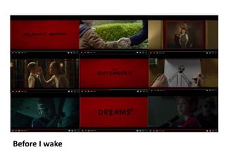
- 2. Screenshot 1 This screenshot shows the colour theme of the film, it shows what the colour scheme may be for the poster and any titles in the teaser trailer. I think that the colours help show the genre as the bold red makes the audience think of blood and shows danger. The font and colour for the brands also helps to add to the atmosphere and feeling of the film, the black compares to the red and helps bring a dark mood and shows that there is something dark and dangerous in the film and again helps show what may be happening in the film.
- 3. Screenshot 2 This screen shot helps look at two of the characters and helps show the audience the relationship between them. You can see that this may be one of the first times they are meeting as they are shaking hands. You can see that the feel is a welcoming although it is very formal. You can see that the little boy in this is polite as he went to give the hand shake, he has been brought up well and as far as you see, also from the clothes he is wearing you see/ think he is just a normal kid. The setting also shows that the kid is going to a well off area and the people adopting him are well off.
- 4. Screenshot 3 This shows the women and man that we see adopting the young boy although we never see the boy in the photography making the audience think about whether the young boy in the image may be dead, this gives the audience more incite on the two characters adopting the boy. This may gives the audience incite into why they are adopting the young boy, maybe the cant have kids now or the boy in the photo died and they are scared to try again. The photo also helps show the family is well off as not many families go and have there photos taken professionally as it is expensive.
- 5. Screenshot 4 This photo starts to show the mystery in the film as the characters dead child appears to them. It has a sinister but sweet emotion to it as the parents are seeing there child again but the audience also then remember that the child is dead. This also lets the audience start to piece together what the film may be about, as earlier In the trailer you see the adopted young boy falling asleep and then the son of the parents coming back making the audience think that his dreams may become real, the audience start to piece together everything.
- 6. Screenshot 5 This screenshot again looks at the colour scheme of before I wake, it comes back to the bold/dark red that makes the audience think of blood and danger and also again looks at the bold harsh lettering and black colour used for the title. This screenshot also shows the date the movie comes out, although it doesn't focus on s specific time of the year like Halloween or Christmas etc. it is close to when Halloween is.
- 7. Screenshot 6 This screenshot shows that the young boy is scared of something, after he draws this he then scribbles over the drawing and says that it keeps it away If he does that. This shows the boy to be scared of Something and also makes the audience think that maybe there is something more than his dreams. There is something real scaring the boy.
- 8. Screenshot 7 This screen shot seems innocent as the young boy is asleep, everything seems fine although the audience know/think that his dreams may come true showing that something may happen/ things may happen. There isn't much happening in this shot although the music at this part of the teaser trailer is intense and builds up the atmosphere that something bad is happening. The shot time for this is also very fast pace and quickly cuts to the next shot adding to the intense feel of the teaser trailer.
- 9. Screenshot 8 This screenshot again focuses on the colour scheme of the teaser trailer but also focuses on the fact that the boys dreams have something to do with what is happening, also again the colours being used show that what is happening is sinister and not beautiful. Also the music added to the teaser trailer shows that there is something dark and tense happening.
- 10. Screenshot 9 This screenshot shows the young boy with something behind him, you don’t know what it behind him but it looks like a dead boy but not the parents son, This may confuse the audience as they were thinking that things only happen when the boy is asleep but he is awake here. This confuses the audience and make them start to think of new stories or what may be happening, this makes the audience want to watch the film as they don’t know what is happening and want to find out.
- 11. This Trailer focuses on an open audience it doesn't focus on specific adults/ younger adults teens etc. but I think it focuses on adults to young adults/ teens. The film is psychological thriller and many of the shots in the teaser show this by focusing on the fact that a lot of what is happening is because of the young boys dreams. This film is interesting as many people would see the young boy as innocent and sweet but it seems from the trailer that what is happening is because of him. This film looks at what my group are looking to create as we want to look into dreams become a reality and someone not knowing what is real and what is not. Also the genre of our film and before I wake is the same.
- 12. The colours of the poster fit with the colours in the trailer the dark red and black although the background of this poster is white, giving a cold feel to the image. Here is a catchphrase from the movie, it stands out and makes the viewer think about what the film may be about. It fits towards the film and genre of the film. Here shows who is in the film and who helped create the film, it shows the main people in the creation of the film and the brands and companies who created it. The eyes in the butterfly show fear and are looking directly at the viewer making them feel uncomfortable and helping them feel what the people in the movie are feeling. Butterfly's are normally seen as beautiful and innocent but here they are dark and scary this completely contradicts how they are normally seen. This could be seen as showing that the young boy would normally be seen as innocent and sweet but he isn't. For my groups poster I would like to take from this how they showed the fear in the persons eyes and merged the butterfly and eyes together to create something scary. I like the colour scheme used. I think that the trailer and poster link well together making it more intriguing to the audience.