Gorgeous Call Girls In Pune {9xx000xx09} ❤️VVIP ANKITA Call Girl in Pune Maha...
Poster analysis
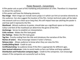
1. Poster Research - Conventions
A film poster acts as part of the marketing and promotion of a film. Therefore it is important
to attract the audience.
A film poster will have the following elements;
Key image - Main image can include iconic props in it which can hint at narrative elements to
the audience. Can also suggest the location of the film. Certain technical codes will be taken
into account such as a close-up or long shot, this will impact how eye catching the poster is
and how well it represents the film.
Masthead - Attracts audience to poster, should take up a significant space on the poster.
Colour and font of the masthead can determine the genre of the film.
Anchorage - Serves to establish an interpretation.
Critic reviews - Makes the film look good.
Star Ratings - Makes the film look good.
Tag line - Punchy ending from the title and introduces the narrative of the film.
Names of actors - May encourage viewers if actor is famous.
Release date - Allows audience to know when they can view the film.
Credits/billing block - Credit to cast.
Certificate/rating- So audience know if this film is appropriate for different ages.
Inter textual references- Links to social media so fans can follow and keep updated.
Distribution and Production company logos - Credit to the companies. Can encourage
viewers if the companies are successful such as Sony.
3. Masthead – The title is the name which suggests that the
film is going to be character driven rather than plot
driven. The white text compliments the black and blue
colour scheme. The white text shows contrast because it
bounces off the black. This could represent any contrast
and conflict in the film. White has connotations of
innocence and black has connotations of evil, this could
suggest the main character is innocent but has a dark
side. The title is also slightly covered by lines which acts
as an obstructed view, which gives connotations of
hidden meanings in the movie. The size of the title is
significant size in terms of the other text on the poster,
meaning that it is one of the first things the audience
sees. Having the title underneath the image draws more
attention to the image itself. The use of serif fonts
suggests that this is a period drama and gives it a more
sophisticated look.
Main image – The key image includes the main actors in
the shape of the iconic Rabbit in the film. The Rabbit is
part of the main characters imagination so having all the
characters friends and family in the Rabbits head could
symbolize what the character thinks about (his family
and friends). The top of the ears of the Rabbit show stars
off the American flag, suggesting that this film should
apply to Americans. Blue is often associated with depth
and stability which could highlight the irony because the
main character is emotionally unstable.
Black has connotations of mystery and
the unknown which could foreshadow
that the plot involves mystery. This
plain darkness as the background also
gives a feeling of fear to the audience
which is emphasized by the scary
Rabbit face.
There is no anchorage text. Anchorage text is
usually present to educate and inform the
audience about something, therefore by having no
anchorage text this gives little away about the film
which will lead the audience to want to know
more and therefore eventually watch the film.
Certificate
Billing block
Distribution/production
companies
Actors
No star ratings or critiques
quotes could have been done
to suggest that the film
speaks for itself and makes
the poster more simple and
to the point as it is already a
simple poster.
4. Main Image – Close-up and size of the
main character as the key image
highlights his important in the film.
Close-up also emphasises his confused,
suspicious look on his face which feels
unsettling for the audience.
The Island has a slight glow around it
which draws more attention to the
image. This glow also corresponds with
the glow of the flame that the character
is holding which links the two images
together. Rain and storms suggest that
there is not an equilibrium and bad
things are happening.
Actor name – quite
visible which could be
because he is famous
so hoping to
encourage audience.
Billing block.
Masthead – Red has connotations
of danger and evil, as well as blood
and murder, suggesting that
murder might occur in this film.
The font is very bold and thick; to
the point, impacting the audience
because of its simplicity. It is not as
big as the main image but this
might be because it is in red which
is eye catching so it doesn’t need to
draw anymore attention.
Distribution and
production company.
Release date – Also in
red to draw attention.
Tag line – Gives
indication of what the
plot of the film is about.
Action packed poster,
could represent how
the film is full of
action.
The colouring on the poster is very
dark (black and white) and faded.
This creates a feeling of fear for the
audience because of the negative
emotions associated with these dull
colours. Black and white are
opposite colours so this could
represent that the character is in
two minds; symbolising his mental
health issues.
5. Main image – Mid-shot of main
character allows you to see his
unhappy face, suggesting that he
faces problems in the film. Hair is
slicked back which connotes that
he is a business man but the wonky
tie suggests he is ‘loosing it’. Brown
is associated with boring which
suggests that this character is a
simple, ordinary man.
Release date –
Capital letters and
in a large font to
make easily visible.
Distribution and
production
company.
Masthead – Sophisticated serif font
suggests that this could be a romantic
drama. Size is large compared with
other text which draws attention to it,
however it can be washed out as it is the
same colour as the other text next to it.
White has connotations of innocence
and purity suggesting that the character
is a nice, innocent gentlemen.
Actor name – Shows
because he is famous so will
attract fans to watch the
film.
Tagline – encourages people to
watch because ‘NO ONE COULD
HAVE IMAGINED’ – makes
audience want it know what it is.
Black writing makes it stand out
and it is positioned next to the
main characters head which means
it is an important piece of text.
Outline of faded person
suggests that someone dies
in the film and his face
shows that he might be
grieving.
Billing block.