ENGLISH 7_Q4_LESSON 2_ Employing a Variety of Strategies for Effective Interp...
Q6
1. 6. What have you learnt about technologies from the process of constructing this product?
To research and talk about my process on conductingmy product, I posted my process on my Blogger, I learnt
how to insertpictures,videos from YouTube and present my written work in a easy to read format, so it
doesn’t look too colourful and messy.
From this film-opening project, I learnthow to use the Motion, Final Cut Pro and Logic Pro software, with the
supportfrom the Music department when it came to usingLogic Pro and Motion and Final CutPro from my
Media Studies teachers. I learnt how to use the Adobe Photoshop software beforehand partly by myself and
from the help of my art teachers for my Art GCSE and current A-level.
For the filmtitle, Paulina found this fontstyle, with numbers
shapingeach letter or number that you type on the keyboard.
Then Paulina downloaded itand typed into MicrosoftWord and
saved it. I realised thatyou cannotput a MicrosoftWord file
onto the Final cutsoftware (ithad to be a jpeg fileor movie file),
which is where we imported and edited out our filmscenes.
I had to download the font onto my account, and then type itonto Motion. Initially,I added some special
effects, but we decided that to remove the special effects because itwasn’t necessary and it would ruin the
ending; instead added justa simplefade in/fadeout. So now, the camera would slowly zoom into the window,
which will be dark as itis set atnight, and then in the black backdrop/darkness,thefilmtitle would appear.
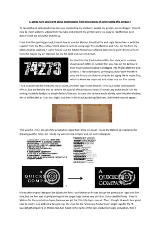
This was the initial design of the production logos that I drew on paper. I used the Dafont as inspiration for
drawingout the fonts, but I made my version look simpler and not overly designed.
T
his was the original design of the Quickshot font. I use Motion at firstto design the production logos and film
title, but the font was slightly boringand the target logo looked very childish. So I picked the fonts I liked in
Motion for the production logos,becausewe got the filmtitlelogo covered. Then I thought it would be a good
idea to modify and add extra designs (e.g. the eyes for the ‘Visionary Productions’,target logo for the ‘A
QuickshotCompany’) on Photoshop. So I typed in the name of the two production logos on Motion, then I
2. screenshot them and opened it in Photoshop by draggingthe screenshotfile,that I saved on desktop and then
use the Brush tool, BlendingOptions to make the font look more suited to our Crime/Mystery filmopening.
The Batman Logo and the Sherlock Holmes logo inspired me to design the filmtitle and production logos.I
used the fonts from Motion for the production logos becausethe font design is better and simpler than the
fonts I found online. I also the design of the Dexter logo because the font looked very distorted,likethe
Batman logo. But I likethe Sherlock Holmes logo becauseof Roman styleit has.So I combined all three styles
of the filmfonts to make the Quickshotlogo.
I intially drewmy friend’s eye with a pencil,then I scanned the
pictureto then edit in Photohop by makingthe outlinecolour from
the graphite grey from the pencil,to black so itstands out and
matches the font colour.The font was also from Motion, then
shifted to Photoshop, so I can rub out the letters ‘o’ and ‘a’,
replaced it with the eyes, I copied and pasted the eye and then
changed the orientation of that copied eye, so then itlooks like
two sets of eyes.
Also,we made a track in Logic but we used a similar rhythmbut
slightly differentinstruments and added more beats to the scoreof
the film’28 Days Later’ becausewe liked how it builtup to create
suspense.
Overall,whatI learntabout technologies whilstconstructingmy
product was that it take a lotof time and consideration to produce a
suitablefilmtitleand production logo. SinceI had a good understandingon how to usePhotoshop before and I
developed my drawingskillsthis year,this benefited me a lot on designingthe productions logos and actually
drawingout a clear storyboard for our group to use when we were filming.