
Recommended
Recommended
More Related Content
What's hot
What's hot (20)
Similar to Alphabets and lettering
Similar to Alphabets and lettering (20)
More from aladelata
More from aladelata (17)
Recently uploaded
Recently uploaded (20)
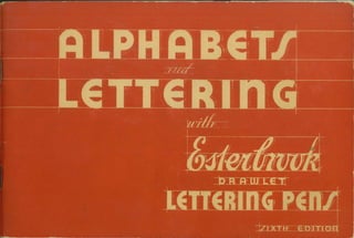
Alphabets and lettering
- 2. PUBl.ISHED BY ESTERBROOK PEN CO. • CAMDEN, N. J•• U.S.A.
- 3. I N T R 0 D • Lettering and Design. This book is an introduc- tion to a fascinating art, which is also a highly- paid business. It deals principally with lettering and design as a commercial craft-today a grow- ing, important, and lucrative business . But the influence of pure art (expression, in beautiful forms) is more and more marked in this field. Hand-lettered advertisements, window cards, mailing pieces - even titles for stories in the magazines - are today earning appreciation as things of beauty. • Pens in Modern Lettering. The tools of the let- terer today nearly always include Esterbrook Lettering Pens. The change from older tools has resulted from two great needs. (I) The novic e or student does not want his time, attention and patience absorbed in an effort just to learn to handle his tools. He wants, rather, to learn pro- portion and design, and to achieve expression u C T I 0 N rapidly. Esterbrook Lettering Pens, because they make an even, steady line, and a,re natural and easy to hold , release the attention and build enthusiasm for the project. (2) The skilled crafts- man finds that time is his greatest asset. Anything that saves his time, or speeds and improves his work, puts dollars in his pocket. Esterbrook Letter- ing Pens save many strokes over a brush. The letters they make do not need to be retouched. This results in amazing savings of time and im- provements in work. The widespread use of Esterbrook Lettering Pens does not supplant the older tools. It rather sup- plements them. Pencils, brushes, crayon, scratch- knives, have a permanent place in the artist's kit, but for a tremendous number of jobs-headlines, show cards, price tickets, even small outline drawings-Esterbrook Lettering Pens cannot be excelled.
- 4. How to Hold the Pens • Esterbrook L are used in ettering Pens holder . Ho!: regular pen- easily-lik simply and holder m e a. pencil. Th t ay paint e o the right of a good bit shoulder. Kee your nght forearm and p ~our entire board t wnst on th stroke' o steady you; Caution: for pens (alphabets qua re- nib the penhold , page 13) straight t er must point s a your shO that th oulder each 1· e terminals 1' me will b o square and 1 e cut off wise you w·~Iean. Other- feet sho 1 get the d- wn on the right. HRFor shad ing -nib you wish to dra~ens, when Alphabet (see a Roman also hold the page 14), The differen pe~ straight. here. ce 15 shown BB
- 5. -- • Pens Must be Kept Clean. When you are through using each pen, clean it before the ink or color dries. Dried, caked color can be scraped off easily-with the point of a regular steel pen- wet color can easily be removed with a bit of cloth. It is particularly easy to clean an Ester- brook Lettering Pen because there are no com- plicated gadgets. The cloth or penpoint easily slips under the reservoir, and cleans thoroughly. It's no chore. But it must be done. For good results, keep your pens clean. • Filling the Pen. Dip pen deeply enough to fill the reservoir, but slowly and gently. Before plac- ing the full pen on paper, touch the under side to the side of the container, so as to drain off surplus ink and avoid blots. Avoid jamming the bottom of your color con- tainer with the pen when dipping. Sediment settles to the bottom and will clog the point and continued jamming of the point against the bot- tom when filling will eventually throw points out of position. Rest at the beginning and end of each stroke to assure sharp, full terminals. Press firmly and steadily on the pen, but not too hard. The pen itself will make a sharp uniform line. • Adjusting Reservoir for Proper Feed. Now sup- How to Use pose we are lettering a black card with a heavy Lettering Pens show card color which flows slowly. Lift up the ink reservoir on the pen with your fingers . The reservoir is fastened to the pen-it will not slide. But one end is free and can be bent up or down. This is a distinctive feature of Ester- brook Lettering Pens, and permits you to use quite heavy colors, easily. You can quickly shift to lighter inks by pressing the fountain down again. • Boa rd. For best results use smooth surface regu- lation coated board, either gloss or dull finish. • Ink and Color. For most lettering use a good Black India waterproof Ink. For strong colors, in- cluding white, use show card colors rather than ink. (Colored ink is too transparent and watery for opaque lettering but is good for tints.) You must dilute colors. Do so-not in the bottle-but in a small separate vessel. A spoon will do nicely;
- 6. Theory of Lettering Use water to thin the color and mix well. You can tell when you have the right consistency if it flows well from the pen, and leaves a solid opaque line. If the iine looks faded or streaked, add more paint. Test out your mixed color on a scrap of cardboard before you start lettering. All utensils must be clean, of course . Dirty colors and clogged pens result when you start working with mussy dishes. • Fortunately for the beginner , the best lettering is usually the simplest. The day of fancy letter - forms and flourishes is passing. A few show cards still are done in the style of 1890, but the better artists everywhere are stressing simplic- ity. Stores in this respect are a little behind the magazines and advertisers - everywhere you will note that lettering has become far simpler. Simplicity does not mean mediocrity or dullness. It can be original , too, as the examples in this book prove . This book contains a varied assortment of c.lpha- bets-more than you will probably ever actually need. Train yourself to perfect letters of fine sim- plicity-letters that are easy to read . It is better to learn a few go od alphabets thoroughly , than to half-learn a great many. Do these :::rlphabets over and over again, in words and phrases, until your hand moves naturally in these forms. Then you are ready to create posters and de- signs of your own . The pens to start with are the round nibs. They are the best adapted to modern lettering forms, are easiest to handle, and give you the quickest results . Therefore, pages 7-12inclusive are de- voted to round-nib alphabets and examples. First comes a basic alphabet - simple, clear, easy to do . On page 8 is a diagram showing just how each stroke of the pen is made . On succeeding pages we show variations---0 slant (Italic) letter of the same style , a script, and exaggerations of the letter for variety and inte.r- est. Last come the examples , showing how these letter-forms are combined into cards. Spacing of letters is just as important as perfect shaping of them . Note how some letters like M and W are much wider than others , while "i" and "e" are extremel y narrow. A little study will show how much space each letter requires to make a legible and unif ied whole .
- 7. REMEMBER 1. Use in any penholder and hold like a pencil. 2. Keep entire forearm and wrist on board. 3. Be sure that pens are always clean . 4. Rest at beginning and end of each stroke and do not hurry. 5. Maintain even pressure on pen at all times. 6. For best results use a smooth surface board. 7. Never use ruler or any other mechanical aid for any purpose other than guide lines . 8. Keep tip flat on paper and use conventional pen- manship arm movement.
- 8. 1au•LAABBS 6ETVEENLETTERS ,ABCDE ILEFTH FGHIJK MNKZ L~MOP AVWXY ·QIISTU OQOGS VWXYI BPRDUJ A POSTER ALPHA&ET ~ NO.I DDAVLETNI& LETTEQSGQOUPED ACCOl2DlNGTOSHAPE
- 10. How the Alphabet on Page 7 Was Lettered • This diagram indi- cates how many strokes for each letter, in which direction they are made , and in which order they are made. All lettering is a com- bination of a few essen- tially simple strokes. Note on all curved parts of letters that the strokes overlap slightly. The strokes given are for the beginner; after you are expert , many of them can be elim- inated , to gain speed. The C, for instance , can eventually be made with one stroke.
- 11. C2ECJRSIU @JJQJ29Ull VWXYI &2 ~~~~~ abc de£gbi ~~~~~~~~~.:::::::
- 12. ~:!rt:~;:i~~:id~ha~ Al/ 2let~lo··1t2lFOlM2tJlIK~lLMletter forrnat10ns that i/,~ l 1 2 ~ l sne characteristic. 3 3 3 2Made with Round Nib J ~ No. 3. NC?>PQa.11 PlS11:JYW 1'.~l::4234$6719 ab>c•,hijklmoop slu,wlJ7!atJedeqlJ ~ klM.lopqrstuvw
- 13. AB~~lG~2 £i 2 5'81i!HJ8r~1 - ~=3~.JJ 3 "St ~ b1hty are the keynotes _ of these formations . · • Made with Round Nib w l ~PtRSTUY No.a. 9*Y! i!MSGVM© 2abedef hij Rim 1opqrstuvwxyz 41
- 14. Variations of Standard Gothic for Contrast • We call these "Mutt and Jeff." The upper is used for weight , the lower for grace and large light areas of let- tering . The only trick to '.'Mutt " is that letters are alternately extra wide and extra thin . You could do the same starting with a thin let- ter if you like. ABCDEFCiHI .JKLMNOPQA /TUVWXYZ6-
- 15. Standard Square-nib Alphabet • To gain from the char- acter of the pen itself serifs (tips) have been added to these letters. The sharp , clean effect of the square nibs thus gives a distinctive air to the alphabet. The penholder must point straight at the shoulder to get true flat terminals at top and bottom of strokes.
- 16. Roman ~:;:~:iliz<).l~E?IJI I (l 111Esterbrook 2;:;~:~~~~~~ ~1Kl MN( JPElRperpendicular to the t1:~:;~::i~:i(~'.~,~l------l---J----,v-zr,ar--v"----tions - the two slant J _ _ -~ ZX ~ , l ~Imes of the A, etc. Fol- low the same stroke- - ---- - ---,,----...------- ------, ------ - chart ou !lined on page 8, ~~~~9--...-~,-a-----~--.---1a----:.,,----------~ r1c1I><1rs 111VVX~z 1234 Sfi/B~}(Ji
- 18. nc1pq rsf uvwxyz
- 21. ABCDEFGHIJ.KLMN~~~'fJ:~~~i~with less width of the ' 0pQRSTuvwXYZ ~,~;N~~~ ." wilh · 1234567890 t¢?!!. .. abcdef ghijklmno pqrstuv~xyz ~ . 3 ~ 3 :i•~ (@ t(:?) .1 ~or ~~ 7'111}. ~~ ~~ i~ o~33"~06'~3 ~ ~;, ~ 4<.t 1 ! . If~)lJJ0 ~ Bf~ ilr~Jf! _,
- 22. • An engraver 's script alphabet shown as white on black. Indi- viduality of letters makes it splendid for use with formal an- nouncements . Best executed with No. 17
- 23. A]BfB)Ef6IclJ]IKl, •tteavymassivedeco- . raH:,re in_itia.l !~tiers with vanety m fill m . Made with any round nib , de- pending on weight of •MN:tII O]P~i( S'f !ettenequfrM UVWXYl"S ABCDEFGHIJ · Kl~". OPQlRS1 U WXGf- gf
- 24. AICDEf6111,JKf -AROl'-QISTUVW~ 1 ib~def~kijklffl~@,Q. ,uvw~niz4~14§_6.~0©1.a~~~3~ Z-'> 's---,, ~ ~- 3~ rg, 'f=< w3t . 3~ Shaded Alphabet drawn with Esterbrook Lettering Pen No. 12
- 25. a tBe (/)i J 9 ;J{ g 9 •Anapp:::!:~bold handwriting. For . best results use pens 3 J{ ;;rm 'YI.(J oJ[l tRs J o,B . UVW.X?JJ&$?- .a 1,.cd fl Iq.h i j Ii 1m n Dp.qAAfllDJJJXJJJ 12 3If.5 6 78 90., - ' ':; I() []
- 26. !::: ABCDEFGHIJKLCondensed • A clean , modern ~:hi::~'ii:: 7 :.~ 0 PQRSTUVWXYZ& $?-abcdefghijklmn opqrst~vwxyz123 .. . . ·"" o; 4567890.~ -":; I(.)[] .
- 27. j B ,.._t p p ~ Ill .• Ludlow r r ~ I) P, f ~ r1 "Adilliculfor beginners . If you try this one use pens 13 or 14. I J ~<L J'Jll O P ORS ..fUV'IVI{. . ~. ,.
- 28. Futura :~~umABCDEFGHIJK• Clean and legible when lettered with eithe,M . LM N O p Q R s T u VWXYZ&$?ab c d e f g hi jk I m n o p qrstuvwxyz123 45678 90., - 1 ': ;!
- 29. A B C D E F G H I JK •Stmn~ · LMNOPQRSTU' VWXYZ&$?abc defghijklmnop · qrstuvwxyz123 ' . Ideal single stroke let - ters for 15 and 16. 4 5 6 7 8 9 0 . , - ' : ; ! .G
- 30. ~~;~ ABCDEFGHIJK• One ofthe best. You'll square , pen No. 6. ~=~f~tuo::e:~nF:o.r~~~~ L M N O p Q R s T u ~ VWXYZ&$? · ! abcdef ghijklmno pqrstuvwxyzl23 · 4 5 67 8 9 0., -.,:;() []
- 31. A 113tC II) IE If tl3 lti ~:.:~• An effective but try- ing alphabet. Shading ' II JI II IL ~ ~ tO II) ::::i'' rmd roullcl tO 112JI S lr IU V l/ X -,,, Z £ i 11~ 31 L1t di tl3 71 s 9t 10 4. 4. 1• ~ ~,'lt ~•• -~•• -~ •• ••
- 32. ~~::,ymodern AB [ DEFIi HIJHLand an ideal exercise for Nos . 15 and 16. mnoP q·R s, uu : WHYZ&S?abEd efghiiklmnap qrstuuwayz12 iJ 3451i7B90.,-:;'I
- 33. '~A~ (((~ EFGIii H •A multiple-~::;: ~ ter . Affords relief from solid blacks . Pens I and 6 are most suitable. JKLMNO~ X Y z & ~;i 2 3 ~ ~ 6 17 8 9 00D JB·= 1J I 11111 ))))) 11111 11111
- 34. ~::o!2i, b ••• ~ m© IDr; lf @ mlsuited to match this all- cap open alphabet. ilJ~r!.M~®IP . @lH~~fJJJWWftl ~w~~~u~~-0
- 35. • , Advertising Figures • Follow for style and proportion only . Two strokes may be needed to acquire desired thickness .
- 36. Neula nd ABCDEFGHIJ• A powerful poster style . A _two-stroke let- ter using No. 14 · KL NOPQR , tTUVWXYZ &S12345678 fl 9 0 •,:'I+*<>!
- 37. -411(?DE 7 (jI-/j]:;K •A style~!~~~ and grace . Most effec- ' LAIAJOP~ ~g I U :~::t~~::::i:such as Karnak Black on opposite page . Use Nos . 1 or 6. VWXljJgt abclejjhi . jlcfmn.opitjfu(IUtX.!fJf2 · · ' I I)34567890.,- ::. I~
- 38. E= ABCDEl'GBIJ' TUVWXYZ&S?- .abcdelghijklmn opqrslavwxyzl2 ' ·34 56 7890.,-":;!(JII
- 39. ABCDEFGHIJK Ludlow Tempo Light . • Neatness and sim- L M N O P Q R .s T uplicity. An easy , single stroke letter that you will use constantly. Use any square or round · nib. VWXYZ&$?--! abcdefghijklmno pqrstuvwxyz123 4567890.,":;()[] GJ
- 40. SUGGESTIONS FOR TEACHERS • The illustrations on this page are strictly ele- mentary , Their purpose is merely to suggest the wide range of uses to which Esterbrook Lettering Pens can be put in school work . Many other plans and schemes will undoubtedly present themselves to teachers in other departments as well as to teachers of drawing. Music for class singing can be placed on paper with great facility , and in a manner that makes it legible to classes in large auditoriums. The size of pen chosen is the only limit to the size scale that can be written . 4+5 -- 9 The large ink capacity will be especially appreciated in work of this nature. • Primary teachers also use Esterbrook Lettering Pen ": for lettering "Flash cards," for reading, spelling, an d arithmetic, etc. Any size card desired can be lettered ·readily if the right size pen is used. The round nib pens are especially adapted for this work, as they can be used like a pencil-moving in any direction without blotting . They will either print or write the script and are excellent for bqld line work .
- 41. 73or4er:r & ~~&'~'7&'~ Ornamentf' Df7.c.~-f1~·t76~·D
- 42. :l:f:lit:l=I Ill:HI:l•I ....................·=··=·-=··=··=·:: :: :: ::-------.-.•.-. ·.-. ·~ ·.-.·.-.·.-.
- 44. ALL-OVER PATTERNS • The patterns on pages 43 and 44 are combinations of lines and spots and were drawn with Esterbrook Lettering Pen No. 1. Ideas may be found in textile designs and wallpaper patterns . With tracing paper, copy a pleasing arrange - ment of units for repetition. Try different spacing plans both horizontally and diagonally. Maintain a good area of black in each pattern and show a gray value in some. A repeat pattern, such as those on page 44,makes an ideal ·book jacket. These designs may be painted in water color tints as an additional problem.
- 47. MONOGRAMS • There is a wide variety of uses for good monograms , includin g stationery , des k set s an d types of jewelry, labels on merchand ise , etc. For private sta - tionery, simple combinations as in the top line are suitable . Four ways of using G S are presented in the top row. A Roman capital H may be combined with various smaller capitals as in Line 4. Other large capitals may be planned similarly . Reversing the values gives a new pattern . No. 1 Round Nib was used . • Exercise-Secure books showing modern type alphabets . Collect trade marks from magazines and unusual styles of lettering . Trace several large Roman capitals from the book in ink, beginning with H. Place various smaller capitals inside the H, using only those that make a pleasing design . Other monograms may be based on unique styles of modern alphabets .
- 48. MONOGRAM/ c:::::>., • ~ @ ~jj 0~ [ti, l•t4•~• _Ag~ ~ INI 11~1~D ~, ~~ ~ ~ - ~~
- 49. DESIGNS FOR SHOW CARDS • The greater the number of parts to be drawn in a layout the more difficult balance becomes . The size and the color of the parts determine the balancing plan. A small mass of black balances twice its area in gray. There are two types of balance: formal and informal. Formal balance consists of a bi-symmet- rical arrangement, or an equal division of masses and color on each side of a center line. Informal balance is more frequently used. Here the parts are balanced on an imaginary center line to right and to left. These miniature show cards and posters sug- gest subjects and methods for original work. A full size design should be at least 9" by 12", planned in pencil first. Esterbrook Lettering Pen Nibs No. 1 to 5 provide variety in size of lettering and a uniform width of line. • Card layout and design is largely a matter of taste . There are few, if any, hard and fast rules for har- mony and effectiveness. Study contemporary adver- tising art-this will be your most dependable guide . • Variety and originality are desirable only when you subordinate them to the essential job of telling a clear, quick story.
- 50. IDren ano'.r IDookJhop, --- . . . ....-- .. . . : ~ : : J)eaurn: [a1TDiier' ' apA 1 areL . u 1:-ra , modern • :411~ 1v,Q/10,. : 0121v, :~ ' - _________ ' fo1• quick. - -V.ANT--,AD .r:r;2v1c= J':N!CA 777
- 51. • • • • • • •• (iBUIL0 • MC•A•5HIP 0 •WORTHV • MASTltR STAUHCH•AHD•STROHG A• GOODI..V .. VESSE.L THAT•SHALL•LAUGH AT• AL.I.. .. DISASTE.R AHD•WITH •THE.• WIND AHD•WII.D•WAVE•WRESTLE ~• a • • fBE·THAT·I~ MEAllV·OF·HEART HATH·A·COHTINUAL a ·FE~T· ..• a l•oSP*.2<>•4 ~lttG·::iOLOMON IN·ALL-Hl5·GLORY JA~·NOT·AQRAV- £1)•LIKE·OHE•OF ·THElE.• Six Attractive Cards • On this page are samples submitted by Miss Marquardt , Super- visor of Art , Newark , N. T.
- 52. Mottoes and Posters • The mottoes were let- ter ed by Akron students and th e p os t e rs by stud ent s in the Alexan - d er Ham i lton Hig h School, New York . LET JS HAIE Fl=IITH You c1.re lr~in~ so ha.rd lo THAT.Rl~T MAKES dccomph5l-t a:: certain lhin.Q Nll~HTNJD111TI-IRT thd.t l.JOU lhwc1.rt your owti • 1 ~ · purpose When you put loo FACT LETJS TQ Tl-IE much thou~ht and effort to EIIDo.«E TQ DQ~ {~em~e;t~r;_mih~ig~~~~-~a DJTYAS UIE Jt'«'ER- your brctin is worKi7ig,on the STAM7 IT - Ll~L"'· .enforcemenl of '-lour mer:itdl • dec1s1on, not on_'ih'1 sub;ect to be mastered You hgnten up; your rnusclQs are not responsible ; you work under too Qreat d stra.in, o)or - a.nxfdus to accomplish bq .----------~ force of mental ener~ll tha.t which the untrained muscles refuse lo_ perform on the eye to "lisua..11~ comprehend . OuRBUSINtSSIS TO DOOUR~RK WE:LL IN1ftEPRE~rNTPLACE WHATEVE:RTHATMAY BE- LYMANABBOTT ~ ~ ~ - - -- -- -- -- -- - JOINTHE C.O --~ -~ ---
- 55. A DECORATIVE COMPOSITION • Various value studies of a landscape are presented on the opposite page. From reference ma terial selec t a simple landscape . Reduce this to its simplest form leaving out all unnecessary details. A tracing from a good photograph is also a me thod. Keep pictures same size as in the plate. Prepare finders by making from stiff pape r or cardb oa rd two rig ht a ngles a bout three-quar ters of an inch in width. See dia gra m. ---- tJ I ' '' :' LJ Move these finders over the tracings until a good compos ition is i=.ecured in a vertical panel. Trace over this panel with a No . 1 Round Nib . Try seve ra l different arrangements and transfer the besl to final paper. Repeat this panel ..::::I ~n the next two pictures , filling in the black and gray value s as indicated in - the plate. Repeating the same subject, plarr-Various shaped panels , large and small, alternating the values in each.
- 57. BROAD LINE DRAWING • The Esterbrook Lettering Pen is becoming increasingly popular in the creation of broad line drawing . We reproduce a few examples of this type of drawing. Simple subjects are rendered with unbelievable ease and skill. THE STROKE POSSIBILITIES OF ONE PEN ----------------~=------------------- --==~--
- 59. d 11with Noa. 1 cmDrcrwn
- 60. Drawn with No. 12 Drawn with Nos. 1 and ll
- 61. Drawn with No. 11
- 62. ...... '--:a.. • ~ ~. -~--._,...._ .:--~~. "',..,,.' - • ,if,, _;ff pDrawn with N ~ /o, 1 ---
- 63. ADVERTISINGLAYOUTWORK • The opposite page demonstrates two ways of planning an advertising lay- out. We have simply touched on this broad subject to shovr how units may be balanced to assure harmony. The desirability of Esterbrook Lett8ring Pens in preliminary layout work is widely recognized by all fine commercial art studios and agency art departments. Their speed and clean stroke delivery make them an indispen::;able part of the commercial artist's equipment. An interesting comparison of the layouts as shown here can be made with the advertising pages in current magazines. In present day advertising, you will find almost countless pleasing adaptations of these two basic principles of design.
- 64. t~e d -n1odern.WVJ·l.AJ.llu.w<,! s AN EXAMPLE OF INFOltMAL BALANCE THE ELEMENTS ARE UNEVENLY PLACED EACH SIDE OF A CENTER LINE § : I FORMAL BALANCE, THE ELEMENTS ARE PLACED SIMILARLY, ON EACH SIDE OF A CENTER LINE
- 65. 3 LESSONPLANS I. Use and Care of Lettering Pens 2. Pen Lettering 3. Border Design in Line
- 66. THE USE AND CARE OF THE LETTERING PEN "AIM "-To acquire and develop a knowledge and skill in the use of an Esterbrook Lette·ring pen. "MATERIAL"-Teacher:-chalk-(plate No. 1, page No. 71). Student-drawing pap~r size 12xl8-Esterbrook lettering pens-rules, pencils, erasers, ink. "PRESENTATION"-Lettering Pens are offered in a variety of styles and sizes. (a) Styles: Round Nibs-provides constant width of stroke with round terminal. Square Nibs-orovides constant width of stroke with square terminal. Shading IJibs-provides thick or thin stroke as desired. (b) Sizes (see page 75). The Esterbrook lettering pen should be held in the same manner as a writing pen with the nib resting firmly on the paper and the little finger and wrist also touching the paper. To fill pen with ink-dip into ink up to number on reservoir, then drain off excess ink by touching under- side of pen to container. Ink flows best when all lines are drawn downward or from left to right with a full slow movement in conventional penmanship arm movements. Very small lettering may be done with a finger and wrist movement. To clean the pen after using-wipe inside the reservoir with a cloth or blotter. Keep pens clean for best results.
- 67. "APPLICATION" Using size 12xl8 drawing paper vertically, lay out 10 pairs of guide lines each l¼" apart with 1/4." between pairs . Each pair 11" wide centered on paper with l" margin all around as per plate No. 1. Nine single strokes are used in formation of the modern Gothic alphabet. The practice of the ::c ~unda- mental strokes will aid the student to eventually construct them with ease when lettering. Practice strokes as shown on plate No. 1 (vertical, horizontal, curves, circles) with Esterbrook lettering pen and ink. Stroke: 1. Vertical Stroke-with nib of pen flat on paper-draw pen downward , make terminals rounded touching top and base guide lines-space between equal to width of stroke . 2. Horizontal Stroke-draw pen from left to right-strokes same length and spacing as vertical stroke . 3. Slant Stroke-left to right. 4. Slant Stroke-right to left. 5. Half Circle-top-draw pen from left to right. 6. Half Circle-bottom-draw pen from left to right. 7. Half Circle-left-draw pen downward. 8. Half Circle-right-draw pen downward. 9. S figure-draw pen downward.
- 68. "PEN LETTERING" "AIM"-To acquire and develop a knowledge of the alphabet and its construction, vcriations and proportion::; and skill in use of Esterbrook lettering pens. "ASSUMED KNOWLEDGE"-Ability to use Esterbrook lettering pens in scribing line (vert ical , horizontal, curves and circles). "MATERIAL"-Teacher-chalk-plate No. 2 (page 71) and samples of single stroke alphabets as in Ester- brook's "ALPHABETS and LETTERING." Student-9xl2 cross -section 1/5" paper, Esterbrook lettering pens, pen cils , erasers, ink. "PRESENTATION" (1) History of lettering Origin:-Egyptians recorded major events with symbols chiseled on stone. Used picture forms to represent idea (i.e., fish, water, birds, etc.). Priests simplified symbols and so developed hieroglyphics . Phoenicians traded with Egyptians-adopted and further simplified symbols-developed alphabet. Greeks (art lovers) adopted and beautified alphabet-reversed reading from right to left, to left to right. Romans further developed and perfected alphabet to most beautiful style. (2) Proportion On the basis that each letter is five units high the following proportions determine relative widths: '.a) Most letters ...... .. .... 3 units wide . (b) A-K-V-X-Y---C-D-G . .. .. 4 units wide. (c) 0-Q-M . ..... . . ..... ... 5 units wide. (d) W . ...... .. . .......... 6 units wide. (3) Parts of letter (a) Stem-vertical up and down stroke. (b) Lobe-round stroke of letter. (c) Swash-curve tail stroke as in R or Q. (d) Serif-pointed overhang at end of stroke.
- 69. (4) Direction of stroke (see page 8) (a) Capitals. (b) Lower case-small, half size ; name comes from printing trade, the small letter being kept in lower case of boxes. (c) Italics-slanted letters. (d) Condensed-letters narrower than usual. (e) Expanded-letters wider than usual. (f) Spaced out-more white space betwen letters. (S) Letter Spacing Do not use a ruler-spacing is not a problem of measurement. The apparent areas between letters should be equalized. Adjoining letters with adjacent. (ND) Parallel lines are separated slightly more because of irregular spaces between other letters. (ND) (WA) (WA) (0 C) Curves are brought closer together because of large space between letters at top and bottom. (OC) (L 0) Curve and Open-side are brought closer together because of large space in open-side Jetter. (LO) "APPLICATION" Using 9xl2 cross-section 1/ S" manila. Letter as per plate No. 2 (page 71)-(allow l" on all sides). Base proportion of letters on fifths as per cross-section paper and subhead No. 2. Top row-to contain parallel line letters. Second row-to contain oblique line letters. Third row-to contain curve line letters. Lay out each letter in pencil and finish with Esterbrook lettering pen and ink. "CLASS DISCUSSION"-On examples of finished plate No. 2.
- 70. BORDERDESIGN IN LINE "AIM "-To acquire and develop a knowledge of design ; to create a border in line construction; skill and facility with Esterbrook lettering pens. "ASSUMED KNOWLEDGE"-Ability to use Esterbrook lettering pens, in drawing and combining lines, curves, circles. "MATERIAL"-Teacher-chalk , plate No. 3, No. 4, No. 5. Student-pencil, eraser, rules, Esterbrook lettering pens, ink, manila paper 9xl2. "PRESENTATION" (1) Use of border (a) to frame in or terminate a design or composition. {b) to decorate a composition. (2) Principles of design (a) Balance-equal division of elements. (1) Bisymmetric-equal division both sides of a center. (2) Occult-unequal divisions of elements but a balance of ctt:-actions. (b) Dominance and subordination-one element dominant by size cr shape to make contrast.
- 71. (c) Rhythm---arrangement of line or shapes which leads eye from one element to another. (1) Transition-leading eye from one element to another without sharp angles or abrupt turns. (d) Repetition and variety-one element-motif repeated to create unity. Variation in other elements overcomes monotony. "APPUCATION" (1) Using 9xl2 manila paper as per plate No. 3, measure in l" rrom edges and draw margin line. Lay out guide lines for title ½" high, for border designs 2" high. Lay out in pencil and finish with Ester- brook lettering pen and ink, a series of borders using dots; broken lines; parallel lines; curves or circles. Apply the principles of balance, dominance, rhythm, transition, repetition and variety. (2) Using 9xl2 manila paper as per plate No. 4, measure in l" from edges and draw guide lines½" apart for border design. Within border frame lay out guide lines for motto to be done in lower-case letters. Lettering and border to be done in pencil and finished in ink with Esterbrook lettering pen. (3) Using 9xl2 manila paper as per plate No. 5, lay out entire sheet in 2" squares. Make an all-over pattern in pencil using capital letters as elements. Finish in ink with Esterbrook lettering pens.
- 72. ,u:n:.._,
- 73. • • -- ---- -- • .. j II •'I .. ...,., I I .. j 1 1 ·--1 I • • --- --- --• II I I - I I I I I I I -- -- - - ...'~ 11 ~~ 1• ' 'I .. r, L ~ I ' •• ,.,. ,.. ~ ,-,, ... O..L, ... - ... 1,1 --" ,__I .. , ""I - J - -- -- --- - - - ---- I ----.. • I -- ., I .. .·-I II I I I - - - I I - I I I I I I I I -- al I - 1 -- .. •••I I I - I • --.. • ,. I ,. --.. -I 1 - - I -"' ,. - . , I I .. j Ill, II • ' ·~' ..LI .....-- --• "", I .. I ... .. • I -- --I I I I --I -- II l I I I, ___ I II I 1 I I I I I I I 'I I I I La -• •'I , • - - -- ..--.-, ... -11 ,. J,i,_ -- -- --I -- p E No 2 I I I I I I I I I I I I I I I I I I I I I I I I I I I /Ill///////////I////I/Ill ~~~~~~~~~~ ((Yfr((Y((Y~ ~~~~~ cccccccccccc))))))))))))) sssssssssssssNAMEOFSCHOOL NAMEOFPUPIL....,,,...,
- 74. lfataskisoncebegun· · neverleavei!!illilsdone · be!helaborqrealorsmall· · doi!wellorno!a!all...·
- 75. The Pens • These are enlarged pictures of a typica: Ester brook Lettering Pen from each of the three groups. Study the shape of the nib (the flat "business end " of the pen) and you will understand why each makes its distinctive type of line. Note espe- ci a 11y the large- capacity ink- reservoir, open at the sides for easy cleaning.
- 76. THE ADJUSTABLERESERVOIRMAKESCLEANINGAND REGULATINGEASYAND SAFE It goes up, and stays up, for use with show card colors. A firm pressure at the heel pushes it back into original position. Back it snaps, no matter how many times it's cleaned.
- 77. ~?? ?~ ~ -~~ ~ ~..:._~11 12 13 14 15 16 17 18 19 ~ . . The Strokes • There are 19 styles and sizes of Esterbrook Lettering Pens, divided into three groups: Round nibs, Square nibs, and Shading nibs. The strokes on this page show the exact size and type of lines made by each.
- 78. TABLE OF CONTENTS Page Additional Gothic Variations... ........ ......... ........ 12 Advertising Layout ........ ...... .... . ........ ... .. .... 60-62 All-Over Patterns ................................ .42-43-44-46 Borders and Ornaments ....... ................. . ... . .39-40-41 Decorative Alphabets . . . . . . . . . . . . . . . . . . . . . . . . . . . . . . . . . . 21 Decorative Composition ................................ 53-54 Eight Rules for Lettering Success . . . . . . . . . . . . . . . . . . . . . . . . 5 Engraver's Script . . . . . . . . . . . . . . . . . . . . . . . . . . . . . . . . . . . . . . . 20 Gothic with Serif . . . . . . . . . . . . . . . . . . . . . . . . . . . . . . . . . . . . . . . . 11 How to Form Letters . . . . . . . . . . . . . . . . . . . . . . . . . . . . . . . . . . . . . 8 How to Hold ihe Pens ... .. . . . . . . . . . . . . . . . . . . . . . . . . . . . . . 2 How to Use Pens .. . . . . . . . . . . . . . . . . . . . . . . . . . . . . . . . . . . . . . . 3-4 Introduction . . . . . . . . . . . . . . . . . . . . . . . . . . . . . . . . . . . . . . . . . . . l Italic and Script ......... : . . . . . . . . . . . . . . . . . . . . . . . . . . . . . . 9 Letter Spacing . . . . . . . . . . . . . . . . . . . . . . . . . . . . . . . . . . . . . . . . . 6 Monograms ............... ... .... ............... . .... .45-46 Mottoes and Posters . ...................... . ........ .50-51-52 Old English . . . . . . . . . . . . . . . . . . . . . . . . . . . . . . . . . . . . . . . . . . . . 17 Old English Variation ................................... 18 Pen Drawing ... ..... .... . .................. 55-56-57-58-59-60 Penmanship . . . . . . . . . . . . . . . . . . . . . . . . . . . . . . . . . . . . . . . . . . . 15 Roman with Serif ............ . ..... .. ..... ... ....... . . .16, 19 Roman with Shading Nib ................................ 14 Show Cards . ........... ........................... .47-48-49 Page Standard Gothic Alphabet . . . . . . . . . . . . . . . . . . . . . . . . . . . . . . 7 Standard Square Nib Alphabet. . . . . . . . . . . . . . . . . . . . . . . . . . 13 Suggestions for Teachers ................................ 38 The Adjustable Reservoir . . . . . . . . . . . . . . . . . . . . . . . . . . . . . . . 74 Theory of Lettering . . . . . . . . . . . . . . . . . . . . . . . . . . . . . . . . . . . . . . 4 The Pens . . . . . . . . . . . . . . . . . . . . . . . . . . . . . . . . . . . . . . . . . . . . . . 73 The Strokes . . . . . . . . . . . . . . . . . . . . . . . . . . . . . . . . . . . . . . . . . . . . 75 3 Lesson Plans . .......... ........ 63-64-65-66-67-68-69-70-71-72 Type Alphabets ....................................... 22-37 Advertising Figures . . . . . . . . . . . . . . . . . . . . . . . . . . . . . . . . 33 Beton Open . . . . . . . . . . . . . . . . . . . . . . . . . . . . . . . . . . . . . . . . 32 Broadway Engraved . . . . . . . . . . . . . . . . . . . . . . . . . . . . . . . 29 Franklin Gothic . . . . . . . . . . . . . . . . . . . . . . . . . . . . . . . . . . . . 27 Futura Display . . . . . . . . . . . . . . . . . . . . . . . . . . . . . . . . . . . . . 30 Futura Medium Italic .... . ...... .. . .... .. .. .. . ....... 26 Gillies Gothic Light . . . . . . . . . . . . . . . . . . . . . . . . . . . . . . . . . 35 Ludlow Karnak Black .............................. , 36 Ludlow Karnak Light. . . . . . . . . . . . . . . . . . . . . . . . . . . . . . . . 28 Ludlow Mandate ......... . .......... .. . ........... . Ludlow Tempo Bold Condensed ............... . .. . .. . Ludlow Umbra Neuland . .......... . ... .. ....... . ......... .. ... ... . Prisma .... ................. ...... .... ..... ......... Variation of Standard Gothic .. . . ............... . . ...... . 23 24 25 34 31 10
- 79. J758-1 Pl'IINTEDIN U. S. A.