3. it by adding water to each color
before you begin.
• Pans are similar to cakes but have
more glycerin, making them semi-
moist and easier to use.
• Highly concentrated colors in
bottles are striking; however, since
these liquid colors are so strong, a
little can go a long way. Also, these
paints aren’t usually lightfast and
can fade over time.
• Tube colors, my personal favorite,
have a moist, creamy texture that
blends beautifully when mixed on
the palette or on paper.
Palettes
Make sure that you have a large enough
palette with a large mixing surface so that
you have room to mix a couple of different
combinations at a time.
There are several ways to set up your palette.
You can arrange your colors in groupings of lights
and darks or warm and cool colors, or you can cre-
ate a color wheel so that complementary colors
are opposite each other.
My basic materials list
Brushes: No. 30 natural-hair round, Nos. 8, 14, 20 sable/
synthetic-blend rounds, Nos. 3, 8, 20 synthetic rounds, wash
brush (21/2-inch bamboo hake brush, sky flow or mop)
No. 2 pencil or B art pencil
Vinyl eraser
Plastic one-gallon or two-gallon
water container
Paper: 140-lb. Arches cold-pressed
watercolor paper (for exercises),
300-lb. Arches cold-pressed
watercolor paper (for paintings)
Plastic palette with cover
Paper towels (to lift out excess
water and create texture)
Hair dryer (to speed up the drying
process and prevent unwanted
backwashes—be sure to apply
heat evenly)
Old terry cloth towel (to keep your
painting surface clean and remove
excess water from brushes)
Transparent watercolors
Large, plastic-cov-
ered palettes work
very well. They’re
light for traveling
and inexpensive
enough that you
can keep several
palettes with a
variety of colors for
different subjects.
I prefer medium-
depth flat wells.
Water tends to
accumulate in the
bottom of deeper
wells, making the
color too diluted.
watercolor essentials
4. Brushes
Watercolor brushes can be expensive, but a few good brushes
can last almost a lifetime if you take care of them. The most
common brush types are the following:
• Round brushes are very versatile. Their brushstrokes
range from wide and rounded to thin and delicate.
Rounds create a soft, organic feel.
• Flat brushes are angular and stiff. They create a
deliberate, hard-edged appearance. Flats are good for
both wide and thin strokes.
• Filbert brushes are flat with a rounded point. They
are useful for blending edges.
• Cat’s tongue brushes are filbert-style brushes with a
tip.
• Fan brushes have spread-out bristles in a fan shape.
• Detail brushes have tips that are short, pointed and
precise.
• Line or liner brushes have long thin tips and are
good for detail lines.
• Sword/dagger brushes create interesting brush-
strokes, ranging from wide to very thin. They work
well for painting fence lines and ropes.
Different brush fibers produce different results. Blends
and synthetics work well for more controlled paintings,
while natural brushes hold more water and color and are
softer, creating looser paintings.
• Natural hair brushes hold the most water and are
soft enough to easily layer color upon color without
lifting previous layers.
• Synthetic brushes spring back to form quickly and
hold much less water than blended or natural-hair
brushes. Some higher quality synthetic brushes are
almost comparable to sable/synthetic blends.
• Sable/synthetic blend brushes are a nice balance
between natural hair and high quality synthetics.
They can hold ample amounts of water and are soft
enough to layer without lifting.
Here are some of the interesting strokes
you can create with fan, mop, cat’s
tongue, round, flat, filbert and sword
brushes (top to bottom).
watercolor essentials
5. Paper
There is a wide variety of fine art paper available; each paper reacts with
watercolor paint differently (see examples below, at left).
• The hot-pressed sheet dries in the mold and then is run through heated
rollers. This paper is smooth, hard and not very absorbent. Hot-pressed
paper is ideal for drybrush techniques. It also works well for loose paint-
ings where backruns and blossoming can be used to your advantage.
• The cold-pressed sheet is removed from the mold before the paper is quite
dry, then pressed without heat. It’s semi-smooth and easily workable,
absorbing water and color well. It’s the most commonly used surface for
watercolor.
• The rough sheet is allowed to air-dry in the mold without any smooth-
ing or pressing. Color skips across the very rough, absorbent surface and
settles in the hollows, creating interesting effects. Rough paper is wonder-
ful for bold work.
In the scale for paper weights, the higher the number, the thicker and stiffer
the paper is. Lighter-weight papers such as a 90-lb or 140-lb tend to buckle
more and accept less water and handling. Heavier papers such as 300-lb are
able to accept more water, lifting, reworking and general handling. Standard
watercolor paper weights include 90-lb, 140-lb and 300-lb, with some new addi-
tions now available in 260-lb and 400-lb weights.
Paper is sold in various formats. Blocks are pads of mold-made, 100-percent
cotton paper with sealed adhesive edges. Blocks come in a variety of sizes and
eliminate the need for stretching.
Sheets are available in various sizes. A standard full
sheet is 22x30, a single elephant is 253/4x40, a double
elephant is 30x40 and a triple elephant is 40x60.
Ten-yard rolls of 441/2-inch paper are a very economi-
cal way to purchase paper. You can cut any length you
want. To remove the memory of the curl, cut your paper
to the desired length and soak it in a tub; then hang it on a
line with clothespins, or mount it to a board with staples.
Sizing is a glaze applied to paper to make it more resis-
tant to moisture absorption. Paper with both internal and
external sizing is best.
Traditionally in preparing the paper, most watercolor
artists soak and stretch their paper before painting. This
prevents buckling and allows you to use lighter-weight
papers. Stretching paper removes the surface sizing, which
then changes the flow of color for the initial wash. I prefer
to work with heavier, 300-lb paper because no preparation
(soaking or stretching) is necessary. I do not attach my
paper to boards because I want my paper to be flexible and
to bend if necessary.
Hot-Pressed
Cold-Pressed
Rough
Brush handling and care
If you take care of your brushes, they
can last a long time.
• First and foremost, never leave
your brushes tip down in a jar or
water container, even if only for
a few moments. This can perma-
nently damage the tip.
• Instead, keep an old terry cloth
towel next to your container.
• Clean off your brush; then place
it on the towel.
• Dip your brush in water before
you begin to prepare the tip.
• Dip your brush in water before
dipping it into paint.
• Avoid submerging the entire tip
in paint. Keep the color out near
the point, not by the ferrule.
• Use watercolor brushes for
watercolor only.
• Use only old inexpensive
brushes for masking fluid.
watercolor essentials
6. Setting the Tone With
Underpaintings
By Fr ank Spino
My buddy jokes that I choose
bright, sun-filled subjects to
offset my quiet, sober personality.
The truth is: Painting subjects with
strong light and vibrant, high-key
colors evokes elements of my first
love—drawing. Working with pencil,
I model objects using shades of
gray; painting dazzlingly lit, color-
ful objects with watercolor, I create
dimension with clearly defined light,
middle and dark values.
As a former billboard painter,
I came to watercolor with the same
direct approach, and because I’m
self-taught, I never learned that there
was any other way. I mix colors on
my palette, bring them to the appro-
priate levels of moisture, maybe do
a quick test or two on scraps of
paper, and then apply them directly
to the painting. No washes, no wet-
into-wet. I just mix the colors and
put them down, aiming at all times
to maintain maximum brilliance
and color intensity.
Follow along as I demonstrate my
process for developing luminous color
and share my best tips for creating
the illusion of light.
Keys to
Luminous
Color
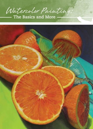
In the photo that inspired Makin’ OJ (watercolor on paper, 24x18), light cascaded over the
orange halves and seemed to set them rolling across the paper. I was excited by the way
the crisp morning sunlight fell, from left to right, boldly on the first orange, obliquely on the
next, with the last cast in shadow and lit from within by light transmitted through the fruit
itself. I was intrigued by the challenge to capture the luminous cellular quality of the juicy
cut oranges and their mottled rinds in a dynamic, high-key painting.
Watercoloressentials
7. Keeping Colors Bright
The most obvious way to keep
colors bright and luminous is to lay
down pure, transparent paint on
white paper, but you can also make
color appear more or less brilliant
in relation to the colors placed next
to it.
In Squeeze Me First! (left),
for example, the oranges in sun-
light get a boost from those cast
in shadow. The value difference
makes them jump off the page,
but they also benefit from the jux-
taposition of strong against muted
color. The opaque quality of the
darks helps make the bright notes
seem more luminous as well.
In Fresh Squeezed (opposite),
the mostly overlooked dark note
in the juice, right in the center of
painting, provides key informa-
tion that defines the color of the
juice in light. At the same time, it
tells much about the light pass-
ing through the dome of the juicer.
Similar comments could be made
about the darker blue-green notes
in this painting.
artist’s toolkit
Paper: I use Arches 140-lb. cold-pressed, typically in block sizes 14x20 and 18x24.
When the work calls for a unique size, I turn to Arches cold-pressed watercolor
board, which can be cut to whatever size I need and allows me to start painting
immediately, no stretching required.
Brushes: I love my Escoda Reserva Series 1212 Kolinsky-Tajmyr sable round brushes,
sizes 8 to 16. I also have a full quiver of Winsor & Newton Cotman synthetic rounds
that I use for down-and-dirty techniques, such as scrubbing and lifting, to which
I wouldn’t subject my delicate kolinsky sables.
Paints: My first choice is Winsor & Newton Artists’ Water Colour, but Daniel Smith’s
quinacridones are also a staple on my palette. I use Aquacover by Creative Mark
when I need to recapture a highlight that I’ve lost.
To begin Squeeze Me
First! (watercolor on
paper, 20x17), which is
bathed in bright sunlight,
I covered the paper with
a warm yellow wash—
with the exception of
the white highlights
I wanted to preserve.
Next, I laid in a wash on
the central orange that
approximated its overall
color. To play off that
spot of color, I laid in a
color note for the cast
shadow to its right, then
a note for the aqua color
next to that, the yellow-
green next to that, and
so on around the piece.
watercolor essentials
8. As I watched my
wife twist and
crush oranges over
the ribbed dome
of the juicer for our
fresh-squeezed
orange juice one
morning, a lightning
bolt of inspiration
struck. What was
once breakfast
was transformed
into still life. With
camera in hand,
I dragged every-
thing outside into
the brilliant morn-
ing sun. Bathed
in light, the juicer
turned magical.
Three of my best
watercolors, includ-
ing Fresh Squeezed
(watercolor on
paper, 17x15), came
from this shoot.
I often create a
quick, loose color
study before I delve
into a painting. In
this study for Fresh
Squeezed (far left),
I worked out the
composition and
tested many dif-
ferent color mixes
before I settled on
this palette.
A spread from my
color notes (left)
offers a sneak
peek into my color-
mixing process.
watercolor essentials
9. Preserving Highlights
Generally speaking, I’m careful with my whites.
I paint around them if I can, use masking fluid
if I can’t and, in rare cases, I use opaque white
paint to reclaim highlights.
In the upper left quarter of Makin’ OJ (page
59) you can see all three techniques at work.
The half orange facing the sun uses the white
of the paper for the center and the ring around
the edge. The tiny cellular highlights were
Although I
relish the often
unnoticed middle
and dark tones in
paintings such as
Sliced Citrus With
Calamondin
(watercolor on
paper, 14x20), for
me, color is all
there is.
Doing a color study such as the one above, I know pretty quickly
if the composition is a winner and if the colors are going to be a
challenge or not.
Despite the variety involved, mixing colors for the bright, juicy
fruit came fairly easily for this painting.
watercolor essentials
10. created with masking fluid. Directly above it,
the orange rind in sunlight nearly drove me
to distraction trying to capture the dimpled
effect of the ruddy rind. I had to use Aquacover
opaque white by Creative Mark to bring back
the highlights I had lost.
In general, if I want to work in broad
washes—areas that can’t be broken down into
small enough sections where I can work around
my highlights—I reach for Winsor & Newton
Colourless Art Masking Fluid.
For Cool Citrus (watercolor on paper, 24x18), I began
with a neutral gray wash a little lighter than what you see
in the upper left corner. An underpainting such as this
helps unify the cast of the finished piece.
see the light: 3 tips
1. Natural light appears different
every moment of the day. Morning
light can be bright but cool. Midday
light can be warm and hazy. Evening
light, which has traveled through the
day’s heated atmosphere, can cast
rosy hues.
2. Sunlight is typically warm. Water-
colorists often use the white of the
paper to depict sunlight, when, in
fact, the white of the paper can
appear quite cool.
3. It’s the relationship between
colors that speaks the most about
light and shadow. If you see shad-
ows at all, it’s because they have
light in them. Where does this light
come from? Is the shadow reflect-
ing the blue sky? Is it picking up
color from nearby objects? Resist
the tendency to go to your darkest
dark too quickly; leave something
in reserve. Indeed, you’d be hard-
pressed to find any really dark notes
in my paintings.
keep colors fresh: 3 tips
1. Steer clear of thin, diluted color. Take advantage of
the full range of color intensity available to you.
2. Start your painting by mixing a bright color. Apply the
color strong but not at full strength so you have some
wiggle room. Work in other colors around the bright and
see how they influence one another: In comparison, one
color will be dominant and one subordinate; one warmer
and one cooler. It will become apparent which color needs
to be more intense and which less.
3. Once you’re satisfied with your bright, leave it alone.
Let it be the anchor to which you key your remaining colors.
Adjust your middle and darker notes accordingly.
watercolor essentials
11. 1I started the full-size painting by covering the
entire 30x30-inch sheet of paper with a cool
blue wash, bathing the piece in shadow. I began
working in the upper left corner until I was com-
fortable with my green color mix. I then moved
to the center and began working on my blues. At
this stage, the colors were not yet at full inten-
sity; only later, when I could see the full illusion
take shape, would I work at full color strength.
Prep Work: Blue Planet (opposite) was too large
and complex to do a full-scale color study, so
I focused on a small section that contained all
the major colors. I tested a variety of blue and
green mixes before I was satisfied. The blue
mix I settled on consists of 60 percent Antwerp
blue and 40 percent royal blue. The green mix
consists of 80 percent permanent sap green, 10
percent quinacridone magenta and 10 percent of
the blue mix. The reds were gradations of opera
rose, permanent rose and quinacridone violet.
Building Color and Light One Step at a Time
1
color notes
For every painting, I make a series
of “color notes” in notebooks I keep
specifically for this purpose. The
notes began as simple swatches of
color mixes, but eventually expanded
to include small color sketches as
well. My paintings can take 40 to 50
hours each to complete and, because
I still work a full-time job, I might
be working on a piece for months.
When I go back to a painting after a
week, sometimes longer, I don’t have
to recall which colors I was using; I
simply refer to my color notes. They
also come in handy when I choose to
use similar still life elements for other
paintings. Many hours of color mixing
are already completed for me.
By the time I finished the painting, I’d filled five 11x15-inch sheets of my notebook
with color notes like the one above, which also included a small color study.
I began by working out the main blue and green mixes that would dominate
the painting; most of the colors I used sprang from these mixes or incorporated
one or the other in some way.
watercolor essentials
12. 2I continued in the
same manner, work-
ing to cover the entire
painting with color. Here
I focused primarily on
the values of my blues,
establishing the pattern
of lights and darks.
3As every color was
influenced by each sub-
sequent color I put down,
I needed to remain mindful
of the color relationships
I was creating and adjust
them accordingly. At this
stage, the main leaf in
the center had taken on
a bluish cast because the
truer greens around it
were too powerful. The
painting was becoming
a diagonal tug-of-war
between the blues and the
greens. To create balance,
I needed to bring out more
greens in the left half of
the painting. Choosing
pinks and red-violets that
would fit in was one of the
final challenges.
2 3
Before I was done,
I had completely
repainted the rose-
like succulent in
the bottom left cor-
ner at least three
times to get it right.
In all, Blue Planet
(watercolor on
paper, 30x29) took
about five months
of Saturdays to
complete. Although
the painting may
not conform to
classic watercolor
rules for success,
I’m pleased with
the results.
watercolor essentials
13. If you aim to find new, exciting subjects to paint, keep
in mind that it’s not just the objects in your paintings
that make the work unique, but also your interpretation
and the personal creativity you bring to them.
Golden koi are symbolic of love, good fortune and
strength. In the demonstration that follows, I’ll show you
how to put a different spin on this oft-painted subject.
Harmonizing shape, color and movement will reinforce
the feeling of a quiet
moment found while
peering into the shal-
lows of a fish pond.
Breaking forms into
multiple planes will
give the appearance of
volume and dimension.
Practice first on a piece
of sketch paper so that
when it comes time to
paint, you’ll layer shape,
color and movement
with confidence.
Harmonize Shape,
Color and Movement
By Linda kemp
A Symbiotic Trio
In Summer Light (opaque
watercolor on paper, 7½x7½),
the brushstrokes guide the
eye in a clockwise direction
that leads to the center of the
painting, creating a swaying-in-
the-wind effect. The gold and
violet, and the red and green,
complement each other to add
a further sense of cohesion
to the vibrant painting.
Watercoloressentials
14. 1Draw a plan for the
layers of fish
I draw the parts of the fish that are
closest to me first. The dorsal fin
and head of each are a good place
to start. Next, I add bodies and tails,
giving life and rhythm to my fish by
curving the parts. After finishing the
bodies, tails and side pectoral fins,
I give each fish its own character
by varying the contour and size.
2Draw and glaze
the top layer
Re-creating the first layer of my
drawing on watercolor paper with
a pencil, I transfer two fish from
my sketch. I glaze around the heads
and fins with pure red-orange (a
mix of permanent yellow-orange
and cadmium red deep). I dilute the
color to soften it, leaving a hard edge
to define the shapes, and then let it
dry. Throughout the painting process,
each element is drawn and painted
one layer at a time.
3Reduce the intensity
of the red-orange
I combine a touch of cobalt turquoise
with the red-orange mix to slightly
reduce the intensity. As the layering
continues through this piece, the
orange becomes progressively more
neutral, or grayed.
4Make a hard edge
I follow my plan to sketch the
bodies of the fish. Working in one
small section at a time, I paint the
slightly neutral red-orange along
the edge of one fish.
Excerpted from Simplifying Design & Color for
Artists: Positive Results Using Negative Painting
Techniques by Linda Kemp (North Light Books,
2013). Available at www.northlightshop.com
and wherever books are sold.
before
you begin
Consider the following as
you plan your painting:
Objective: Create harmony
in color, shape and move-
ment. Practice glazing
techniques for subtle
transitions in intensity
with touches of clean tints
and neutrals.
Simplified color concept:
Paint with changes in
intensity, working with
complementary colors.
Keep the values close.
Shape-making strategy:
Think round. Curves,
curls, circles and ovals
work together to unify
shape and movement.
Dynamic impact: Clean
tints appear luminous
when paired with neutrals.
Practical suggestions
for success: Let each layer
dry before progressing
to the next step.
tool kit
Surface: 140-lb. cold-
pressed or hot-pressed
watercolor paper, 5½x7½
inches
Paints: cadmium orange,
cadmium red deep, cobalt
turquoise, permanent
yellow-orange
Brushes: No. 12 or 14 round
Misc.: sketchbook or
sketch paper, pencil
1
watercolor essentials
15. 5Pull the color away
from the body
I wash the color away from the
fish by dampening the paper
and creating a soft edge, gradually
transitioning the intensity of
the color.
6Dilute the color outward
I continue to paint around the
forms, diluting the paint as it’s pulled
toward the edge of the paper. Then
I set the work aside to dry (or use a
hair dryer to speed the process).
7Continue building
I follow my fish blueprint to add
the fins and more levels of layering.
Based on the number of sections
I’ve divided the painting into, this
requires several steps of sketching
and glazing.
2
3
4
5 6
7
watercolor essentials
16. 8Neutralize the color
as you add layers
For each new layer I add, the
red-orange becomes more grayed.
I accomplish this by increasing the
percentage of turquoise in the mix.
I test the paint as I work, adding
more water as needed to keep the
value from becoming too dark.
9Add some pebbles
I paint the first set of pebbles
under the fish, accentuating the
stones’ round form and a circular pat-
tern to carry the theme through. Next,
I paint around the stones with grayed
color. Little hits of pure turquoise
create a jolt of color.
10Scatter stones
I follow the same basic strat-
egy for building in the negative space
to add more pebbles. I’m not paint-
ing the pebbles; I’m painting around
them. I work slowly and let the paper
dry between steps.
11Keep the motif going
My painting now has five
levels of pebbles. Working from the
upper to the lower levels as I build,
the piles of pebbles get deeper.
11
9 10
8
watercolor essentials
17. 12Develop the inside details
Eyes and the fins’ bony spines can be added, but instead
of painting them in, I paint around them.
A United Front
The combination of color, shape and movement produces a calming,
quiet effect in the completed painting (below). The blended comple-
mentary hues, repetitive shapes of the pebbles and the semicircular
positioning of the fish add up to a harmonious result.
12
Color, shape and movement—as well as the bright shot of turquoise in the
center of the painting—draw the viewer’s eye into The Love Dance—Golden Koi
(below; watercolor on paper, 5½x7½).
watercolor essentials
18. want more?
Get your subscription to
The Artist’s Magazine and
Watercolor Artist today!
Also check out Watercolor Essentials by
Brigit O’Connor and Linda Kemp’s
Simplified Design for Watercolor Artists
Deluxe Collection
Connect with Us