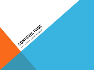
2. VERSION 1
• I have done the background and tried to match it
with the colour of my front page because it is part
of my colour scheme.
• I have also done the title ‘ Contents Page’ large
and different colour to every other colour that is
on that page so that it can stand out and so it is
eye catching.
• I have also added sub titles ‘Cover stories’. This
will guide that people who are reading the
magazine to what they might be searching for
pages about that topic. I have also added a white
underline to the word so that It can stand out.
• Another thing that I have done is, I added lines to
the contents page to separate it front the subtitles
and the title, it also looks professional I have
added a border on the white line so the white like
stands out, and it also part of the colour scheme.
• I have also added the number of the page and on
my second version you will see the improvement
with the numbers and the text that is added on
the page.
3. VERSION 2
• As you can see I have made a massive progression. I
have added another line down the page and I have
also added a black line to the white line so that I can
stand out. Now I think the contents page look more
professional.
• The colour that I have used was done in the right
order and looks organised.
• I have also added shapes to each number so that the
person who reads the magazine can easily spot the
numbers. And these shapes also matches very well
with the music genre.
• I have also used a variety of fonts, and I have also
used the same fonts from the front cover so that
people can identify if quickly from the contents page
and read the story. The fonts for the numbers are
different to the fonts use on the front cover.
• I have also added an image and rotated it to make it
look more fancy, I have also added a blue border
around the image so that it can stand out and it also
makes the image look more professional.
• The way that I have structured the layout of this
magazine so far is good but it will get better, I really
like the way I have organised everything .
4. VERSION 3
• On this version I have added more text and
changed few things.
• I have added a shape next to the image so that
the magazine looks like an music magazine
rather than a fashion magazine, the colour of
the shape is black which then matches with the
colour scheme.
• I have also added more subtitles and added
white lines under the subtitles so that the sub
titles stands out.
• Another creative change that I have done is
added a shape of my own – an arrow- The
reason why I have added that arrow near the
text below is because it shows that you can click
on the website and find more information about
the magazine. This also makes the magazine
look professional.
5. FINAL VERSION 4
• I my final version I have worked very hard, to
make the magazine look professional.
• A change that I have done is I have added more
shapes to make it look more like a music
magazine and the colour that has been used for
the shapes are the same as the colour scheme –
grey, white, black, blue.
• I have also added more lines as borders so the
images.
• I have also made all the text smaller so that you
can see the images better, and this way it looks
more professional.
• The number that are on the images are set out
by the colour scheme and they are also enlarged
so that people who read the magazine can see.
• Another thing that I admired to add is the editor’s
speech, this would have made the magazine
more professional and interesting to read.
• I have also added more images to the side and
added a borders to them so they stand out and
are eye catching.