
Recommended
More Related Content
Viewers also liked
Viewers also liked (18)
Similar to Double Page Spread Codes and Conventions
Similar to Double Page Spread Codes and Conventions (20)
Recently uploaded
Recently uploaded (20)
Double Page Spread Codes and Conventions
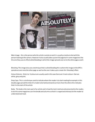
- 1. Main Image- thisisthe personwhothe article iswrote onand it isusuallyamediumshotwiththe personlookingatthe camera.Howeveritalsousuallytakesupone full page butinsome magazineslike thisone theyuse an effectcalledbleedinginwhichthe image spreadsoverontothe otherpage as well. Bleeding-Thisimage alsousesatechnique thatiscalledbleedingthisiswhere the image onthe DPSis spreadout overontothe otherpage as well asthe one it takesupto create this‘bleeding’effect. ColourScheme - Only2 or 3 coloursare usuallyusedinthiscase there are 3 maincolours that are white,greyandpink. Drop Caps- Thisis a technique usedtoindicate where the readeristostart readingforexample inthis double page spreadthe letterDismade to be boldandstand outmore thanthe othersthisindicates that itis the start of the article Body- The bodyisthe main part of an article and ishow the textislaidoutand presentedtothe reader, to do thissome magazinesuse line breaksandcolumnssothatit is organizedandeasyforthe readerto understandandread.
- 2. Main Image- Thisisalwaysthe personwhothe article isbasedon or inthiscase the band/groupandas youcan see the image isthe bandwho thisarticle isbasedon.The main image alsohasits ownpage ina double page spreadbutagaininthiscase it takesupthe majorityof both. Bleeding-Thisimage alsousesatechnique thatiscalledbleedingthisiswhere the image onthe DPSis spreadout overontothe otherpage as well asthe one it takesupto create this‘bleeding’effect. Background – the backgroundof the DPSis neververycolourful orboldastheyare usedtomake the people/personinthe mainimage standoutmore to the reader. Text- InthisDouble Page spreadthere isa lotof boldtextusedthisisusedsothat it standsout to the readerand alsoitis usedto showthe readerwhatis the mostimportantparts of the article , it can also be usedto showthemwhatto read first. Captions- These mayalsoappearondouble page spreadsastheygive the readerinformationaboutwho the article isbasedon. Itcan alsoencourage the userto readon and continue furtheronthroughthe article.