Call Girls In Radisson Blu Hotel New Delhi Paschim Vihar ❤️8860477959 Escorts...
Media layout page
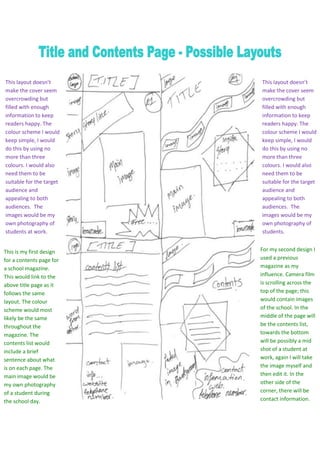
1. This layout doesn’t This layout doesn’t
make the cover seem make the cover seem
overcrowding but overcrowding but
filled with enough filled with enough
information to keep information to keep
readers happy. The readers happy. The
colour scheme I would colour scheme I would
keep simple, I would keep simple, I would
do this by using no do this by using no
more than three more than three
colours. I would also colours. I would also
need them to be need them to be
suitable for the target suitable for the target
audience and audience and
appealing to both appealing to both
audiences. The audiences. The
images would be my images would be my
own photography of own photography of
students at work. students.
This is my first design For my second design I
for a contents page for used a previous
a school magazine. magazine as my
This would link to the influence. Camera film
above title page as it is scrolling across the
follows the same top of the page; this
layout. The colour would contain images
scheme would most of the school. In the
likely be the same middle of the page will
throughout the be the contents list,
magazine. The towards the bottom
contents list would will be possibly a mid
include a brief shot of a student at
sentence about what work, again I will take
is on each page. The the image myself and
main image would be then edit it. In the
my own photography other side of the
of a student during corner, there will be
the school day. contact information.