DATA + DESIGN
where math and art collide
Trina Chiasson, Infoactive | @trinachi | infoactive.co/data-design
This year, I did something new.
I worked with 80+ volunteer
contributors to write a
300-page ebook.
How do you write an
open source ebook?
It started with a message…
Hi Trina! Stats dork from Chicago here…
Do you have any plans to include tutorials
for basic data cleaning and data selection
techniques for users who may not have
any statistics background?
— Dyanna Gregory
This is what most statistics textbooks look like.
Most designers say…
This isn’t
for me
HAVE YOU EVER SEEN A BAD INFOGRAPHIC?
24.5%NO
84.5%
YES
Why do so many
infographics suck?
THEORY #1
Graphic Designers are evil.
They sacrifice
truthful data representation
for aesthetic gain.
THEORY #2
Marketers are evil.
They sacrifice
truthful data representation
for more clicks.
THEORY #3
Most people aren’t evil.
Good data visualization
is really hard to do.
Who has skills in programming,
design, and data analysis?
Not everyone is blessed with the innate ability
to make brilliant data visualizations.
What data collection looked like,
not too long ago
What data storage looked like,
not too long ago
What data collection
looks like today
1985: The birth of Excel
But what do we do
with all of this data?
The price of light is less
than the cost of darkness.
— Arthur C. Nielsen,
Market Researcher & Founder of ACNielsen
Let’s send our data to a designer
who can make it look pretty.
But most designers
are not trained in stats
How about a friendly
introduction to data?
But how do you write an
open source ebook?
There’s no
open source book
on how to write
an open source book.
Don’t underestimate the
awesomeness of strangers
on the internet.*
* Especially strangers who volunteer to
write books about data in their free time.
In six months,
we wrote and released the
English version.
Data + Design is now being
translated in Chinese, Russian,
Spanish, and French.
Is it true that
dataviz people
hate pie charts?
That’s a complex
question.
Arguments against
pie charts:
13% 100%
13%
A table is nearly always better than a dumb pie chart;
the only worse design than a pie chart is several of them,
for then the viewer is asked to compare quantities located
in spatial disarray both within and between charts […]
Given their low density and failure to
order numbers along a visual dimension,
pie charts should never be used.
Edward Tufte, "The Visual Display of Quantitative Information”
Graphical perception: Theory, Experimentation, and Application to the Development of Graphical Models
Meat Pies
& Color Theory
What Color
Is This Chart?
#TheChart
Hot Pie Cold Pie
Hot PieCold Pie
Men who cannot
read this chart
Men who can read
this chart
So you should use
monochromatic
color scales, right?
Monochromatic scales are
better for continuous data
Be careful with
multicolor scales
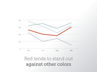
Red tends to stand out
against other colors
Can you find the red circle?
How about now?
Which is easier?
Finding boundaries in color vs. shapes
Adapted from: Healey, Christopher G., Kellogg S. Booth, and James T. Ennis. “High-Speed Visual Estimation Using
Preattentive Processing.” ACM Transactions on Computer-Human Interaction 3.2 (1996): 4.
So what colors
should I use?
It depends, but…
BLUE & ORANGE
More visual
trickery
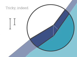
Our brains look for
baselines to compare
distances
But the dark blue line
is measured on a
vertical scale.
Tricky, indeed.
Another example…
At first glance, you might think that the
dark blue line decreased in value.
More visual trickery!
Same data, different story.
How do we make data
more human?
US unemployment rate from 2007-2009
http://www.nytimes.com/interactive/2009/11/06/business/economy/unemployment-lines.html?_r=0
In 2008, the Sichuan Earthquake
killed over 60,000 people in China.
“For seven years she lived happily on this earth”
- Mother of an earthquake victim
How will you
share your data?
DATA + DESIGN
where math and art collide
Trina Chiasson, Infoactive | @trinachi | infoactive.co/data-design

Data Design: Where Math and Art Collide