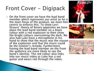
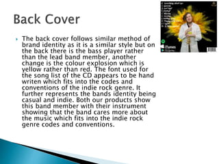
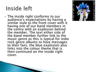
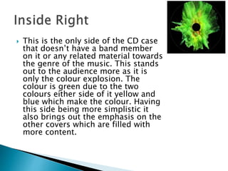
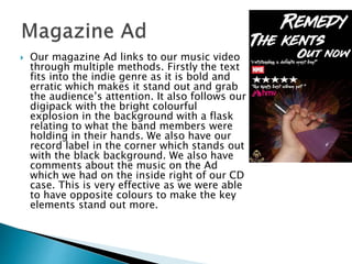
How effective is the combination of your
main product and ancillary texts?
Anthony Edwards
 In both our music video and our ancillary
products we focus around the concept of a
remedy. This is most prominent in our digipack
and our magazine cover as we have the artist’s
identity with the title “Remedy”. This also links
into another concept that we attempted to focus
on which was the artists being the biggest part as
for the indie rock genre typically the artist is seen
more as they tend to put the music first. This is
clear throughout all our products and texts as
our artist has the most screen time in the video
and each band member has their own side of the
CD case.
 On the front cover we have the lead band
member which represents our artist as he is
the main focus of the product, we main him
centric to enforce this. To show Levi-
Strauss’ theory of binary opposites we have
place the lead band member on a black
colour with a red explosion to then show
the bright colours overcoming the dark. We
also had Luke have a microphone in his
hand to show that the music was the reason
of the explosion and that the music could
be the listener’s remedy. Furthermore
having the lead band member on the front
the audience are more likely to see the
band’s identity. The red colour also links
into our music video as Luke has a red
guitar and wears red through the video.
 The back cover follows similar method of
brand identity as it is a similar style but on
the back there is the bass player rather
than the lead band member, another
change is the colour explosion which is
yellow rather than red. The font used for
the song list of the CD appears to be hand
writen which fits into the codes and
conventions of the indie rock genre. It
further represents the bands identity being
casual and indie. Both our products show
this band member with their instrument
showing that the band cares more about
the music which fits into the indie rock
genre codes and conventions.
 The inside right conforms to our
audience’s expectations by having a
similar style to the front cover with it
having one of our band members in
the centre with an explosion behind
the member. The text either side of
the band member further link to the
music genre as this is typical for indie
rock genre albums to have messages
to their fans. the blue explosion also
links into the colour theme that is
then continued on the inside right
cover.
 This is the only side of the CD case
that doesn’t have a band member
on it or any related material towards
the genre of the music. This stands
out to the audience more as it is
only the colour explosion. The
colour is green due to the two
colours either side of it yellow and
blue which make the colour. Having
this side being more simplistic it
also brings out the emphasis on the
other covers which are filled with
more content.
 Our magazine Ad links to our music video
through multiple methods. Firstly the text
fits into the indie genre as it is bold and
erratic which makes it stand out and grab
the audience’s attention. It also follows our
digipack with the bright colourful
explosion in the background with a flask
relating to what the band members were
holding in their hands. We also have our
record label in the corner which stands out
with the black background. We also have
comments about the music on the Ad
which we had on the inside right of our CD
case. This is very effective as we were able
to have opposite colours to make the key
elements stand out more.
 Overall I think that the combination of our music
video and our ancillary texts was effective due to the
key themes that we used such as searching and
remedy which featured heavily in our ancillary
products. WE also used props which featured in all
our products such as the instruments which were in
our video as well as our digipack and then the flask
which was in both ancillary products. This helped
with allowing the audience to connect the key
features of our products. Furthermore we used colour
symbolism by showing bright colours as being
upbeat and fun as well as joyful which we used in the
colour explosions in our ancillary products and then
in our video we used colour correction to give an
orange tint to show how bright our video is.

Evaluation Question 2

  • 1.
    How effective isthe combination of your main product and ancillary texts? Anthony Edwards
  • 2.
     In bothour music video and our ancillary products we focus around the concept of a remedy. This is most prominent in our digipack and our magazine cover as we have the artist’s identity with the title “Remedy”. This also links into another concept that we attempted to focus on which was the artists being the biggest part as for the indie rock genre typically the artist is seen more as they tend to put the music first. This is clear throughout all our products and texts as our artist has the most screen time in the video and each band member has their own side of the CD case.
  • 3.
     On thefront cover we have the lead band member which represents our artist as he is the main focus of the product, we main him centric to enforce this. To show Levi- Strauss’ theory of binary opposites we have place the lead band member on a black colour with a red explosion to then show the bright colours overcoming the dark. We also had Luke have a microphone in his hand to show that the music was the reason of the explosion and that the music could be the listener’s remedy. Furthermore having the lead band member on the front the audience are more likely to see the band’s identity. The red colour also links into our music video as Luke has a red guitar and wears red through the video.
  • 4.
     The backcover follows similar method of brand identity as it is a similar style but on the back there is the bass player rather than the lead band member, another change is the colour explosion which is yellow rather than red. The font used for the song list of the CD appears to be hand writen which fits into the codes and conventions of the indie rock genre. It further represents the bands identity being casual and indie. Both our products show this band member with their instrument showing that the band cares more about the music which fits into the indie rock genre codes and conventions.
  • 5.
     The insideright conforms to our audience’s expectations by having a similar style to the front cover with it having one of our band members in the centre with an explosion behind the member. The text either side of the band member further link to the music genre as this is typical for indie rock genre albums to have messages to their fans. the blue explosion also links into the colour theme that is then continued on the inside right cover.
  • 6.
     This isthe only side of the CD case that doesn’t have a band member on it or any related material towards the genre of the music. This stands out to the audience more as it is only the colour explosion. The colour is green due to the two colours either side of it yellow and blue which make the colour. Having this side being more simplistic it also brings out the emphasis on the other covers which are filled with more content.
  • 7.
     Our magazineAd links to our music video through multiple methods. Firstly the text fits into the indie genre as it is bold and erratic which makes it stand out and grab the audience’s attention. It also follows our digipack with the bright colourful explosion in the background with a flask relating to what the band members were holding in their hands. We also have our record label in the corner which stands out with the black background. We also have comments about the music on the Ad which we had on the inside right of our CD case. This is very effective as we were able to have opposite colours to make the key elements stand out more.
  • 8.
     Overall Ithink that the combination of our music video and our ancillary texts was effective due to the key themes that we used such as searching and remedy which featured heavily in our ancillary products. WE also used props which featured in all our products such as the instruments which were in our video as well as our digipack and then the flask which was in both ancillary products. This helped with allowing the audience to connect the key features of our products. Furthermore we used colour symbolism by showing bright colours as being upbeat and fun as well as joyful which we used in the colour explosions in our ancillary products and then in our video we used colour correction to give an orange tint to show how bright our video is.